Logo design is one of the few arts that can be used both to reveal ideas and to hide them at the same time.
Since branding relies on the visual aspect, it may not come as a surprise to hire a team of really great experts who can do the job for you well and spice things up just enough to mousetrap consumers and make them talk.
Big brands manage to do that. Here is a list of 20 big brand logos which have a message hidden in their logo. Can you spot all of them?
(Scroll down to read the key.)
Hidden Messages in Brand Logos Examples
Amazon

Baskin-Robbins

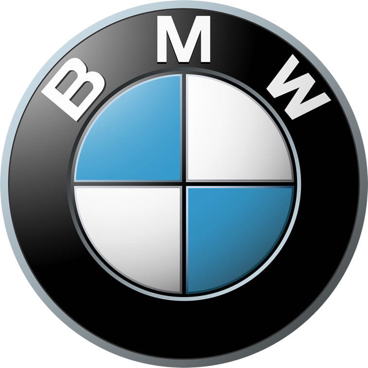
BMW
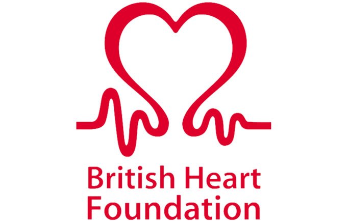
British Heart Foundation
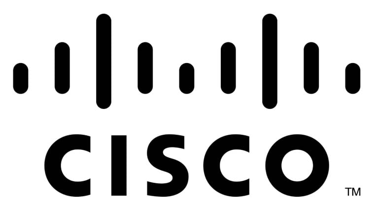
Cisco
Coca-Cola

FedEx

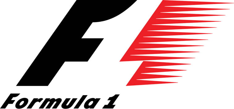
Formula 1
Gillette

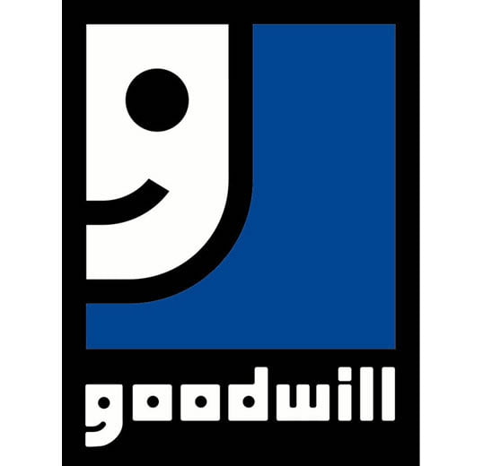
Goodwill
Jack in the box
Le Tour de France
LG
Museum of London
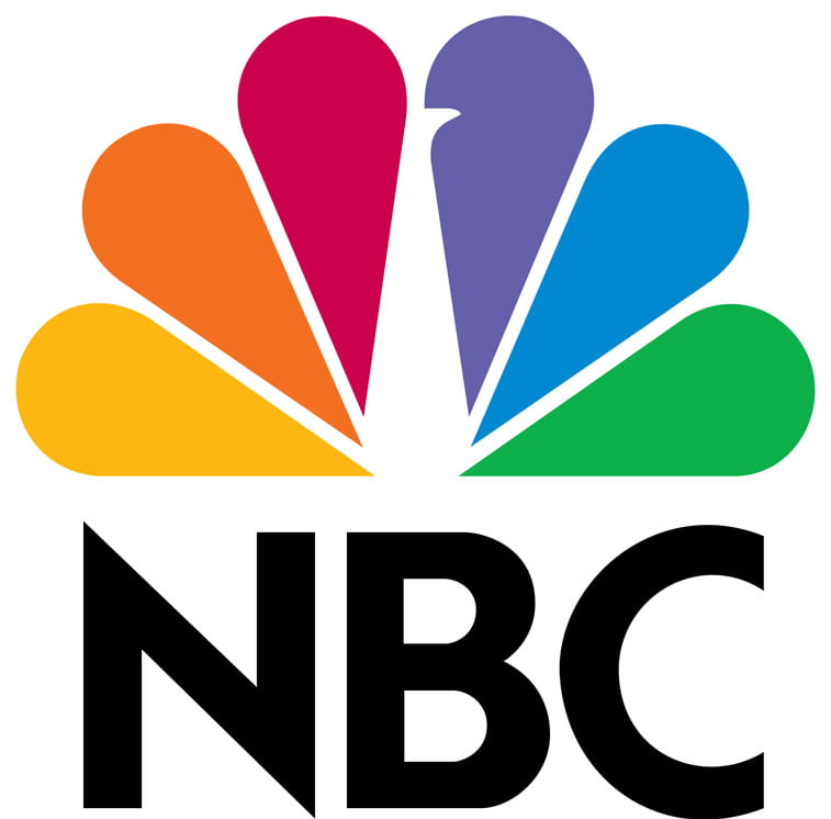
NBC

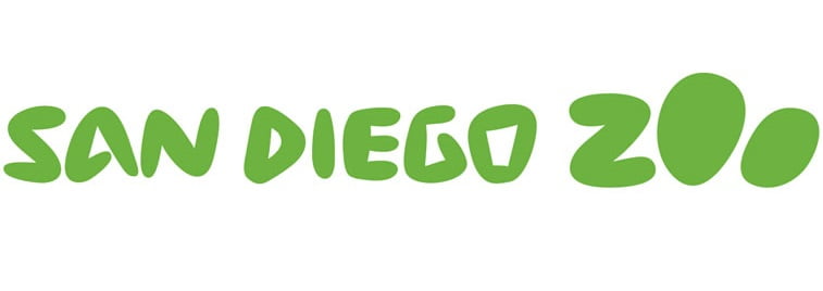
San Diego Zoo
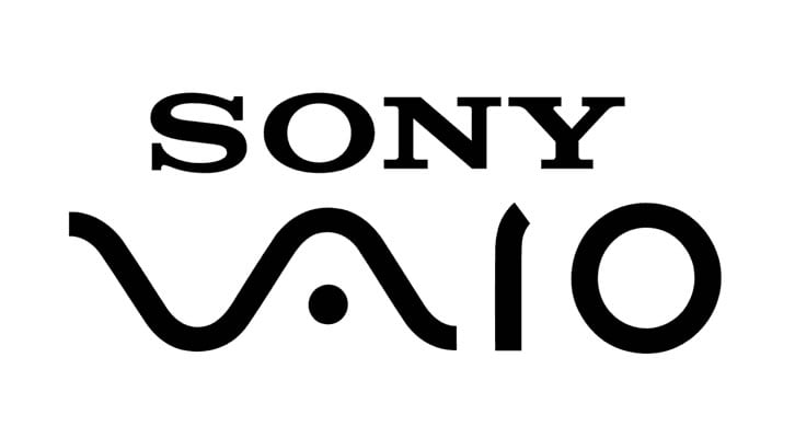
Sony VAIO
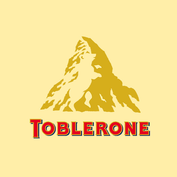
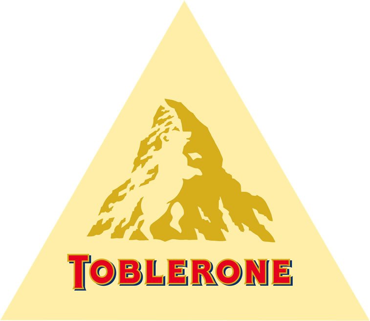
Toblerone
Unilever
Key: Where the Message is Hidden
Amazon – Besides showing a smiley face indicating to customer satisfaction, the arrow below the word ’amazon’ points from A to Z, which is a variety of products that Amazon offers.
Baskin-Robbins – even though the logotype includes the ice cream brand’s initials, the secret lies in the pink number of 31 formed by the two letters, which represents the number of original flavors offered by the company.
BMW – this logo stays true to the company’s aerial history: the white sections represent a rotating propeller, whereas the blue sections represent the sky.
British Heart Foundation – the logo clearly shows a heart in the electrocardiogram reading, but the secret lies in the positive reading which promises hope.
Cisco – since the company is from San Francisco, the blue lines represent Golden Gate bridge, whereas the name itself is short for the city of San Francisco.
Coca-Cola – this logo is the perfect example of a coincidence. When it was used in a marketing campaign in Denmark, people spotted their national flag between the letters O and L, so it came quite handy during the promotion.
FedEx – what many do not see at first in this logo is that the negative space between the letters E and x actually form an arrow, which represents speed and delivery accuracy – the factors this company promotes.
Formula 1 – another great example of good usage of negative space: the number 1 is formed between the black letter F and the red lines which represent speed.
Gillette – razors obviously cut everything perfectly, including Gillette logo whose letters G and L have been cut with precision, representing product sharpness.
Goodwill – the smiley face in Goodwill logo is just an oversized image of the G letter in the logotype.
Jack in the box – letters O and X form an ichthys, a symbol of fish which is an example of what company offers on their menu.
Le Tour de France – the logotype does not only contain letters, but they form a bicycle and a cyclist whose front wheel is actually the sun.
LG – the logo consists of letters L and G forming a face. And not only that. Some even see a Pacman face in it!
Museum of London – unseemingly at a first glance, the colors of the Museum of London actually represent the expansion of the geographical area of the city of London throughout history.
NBC – peacock formed by the six colors and the silhouette of negative space at the center is not there by accident – the NBC actually take pride of what they broadcast so it came quite naturally to use this symbol in their company logo.
Pinterest – the letter P in the logotype is stylized so as to form a pin, which is exactly what this growing network’s users do with the images on their boards.
San Diego Zoo – the logotype has a hidden paw in the word Zoo. Have you noticed it?
Sony VAIO – this one’s a bit tricky. The letters VA in the logotype form an analog signal, whereas the letters IO resemble the numbers 1 and 0, i.e. a digital signal.
Toblerone – there’s a bear hiding in the mountains of Toblerone logo. It symbolizes Bern, the capital of Switzerland which is known as the city of bears, and exactly where the company was founded.
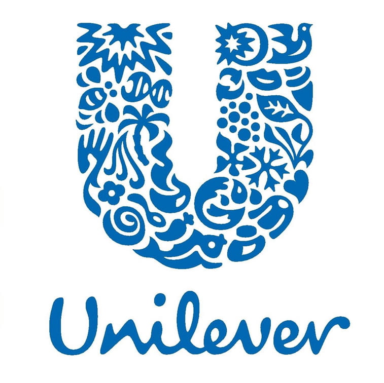
Unilever – the creative logotype of Unilever is made up of the letter U formed by different shapes which symbolize the company’s business, such as a recycle icon (sustainability) and lips for beauty and taste.
Like this article? See more:
- Food logos with calorie count by Calorie Brands
- Logo design evolution: famous brands then and now
- Logos comprised of words with hidden meanings
- Satirical logo design: Universal Unbranding Project by Maentis
- Brand design: 3d inflatable artworks by Vinicius Araujo
- How good is your logo?
- Things to do before designing a logo
- 9 branding design principles
