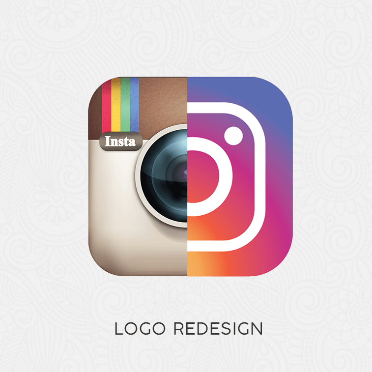
Logo redesign is a normal process – when companies with effective branding decide to do it, it is a clear sign that times (and people) have changed.
If you are a social media user, then you probably noticed that some of your favorite networks have changed their looks – some for the better, and some for the worse.
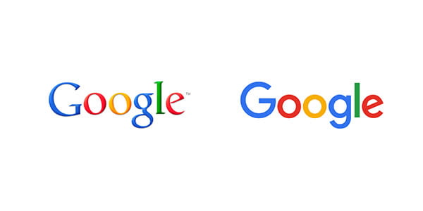
Instagram, for example, decided to ditch its iconic camera logo and opt for a gradient icon design which puts emphasis on color (purple, orange, and pink, in this case). Other brands, such as Facebook and Google, decided only to change the font, giving their logos a fresher look. On the other hand, maybe the biggest surprise were MasterCard, Lenovo, and Medium which all made major changes on their logos.
However, we will not reveal too much. See for yourselves and tell us, in the comments below or on our Facebook page, what three logo redesigns are your favorite, and what three new logos you like the least.
20 Examples of Logo Redesign
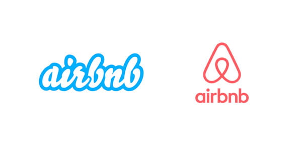
Airbnb
Asana

Codecademy

Deviant Art


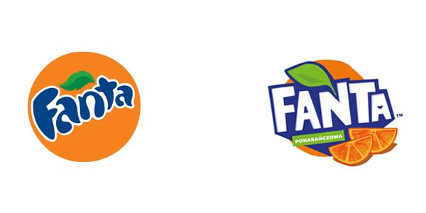
Fanta
KFC

Lenovo
Logitech

MasterCard
Medium
Microsoft

Nivea
PayPal

TP-link

Uber

Vevo

