Logo is your company trademark, your business image, the visual identity of your company. It makes you stand out from the crowd, if it looks good, of course.
The summer of 2015 started with the change of logos. Brands such as Facebook and Google have decided to change theirs, and their efforts have ended in different ways. Namely, Facebook’s announced change of logotype in July was not widely noticed and was even frowned upon by some, whereas Google’s September flat design has got only thumbs up so far.
What makes a logo great?
Different designers focus on different things, but what the majority of them agree on is simplicity.
According to Milton Glaser, an American graphic designer, best known for the timeless I ♥ NY logo (which dates back to 1977), reports that
you want to move the viewer in a perception so that when they first look at [the logo] they get the idea, because that act between seeing and understanding is critical.
A great logo needs to have the following four features:
Uniqueness
Since the function of logos is to make you recognizable among the competition, you need to stay away from the expectations. This means that if you plan to sell coffee, your coffee shop logo need not necessarily include coffee beans or mug for that matter. The perfect examples of this are Apple and Starbucks logos which have nothing to do with computers or coffee, respectively.
Adaptability
Especially today, when we are facing the changes in modern technology and the rising need for responsive design, it is crucial that your logo has this feature as well. Strong logos need to adapt to different sizes and stand the test of re-scaling, be it small-scale business card or to the size of a billboard, without losing on detail and quality.
Timelessness
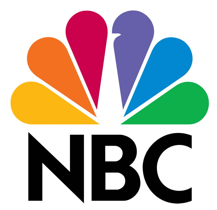
Even though you never know whether your logo is going to become timeless, because it usually happens when you least expect it, when creating a logo, you need to imagine your company ten or twenty years from now and think whether it will stand the test of time. Timelessness can be achieved simply through neutrality: using certain color palette or shapes, clean lines and symmetry, as in the case of the NBC Universal logo.
Appropriateness
The last, but not the least, think you should think about is appropriateness – is your company logo working for your target audience well? There is a hidden meaning behind colors in business, so you need to pay attention to this. Naturally, fun design will not work for a big lawyer company, and too serious an approach will not be accepted by, say, your target audience in a kids’ language academy.
How to assess if your logo is great or not?
Paul Rand, an American art director and graphic designer (famous for his IBM, UPS, ABC, NeXT, Inc., and Yale University Press logotypes), also advocates simplicity in logo design.
You can follow these seven steps in assessing a logo quality:
Is it distinctive?
Is it visible?
Is it adaptable?
Is it memorable?
Is it universal?
Is it timeless?
Is it simple?
If the answer to either of the questions is “Yes,” we congratulate you, because your logo has what it takes to become the best one in the world.
However, if “No” is the answer to any of the questions, we suggest you check out our logo galleries from 2012 and 2013, as well as 2014. and our Behance portfolio to see what we have done so far.
If you have ideas about your new logo update, do not hesitate and contact us to design a new logo for you.
[button style=”1″ caption=”We are at your service!” link=”https://www.popwebdesign.net/order.php?f=graphic”][/button]
