Flat design is currently in. "Why and how?", you may ask yourself. Well, there is a history behind it. Without getting into too many boring details, here we present you a short history of flat design: its past, present, and future.
As it often happens in the history of art, a new genre usually emerges as an answer to the previous or current trend – and it is completely the opposite of its predecessor. Since history seems to repeat itself, it did not skip its course this time.
What is Flat Design?
Flat design can be defined as a two-dimensional style in design which lost all stylistic elements that sugar the image up and make it seem three-dimensional. Rather than focusing on gradients, drop shadows and textures, flat design stresses content, color, and typography.
Features of flat design:
– Minimalist approach
– Focus on color
– Focus on typography
– Simple elements
Even though this sounds simplistic, in essence, flat design is not really something beginners in web design or design in general can do on the first day of their job. If you are one such beginner and would like to get yourself acquainted with flat design, you can find more information about its principles on Designmodo.
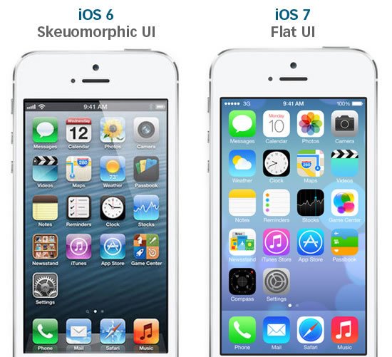
What is obvious is that in the past three to four years the web has become truly flat – no matter the niche. This trend came into existence as the opposition to the so-called “rich design,” and skeuomorphism, all used at the beginning of 2000s, mainly by iOS6 – which was a trendsetter at the time, and basically consisted of realistic designs which copied things from the real world.
The origins: Swiss design and minimalism
It seems that flat design originates from the Swiss style (aka International Typographic Style) which dominated the design scene back in the 1950s. It came into existence in 1920s in Russia, the Netherlands and Germany, and became really popular in 1950s in Switzerland when the world-famous Helvetica typeface was designed (back in the day, it was called Neue Haas Grotesk).
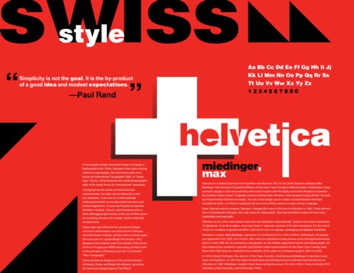
Just like the post-war minimalism, this style focused mainly on typework and big images – content rather than design delivered the message – and to this day preserved this feature on the world wide web.
How Digital World Became Flat
Quick forward to the twenty-first century. Every flat designer knows that its modern history starts on the day when two opposing companies – Microsoft and Apple – started their design combat. Namely, when iPod flooded the market, Microsoft created the Zune media player in 2006. This player’s display focused on typography, it had a large lower-case menu and its background imagery changed when a new song was playing.
After that, the sequence of events was natural – the design was extended to Windows Phone 7 in 2010 (and was called “Metro”), and was so influential that even Apple replaced its skeuomorphic design and went completely flat in iOS7. Talk about a shapeshift.
One of the most recent makeovers includes Google’s rebranding and the introduction of their 2015 flat logo. Their services went far from flat, however, and now prescribe material design.
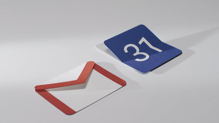
Even though it differs from flat, it is obvious that some principles have been used in the process of materialization.
This change was also caused by another huge thing that hit the world of web design: responsive design, which moved the focus to functionality of websites on different devices. Flashy and rich designs were slower to load on smaller mobile devices, especially when Internet connection was bad, so designers needed to simplify things.
The Future of Flat
Even though in the past flat design has been criticized as being made for designers (and not users), or lacking art and true design features, it is obvious that it has persisted over the years whereas its offspring – material design – may be the next big thing in web design.
What do you think, how long will flat design persevere and will it be lost and forgotten this year? What are your predictions? Tell us in the comments below.
