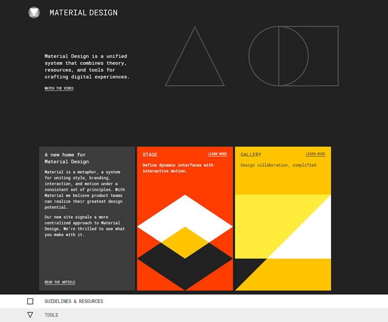
Google recently launched a new website for Material Design – material.io – with, as they put it, “a more centralized approach to Material Design,” and with abundant guidelines and tools prepared for your easier use. In 2017, we hope to see more of it on the web, so we have curated this small guide that should help you master Material.
What is Material Design?
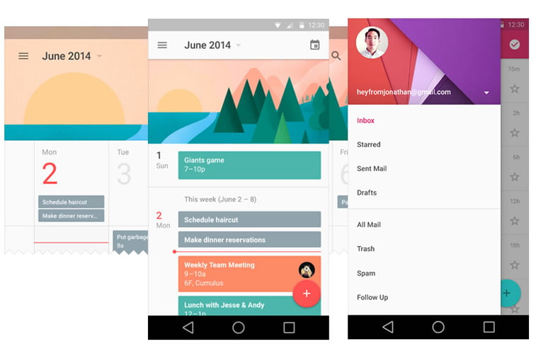
Material Design is a design language Google developed in 2014 under a codename Quantum Paper. MD was based on ink and paper; however, unlike those two materials, this design has physical surfaces and edges, but it can expand and reform intelligently.
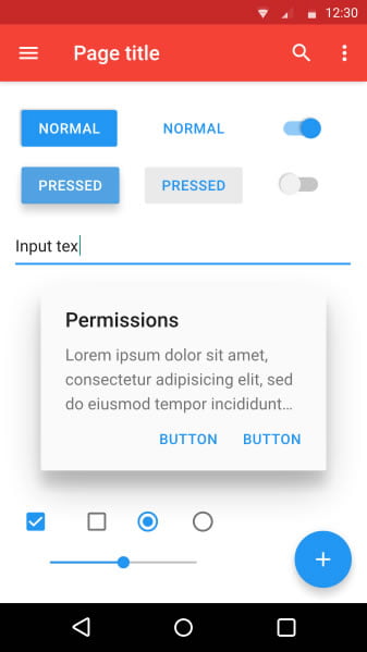
You can see it everywhere: starting from your Google Inbox, over to Google Play Store, even in Chrome, for that matter. And it is implemented so intelligently that it warms up your senses and you wish to see it in other apps as well.
On its new site, Google defined MD as follows:
“Material Design is a unified system that combines theory, resources, and tools for crafting digital experiences.”
In other words, Material Design is considered to be a philosophy that encompasses all design in the future in a consistent way, no matter the device. This graphic language is understood by its designers as a means of helping people interact with devices in a smarter way, intuitively. For example, when you see a button on the screen you will know that it is there to be pushed, and once you do push it, it sort of pulls up and you perceive it more dynamic.
Material Design Guidelines
A great way to start learning how to design material apps and web applications is by browsing Google’s Material Design Guidelines on their official website.
There, you will be able to grasp the idea behind material as a metaphor, including its properties, shadows, and news. Additionally, you will be able to learn about motion (material motion, duration & easing, movement, transforming material, choreography, and creative customization), style (colors, icons, imagery, typography, and writing), layout (principles, units & measurements, metrics & keylines, structure. Responsive UI, and split screen), components (bottom navigation, buttons, cards, chips, dialogs, lists, menus, and many more), how to use patterns and even get cool resources such as color palettes Google proposes.
Material Design Resources
Here are additional MD resources that can help you study this beautiful design philosophy:
- Material Design Intro & Tutorials
- Android: getting started with material
- Material for developers
And finally, tell us have you had the chance to go through Material design specifications and design a user interface in this design language. Do you find it challenging and more modern than, say, flat design? Are there any challenges you have had to face with when designing your first Material UI?
