Being employed in anything that has to do with the Internet, one has to be in touch with a significantly big number of topics. So what are the web design trends to pay attention to and incorporate in your projects in 2017?
When you are in web design business, you need to be familiar with the latest developments so as to meet the expectations of your customers in the best possible way. Following trends is one of the ways to do it. That is why we carefully analysed several leading online pages on the topic and made a list of 10 most important web design trends that are most likely to boom in 2017.
10 web design trends to look out in 2017
1: Animations
One logo design trend that intersects with web design is animation, and by that we mean high-quality GIFs and cinemagraphs. Animations are a great way to add some dynamics into otherwise static pages.
Embedding a high-quality full screen GIF loop to your website home page is an excellent way to keep your visitors’ attention for longer than just a glance and make them curious to know what you do.
2: Weighty typography
In line with logo design trends for 2017, where one of the trends is bold typography as well, or, more precise, the combination of big and small letters, typography in web design in 2017 also shifts towards bigger letters.
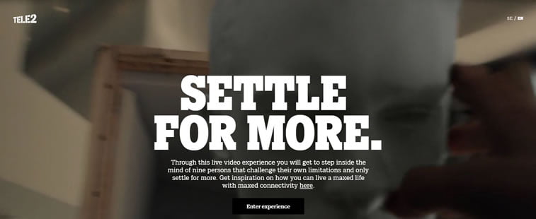
Bear in mind that the general rule about all caps that equals shouting is still valid, so apply this bold lettering only to titles, headings, or what you want to attract special attention to.
3: Asymmetry and visual experiments
The trend of perfectly symmetric web pages has done its fair share and it is now time to let in the asymmetry and visual experiments.
That means that it is no longer required to keep all elements on a page in a perfect order, but rather to keep them scattered around a page as if they were placed there randomly. Web designers further experiment with this, so only time will tell if this trend is there to stay.
4: Lively colours
Neutral or achromatic colors are a thing of the past, because the vivid color trend is on the rise, especially in web design. That still does not mean using only neon colors or combining shades that prevent readability, but rather making statements by implementing daring color schemes into website pages.
Furthermore, adding lively color layers to a website adds depth and texture, hence the visitor is more likely to rummage through the pages and further explore the website.
5: Bright gradients and duotones
When minimalism took over web design, website designers had to find a way to differentiate from one another, and the solution they came up with to this problem evolved into bright gradients and duotones.
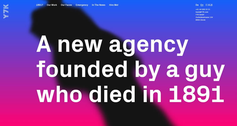
Gradients and duotones are appealing as they look cool and modern, and are regaining the popularity that almost disappeared throughout the last several years.
6: Hand-drawn illustrations
One of the best ways to stand out from the crowd is to have something customized to turn into your trademark. In web design, that means incorporating hand-drawn illustrations onto web pages.
Hand-drawn illustrations add personality and are a great refreshment in the age of flat design and minimalism. If further combined with them, customized drawings may have a stunning final effect.
7: Minimalism
If you pay attention and analyze the websites from 10 years ago and compare them to the newer ones, what is most evident is that minimalism is in full swing. The beauty of contemporary websites lies in their simplicity, minimalism being one of its key features.
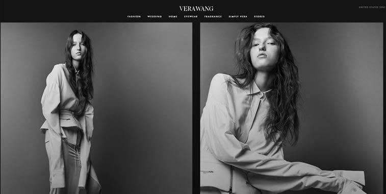
Reducing the number of elements on a page is even better for website owners as it enables them to direct the reader where they want them to go, allowing for more intuitive page browsing, hence smoother user experience.
8: Text in various directions
The best way to draw the reader’s eye to something is to engage his mind for a couple of seconds – that’s how much it takes for a brain to process text written in various directions. Web design trend for 2017 postulate text in different directions as a good idea.
If you think there’s going to be a complete mess of text going in all directions, or at least Scrabble-like, the good side of this trend is that the text is limited to the mixture of horizontal and vertical directions only.
9: Authentic photographs
Stock photos websites have been with us for so long that they started reappearing on different media channels. And the thing is, once we are able to recognize something as already used, it is time to turn a new leaf and do better than that.
Web design trend for 2017 includes more authentic and unique photos. That is why professional photographers might also start making better bucks in 2017, as the need for authentic photos is inevitably going to boom in web design.
10: Fake news ban
Many people around the globe made a living in 2016 by launching and relaunching websites that published fake news, the peak of which was reached somewhere around the election time in the US.
Once Google found ways to identify fake news bots, the money simply stopped flowing into their bank accounts, and the fight against fake news continues in 2017 even more severely than before. This means that web design will also be affected by such shift, as less fake news websites will be thriving.
Are there any trends we did not mention but you believe should be on the list? Do you have any favorites that differ from our selection? Share your thoughts and ideas in the comments section below or on our Facebook page!
