Logos are important for businesses. They represent companies and their vision and goals and make them memorable. And certainly, every company wants to be memorable. This is where logo design steps in.
If you are a beginner in graphic design and want to start designing logos – but are not sure where to start – here we offer you a guide to the logo design process.
How the logo design process runs
1. Thorough preparations help you run half the race
This is basically what every experienced designer will tell you. The key is talking to your clients about what they want. Do they need a redesign? Do they want a special color palette? Do they have a sketch of their own? Do they have competition? Whom do they want to target?
Basically whatever comes to your mind.
The more questions you ask them before designing a logo, the better for the end-product. What you can do is to make an official document of you as a designer with the questions, or – if you are also into web design – create an online form which your clients can fill in and help you get the best project brief.
And after that, ask them some more questions to make things clearer.
2. Start with the right tools
Every craftsman needs to have the right tools. Just like blacksmiths have their hammers and tailors their needles, designers also need to work with the right tools.
Start with these:
- Paper and pencil
- Adobe Illustrator
- Adobe Photoshop
- Graphics tablet
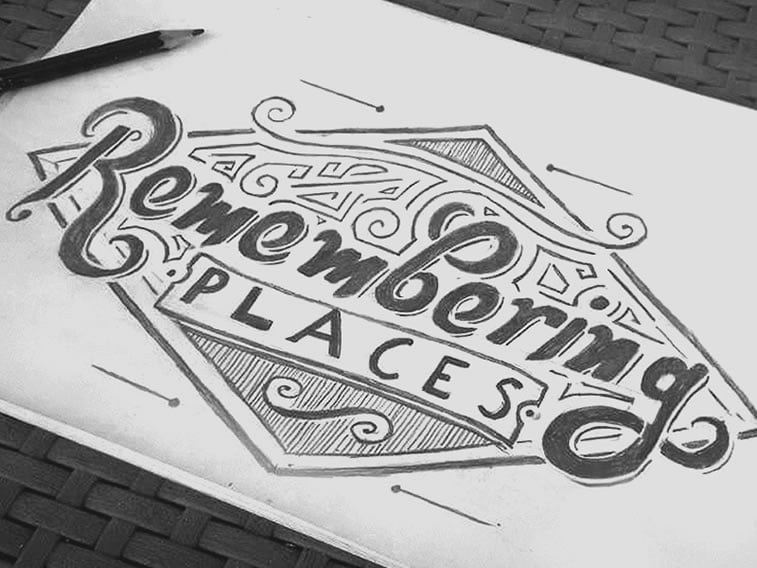
Designers usually make their first sketches on paper (around 10 to 15 versions) and only then do they draw the best iterations in Illustrator. Why illustrator? Because, unlike Photoshop, it creates vector images which can be stretched without harming quality. But when do you use Photoshop? When you send the logo presentation to the client (more on that in step 6).
Using graphic tablets is not a must, but designers who discover them early on in their careers feel like they cannot do without them, so we recommend getting one to facilitate work.

3. Choose your fonts wisely
Some people believe that logo design is all about fonts, while others strongly disagree because that can make the whole process mundane as if anyone can do it.
However, truth be told, fonts do play an important role in logo design. Especially if you need to design a logotype.
If you already have a ton of fonts in your hard drive and do not know where to start, you can use some useful tools such as Nexus font manager, which is free for use and shows you a preview of your logotype (basically the word you type in). You should try with any font, and use even combinations of two different fonts (if your logotype consists of two words).
4. Color them pretty
Besides fonts, color is very important in logo design. According to color theory and color psychology, every color bears a meaning in design, so if you choose e.g. fuchsia for a software company – things will probably not work out well for you.
The first versions of logos are usually done black’n’white because at this stage designers want to focus on the shape rather than the color representation.
After that, every designer to be should know that colors are not the same on a computer screen and when printed. You have probably already heard about terms such as RGB, CMYK and Pantone color palettes. These are all intended for different purposes, so for example, CMYK is made for printing whereas RGB is made for digital representation.
When clients demand multicolored logos, many designers use color palettes to see which colors match. If you are not familiar with online tools such as Coolors or Paletton, or Color Hex for shades, here’s a hack for color schemes: you can download palettes from Dribbble, just like many designers do.

5. Revise with your betas
When you have finished everything, skim through the brief once more just to be clear that you have not done something completely different than asked.
After that, if you are not sure how it turned out, you can show your work to your peer designers, or even experienced designers whom you trust will give you honest advice. Having a mentor is truly great but if you do not have one, peers will do just fine.
6. Preparation for delivery
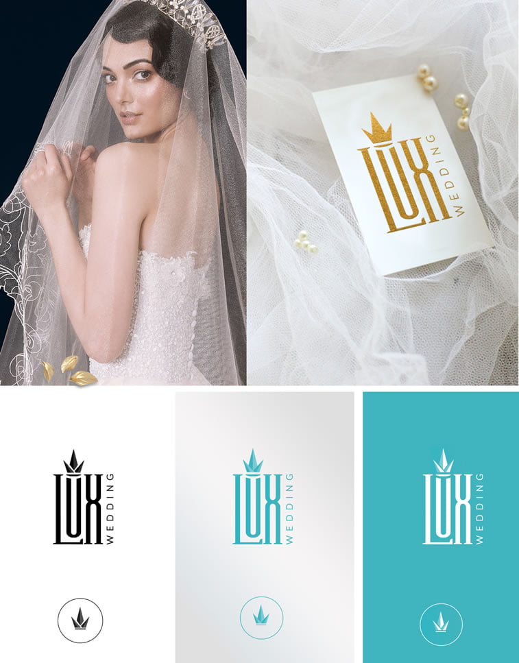
The end is nigh. When you are absolutely sure that the time has come to deliver your logo to the client, NEVER fall into the trap of sending your working files to them, especially not layered files. What may happen (we know from experience) that clients can take the files and go away into the night, never calling back or giving you the fee. To prevent this, always show them only presentations (you can use mockups – the Internet is loaded with these), and only after the design has been approved and you get your money – you can deliver the following files:
- Ai vector
- pdf file
- png files of all logo variations
Since the majority of clients will not be able to open an Ai file (but will be able to forward it to a printing or publishing house), you can send them a pdf version and png files with all logo variations.

Wrapping the logo story up
In the end, you should know that things will not work as smooth as we wrote here in this article. Sometimes you will get inspiration from riding on a bus and running home to create your logo. But there will also be days when you will not be able to create anything. And this is perfectly fine, too. When you see that things simply do not work after five hours of exhaustive work, the best thing you can do is to sleep on it. After you have some rest, you can give another try as fresh as a daisy.
Mind you that this article has been written from the perspective of two designers who have a pretty similar workflow. But yours may and surely will be different. And that is perfectly fine because there is no room for uniformity in such a creative industry as graphic design is.


