Everyone wants a website which stands out. And this is a perfectly normal thing to expect. One should get a unique design for the money they invest into web design. However, from the position of a web designer – things are not that straightforward.
In fact, when you are a full-time designer, you usually get clients wanting basically one and the same thing all over again, on a day to day basis. Sooner or later, you end up offering pretty much the same designs.
So, where to find inspiration or at least a shift in perspective?
If you think about it, you client wants their website to dominate among their competitors’ websites, and if this is the sole purpose of the website – so be it. However, what you can do is to take some of these four pieces of advice to help the client get a one-of-a-kind website.
4 Tips for Making Outstanding Websites
1. Good organization
The first thing visitors will notice on your website is whether they can find the thing they are looking for or not. If your website lacks this one thing, it is a lost cause. To avoid wasting time (read: money), you website needs to be structured well.
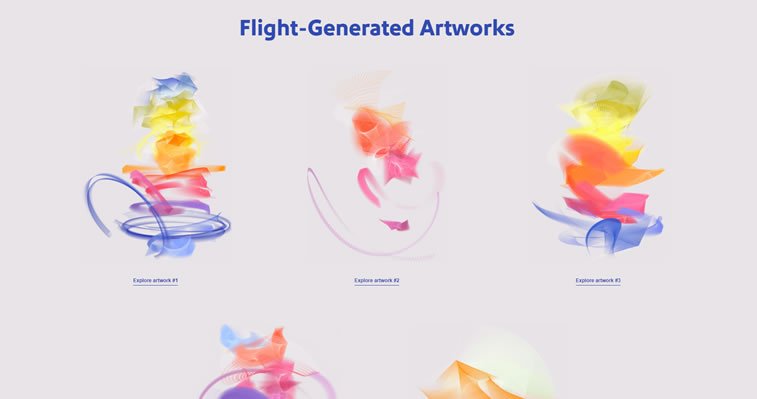
Getting a bunch of images, chunks of text and data all in one place is as good as nothing, unless you organize content well and lead your visitor through the process in a meaningful way. The layout of the website needs to be logical and every section should have to be ordered and easy to understand. JavaScript frameworks can help you with this if you are into coding or have the slightest idea of how things can be implemented in your design.
2. Solid copy/content
The website layout is just a skeleton – bare bone – without content. It needs meat and organs to make the body function. If you want your body, that is – the website – to be a functional being, it needs a nice copy, that it textual and graphic content on it.
Wait for your client to provide you with website copy and never use lorem ipsum text to fill in the gaps. What often happens (to rookies) is that dummy text stays on the website even after the launch, and this can leave a huge (negative impact) on your website visitors, making you look like a reckless person or even a fraud.
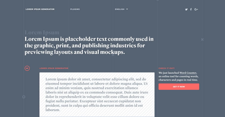
To avoid this, ask your client to give you the copy and then – if you work with a copywriter – make the content look as if it was written by a human being. Marketing agencies often forget the sole purpose of the text: to help the visitor get the message, so they pump the text with unnecessary things and miss the point. Avoid this and make the text pop.
3. Animation
Web design trends today dictate the use of animation. Sure, following trends blindly can backfire easily if you do not know how to use it at your advantage. So be careful about this one. If you do not have an original idea, you better cancel it.
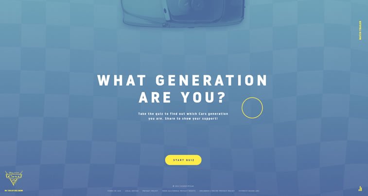
Animated buttons and flying saucers will not be of particular use if they do not fit in with the rest of the design. Make animation count and, if you are not an expert in this field, it is better to leave it to the people who can do it properly.
4. Color and type
Another design trend this year is the use of bold color schemes and authentic typography. This one is pretty straightforward and if you are a beginner in web design, you should first study typography and color in web design before you start the feat.
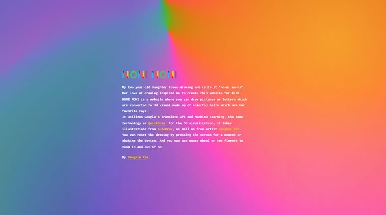
It is always good when the colors on your website match brand colors, as well as font choice the fonts of your logo and overall branding style guide. Talk to the graphic designers who were in charge of the project and make sure that your type does not run over the overall brand style.
Back to you: what do you think, are these things workable? Do you use some of these techniques to draw attention to your website? And did we, perhaps, forget to add something to the list? If so, do not hesitate to remind us in the comments section below.


