Design thinking is a set of principles for a hands-on approach to problem-solving using a human-centered design within a design-centric culture anywhere where the emotional, cognitive, and aesthetic needs of users tend to be fulfilled.
A lot of buzzwords here, right?
So, let us enlarge this definition bit by bit and see what design thinking actually is. And more importantly, how can it help you during the process of user experience research and user interface design.
In this article, we will focus on using design thinking principles for UI/UX design services, and see how these can aid designers in making much more meaningful, functional, and usable web design solutions.
Since the most effective way during the design thinking process is mapping, you should make yourself a space for it, sharpen your pens, and get those post-its ready. You are going to need them.
We will now walk you through the process, step by step.
Let’s start.
What is Design Thinking?
Design thinking may be misunderstood as a “one rule fits all” strategy, but it is not, and sometimes it will not work. As Bill Burnett, an assistant professor and master in design thinking at Stanford University, likes to say:
“Design thinking is a method, not magic.”
So, it is a method, a process, a skill-set, a mindset. And yes, it really is a set of principles, too.
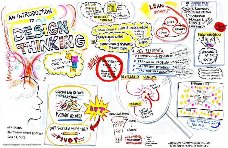
The core design thinking principles are:
- Empathizing with users – you should start researching and walking in user’s shoes as soon as you start a new project.
- Defining the problem – includes mapping difficulties, interpreting, planning, and strategizing.
- Ideating solutions – brainstorming, imagining, pondering and reflecting on possible outcomes.
- Prototyping – means sketching, visualizing, applying, and creating wireframes and beta versions.
- Testing – includes reviewing, getting feedback, fixing, clearing out, and revising.
Please note, there is no straight line here, and these are not simply five consecutive steps – it is a cycling overlap of procedures.
Bear in mind also that design thinking is not a process to be done in solitude. It requires collaboration between people with different specialties who will contribute with original, fresh ideas, and then narrow the ideas down to possible solutions.
So, if you are preparing to create a website, gather your team of fellow designers, researchers, developers, SEO experts, copywriters, and others to get as many different perspectives, ideas, and solutions as you can.
Because, you know what they say – meeting the client’s expectations is excellent, but exceeding them is what will keep the designer in the business.
Design Thinking Principles: Process
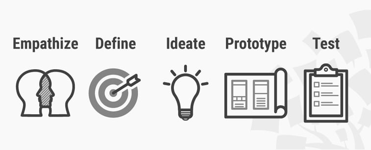
Interaction Design Foundation defines design thinking as a “non-linear, iterative process which seeks to understand users, challenge assumptions, redefine problems and create innovative solutions to prototype and test”. As we could see in their collection of topical content on design thinking, this method consists of 5 phases – Empathize, Define, Ideate, Prototype, and Test.
So, let us dive deeper within every one of these phases.
1. Empathize
As a designer working for a client, first you need to understand your client’s needs. And then, when you start designing, you should teleport yourself into the mind of the user.
Who are the future users of a digital product you are creating, what makes the target audience distinctive, what are their habits, what is their online behavior like, where are the pain-points, what are the users’ needs that have to be fulfilled? Answering these questions may help you make a good start.
And, how can design thinking help you as you proceed?
In the first phase of web design project, the focus should be on empathizing with users’ needs. So, using the so-called empathy map should ease the process.
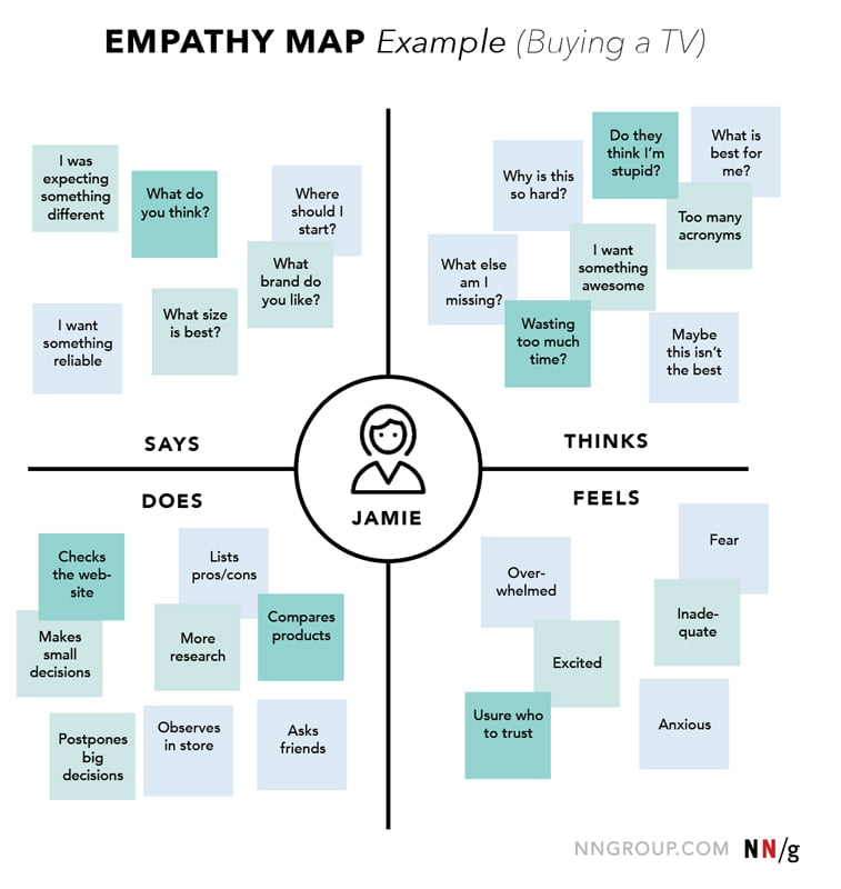
Empathizing with users means focusing on their experiences, especially emotional ones. For that matter, a helpful tool may be the so-called ’empathy map.’
Empathy mapping is a way to define a rough user persona and characterize your target users in order to make effective design decisions. You should pay attention to users’ need, goals, expectations, behavior, habits, and so on.
UX specialists from the Nielsen Norman Group (NN/g) have created helpful templates and examples of various maps that could be used during the design thinking process.
At NN/g, they define empathy map as a tool used for articulating what we know about a particular type of user, and they split it into four quadrants – Says, Thinks, Feels, and Does.
This way, a designer has an insight into the user’s perspective regarding the tasks related to the product. For every type of users, a new empathy map should be used.
2. Define
In the next phase, you should start thinking about the steps that users need to make in order to successfully use a website, a progressive web application, an online shop, or other forms of web presentations you are creating. That could include mapping your users’ journey and defining all the problems they may stumble upon along the way of interacting with your site.
In this case, user journey maps may come handy.
User journey mapping is a way of decomposing user experience with a product or service as a series of small steps.
The journey map will defer depending on the time perspective you take.
- A retrospective map should be used to track the current moves of the users, the way they usually behave on the Internet, based on the research.
- A prospective map should be used to outline how you expect users to behave with a completely new product.
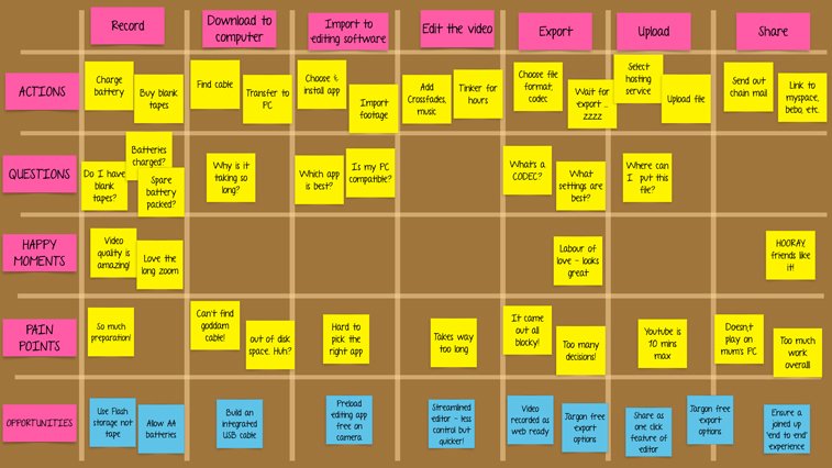
In his article on Medium, user research specialist Harry Brignull describes user journey map as defining steps through time on the horizontal axis, and themes for analysis on the vertical axis, which usually stays the same, while the horizontal axis changes.
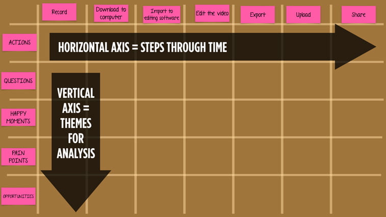
As Brignull explains, points on the vertical axes are where a designer should start from.
- Actions are things the user needs to do to move to the next step.
- Questions are those that the user needs to answer before moving to the next step.
- Happy moments are positive, enjoyable things that improve the experience.
- Pain points are all the frustrations and annoyances that spoil the experience.
- Opportunities are design enhancements that you could implement in a new product to address any of the problems identified.
For each project and every product within, the user journey map will be different.
3. Ideate
As we already mentioned, design thinking process used for web design is not a one-man show. It requires a multidisciplinary approach in order to find best possible solutions for website usability.
When you go through the first two stages of the process, the next step is coming up with as much relevant, fresh, and innovative ideas. This is the most exciting phase, as it provides the possibility to imagine the unimaginable and make it a real thing.
There are only several simple rules to follow here – set a time limit, stay with the topic, be visual, and build on each other’s ideas.
So, get ready to brainstorm.
Ideation process can help you with:
- Asking the right questions;
- Thinking unconventionally and beyond obvious;
- Discovering unexpected possibilities of your product;
- Coming up with innovative solutions.
Remember, there is no such thing as a bad or unwanted idea. Everything that comes to your mind is worth consideration.
4. Prototype
Design thinking focuses on human-centered design. It means providing solutions for humans, with an accent on fulfilling a particular human need. And, in order to fulfill the need, you must know what the pain points are so as to find suitable solutions.
When creating a UI or UX design, trying out different solutions and designing an interface that will bring enjoyable user experience is all you should focus on.
Designing a solution that fulfills a particular user’s need requires the problem to be fully understood. If a problem is not properly defined, you could end up with a limited knowledge of its scope, and you might create an inadequate solution.
The best way to visualize solutions and define possible mistakes is to start from drawing a website sketch only to proceed on creating a digital wireframe.
Design thinking process will help you in thinking beyond the initially apparent state, and start using various strategies that you have not considered before. When you define the problem, you should try multiple alternative solutions and simulations before settling on the final solution.
Creating a working model helps in dealing with complex design issues. That is why optimizing beta version of a website and making it available to the public can always be a good decision. The most valuable feedback will come from real users.
For this phase of design thinking process, you could also benefit from the so-called Agile methodology, which includes a group of software development methods for collaboratively building better business solutions.
The core Agile concepts include:
- Iterative development
- Risk management
- Transparency
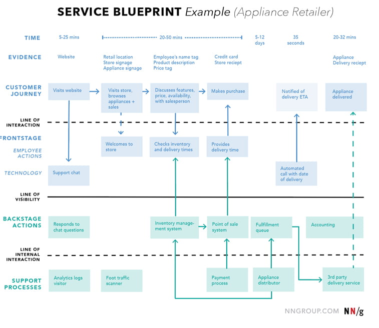
User experience specialists from Nielsen Norman Group would propose another useful map for the phase of prototyping, and it is called – service blueprint.
A service blueprint, as they define it, visualizes the relationships between different service components – people, propositions, and processes – that are directly tied to points in a specific user journey.
This kind of a map is split into four lanes – User/customer actions, Front stage actions, Back stage actions, and Support processes.
It is chronological and hierarchical, and it should be used to discover weaknesses, opportunities for optimization, and to bridge cross-department efforts in the understanding of how the service is provided.
5. Test
When you make a prototype of your website, the next stage is – testing its functions, usability, and utility for end-users.
If you are fortunate (and skillful) enough, you might create a flawless design out of the first try. More likely, though, there will be some errors to fix. And that is completely fine, as one of the core principles of design thinking process might also be – to tolerate failure.
Mistakes during a UI/UX design are inevitable, but the most important thing is to identify them while there is still time to fix them. That is why testing the prototype is an essential part of every web design process.
There are many web development online testing tools that can be very helpful during the phase of evaluation of your work and the functionality of your solutions. Some of them are free to use, and include Webflow, Vectr, InVision, and Marvel, only to name a few.
In the end, use design thinking as a tool as well, and keep in mind the wise words of Dave Cronin, executive design director for industrial Internet applications at General Electrics, as he says:
“Design thinking is an essential tool for simplifying and humanizing.”
Conclusion
Design thinking process might seem a bit confusing until you dive into the matter of empathizing with users, defining problems, ideating for solutions, prototyping, and testing. And then, all of a sudden, if you are a web designer who specializes in UX or UI design, you realize that perfectly clear that design thinking principles refer to pretty much the same stages of a process as web design does.
That is why these two processes are complementing each other, and that is the reason why mapping methods can truly contribute and be helpful throughout your every-day work as a designer.
And to conclude, instead of a classic conclusion, here is our advice to you – use design thinking to truly think about your design.
Keep your team members close, work together on ideas, brainstorm, evaluate every decision, prototype, prototype, prototype, test it on real users, and revise your web design solutions until they are simplified and humanized.
