User experience (UX) is one of the most important elements of web design, and many seem to fail at this crucial point. If you are new to design and would like to familiarize yourself with UX principles – the what, the who, the how, and the why – here we will present you the main concepts to help you streamline a UX workflow and develop a mindset that will lead you to better design thinking.
If you know the feeling of having the ability to help people in need of web/app design but not knowing for sure where to start, you are in the right place. We will try to elaborate on how to develop a solution that converts and is usable, without looking too flashy. First of all, you need to learn to ask the right questions, in the right order and have this article bookmarked.
Mind you this is a two-part series which we will follow up in a few days. You can expect an update here.
Let us start.
In the beginning… There was web design.
Something over a decade ago the web was, well, simple. You had a webmaster – a person who designed, developed, optimized, maintained and grew a website from its initial stages. A single person could relatively do the whole work on the website. Some dinosaurs like this one are still alive and kickin’ today – God knows how, but they are an excellent example of that old school of design. In the early days, website design and functionalities were limited – the technology stacks needed to animate an element or upload high-res images were astronomically expensive and we all had to deal with that sweet, sweet sound of a 56k modem. The flashy design just was not working for anyone.
New technology stacks and web standardization have moved the limits of web design and enabled more functionalities which are cost-effective and lightweight. Hell, just visit ThemeForest and take a look at any of the web templates there. Mind-blowing.
Nowadays, anyone with a dash of creativity, knowledge of grid systems and a well-organized tool stack (PS, AI for starters), can become a web designer. The technology allows it. There are no limitations to your creativity, just limits to your budget. And exactly because of the availability of knowledge, resources for learning and market demand that it constantly grows, the title gets abused.
Let us elaborate.
Whether you have decided to use a website template or to hire a designer to create a web solution/presentation for you, you cannot expect it to automatically resonate with your audience. You cannot expect that the design itself will get your goals accomplished (subscribers gained, products sold, leads generated). It does not work that way.
A designer can present a visual design that is new, fresh and in sync with all the current trends and aspirations, but its usability cannot be determined from the head of one single person.
Most designers today present you a visual solution in a PSD format or a JPEG export of it. Dull, dead, with no background story of how elements should work, animate or complement one another. More experienced designers will – but then again, how often will they – explain the imagined user journey? Do they really know how it works or do they just focus on a 2D presentation based on the best practices and visual design trends that are currently hot?
However, there is more to UX design since it can change the way you look at the web: it depicts marketing, development, design, the whole package, really.

UX design is a collection of principles, techniques, and philosophies that differentiates a design of an end-solution from designing for the next step of a user’s journey. UX design includes not only the presentation of visual design but also research and understanding of the user/customer journey from the point where people first find out about your product/service/idea to the point when they convert and beyond.
The point of UX design is to answer the pain points of your users and design a journey that responds to their goals and needs. Whether we are talking about a one-pager, corporate website, web or mobile app, UX is vital to the success of getting your message across and both your and your users’ goals met.
So, what do User Experience designers do? What exactly differentiates them from web designers? Well, there is no specific description of a day’s work in a life of a UX designer as one relies on various techniques, resources, and toolsets for different project stages, but we can try to run through as thoroughly as possible without making your head spin.
#1 Analysis and research
Before you even draw a single pixel, you need to research your target audience. What is the product/service you are designing around? How much is the market saturated by a similar product/service and who are your main competitors, if any? When working with bigger clients, you can expect their marketing team to provide this data for you. However, a single best trait of a great UX designer is to doubt and test EVERYTHING. So, prepare to do some research. Research should be split into two phases:
- Primary research
- Secondary research
Primary research can be done in several ways and should start with some initial assumptions about the target users and your understanding of the product/service you are designing around.
To name a few methods:
- Direct approach
Grab $20 of the ATM and visit a coffee shop. Buy a cup of coffee to a complete stranger and ask them a few questions. You already know your product/service’s end-use, so you can now ask around for the pain points of random people your product can solve. Ask about their daily routines and how they interact with the web – what devices they use and how often, what websites they visit and have they seen a similar product before.
This type of research is exploratory and can be done in group sessions as well.
- Online surveys
Harness the power of online reach and draw up a questionnaire and distribute it to potential users. This method can be costly but surely less time-consuming and can bring you a more precise input.
Secondary research is done by gathering data patterns from third-party sources like Google Analytics demography reports and behavior flows. Public and educational resources like case studies, reports, and whitepapers could also do the trick. You can also go for commercial ones, such as buying a report from companies that conduct global market research. However, it is always better to go with your own data.
Based on your initial assumptions, once you complete this, you will know how both market and people react to the product/service you are designing around.
Defining your target personas
When you lay out all the data gathered, you will most certainly visualize a pattern in answers, results, and demography of users. Use this data to define two to three, but no more than four target personas. Give each one a name, sex, age, assign them needs/goals and behavior traits, such as what they would say and what they would actually do.
Why is this important? Imagine having a web store that sells sports supplements and you need to figure out which one is easier for you to work with, as a designer:
- Your target group covers people from 25-34 years who go to the gym.
- Our target is Michael, 25-34 years old, uses an iPhone, and who goes to training sessions every day and considers himself a professional athlete, often hangs around Facebook and communicates using memes, but mostly over WhatsApp because he is concerned about his personal information.
You get the point, right?
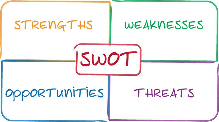
The SWOT analysis
This type of analysis is something that marketers do. And nobody expects from you as a designer to run one, but it may help you formulate much-needed answers.
SWOT analysis will basically give you both internal and external insight into your client’s company/organization and help you discover new opportunities to emphasize and capitalize on. It can help you A LOT when designing content around the layout presented. Here is a set of questions you need to answer:
Strengths:
- What are your client’s company advantages?
- What do you better than your competitors?
- What do other people see as your strengths?
- What are your success indicators (sales made, leads generated, etc.)?
Weaknesses:
- What can be improved?
- What should be avoided?
- What do other people see as your weaknesses?
- What are your failure indicators (carts abandoned, leads lost, etc.)?
Opportunities:
- What opportunities can you spot?
- What trends are you aware of that may be important?
Threats:
- What obstacles do you face?
- What are your competitors doing?

Again, SWOT analysis is important and the data gathered will help you a lot but do not try to overthink or over-analyze it. For you as a designer, this type of analysis is there just to help you pinpoint a different/fresh approach to design that will separate your client from the competitors. And for those of you who want to dig deeper, here is an in-depth guide on how to use the SWOT framework.
#2 Creating scenarios and storyboards
A scenario or a storyboard is a narrative that basically describes a day in the life of your target persona and how your clients’ product/website/app fits into their daily life. However, keep in mind that when writing scenarios or otherwise user stories, you are not focusing on edge cases but rather on regular usage.
This is a method “stolen” from the movie industry and you will use it often to visually predict and explore your user’s experience with a product. Think of it as watching a movie of how users start interacting with it. It can immensely help you understand how users flow through interactions over time and based on it create a strong narrative. They are a super-effective and cost-efficient way to capture, relate to and explore different experiences throughout the design process. They are hugely beneficial as they:
1. Put a human face on analytical data
2. Are a team-based activity and anyone can contribute
3. Rely on iterative approach and enable you to experiment with little to no additional costs.
And please, do not worry about your ability/inability to draw, it does not matter. The main skills of a great designer do not lie in Photoshop or Illustrator but demand the ability to compose and showcase a scenario.
Here is what you should focus on when composing a story structure:
- Describe a character
Remember Mike the Athlete? A specific target persona needs to be involved in your story with all his merits and flaws, behavior and decisions he makes along the way. Get into his mind. Do a few pushups if you have to.
- Describe a scene
What surrounding/environment is he placed into? Use real-world context that involves people and places he’s in.
- Describe a plot
Most designers will jump directly to this part without describing the backstory of the previous two points. Do not be that guy. Be Mike. The narrative of your story has to focus on the goal of a character.
Stories usually follow a narrative structure which resembles a pyramid and yes, there is a term for it. It is called a Freytag’s pyramid and you can learn more about it in this guide on QuickBase.
Just remember the things that make a powerful story – authenticity, simplicity, and emotion.
Alright, this is where we stop for now, but in the next article we will talk about the two remaining phases of UX design: the how and the why – that is, we are going to depict wireframes, prototypes, as well as usability and user testing, so stay tuned!


