This is Part 2 of our beginners’ UX Design tutorial. In this article, we will address the how and the why of user experience design by starting off from wireframing as a process and give you more detail about usability and user testing.
To revise, last week, we talked about the following things:
#1 Analysis and research. At this stage, you need to conduct two types of research: primary (direct), and secondary (online survey). Ask around who your target group is, ask them a few questions, let them show their habits and behaviors, and conduct a SWOT analysis to see what the strengths, weaknesses, opportunities and potential threats to your design may be.
#2 Creating scenarios and storyboards. At this stage, you need to use the data you obtained in the research phase and create a strong narrative for your target persona.
Moving on to the third phase…
#3 Wireframing, mockups and prototyping (finally!)
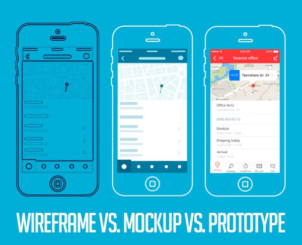
A wireframe should be a rough guide for a website/app layout – not a design prototype. And there is a huge difference between a wireframe and a mockup. As a designer you don’t need to make it look flashy, you need to keep it as simple as it gets as it rarely works out the first time. Use elementary elements such as simple shapes, arrows, and text to sketch out a layout and point out the steps/branching in the user journey.
Simply put, wireframing is a technique you will be using to collect all of the above and fuel it into a sketch. It’s a simplified outline of a visual layout that resonates with each step of a user’s journey. The wireframe is but a skeleton of a layout and nothing more.
Mockups are the skin of a layout. And they are strictly visual. With mockups, you can solidify all your visual ideas and decisions based on the data collected in steps #1 and #2. With mockups, you can experiment with color and style variations and if you’re up for it, create pixel-perfect drafts.
Prototypes are where you breathe fire into your design. With them, you can design interactions, animate visuals to make your website stand out, and test your interface ideas. Every stage of the design process should have them – gradually as you get more experienced in UX design, you can leave it for the end stage.

But remember, wireframes are just means to a prototype. There are simply no words to emphasize this hard enough. By understanding the difference between these three you won’t be making the same mistake roughly 90% of web designers make – instead of sketching out layouts they jump directly to high-fidelity mockups as their first drafts and never make it to a prototype but simply write a .txt file of what and how should be animated. Which is dull, boring and 2D.
The perfect world flow should go something like this:
Wireframe > Low-Fidelity Prototype > High-Fidelity Mockup > Off to coding and deployment
However, in a real world, the workflow looks like this:
Sketch > Wireframe > Low-Fidelity Prototype > High-Fidelity Mockup > High-Fidelity Prototype > Off to coding and deployment
And no matter which flows you decide on – remember that wireframes are ALWAYS LO-FI!
#4 Usability and user testing
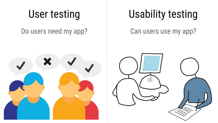
User testing – basically involves getting a “lab rat” that will sit in front of your final prototype or finished design, asking them to perform a certain task while they’re thinking out loud. User testing is completely straightforward and anyone can and should run one.
As a designer, you already know how the prototype works. You know the interactions. Hell, you designed them. And therefore, you are not the one who makes the final call whether it works or not. It’s your potential user – Mike the Athlete.
There are three main methods types of usability testing:
- Explorative methods
Used in the early stages of design process. As a designer, you should present product layout wireframes, watch and carefully collect reactions. The aim here is to discover just how and how much users comprehend the product and visualize their mental processes while using it.
- Assessment methods
Used in later stages when you have an interactive prototype. Here you can evaluate the effectiveness of the design as well as grade user satisfaction with the final product. A prototype helps track reactions and errors made by the users. This is extremely valuable data as it will help you eliminate flaws made in the design process.
- Comparative methods
Used when needed to decide on a version that works best amidst several solutions presented.
Users are presented with several versions of a design element and share their opinions. When this is out on the table, you make a list of pros and cons and choose the most user-friendly solution.

There are various methods and tools you can use for user testing so we will only name a few of them and leave you to explore further.
- Coffee tests
Again, grab $20 from an ATM, visit a coffee shop and have a one-on-one test with a random person. This is cost-effective and, as a bonus, you might make some new friends.
- Remote user testing
It’s in the name. Just Google it. The concept is to make up a test, set it up in a web environment and distribute it to as many people as you can. You’ll get greater volume in terms of feedback and make your decision based on the analytics.
- Expert reviews
Asking an expert to review your product will return a wide feedback without wasting too much time. Especially if you find niche experts with experience in usability testing.
- Split testing and multivariate testing
This type of testing is done on a live version of a website or app. You basically set up different versions of a design in a live environment with user parameters of choice and track analytical data with Google Analytics or similar software. Split tests are used for testing different versions of the page/app screen while multivariate tests are for testing with different elements on a single page. You can read more about this method in an article on OptinMonster.
To doubt and test everything is a single greatest trait of a great UX designer. And you should always have this in the back of your head. There’s a saying, “better twice measured than once wrong”.
Conclusion
User Experience should be the core driver of a good web design. And this article is not only meant for you web designers in the making out there but to you as future clients who are in need of a new web design solution or improvement of an existing one.
Your goals should be always user-centric and the design delivered should reflect the same. Remember that a good design is not only about answering the right questions but in doing so in the right order. And if this is beyond your scope, you’re not to blame. You can always turn to an expert or a professional web design agency to help you out in the process.


