No one wants their website to be perceived as disruptive, annoying, or unpleasant. Instead of that, everyone desires it to be sleek and elegant, introducing smart navigation and smooth transitions. But, what if your clients insist on implementing all sorts of pop-ups all around the pages? Could there be a positive outcome from that?
If you look at it from a clients perspective, one question is rising up – what about all those privacy policies, e-mail subscriptions, push notifications, latest deals, season discounts, giveaways, free e-books, and every other important information they need to share with their visitors?
Those must appear somewhere and grab users’ attention straight away, right?
Right.
And the pop-up boxes really are the perfect solution. Bear in mind, though, that pop-ups should be handled with a special care.
If you happen to cooperate with pop-up loving clients, as a web designer or a web developer it is practically your obligation to tell them that too many boxes senselessly jumping out of nowhere might simply terrify users and make them run away in a split of a second. And clients would not want that to happen. But then again, the client is always right, right?
So, if they want pop-ups, the pop-ups are what they will get. Just remember – if you make them appear creative and charming, those boxes might as well serve the purpose – to get the attention of users and keep them stay on board, intrigued to explore more. Bingo!
But how to make pop-ups look appealing, not repelling?
All you need to do is follow simple website pop-up rules, and make sure you never break them.
But Wait, Statistics First
After reviewing 1,754,957,675 pop-ups in their study, Sumo had found a few relevant statistics about the pop-up performance and conversion rates. According to their results:
- The top 10% highest-performing pop-ups averaged a 9.28% conversion rate
- Only 3 out of 100 websites ever have pop-ups with conversion rates over 11%
- The average conversion rate for all pop-ups is 3.09%
Besides that, they managed to pull out some key points about the pop-up performance that directly affected conversion rates, whether by increasing or decreasing them. Those key points show that:
- Pop-ups with more context have higher conversion rates
- The highest-converting pop-ups don’t appear immediately
- Being unclear with your headline and offer will sink your conversion rates
- Personality creates interest
- The best pop-ups offer something of value
- Pop-ups shouldn’t appear immediately after a visitor closes out
- Calls to action need to match the offer
- Exit pop-ups need an overwhelmingly valuable offer
Now, with all that said, let us jump to those rules we were talking about. Follow them through, and if you want the successful pop-ups, try not to disobey them.
Rules For the Good Pop-up Design
1. Make it original
Thousands of pop-ups on the Internet look exactly the same as thousands of others, would you agree? Most of them are created by using the same tool, or there was simply no interest in making an original design. But, if you are planning to create some pop-ups for your own or your client’s website, throw in a few fresh ideas and make sure they turn out to be quite unique and never-before-seen. If you manage to wow the users, you are going to score some conversions as well, that is for sure.

2. Wait for the perfect moment
No one says that you must put a pop-up on a homepage, although they usually apeat there. In fact, the advice is not to do that. It is going to be much more fruitful if you created a pop-up specifically for the internal page on special book editions, for example, or to award the visitors who stayed longer on your website, so after several minutes there might be the box with an additional 20% discount popping up just for them.
3. Think about mobile users
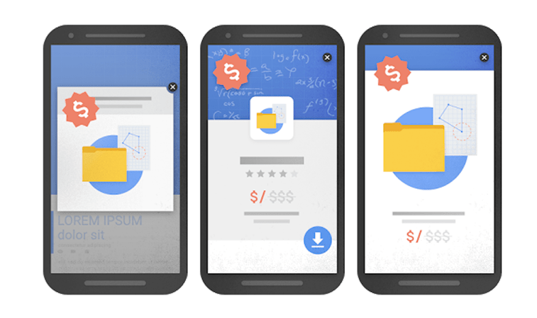
When it comes to mobile devices, several simple rules for mobile pop-ups should be followed – do not put a pop-up on the first website page, do not use oversized pop-ups that cover most of the page, and do not use intrusive interstitials, because all of those could easily make the users leave your website immediately and never look back.

4. Put the content within a context
There would be no sense in putting a pop-up about the shoe discount on a page with scientific research papers, right? Okay, that might be a bit of an extreme example, but you can see the point. If you, on the other hand, put a pop-up that elegantly slides from the down-right part of the screen offering an invaluable invitation to a scientific congress for the users who are currently scrolling through those research papers, it would be truly contextual. And it would, most certainly, catch an eye of each and every visitor on that page.
5. Add some real value
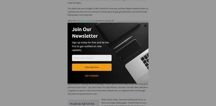
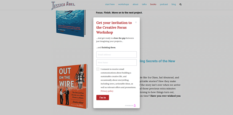
Every pop-up should bring some real value to users. If not, no one would care for them, and no one would ever want to leave their e-mail address or any other kind of personal information. So, if you want an efficient list-builder, for example, make sure there is something really, really valuable that you are offering in exchange. It can be a free e-book, discount coupon, conference invitation, free shipping code, e-course scholarship, efficiency-proven spreadsheet, or anything in between, depending on the target audience’s needs.

Conclusion
All in all, pop-ups do not have to be bad and irritating. Their purpose is to grab the viewer’s attention and bring some extra value to the website, and that is exactly what they are going to do if designed well and carefully thought through.
Whether you have a portfolio website, web presentation, or an e-shop, intelligent interactive web design solutions could help attract more visitors to the website and, of course, make more conversions. Pop-ups just happen to be really efficient in that.


