What would you do if you knew that 1 billion people cannot access your website? Even if they manage to visit it, they are not able to navigate through nor to understand it, so it appears to them as a completely useless web page. Would you be willing to change that?
When we say a billion people, we are not exaggerating. The World Bank statistics show that there really are 1 billion people with disabilities in the world, which makes 15% of the world’s population. Among them, there are 110-190 million people experiencing severe disabilities.
We all know that social inclusivity is an issue of empowering all the marginalized and discriminated people in society. It means giving a helping hand to everyone who is dealing with any kind of a physical or mental disability, by bringing up the awareness and making assistive technologies that may help them to be included into the community.
And what about web design inclusivity? Should the design area be different?
It should not.
So, let us dive deeper into this subject matter.
Why is Inclusive Design Important
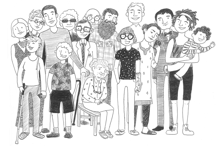
Inclusive design means designing websites, applications, browsers, tools, and every other digital product minding everyone who is permanently or temporarily disabled.
In other words, it means creating usable, functional and easy-to-use products that meet the needs of as many individuals as possible.
Instead of assuming a one-size-fits-all user experience, inclusive design aims to please a diverse range of individuals and accommodate a variety of experiences and ways of interacting with the world. While assistive devices aim to remove a barrier for people with disabilities, inclusive design strives to fundamentally redesign a product so that the barrier does not exist. – Eone magazine
Fortunately, designers and developers have started to pay much more attention to this lately.
And yes, inclusive design and accessibility have become somewhat buzzwords in the design community. But it is not something that has been just invented recently.
For example, take the image alternative attribute Alt text. It is the box in the back-end of your CMS that you fill in with what you see on the image in order to make it more readable for search engines, as one of the SEO techniques for the image optimization. Right? Well, not really.
It is used for SEO optimization, that is correct. But do you know the first and foremost purpose of the image Alt text? It is used to textually describe non-textual content on a web page and make it readable for screen readers. Therefore, visually impaired users can easily know what is shown in image. That is why Alt text should be more descriptive and not simply staffed with keywords.
So, adding Alt text to photos and other visual content is one of the core principles of web accessibility.
What is Web Accessibility
Accessibility is one of the main goals of the inclusive design.
Making a website, or an e-shop, or a web app accessible means that every web page is designed and coded in a way that makes it approachable, usable, understandable, and navigational to users with physical and mental disabilities of any kind.
As described by the Web Accessibility Initiative (WAI), many sites and tools are developed with accessibility barriers that make them difficult or impossible for some people to use. Making the web accessible is going to benefit individuals, businesses, and society.
Disabilities that affect access to the web include:
- auditory
- cognitive
- neurological
- physical
- speech
- visual
Besides that, web accessibility also benefits people with temporary or situational disabilities, such as:
- people using small screens on mobile phones, smart watches, and other devices
- people experiencing the change of abilities due to aging
- people with temporary disabilities such as a broken leg, lost glasses, exposure to loud music
- people with situational limitations such as too low or too bright light, or too noisy environment
- people using a slow Internet connection or limited bandwidth
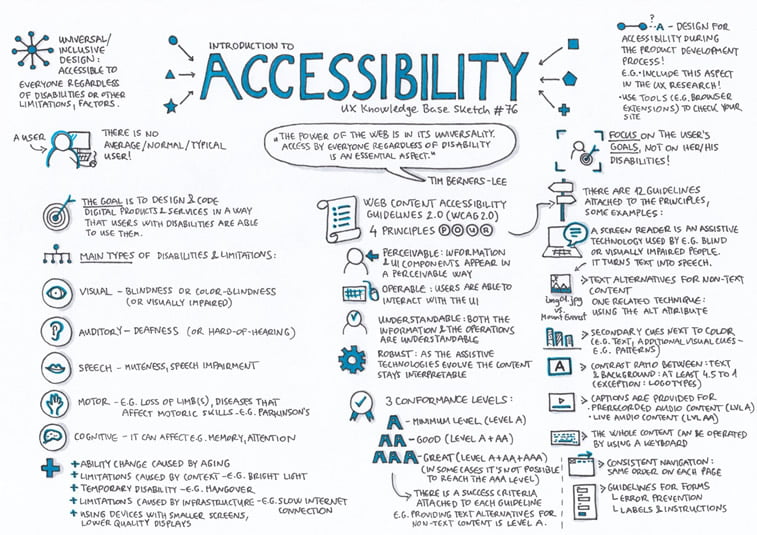
An overall review of accessibility principles is so powerfully represented in the sketch drawn by Krisztina Szerovay, UX designer and a founder of UX Knowledge Base Sketch.
How to Make Your Digital Products Accessible to Everyone
If you think that designing for accessibility is difficult and you simply do not want to bother with that, we remind you about those 1 billion people who might not be able to access your website if you don’t do it.
So, let us help you understand those guidelines and make the principles more digestible.
According to Web Content Accessibility Guidelines (WCAG) 2.0, there is a wide range of recommendations for making web content more accessible to people with disabilities, including low vision, hearing loss, learning disabilities, cognitive limitations, limited movement, speech disabilities, photosensitivity, and combinations of these.
There are three levels of conformance to WCAG guidelines:
- A – basic accessibility requirements satisfied
- AA – medium-scale accessibility requirements satisfied
- AAA – high-volume accessibility requirements satisfied
Usable Steps for the Basic Level of Accessibility
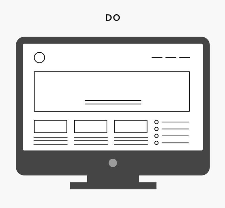
Keep your layout clear
No one likes a messy design or a chaotic layout full of unreasonable navigational signs or a non-logical groups of information. So, as Andrew Wilshere and Teresa Lamb explain in the article written for Design Lab, make sure to reflect the information hierarchy in a clear visual layout that makes the user naturally navigate through the content.
Create understandable links
Remember the time when the anchor text for links read “here”, “here”, and “here”? Well, those times are long gone for a reason. Nowadays, you should mind the screen readers and put the meaningful explanation of the link into the anchor text. Keep it concise and understandable.
Design large buttons
Call-to-action buttons are one of the most significant web design components, so please handle them with care. It means that you should make the buttons large enough to catch the eye of every user. It also means that you need to make them distinctive, easily approachable on small screens, and non-confusing.
Enable customizable text
You may think that a font size 12 is quite enough for the readers of your website. But, the readers might not agree. Some of the users may find it really hard to read such text and they might simply leave your website never to come back. So, please have in mind to always enable the possibility of a font size adjustment by users. It will make the reading experience much more enjoyable.
Test keyboard navigation
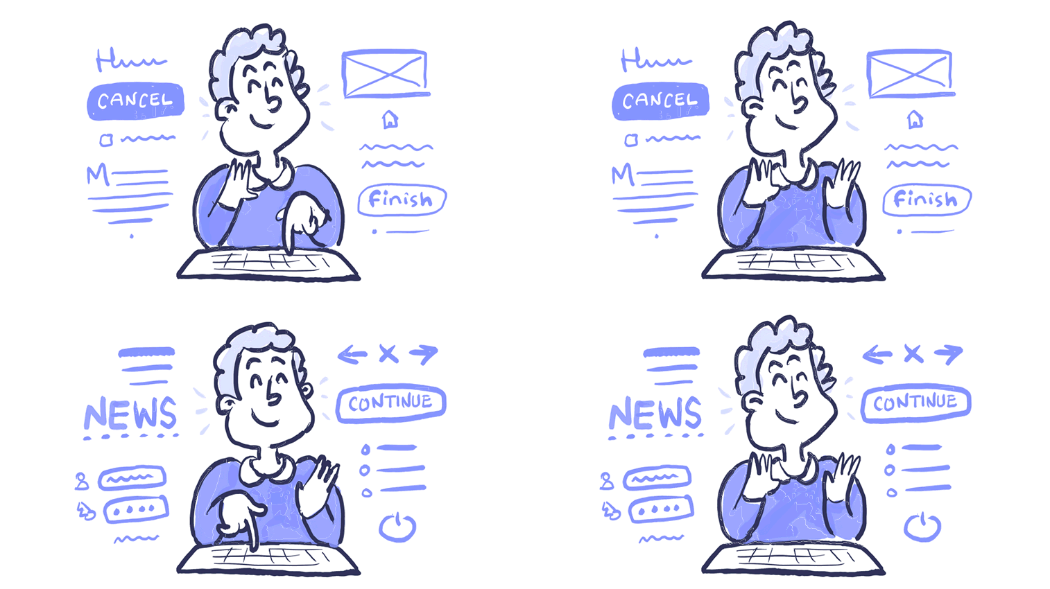
When you test your web design prototype, do not forget to test the keyboard navigation along the way. Go from left to right, try going up and down, test the Tab and Enter keys, and make sure that you can navigate through the whole website using only a keyboard. This kind of navigation is one of the most important aspects of web accessibility as it may impact many people with different disabilities.
Make a good color contrast
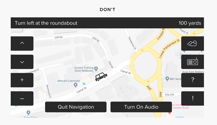
If you put light-gray letters on the white background, you will make the text hardly readable. The same will happen with dark letters on the even darker background. So, think before you act, and make sure to create a high value of contrast on your web page in order to make it accessible to more users. Also, mind everyone who deals with color-blindness and try not to put similar or unrecognizable colors side-by-side. Users will appreciate it.
Do not overcrowd the screen
When thinking about product features and designing a screen layout, please bear in mind that “less is more” and keep the design minimalistic. Meaning: keep the elements on the minimum, make them visible and do not overcrowd the screen. If you do that, it might seem overwhelming to the users and it might increase the bounce rate for your website, and no one would want that to happen.
Provide captions for video content
It is so common to watch a video that is not in your mother tongue with subtitles. If there weren’t subtitles, you won’t be able to understand a word, right? Well, that is exactly what people with a hearing loss experience. They cannot understand a word without captions. So, make sure to provide captions for every video that you play on your website. And don’t forget the golden rule – do not put a video on autoplay.
Make transcripts available for prerecorded audio
If you run a podcast on your website or you usually upload a lot of audio material, make sure to provide transcripts for every recording. You can make a full-size version or a shorter summary, but either way, do not neglect the importance of text aligned with the audio. It will benefit the auditory impaired persons, and make your content more accessible to everyone else as well.

Try walking in user’s shoes
If you are a designer or a developer who is regularly dealing with clients, there is a big chance that most of them would not even think about accessibility.
Let us take a producer of headphones for example. He might say that auditory impaired or deaf people are certainly not in his target audience, and he might wonder why should he make his website accessible to them.
Or, a book publisher might think that dyslexic people have nothing to do with his business and simply neglect them as potential customers.
And the biggest irony might be if a producer of assistive devices for blind people does not make his website accessible for visually impaired individuals.
If you ever find yourself in such a situation, what should you do? Should you intervene and explain the importance of inclusive design to your clients? We believe you should.
And how could you show them what you mean?
First of all, you should run the accessibility test and see the website pain-points. For that purpose, you can use some of the online testing tools recommended by Jennifer Aldrich on the UX Magazine. Her list includes AChecker, Contrast Analyzer, Skala Preview, and Wave Web Accessibility Evaluation Tool.
Then, you can simply put your clients’ business website to be read by a screen reader. That kind of a live demo will make them experience first-hand the ups and downs in web accessibility. And that might change their mind.
If you want to experience it yourself, you can try the beta version of the Funkify, the new extension for Chrome that helps you see the web and use interfaces through the eyes of users with different abilities and disabilities.
Conclusion
Here is a one-sentence wrap-up:
Inclusive design and web accessibility are so much more than buzzwords.
Designing for inclusivity and accessibility means that every digital solution that you create should provide a bespoke user experience to each and every user, no matter if they are permanently or temporarily disabled, or not disabled at all. Following these guidelines will also make your website more usable to users in general. It can boost your page visits, extend the time users stay with your website, make it easier for customers to purchase from your e-shop, and make your web pages much more SEO-friendly.
Everyone has the right to view, review, and interact with your online content. Do not take that right away.
Think about every aspect of web design solutions and make your users happy.
This article is only a scratch on the surface of the accessibility subject matter, but we do hope that we managed to explain its significance and provide you with the usable steps for improving your websites and digital products by making them accessible to everyone.
We invite to share your thoughts, recommendations, and concerns with us by leaving a comment in the section below or by commenting on our Facebook page.
