Web design has evolved quite a bit during previous years, don’t you think? It seems like we have entered a post-responsive era, followed by digital experiments, moving backgrounds, innovative interactions, unique typography, hero illustrations, and socially conscious design fueled by equality, inclusivity, and accessibility.
Not bad, huh?
Not to mention the enormous amount of energy that designers and developers around the world put into the UX research, immersive UI exploration, problem-solving strategy, user-centered approach, and altogether – making a good relationship between technology and aesthetics.
The results are visible in a form of fresh, exciting, and impactful websites. And 2019 has just begun.
We look forward to seeing more of these trends in the months before us.
Top 10 web design tendencies in 2019
1. Digital experiments
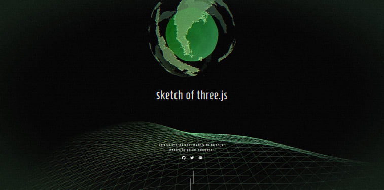
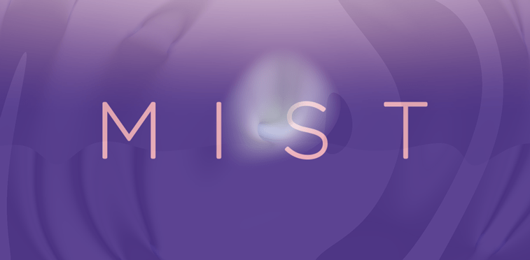
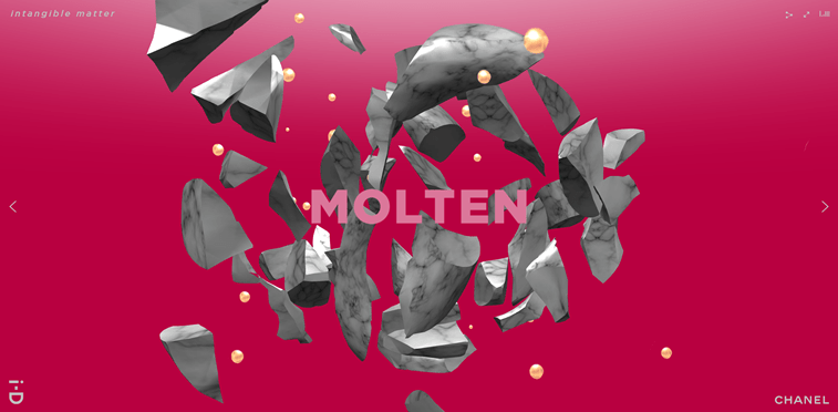
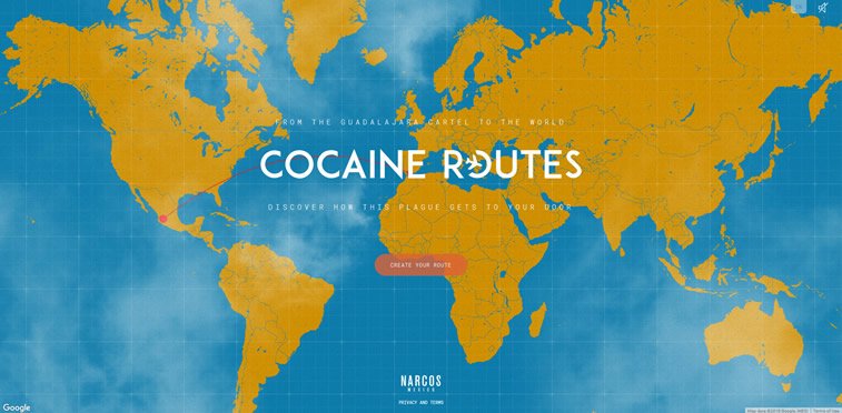
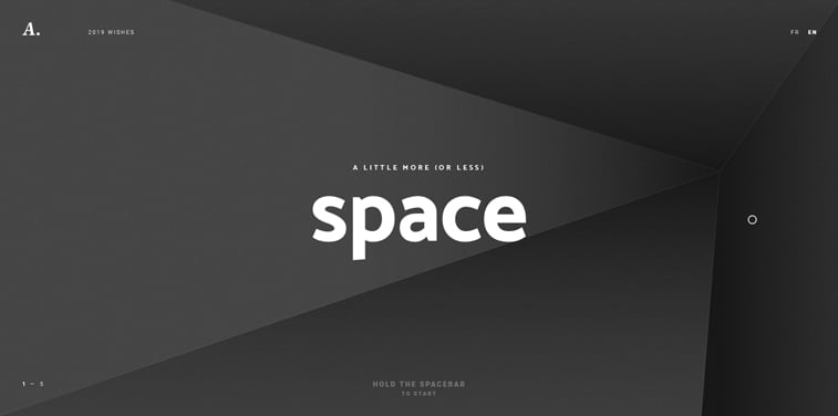
Have you ever thought about making a digital scent and matching it with sound? Or, using the digital space to wish a happy new year in a unique interactive way? Or, maybe, making a website as a support to the latest season of a popular TV series?
If you are curious to see what can you create, why not simply creating it by experimenting on the web? It is no longer a question whether you should try it or not, it has become a trend.
So, play with design, make something original, and exceed the expectations. Users will appreciate the creativeness, and fellow designers are probably going to praise your work across the web.
Make a bold statement with your web presence in 2019. And make it count.
2. Narrative illustrations
Hero images have been around for a while. Stunning high-quality photographs that fulfill the space above the fold can be seen on so many homepages.
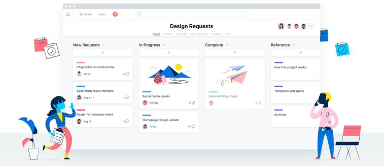
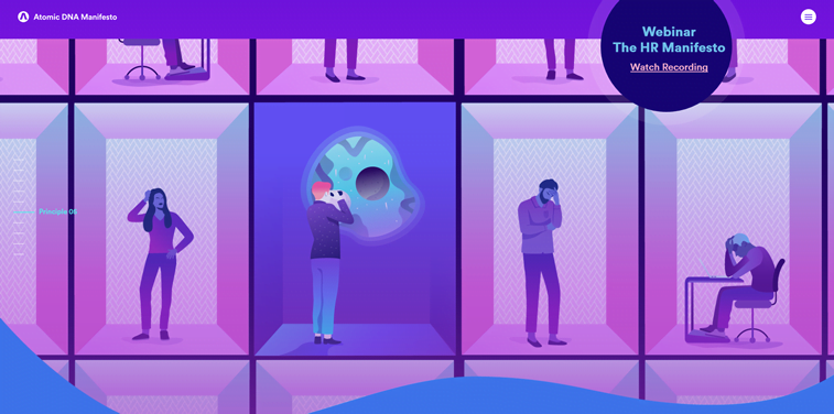
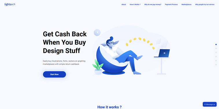
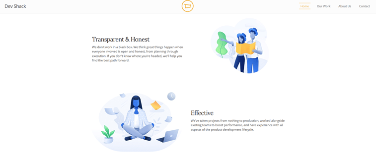
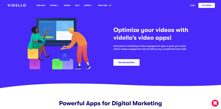
Nowadays, instead of photographs, we see a lot of illustrated imagery out there. And the latest trend: narrative, people-oriented, colorful 3D illustrations.
Free libraries of customizable illustrations like Humaaans, unDraw, and resources alike, have certainly contributed to the fact that the web is being populated with illustrated people of all shapes, sizes, colors, and abilities.
And a new micro-trend: blue people in illustrations. It caught our eye within The state of UX in 2019 report by UX Collective. Why blue people? Well, “to solve all diversity problems”, of course.
However, illustration holds a huge potential for brands and products. Slack has recognized it, Asana too, as well as many other bigger and smaller companies around the world. And if you are curious about the behind-the-scenes look at researching, concept-making, and creating the illustration custom library for Slack, illustrator Alice Lee have showcased the whole process in her article.
3. Innovative interactions
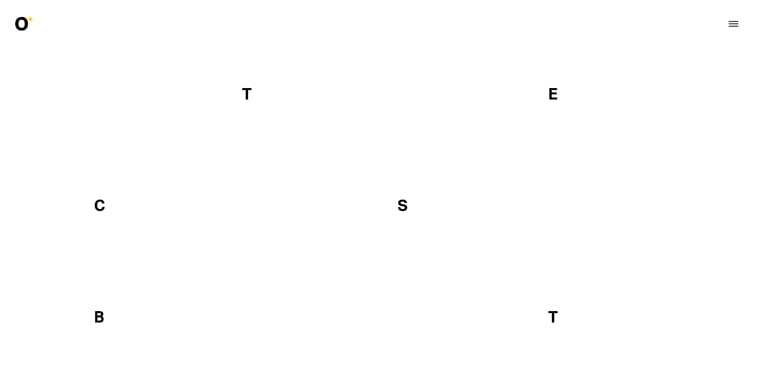
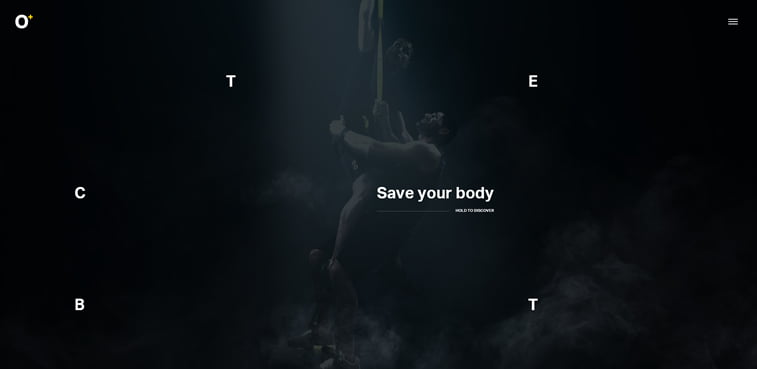
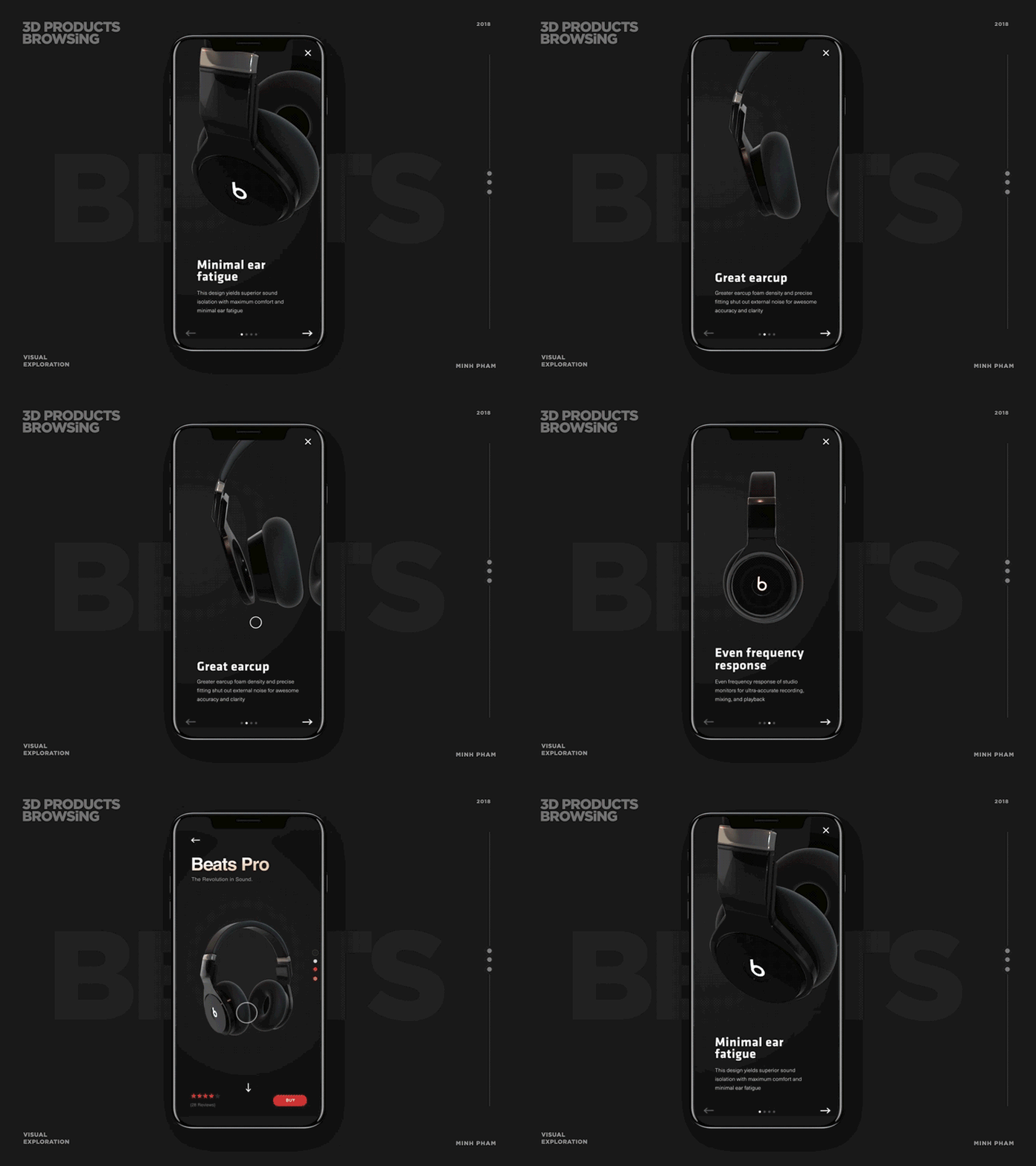
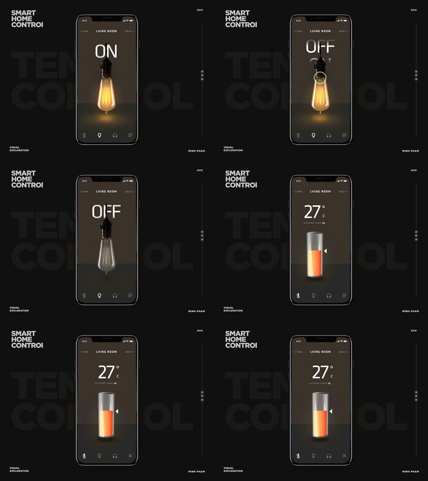
Responsive websites with navigation menus jumping from the top to bottom in mobile versions (to make it easier for users to tap with a thumb), or multimodal interfaces, various possibilities of voice-enabled UIs, and 3D product browsing are only some of the innovative creative interactions that appear on the web lately.
Microinteractions are also becoming more and more important for refining user experience. So, we get to see a lot of tweaks in notification signals, lights, tones, colors, and pop-ups being designed in an innovative way. Also, a lot of dedication goes to writing microcopy that will make user interactions smooth and successful.
4. Unique web typography
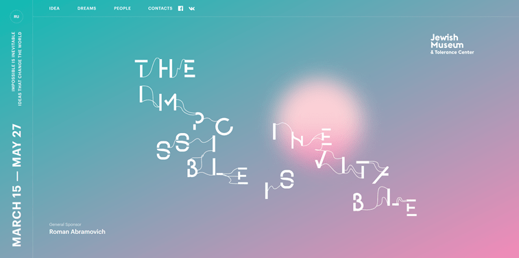
Many companies use custom-made typography for branding, new logo design, or making a corporate identity makeover. Unique visual language is becoming a big trend in web design as well.
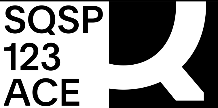
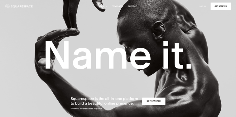
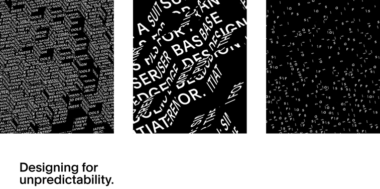
For example, typographers recently created Clarkson, a completely new brand typeface for Squarespace for their website redesign. As they describe it, it communicates the New York heritage and it is intentionally idiosyncratic, balancing the clarity and sophistication of a neo-grotesque sans serif with thoughtfully cutting edge of the letterforms.
Nothing can make your brand stand out on the web better than bold typography. That is a proven fact.
5. Intrinsic web design
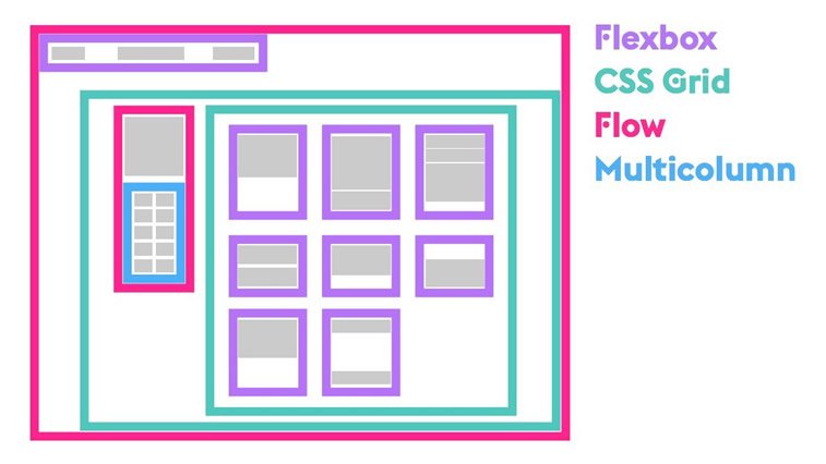
“Everything about web design just changed”. That was the title of the talk that Jen Simmons gave at An Event Apart convention in Seattle in 2018. During that talk, she coined the term Intrinsic Web Design.
“Intrinsic Web Design is a name that I gave to this new era, because I think we’re really in a new era of layout design, and for anybody who’s been doing this for a while, you’ll remember these other eras that we had. We used HTML tables for a long time, we used Flash for a long time, we had this debate between the fluid web design and fixed-width web design. Then, we didn’t have to start over and define everything, and responsive was that kind of word. Each of those eras had names. I feel like we need a new word for a new era.”
– Jen Simmons, Designer Advocate at Mozilla
So, after simple HTML, flash layouts, fluid layouts, fixed-width layouts, and responsive design, what is next? Intrinsic design.
What does that mean?
The word intrinsic means something that belongs naturally, something essential, natural, constitutional, built-in, deep-rooted.
In the web design arena? It means a debate between fluid and fixed, or table-based design. It is a way to describe ‘responsive design +’.
Some of the main differences, as Jen Simmons describes them, include:
- Responsive web design has flexible images. Intrinsic web design has flexible images or fixed images. Whichever you want.
- Responsive design has fluid columns. Intrinsic design has fluid columns and rows.
- Responsive design uses media queries. Intrinsic design doesn’t necessarily need them.
The bottom line: you can mix fixed and fluid. You can make a layout fluid until it hits a minimum size, at which point it stays fixed. We will definitely see more of intrinsic designs in 2019 and the following years.
6. A splash of vibrant colors
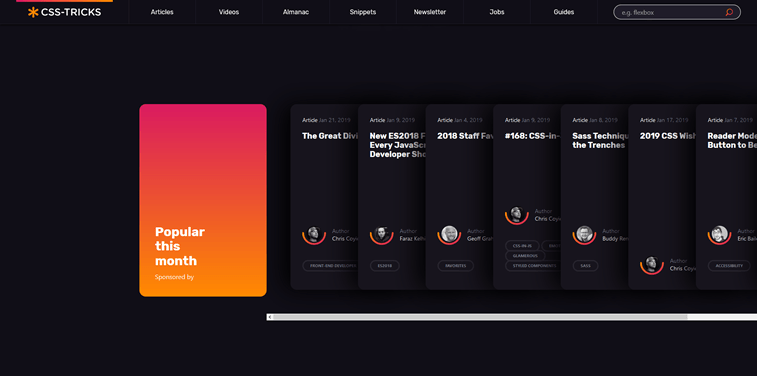
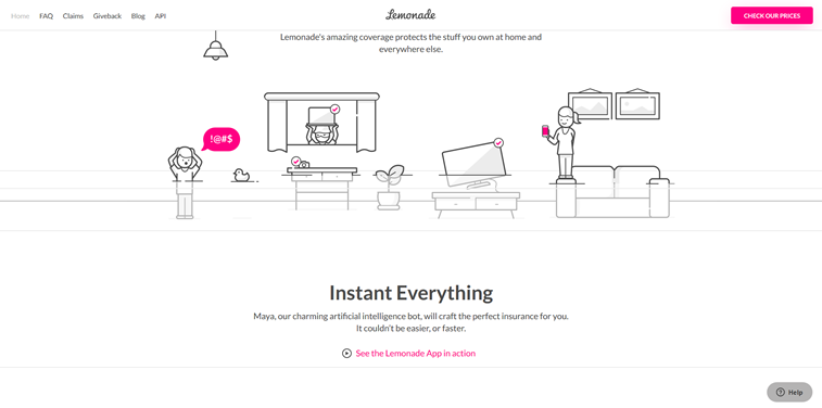
Bright hues and saturated color gradients can easily grab user’s attention. They boost the visual appeal of the user interface and improve user interaction. Therefore, they keep more users on the site.
“Pink is the new neutral”, reads the Webflow blog post from the last year. And we see it in 2019, too. Web designers are using some great shades of pink and vivid color gradients to freshen up the looks.
Chris Coyier has done it with the latest CSS-Tricks website redesign. Are you considering a splash of colors for your next design project as well?
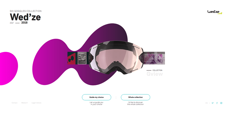
7. Broken grid and fluid shapes
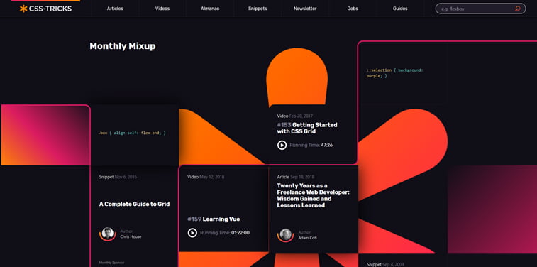
Geometrical shapes have been all over the web for ages. Squares, circles, and rectangles have usually been used for sketching, wireframing, and final layouts. And the layouts have usually been shaped as a symmetrical grid.
Well, no more.
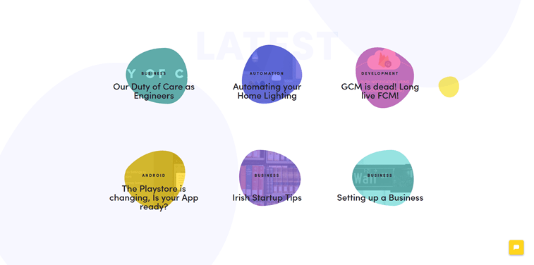
There is a tendency to experiment with broken grids and more fluid, organic shapes in order to create the natural looks and more visually appealing websites.
UI/UX design does not need a surgical precision, rather an artistic style that will make the design more approachable to users, and more in line with human nature. Experiments with grid and organic shapes can most certainy help with that.
8. Glitch effects
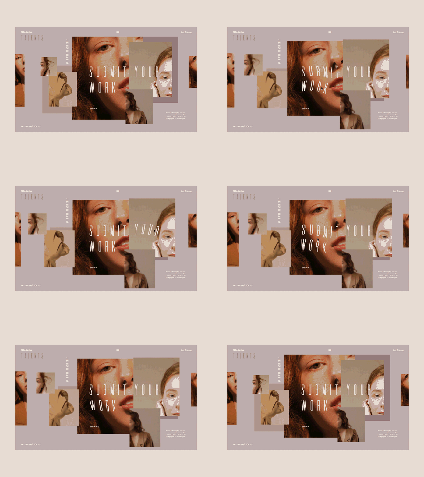
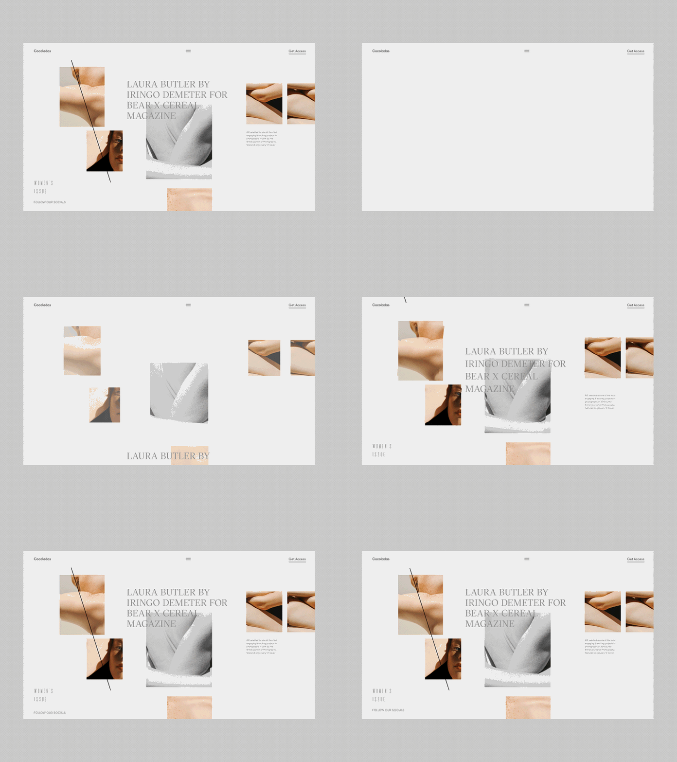
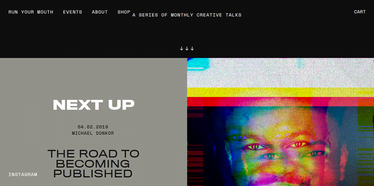
Retro style keeps coming back to web design trends. Actually, it never left. Glitch images had been a thing during the 90s, but they never seem to go out of fashion. So, we continue to see websites with this kind of effects nowadays. It makes people feel nostalgic, and it is usually a good thing.
The retro aesthetic has proven to be effective in grabbing users’ attention and keeping them on site. And that is always a good thing. So, long live the glitch.
9. Homepage going live in 3, 2, 1…
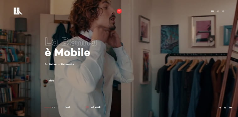
Illustrations are not the only heroes in 2019. Video backgrounds have become a thing and will probably stay that way. If used properly, moving images on your website homepage can make a good first impression, so more and more sites are using such eye-catching web design elements.
Video can bring the artistic looks, and designers seem to be happy with the outcome, but not only them. Digital marketers say that video background could improve the conversion rates by up to 140%, only because video makes visitors stay longer on the site and make more meaningful interactions.
10. Socially conscious design
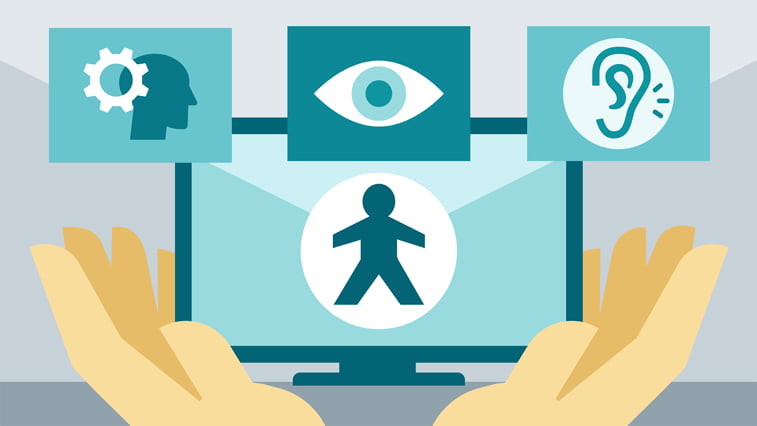
We are happy to see that 2019 shows more and more socially conscious web designers, illustrators, animators, and other creatives, who craft diverse solutions for the internet.
The improvement of web accessibility standards and creation of digital products that embrace people of all ages, abilities, genders, cultural, religious, and ethnic identities, has surely made the world wide web more inclusive and accessible than ever.
“You can’t just draw purple people and call it diversity”, writes a Shoppify illustrator Meg Robichaud in her article on Medium. “Diversity in tech is not going to be solved in an empty state”, she adds.
And we couldn’t agree more. Inclusive design includes so much more than that. And it is not going to magically alter the real life, but then again, we cannot but ask – do you believe that design can change the world? We believe it can.
Conclusion
To wrap it all up, there is one thing we can be sure of.
Forget about statements like:
- It has always been done that way
- People are used to seeing that on page
- Users do not want change, so we keep everything looking the same
- Write some text, any text, to fill in the blanks, users will get it
By all means, the web design industry has always been a trend-setter and a change-maker with its innovative, experimental, and original approach to shaping the web. And 2019 will be no different. We are glad to see that web designers are not just sitting there, doing the same thing over and over again.
And we are especially encouraged by the fact that the combination of strategic thinking and research insights has become a trend itself. We surely hope it won’t go anywhere in the near (nor far) future.
We would like to hear your opinion on web design trends for 2019. Have you noticed some other novelties in the industry that you consider worth discussing? Share your thoughts in the comments below or on our Facebook page.
