There are many perks if you decide to use custom illustration for your company’s branding. First of all, nobody will have that same illustration, as it is your own. The same cannot be said for stock photography, as there is no guarantee that other websites will not use that same photograph you picked out. This is not a path to creating your uniqueness in the business world.
Illustration is less polished, sort to say, but it has its own character and you can shape it any way you like. Besides having pretty visuals on your website, you can also play around with illustrations. Remember comics? You can create your own series with original storylines.
Best Illustration Examples in Branding
Many companies decided to stick to only one character and make it their official mascot. Others decided to create a whole fantasy world with a cast of main and recurring characters. It is up to you which creative direction you will take.
Here are four popular brand illustration examples for marketing purposes to inspire you.
1. Google Doodles
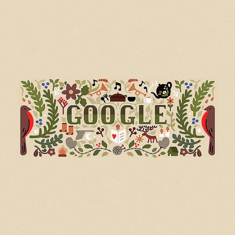
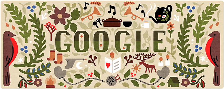
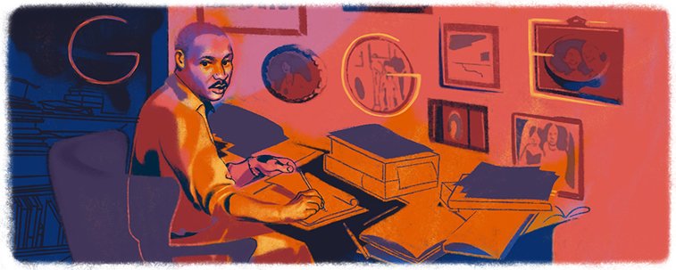
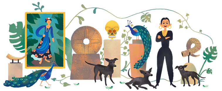
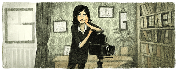
You see one almost every day. They are celebrating birthdays of notable people, holidays all around the world, fun holidays such as Ice Cream and Pancake days and so on. Also, they are a great and unobtrusive way of distinguishing Google from other search engines.
But, Google Doodles were born out of pure coincidence. First “doodle” ever was created way back in 1998 when Larry Page and Sergey Brin, Google founders, decided to make a cheeky “out of office” note which would be attached to the Google logo on the browser’s homepage. They were visiting the Burning Man festival that August and therefore added the festival’s logo – a stick figure drawing.
Still, the idea of Google Doodles lingered. Suddenly, two years later, founders asked Dennis Hwang, who was a new intern back then, to make a doodle for Bastille Day. People loved Hwang’s work so much that he got promoted to chief doodler.
Of course, today this work is managed by a team of illustrators who have made an astounding number of over 2000 doodles so far.
2. Red Bull cartoons
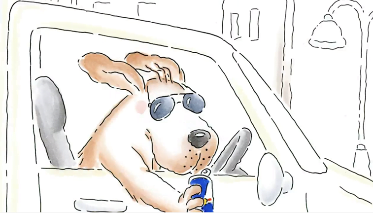
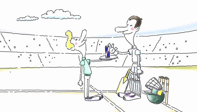
“…gives you wiiings.”
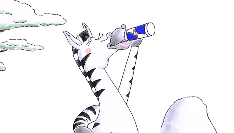
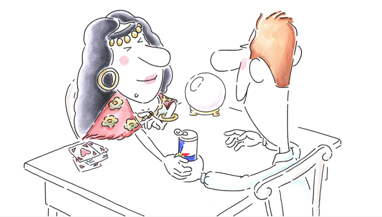
Red Bull founder Dietrich Mateschitz is actually the person behind this slogan. He also created the now worldwide famous advertising campaign with the helping hand of Johannes Kastner. The campaign was put on paper in the form of illustrations by art director Horst Sambo. However, they did not stop there. To make it even more appealing, Tibor Hernádi animated those drawings into short and funny cartoons. These videos captured the spirit of the company and showed fictional and unconventional ways in which Red Bull can save the day.
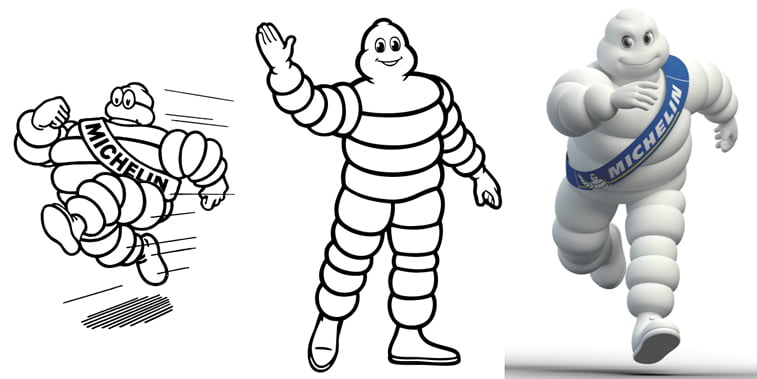
3. Michelin Man
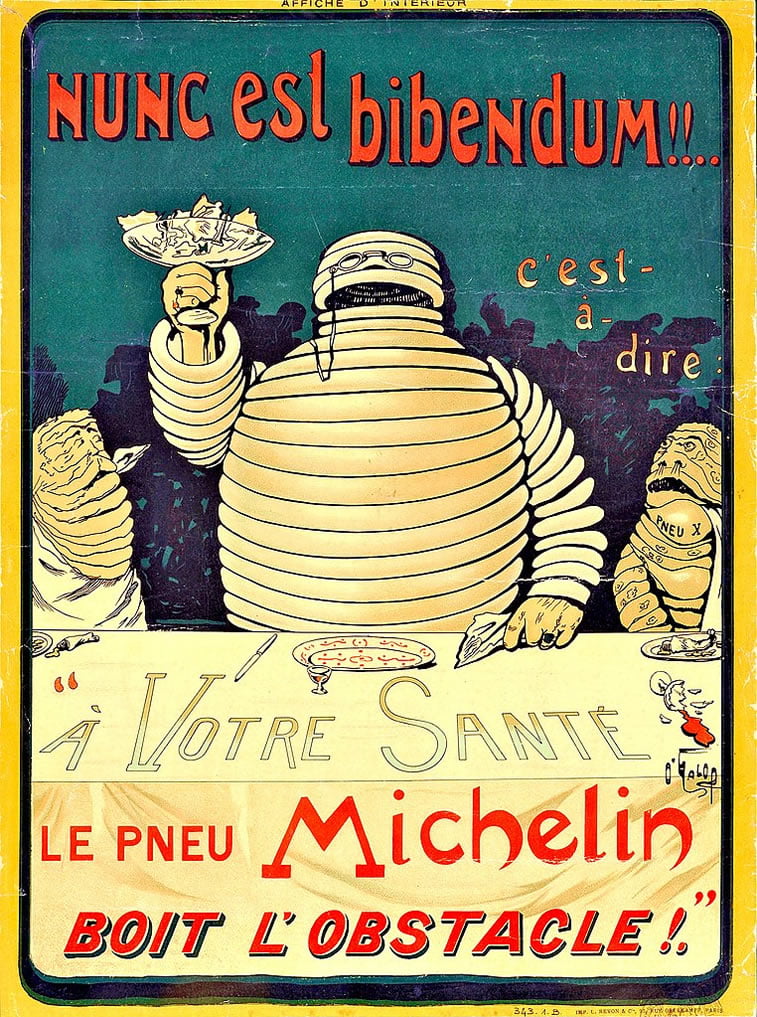
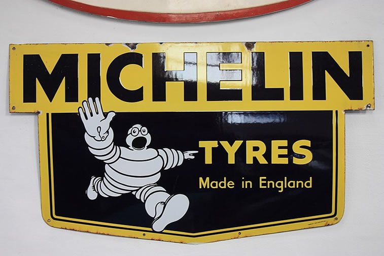
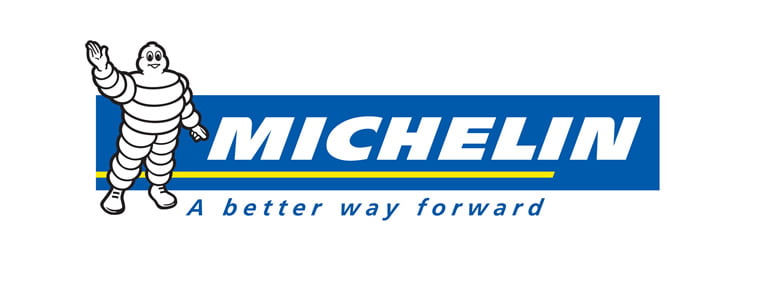
Michelin Man is a mascot of a well-known French tire manufacturer, Michelin. The story of how he came to be is also full of coincidences.
Brothers Michelin needed a poster of some sort for their new product. During one fair, they noticed that a stack of their tires resembled a person. Once they met cartoonist Marius Rossillon, famous O’Galop, they knew what they wanted. Rossillon had a poster he made for a brewery which got rejected. It depicted a man holding a glass. Brothers decided to add the tires around the man and to make some other tweaks to the original image. But, they left the quote “Nunc est bibendum” (“Now is the time for drinking”), which had a lot more sense when it was a beer ad.
Still, they kept the drinking glass and added nails and rocks inside it to represent dangers on the road. They also further explained the poster with the tagline in French “C’est à dire : À votre santé. Le pneu Michelin boit l’obstacle” (“That is to say: Here’s to your health. The Michelin tire drinks up obstacles”). Bibendum also somehow ended up being the name of the tire man, even though he is today more popularly known as the Michelin Man.
You may wonder why is he white? Well, tires back then were white until 1912 when carbon became one of the ingredients as well.
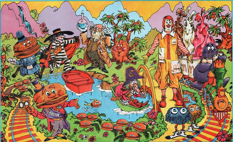
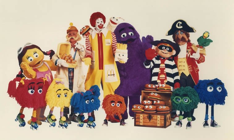
4. McDonaldland characters
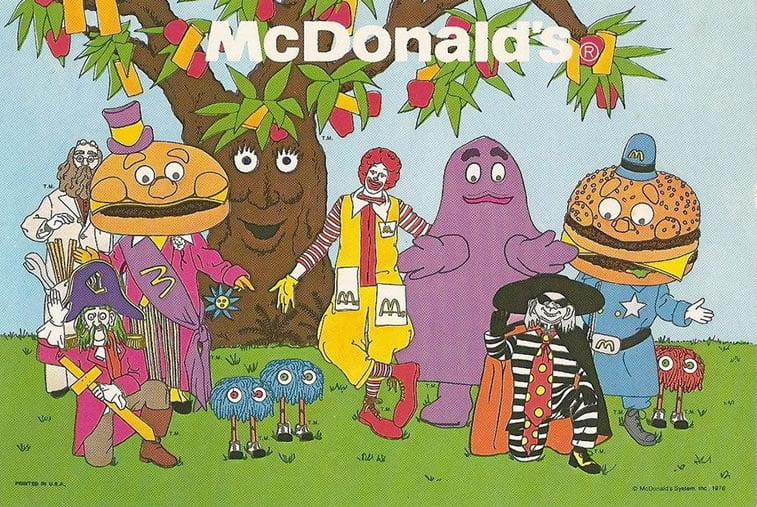
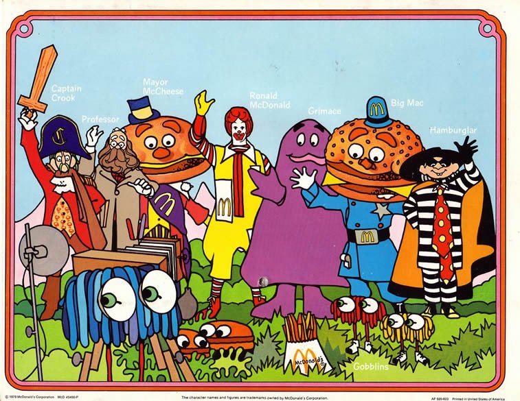
While Michelin brothers decided on one character to represent their brand, McDonald’s introduced a whole bunch of them. And they all lived happily together in McDonaldland.
This fantasy world and the whole array of characters led by Ronald McDonald were introduced during the 1970s and became McDonald’s main marketing tools until 1990s. Marketing firm Needham, Harper & Steers created the McDonaldland and this turned out to be a successful strategy since the characters appealed to McDonald’s most loyal consumers – children.
Besides the drawings of characters, McDonald’s also hired people to dress up as them and even animated the characters in short videos.
You probably noticed their absence in the later years. This happened because McDonald’s switched its strategy and characters retired, although they may be seen in some restaurants as drawings on the walls and on some packaging.
Conclusion
Many companies’ illustrations managed to stand against the test of time. They became sort of immortalized in companies’ logos and branding material. Generations upon generations of consumers recognize them and are able to identify them without their name being indicated. Keep this in mind when building your visual identity.
Which company in your opinion did the best job? Which illustration or character left a lasting impression on you? Head over to the comments section or join the discussion on our Facebook page.
Are you looking for an agency who is up to the task of creating your visual branding or refreshing your current one? PopArt Studio has numerous projects and that many satisfied clients. Check out our portfolio and order today.
