Web designers use them as a tool for ideation, experimentation, skill sharpening, and portfolio boost. They choose an existing website and reimagine its appearance. Improve it. Level it up. Make a better user experience and create more functional interfaces. What are we talking about? Yes, this is all about website redesign concepts.
Sometimes, designers just create them for fun.
But more often than not, redesign concepts represent a way of:
- A critical approach to design
- Rethinking website’s functionality
- Challenging usability of existing navigation bar, search options, filters, and other UI elements
- Questioning the impact of CTA buttons
- Refining website copy
- Making new solutions for a complete website makeover
No matter if it is a website of a globally recognized brand, a well-established non-profit organization, one of the most frequently used media portals, or a favorite fashion online store, web designers from around the world often dedicate their time and ideas to the creation of such new solutions. And the results are usually pretty amazing.
So, we have gathered together some of the great redesign concepts from Behance and Dribbble, and we present them to you today. Here is for your inspiration, cheers!
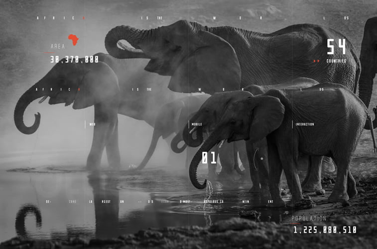
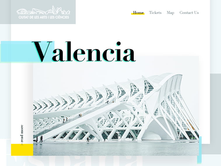
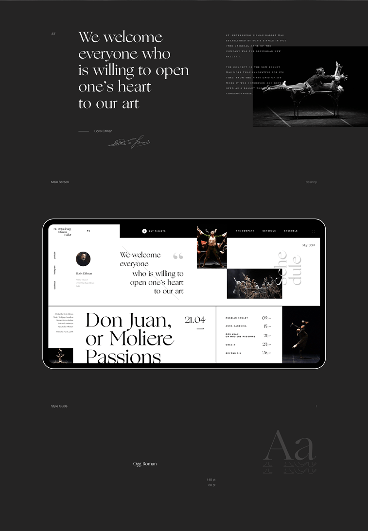
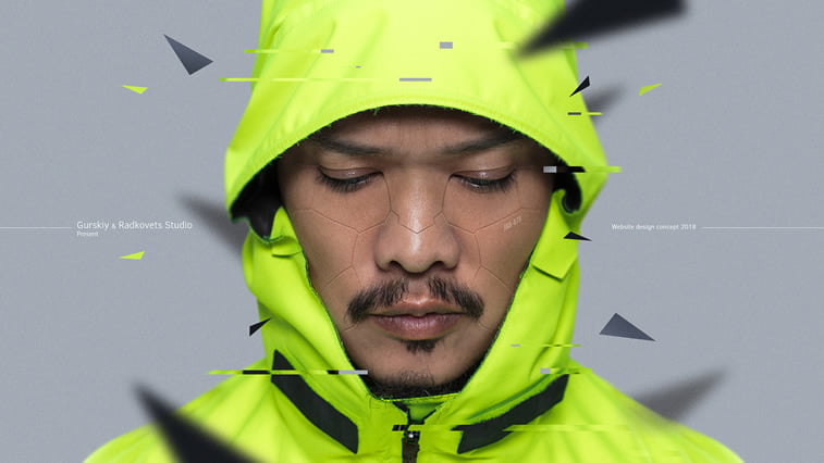
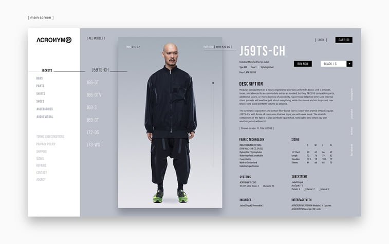
ACRONYM Website Design Concept by Gurskiy & Radkovets on Behance
Flood concept by Alberto Conti on Dribbble
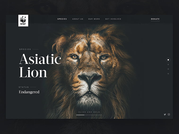
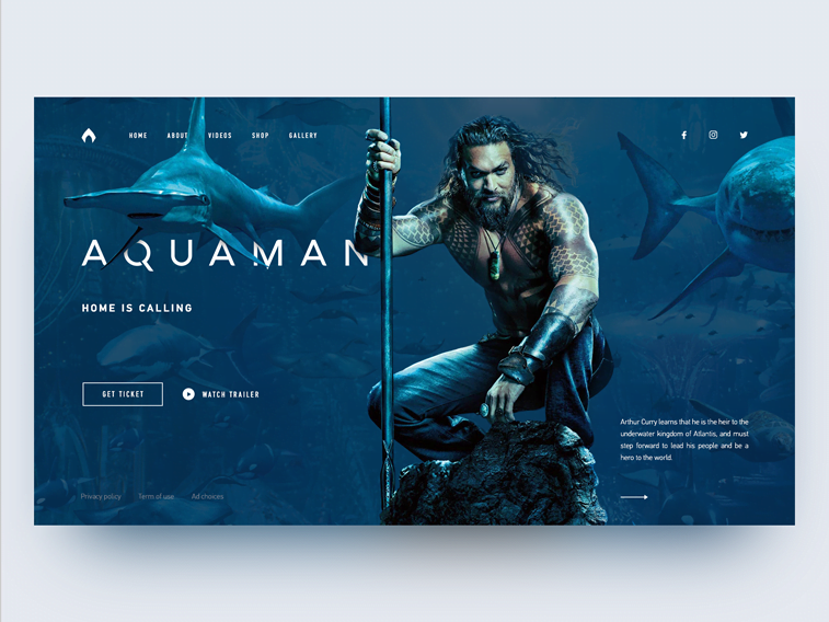
Two Times contacts page animation concept

Range Rover Evoque UI design concept by PopArt Studio on Dribbble
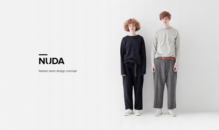
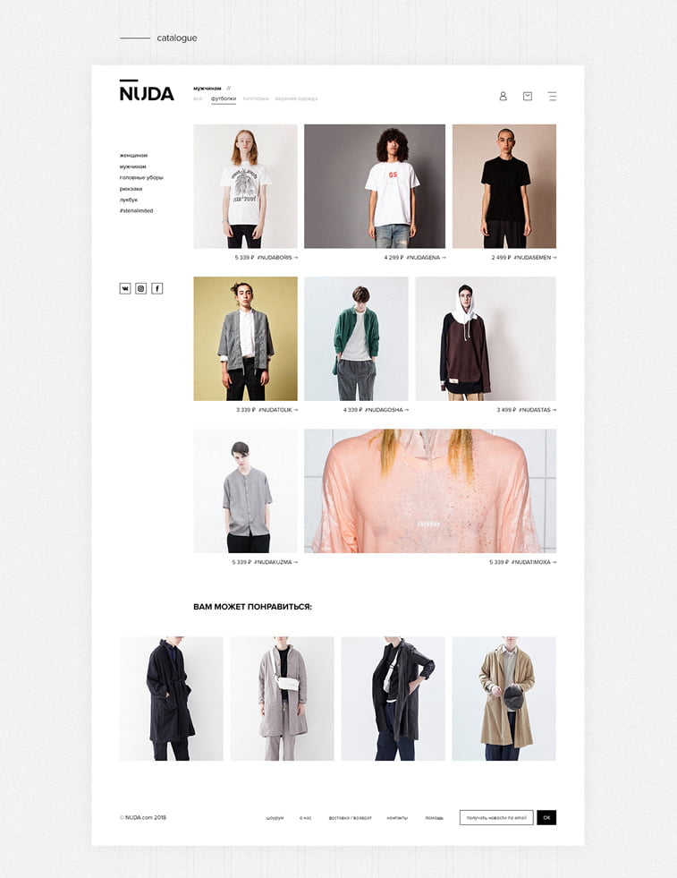
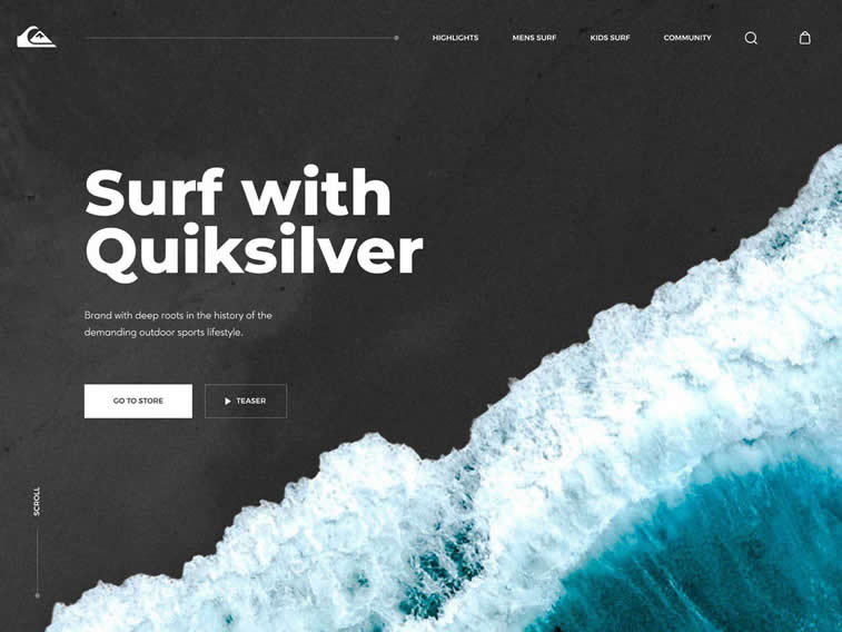
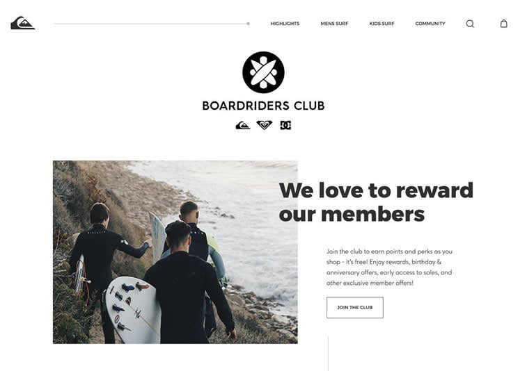
Nike Footwear Website Concept by PopArt Studio

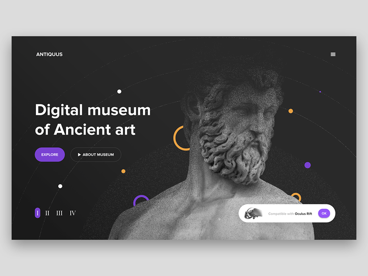
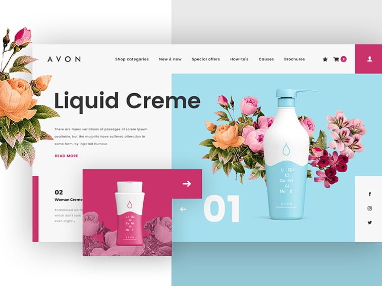
Diagonal Scroll Gallery Concept by Nathan Riley for Green Chameleon on Dribbble
TDI – Data Dashboard Design by George Railean on Behance
Molecular Genetics vs. Media home page animation by Zhenya Rynzhuk on Dribbble
D. M. Studio Opening Menu Animation Brutalism Version by Zhenya Rynzhuk on Dribbble
