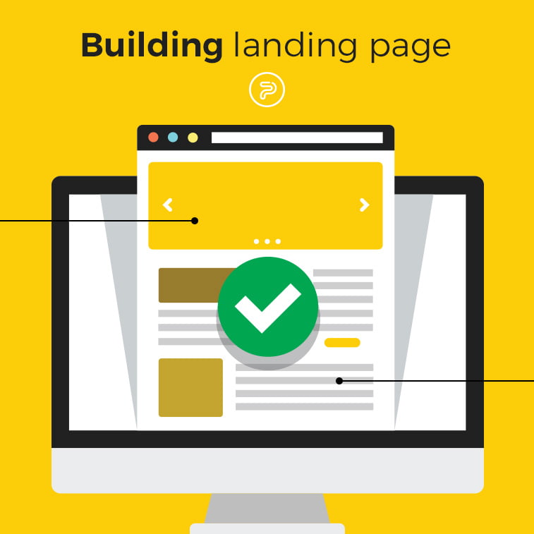
Trying to stand out among all the internet clutter can seem such a daunting task. Especially when there is a ton, or two, of landing pages which all have the same goal in common – sending out a siren’s call to the potential customers and luring them to conversion.
How can you create a page that is attention-grabbing and that can successfully hook people to stay and eventually do what you planned all along?
At the end of the day, it is really your results and page’s analytics that will tell you what is working and what is not performing as well as it should. However, there are some tips and good practices that you can implement while designing your landing page.
What is a landing page anyway?
Why a landing page? Well, simply because your visitors literally “land” on your page after they clicked on your ad. Usually, you place your ads on social media, in a newsletter or as a Google ad. The ad is equally important since it transfers people to the landing page. But the landing page is the one who does all the magic.
The copy and the design of it need to convince people to either buy whatever it is that you are selling, or to leave their information, usually their email address. The first type of landing pages is called click through, while the one which is only collecting data for further marketing purposes is called lead generation.
Click through pages have a tad bit harder task at their hands. They need to contain persuasive storytelling about your product or service in a way that people start thinking about how they managed without it so far. The ultimate goal of these landing pages is to turn the visitor into a buyer.
On the other hand, lead generation pages oftentimes offer a nice free gift if the visitor leaves their email. People love free things, so by exchanging just their email address, they will receive something enjoyable or helpful in return. Their email addresses are then stored for your further use. After some time, you can either send your newsletters, coupons or whatever you wish to those same addresses.
Now that you know the difference between the click through and the lead generation, you can start building your own landing page.
But you may be wondering where to even start.
How to start
First of all, decide on the purpose of your landing page. Once you decide what that is, the rest is relatively easy.
Keep in mind that you are creating the landing page first and foremost for the people. It needs to be appealing. And for the page to be appealing you need to know your customers. In order to sell well, you need to know to whom you are selling. That is the characteristic of a good salesman. But, since you are not a car salesman and you are not selling at a car dealership but online, your page needs to do all the talking for you.
Which is more important, copy or design? The answer is both. High-quality pictures, informative text with just the right amount of humor, clearly visible call to action (CTA) button – that is the perfect recipe for your landing page.
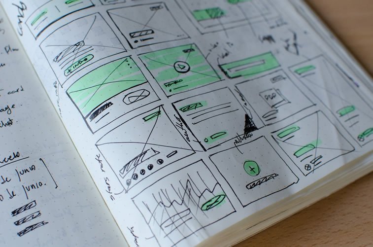
Although, once you get your page up and running, your work on it is not done. Constant tweaking is necessary. In order to have a functional landing page, you need to be checking all the time the page’s performance. That is when the visitors’ behavior becomes invaluable. Making sure that the number of people that are leaving your website (bounce rate) is at the minimum is of the greatest importance for your website.
How to keep visitors at your page once they arrive? Read on to find our tips and tricks and proven strategies that work when it comes to landing pages.
What to do
Some of these tips proved to be working, but each landing page is different and each audience has its own tastes. However, do try some of these suggestions as they are steps on a roadmap to having a coherent, SEO and design-wise purposeful landing page.
Design tips:
- Place all important information “above the fold” – that is all the visible content at first glance without scrolling down. Make sure your CTA button is also above the fold.
- Since we mentioned the CTAs, stick to only one button. It has to be immediately clear to the visitor what should be clicked.
- Steer clear of stock photography. You do not want random people laughing at a salad or at a laptop on your page. Hire a photographer or use the camera yourself and take actual pictures of your product or your co-workers.
- Good design is a responsive design. People are using mobile phones more often nowadays. Check how your page is looking on mobile phones, tablets, and desktops as well.
Copy tips:
- Be straightforward with your headline. Visitors need to know immediately what it is that you are offering.
- Make sure that the copy is short and to the point. Explain your product or service in a few short sentences. Do not use buzzwords and make sure that everybody can understand what you are offering.
- Use bullet points just like we did here. They are short and offer easily digestible information.
- Do not forget to add a confirmation message for people who filled out your form.
Final touches:
- Check the loading time of your page. It needs to load faster before your visitor decides to leave.
- Add your clients’ logos. This is a simple trick which can lure more people to whatever it is that your brand offers.
- Add your customers’ reviews. But do not go overboard. Pick just a couple of them.
- Use short forms. People will give up easily if they have to fill out some form for longer than 10 minutes. For newsletters, you only need the email address.
Of course, you do not have to use this as a definite checklist of all the things that have to be present on your page. Choose the ones that you believe will go well and correspond with your offer. Depending on your target audience, switch things up or down a notch.
What not to do
As there are things that you should do, there are also those that you should avoid. And here they are:
- Overstuffing your landing page with images, text, and offers is never a good idea. Choose only one message you wish to convey and stick to it.
- Avoid big chunks of text. Add just the right amount to offer enough information. People do not want to read a whole manifesto about how great your product or service is. Convince them instead in a few sentences or less.
- Not adding the option of opting-out from a newsletter is never okay. As people can sign up, give them also the possibility to remove themselves from your mailing list.
- This is a given, but do not promise something you cannot provide. Deceiving tactics have no place in business, being it offline or online.
- Do not make your homepage a landing page. The landing page should be a separate page, dedicated to a specific product you wish to sell or a page that has a specific purpose, like gathering emails or displaying a special time-limited offer.
- Handwritten-like curly fonts may be nice to look at, but they can also be illegible. Use a font that is easy to decipher and that can also showcase your individuality.
- Try to avoid pop-ups, but if you really want to use them, make them as unobtrusive as possible.
Stay away from these mistakes and oversights so that your page could have better chances in the vast spaces of the internet.
Conclusion
There you go. With these tips of ours and fine-tuning from your side, your landing page has all the prerequisites to become a successful one.
Do not forget to constantly upgrade your page since the results will only roll in once you put in the work on presenting your offer in the best way possible. Only hoping that it would work as you wished for will not yield any profit.
Trying your luck with more than one landing page can also be helpful. Offer, for example, on one landing page a free e-book in exchange for the visitors’ emails, and on the other directly sell your product. See which one fares better and then you can easily choose the one which has more hits overall.
Building a landing page that works is a never-ending task. But it can also make your business considerably bloom when done right. Tune in to the taste of your customers and watch as your visitors’ count grows.
What are your experiences when it comes to landing pages? Head over to the comment section or join the discussion on our Facebook page.
