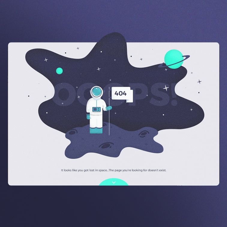
The purpose of 404 error page is to inform users they have hit a non-existing page. But there is so much more to it. The ultimate goal of this page is to make people feel less uncomfortable about the inconvenience and point them out to other useful pages on your website.
A meaningful and well-designed 404 page should bring viewers back on track, but also echo your brand’s style and enlarge your brand’s values. The results should be visible as a larger number of recurring visitors to your website despite the incovenience.
Here are some essential dos and don’ts of the 404 error page design.
Please do not:
- Fill the page only with the basic text saying that the page was not found
- Use generic design, placing the information in the upper left corner and leaving the rest of the page blank
- Make your 404 page look cold and lifeless
Instead, please do:
- Make your 404 page look warm and fuzzy
- Design a unique page aligned with your brand’s values, style, tone of voice, etc.
- Use custom-made imagery, i.e. illustrations, animations, sketches, comics, gifs, videos, etc.
- Write clever, informational, humorous copy
- Let the page speak to your visitors in a friendly tone
- Let it shine the light on the options for recovery
- Point out to other useful pages on your website
- Be innovative and keep your visitors engaged
25 Inspired 404 Page Design Examples
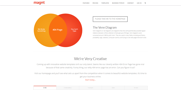
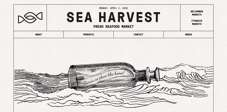
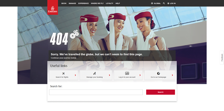
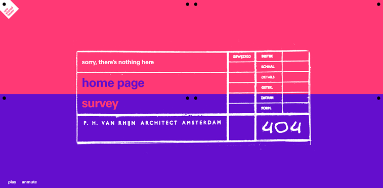
If you are not exactly sure how to accomplish all that, or you simply feel a lack of inspiration, here are some of the most creative 404 pages design examples that we have seen around. Devour them all and let your creative juices flow.
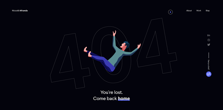
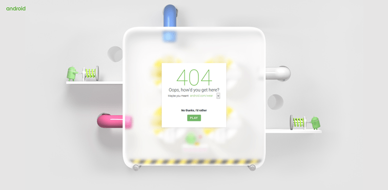
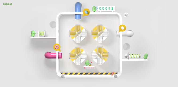

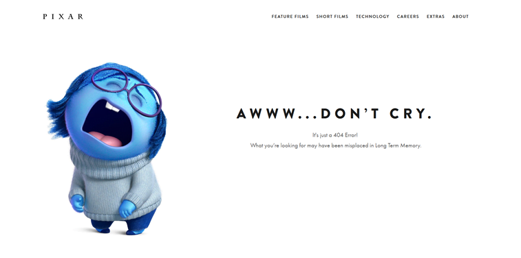
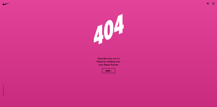
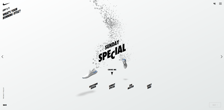
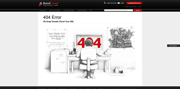
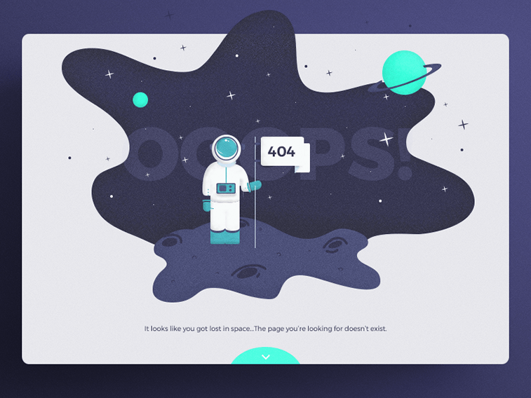
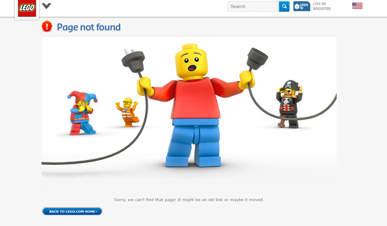
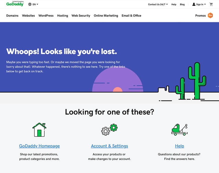
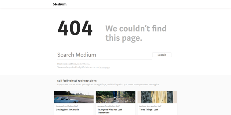
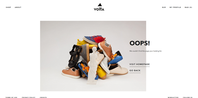
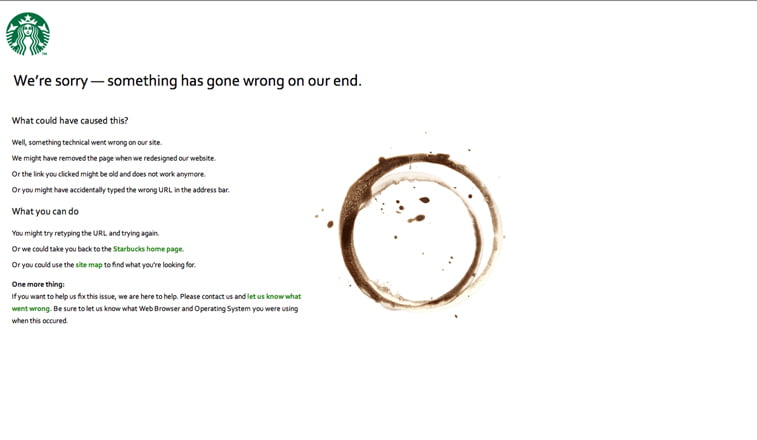
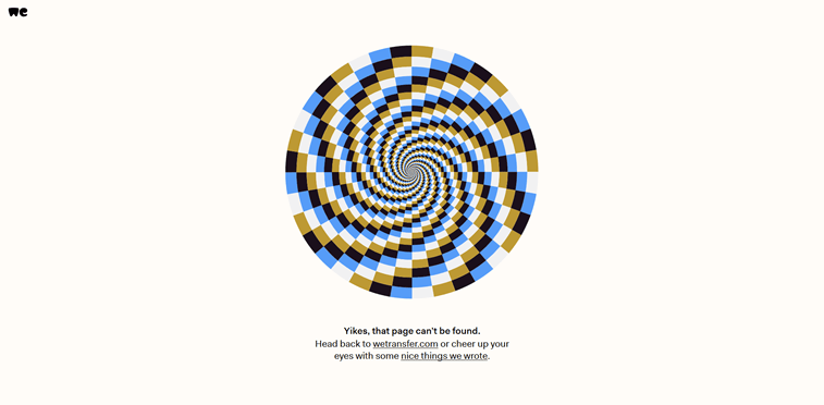
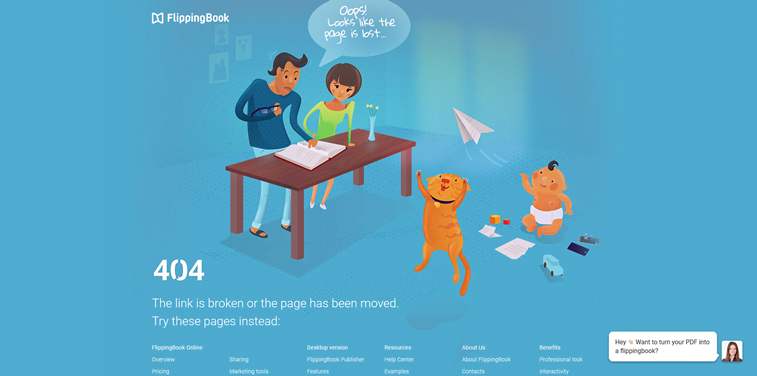
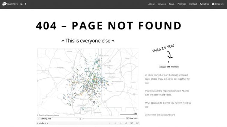
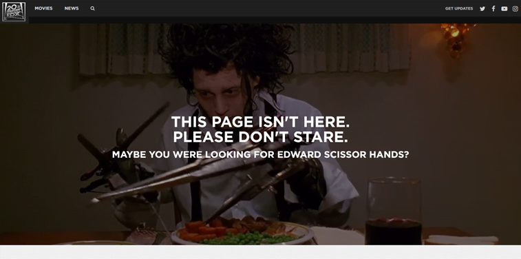
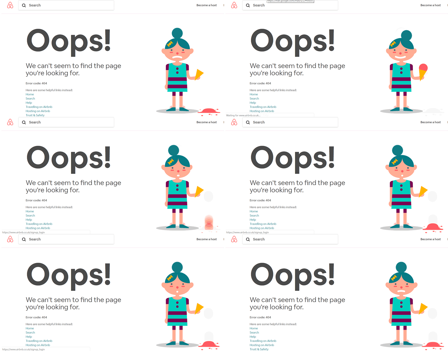
How do you like these error pages? Do you have your favorites? Have you stumbled upon some other great examples that you would like to share with us? Please do! Share in comments below or on our Facebook page.
