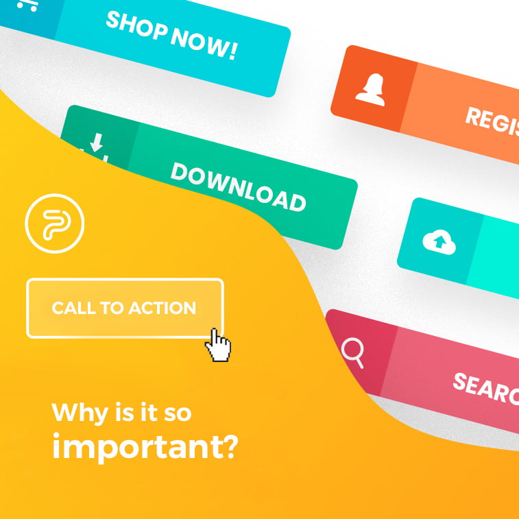
If you have your own website, you are probably hearing stories and reading blog posts about that oh-so-fabulous call to action. What is that exactly and why is it so important?
Call to action, or shorter CTA, is a marketing term that became popular in the business world. You probably saw various colorful buttons on countless websites with mandatory text such as “Buy now”, “Learn more”, “Order today”, “Apply now”… Those are all calls to action. They are often in the shape of buttons which are inviting you to click on them, but they are also present as banners and as simple links.
What Is a Call To Action In Business
Their job is to inspire people to take the next step on the website. After you are done reading a blog post, below you can usually find a CTA which offers you a download of a free e-book on the topic you just read about. Or it may offer you to sign up to receive the blog’s newsletter.
Calls to action are an inevitable part of sales pages. The text (also known as copy) on these pages also plays a big role. Their mutual goal is to convince the potential buyers to take action since you are offering a product or service which is exactly for them. This product or service is something that they did not even know they needed, but now they need it so much that they want to contact you straight away. This is the ideal scenario of how good copy and call to action should work. Of course, the reality is far from it, but there are ways on how to make something more out of your CTA button.

Main Points of Call To Action
When you are thinking about calls of action on your website, you need to take notice of:
- Where is the call of action positioned;
- How does it look like (is it a button, picture, banner, link…);
- Which text is on it, but also which text is above it.
Whether you are going to place the CTA at the end of the article or by its side, depends heavily on the content which is also placed on that page. In case it is an online shop, it is best to have a CTA under each product that you are offering.
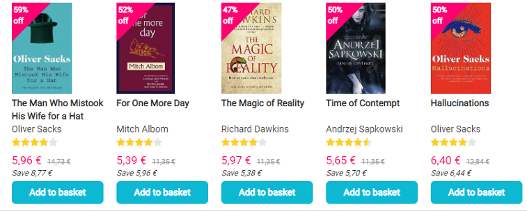
In case it is a blog post, call to action is usually placed below the text. Do you want your visitors to create a profile on your website? Try to place the registration form on the side and make sure it is visible enough.
When it comes to looks, make sure your calls to action are noticeable. Make sure that the button is of vibrant color, but to be at the same time aligned with the rest of the page – to attract attention without being over the top.
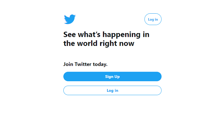
Be creative when it comes to CTAs. Design a button in a special way, place the link inside the banner which will also be designed in a way to attract visitors. It is only important that it is clear on where should be clicked on. It has to be designed with taste and it should not look like someone else’s paid ad.
Text depends on the action you wish your visitors to take. Make sure that it is clear and concise. You can write something which differs from standard messages such as “Order now”, “Register”, “Call today”. Try something new so you can be different from your competition.
Tips for Your Call To Action for Business
It is a thin line between having too little or too much CTAs. Do not place too many buttons or banners on one page because visitors will not know what is expected of them to do. They can be overwhelmed with too much information. In situations like these, people will probably just leave your website. And that is something you do not want.
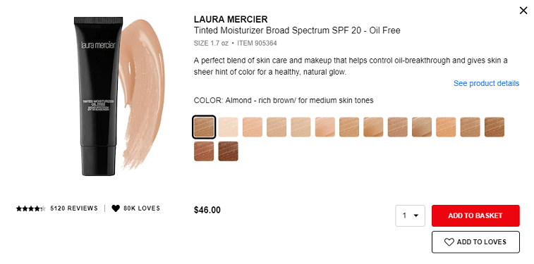
Some experts believe that you need to have at least one CTA on each page of your website. In any case, certainly do try to have one call to action on your sales pages.
Also, it is important for your visitors to know what they are clicking on and with what they agreed with. Be transparent when calls to action are in question. Are you going to save email addresses and names of people who signed up for your mailing list? Inform them about that in a little text cloud under the signup form so that they can know which information they are sharing with you before signing up.
One marketing trick which you can use to attract the attention of the visitors is to offer a trial period. In this way, an immediate buy is avoided, but during the trial period users can see if they like your product or service.
Giving out free gifts with the bought product also attracts people. They decide faster to buy something in case they will receive something for free with it (even if they do not really need the gift).
If you want to shorten the time buyers spend thinking about whether to purchase your product or not, you can set up a time limit. Mention that a certain product is available only today or it has a discount only this week. This psychological trick will affect some people to make decisions about purchasing faster.

Conclusion
There are many ways to inspire potential buyers to open their wallets. Calls to action are only one tool, next to the website’s content, which will lure people to click on a button, picture or a link and leave their personal information to you. You surely will not leave your personal data to a website which does not look reliable. This is why you should seriously dedicate time to calls to action.
We wish you a lot of success in creating your calls to action, and to conclude, you know how the old blogging saying (call to action) goes – sharing is caring.
What are your experiences with calls to action? Leave a comment below or join the discussion on our Facebook page.
