“Look at that subtle off-white coloring. The tasteful thickness of it. Oh my God, it even has a watermark…” In case you are a movie buff, you probably recognized that the previous quote is from the movie “American Psycho”. Patrick Bateman, played by Christian Bale, is left speechless at how good the business card of his work nemesis is.
Jokes aside, you do not have to shock people with your business cards, but uniqueness always draws attention since it is different from the generally accepted uniform design. Since a few years back, the minimalist approach is more and more popular, as well as 3D effects and vibrant colors, but of course, that is not the path everyone needs to take.
Here are a couple of original solutions when it comes to this little marketing tool.
1. Gal Weizman
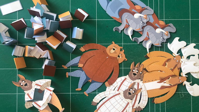
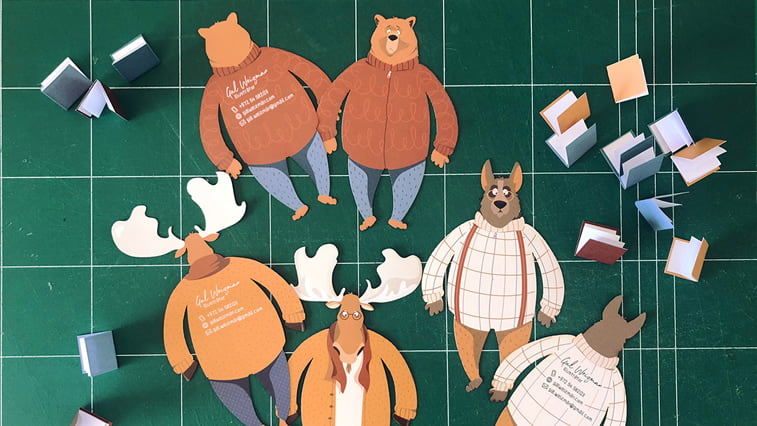
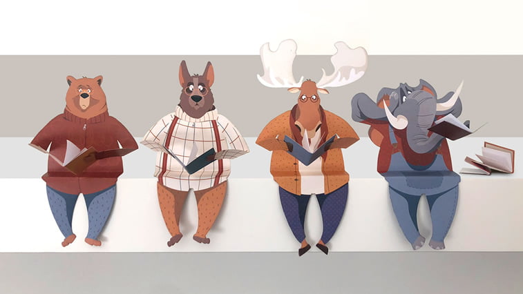
Gal Weizman is an illustrator and visual designer from Jerusalem. She especially enjoys drawing animals. Which is easy to notice since the business cards she prepared for her stand at children’s fair in Bologna featured funny animals. Cute teddy bear, dog, dear and elephant are cozily dressed while reading. The 3D effect with their paws (and trunk) which are holding books gives a new dimension to these illustrations.
2. Meg Lewis
Meg Lewis is a designer from Minneapolis. Her style is eclectic and recognizable since she is always using the same color palette which includes ochre, orange, millennial pink, navy blue and a couple of others. Meg also sells decorative objects with her design, including backpacks and make-up bags. She transferred her originality to her business cards as well, albeit in a bit less playful spirit.
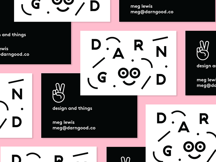
3. Damian King
Showcasing your work on your business cards is a great marketing move. Damian King, designer, illustrator and calligrapher from Oakland Hills, also agrees with that. It looks like orange, pink, ochre and navy blue are very popular colors since they found their way to Damian’s business cards as well. Nature motifs and geometrical shapes in vibrant colors are definitely catching attention.
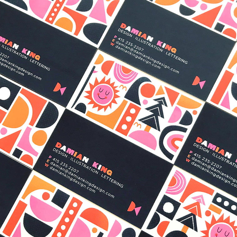

4. Brian Steely
Art deco with elements of American Native culture – this is how Brian Steely’s style could be described. You can also notice it on his business cards featuring an original profession – “design shaman”. The combination of white and yellow with black lines that stand out are making the visual experience stronger.
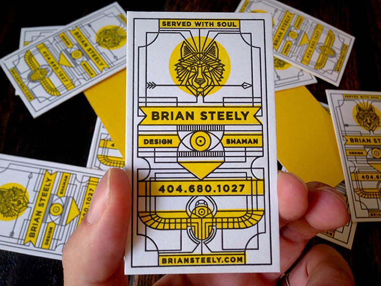
5. Hollywood Agency
Hollywood Agency is actually located in Boston, but they are proudly carrying the spirit of old Hollywood on their business cards. They resemble old-fashioned cinema tickets and they are the work of Dustin Dodd. Dodd is combining the art deco elements with the good, old Americana. Something that also helps these business cards do not get left behind on a table is their vibrant orange color.
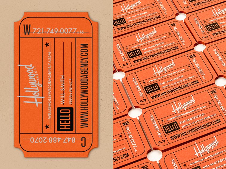
6. Lucie Bajgart
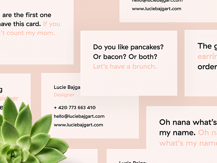
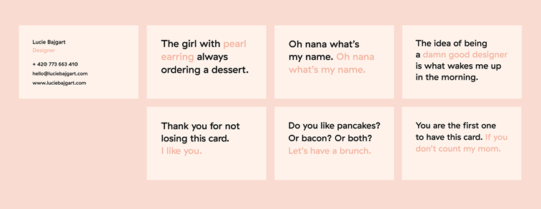
Lucie Bajgart introduced her sense of humor on to her business cards. With the unavoidable millennial pink and whimsical messages, this designer managed to garner the attention with this simple, but at the same time interesting and bold design.
7. Viktor Kram
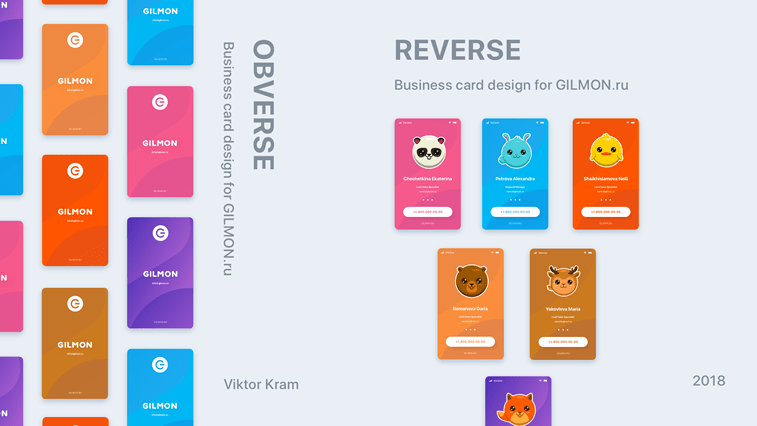
Viktor Kram’s first Dribbble project is the designing of business cards for a Russian company, Gilmon. Animal illustrations which resemble Pokemon characters can be found on designed backgrounds which look like mobile phone contacts.

Did this post inspire you to refreshen the look of your own business cards?
You are at the right spot since we are also offering the service of creating original business cards according to your taste.
You can check out our work by following this link: https://www.popwebdesign.net/portfolio…eng.html


