In almost every walk of life, change is pretty much inevitable and in the ever-evolving world of web development and content creation, constant tweaks and shifts are pretty much commonplace. The latest version of WordPress’ editor tool has pretty much stayed the same for years and some thought it was time to usher in a new era, or to simply put, introduce a more enjoyable and simpler editor which enables writers to create richer content with more ease.
Enter the Gutenberg editor.
Does the new tool deliver these promises? Let’s find out from the following article.
Enter Gutenberg
Getting its name from Johannes Gutenberg (inventor of the revolutionary printing press) and its main goal is to make it easier for those new to WordPress (and for those who have been using it).
The shortest way to describe the new editor is by saying it uses “little blocks” and generally makes it easier to navigate through WordPress by letting users get away with using fewer shortcodes and HTML-wizardry.
Getting started – more space to create
Installing the new plugin is pretty easy. To get the latest version, simply visit the website, or get it under the “Add New” plugins feature in your WordPress dashboard, given you use at least the 4.8 version. It’s also strongly recommended that you familiarize yourself with the new plugin either on a test site or in a staging environment.
New dashboard menu
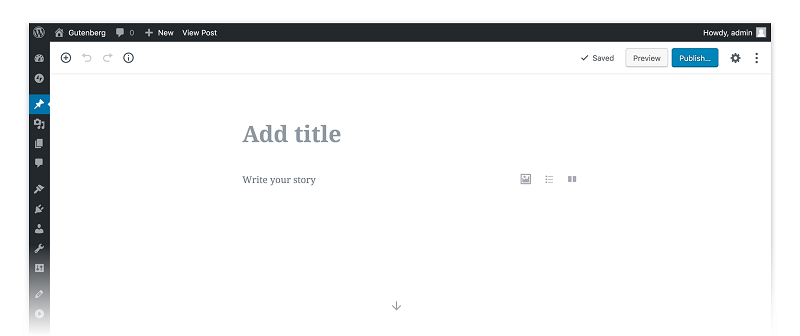
After opening Gutenberg, you’ll see that you have a new dashboard menu which gives you more writing space than the previous plugin. It’s okay to say that the Gutenberg editor has a kind of Medium-like feel to it, so it might require some time to get used to for those who have been using the previous plugin exclusively.
Is this a good thing? Well, the bigger writing space is supposed to create a less distracting environment for writers, which can be beneficial, especially for those who prefer writing on laptops (to take things one step further, Gutenberg enables you to hide the sidebar on the right, giving you even more space).

Embracing changes
With the Gutenberg, switching between visual and text editor (mode) is a simpler process, meaning, you now have a drop-down that’s on the top left side of your screen.
With HTML comments on each of your blocks’ beginning and end, you can create these blocks directly by using text editor mode. This can be a good thing but can also make things look a lot more crowded.
Simpler block management
Managing blocks has also become less of a hassle, meaning that you can move the blocks up or down with more ease, delete them or create settings for them individually – another Medium-like feature.
Work from mobile with less hassle
One other major surprise with the new plugin is that it makes working from mobile easier. Need to change an image or need one more paragraph? With Gutenberg, you can do it on the go.
Farewell TinyMCE?
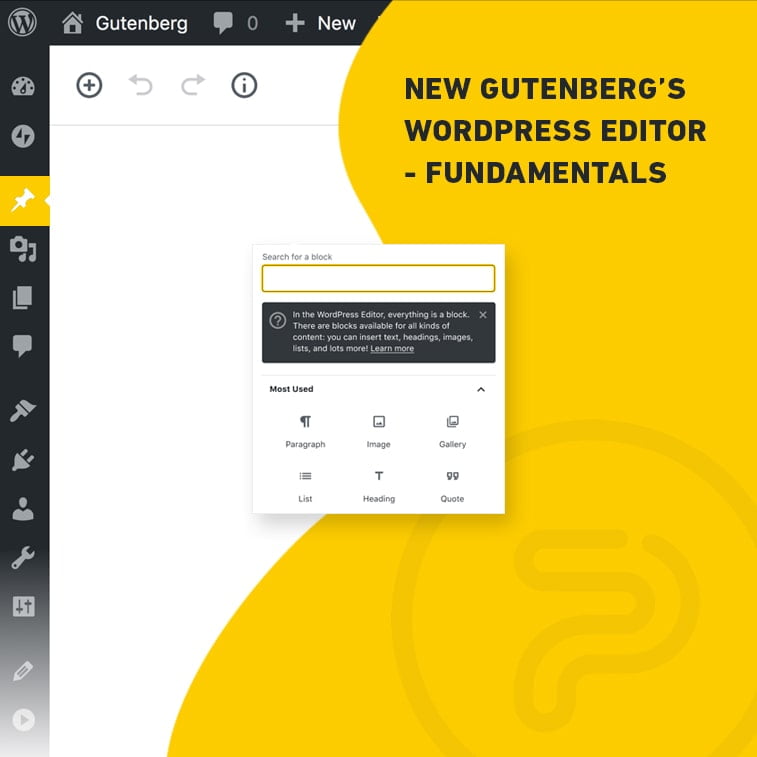
One fundamental change would be the absence of the TinyMCE toolbar, which has been a mainstay in the last few years. Instead, you’ll have to click on the “Insert” button to get a similar drop-down menu.
Why is this, you ask? Is the TinyMCE editing engine gone?
In short, yes and no.
With Gutenberg, the engineering team wanted a simpler plugin that makes editing a more user-friendly experience. This all was achieved by essentially integrating the TinyMCE engine into some of Gutenberg’s features like the table and the text block management options.
The realm of blocks
Do you remember that inserting table blocks could easily turn into a disaster with the old plugin? Well, dealing with table blocks is a lot easier now and you can insert tables via the editor as blocks – no more HTML codes or 3rd party plugins.
Also, you can add blocks with responsive text columns with ease, and you can also choose different layouts. This simplification along with the table blocks is a huge improvement over the old editor since both features required a lot more hassle to work properly.
Another cool feature is the live HTML block which – after you insert your code – lets you see a preview from within the block itself. This handy feature can be pretty cool. For starters, it saves you time because you don’t have to switch between the visual editor and text editor mode constantly.
Simple image integration
Adding images has also gotten pretty simple. The 0.5 version of the plugin lets you drop or drag images directly into your image block. The only drawback is that it has a specific fade effect on the image which can be a major issue for some.
New text options on the horizon
Gutenberg also utilizes new visual and cover text possibilities which make it a simpler plugin to use. Changing font size and font style is easy, creating a Drop Cap takes seconds and you can easily change text colors as well.
Also, you’ll notice that the fonts in the blocks already match the fonts on your page. This is a cool little feature that aims to keep you more intact with the style of the page you’re currently working on.
The introduction of autocomplete lets you insert blocks and enables you to format content quickly in fewer steps.
Helpful tools for text editing and better user-experience
By adding a Table of Contents option on the sidebar, you can click on them and easily get to the preferred section of the article you’re currently reading. When you’re working with lengthy content, this little feature can be a game-changer.
Using your blocks as anchors is also a pretty awesome new feature. Adding these anchors lets you to directly link to specific sections or headers in the post. A great feature for sharing and for setting up jump menus.
New features also include pulling quotes besides blockquotes. There are also new options in block positioning. Now, you can align blocks wide and align them full-width, apart from the classic left, center, right, and no alignment features.
Button and embed options
Gutenberg enables writers to add buttons with more ease. No HTML, no 3rd party plugins, just an easier way to add CTA.
Embedding media content is a joyride with Gutenberg. It’s really easy, and lets you use tons of options (content from Youtube, Hulu, Imgur, Soundcloud, Slideshare, just to name a few). Couple it with the new alignment and block managing options, it’s safe to say that you can create in new and exciting ways.
However, with all these new options, things can end up looking crowded and can potentially ruin overall user-experience if used excessively. It’s safe to say, balance will be key.
Gutenberg – pros and cons
After summing up the fundamentals of the latest WordPress editor plugin, let us sum its pros and cons.
Pros
- Less TinyMCE makes the editor an easier plugin to use
- The Medium-style editing experience can certainly appeal for some publishers
- More screen space, fewer distractions – a plus for writers
- Managing blocks is easier and the alignment features can really improve user-experience on full-width sites and screens with bigger resolutions
- Mobile-friendly – lets you edit on the go. That’s always a pro in our book
- Easy for beginners to master
Cons
- You won’t be able to turn it off since it will be the official editor of WordPress. However, you can download a plugin called “Classic Editor” which restores the old version
- In some cases, mastering Gutenberg can be harder – too many options might throw new users off track
- There are numerous plugins and themes out there and making them all compatible with Gutenberg will probably mean a lot of extra work for developers. And when they do start working on it, outstanding support from WordPress will play a crucial role in the success of their work.
- The new block features and embed options might result in crowded pages.
Wrapping it all up
All in all, the new editor is something worth being excited about since its new options enable publishers to get more out of their websites and content.
Want the Medium-experience but with our favorite CMS? This might be just what you call “the best of both worlds”.
One thing’s for certain though, for Gutenberg to become the editor we’ve all been dreaming of, it must be compatible with the majority of themes and plugins out there which will probably be a huge task. And after that is all done, it’s safe to say that the new editor will become a pretty popular little tool in the digital realm.
Until that happens, feel free to browse our blogs to get your tech-savvy kicks and to find out what else is new in the industry.


