It seems like the one-page website trend is not going away any time soon, and that’s for a good reason. Not only is it a simple method of designing a site, but a one-pager can also be very persuasive towards your customers, thanks to its nature of highlighting the best features of the website. In this article, we will cover what a one-page site is and how to create one with WordPress. So, shall we take a look?
What is a one-page site?
As its name implies, a one-page site is a type of website that consists of all the essential information and content on a single page. It’s usually used by brands and businesses to promote their products without too many distractions.
It’s usually straightforward towards its content, simple to use, and image-oriented. One-page site is perfect highlighting products, services, or content targeting a specific group of people.
There are plenty of benefits a one-page website offers, such as:
- Smooth user experience– when someone clicks on a menu item, the page scrolls down and shows a section anchored to the item instead of loading another page.
- Drawing more attention– a one-page website is usually image-driven, which means the chance of capturing people’s attention is higher compared to classical blog structure.
- Uncomplicated maintenance– since there’s not much to look after, maintaining a one-page website is considered to be less complicated.
- Conversion boost– a one-page website is designed to focus on call-to-action buttons, encouraging users to opt-in, potentially boosting your conversion rate.
Keep in mind, if your blog consists of an enormous amount of content, one-page sites might not be a good option. You don’t want to create a super long web-page that’s very hard to navigate and is stuffed with content.
What makes a good one-page site
When your website uses a single page, you have to make sure that everything you include on the website is necessary. Here are some key elements of what a one-page site should look like:
- Suitable domain name– your website’s domain name represents your brand and overall image. If you need help choosing the perfect domain name, check out these generators.
- Sections and menu items– cluttering the website with images and buttons without sectioning them can lead to poor user experience. Instead, add menu items linking to a different section of the same page.
- Contact forms– contact forms are essential for every website. Place them where it can be spotted by visitors right away, on the upper part of the page, for example.
- Using call-to-action buttons– these are used to increase conversion rate, therefore a good one-page website needs strong CTA buttons placed in strategic places.
Creating high-quality one-page website
Creating a one-page blog on WordPress is not a difficult process. In fact, there is a wide selection of WordPress themes dedicated to one-page websites.
However, where do you begin and how to create an excellent site? Here are the essential steps on how to create a high-quality one-page website.
Setting up WordPress
Before building any website, you need a strong foundation in the form of a web hosting service. Make sure that your choice offers good server uptime and live support.
Once you’ve picked a web hosting provider, make sure you’ve purchased a domain name for your WordPress site and begin setting it up. If you don’t know where to begin, don’t be afraid to send a message to your hosting provider or search for more information online.
Pick your theme and a design

Now, that you’ve set up your site, it’s time to customize it and turn it into a one-page website. Luckily, WordPress has some great selections of one-page site themes on its official theme directory. You simply need to install and activate it!
Should you need more options, there are hundreds of stunning premium templates for one-page sites on third-party websites such as Colorlib and ThemeForest. If you don’t know how to upload one or how to use your new theme in WordPress, check out this tutorial.
Once you’ve chosen a theme, the next step is to design your website. Most WordPress themes are fully customizable. That is achieved through your dashboard. Here are some concepts to take into account when designing a one-page website:
- Responsiveness– make sure the template you’re using functions well across multiple devices and browsers.
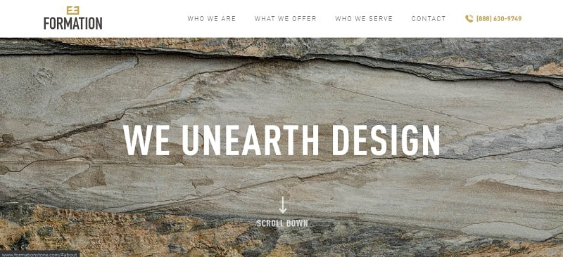
- User-friendly– ensure easy navigation for your webpage by adding such features as anchor links, a floating menu bar, scroll down and back-to-top buttons. For example, Formation is a one-page site that includes features mentioned before.
- Simplicity– images are a great way to highlight the content on your website, but placing them alongside each other can be overwhelming. Opt for simplicity instead. Here’s Lena Steinkuhler’s site as an example of how this method is implemented.

Anchor links
One of the most important parts of a one-page website is arguably an anchor link. It allows your visitors to jump to sections with a simple click of a navigation item
If you have many sub-sections on your site, an anchor link is a must-add feature if you want to ensure a smooth user experience.
Most templates and themes for one-page websites already have built-in anchors that you can customize freely to your liking, but if you happen to a theme without this feature, you can set them up manually or through the use of plugins.
Wrapping up
Having a one-page website comes with many perks and boosting conversion rates is one of them. In this article, we’ve covered what a one-page site is and what you need to do to create one.
We hope you’ve found this article useful. Good luck!


