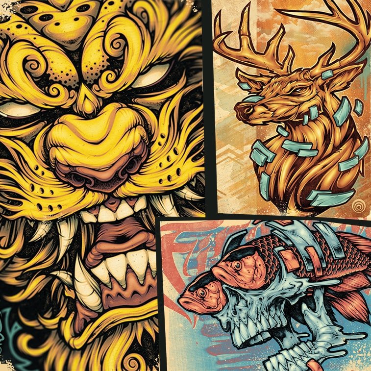
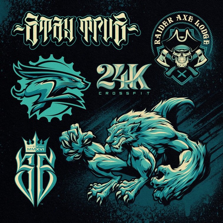
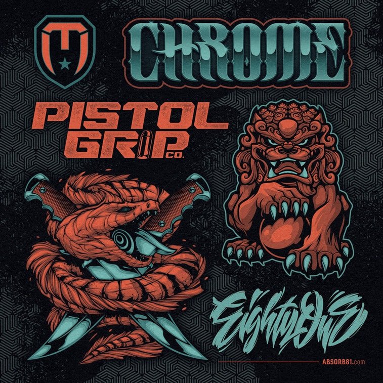
Craig Patterson is a Texas-based graphic designer, that goes by the artistic name Absorb81. He specializes in illustrations, typography, mascot design and brand identity. Craig explains his style as "heavily influenced by graffiti, skateboard graphics, and comic book artwork", and that it drives shapes and lines into new and unique creative directions.
We had the pleasure of discussing Craig’s artistic path, inspirations, and style characteristics.
If you wish to see more of Craig’s works, follow him on Instagram, Twitter, Facebook, Behance, Dribbble, or visit his website.
PS: Tell us more about how your artistic journey began.
CP: I’ve been drawing ever since I can remember. I was really into comic book art in middle school. I was more interested in the artwork then the storyline for sure. I had sketchbooks full of my own characters. Soon after, I was introduced to the skateboard culture and got emersed in skateboard graphics and skateboard magazine design. I loved the way they would mix hand drawings with photos and typography. That style and scene consumed me for a while. That pushed me into the digital world, spending hours reading “How to” books on Corel, Illustrator, Photoshop, Flash, and Web Design. I got my first job at a screen print shop as a printer before moving into the art department. I “soon” recognized, after about 15 years, that I was getting burnt out designing t-shirts for schools and family reunions, and I that needed to go fulltime freelance and start my own business. I was nervous at first but quickly realized that I should have been doing this a long time ago.
PS: How did you come up with your artistic name?
CP: I think a lot of people feel you are born with a skillset, and you either have it or you don’t. I’m a firm believer in the idea that some people might be more creative, and some might learn faster than others, but, like anything, you have to put the time into it to really see the results.
Long answer short, I feel like I been “Absorbing” Art, Music, Techniques, Inspiration, etc… since I was born or at least when I was really young. And I’ve been learning and growing every day, and I still have so far to go. Oh, and I was born in 1981.
PS: What is the source of your inspiration?
CP: Early on, I was heavily influenced by Sam Keith (The Maxx), Todd McFarlane (Spawn), Dave Kinsey, and Andy Howell.
Today I’m inspired daily by artists on Social Media. Photographers, Videographers, Musicians, Artists, and Designers who are passionate about their craft, and it shows in the work they put out into the world. It truly pushes me every day.
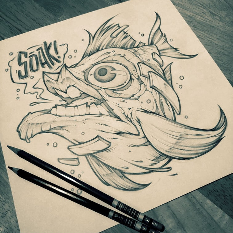
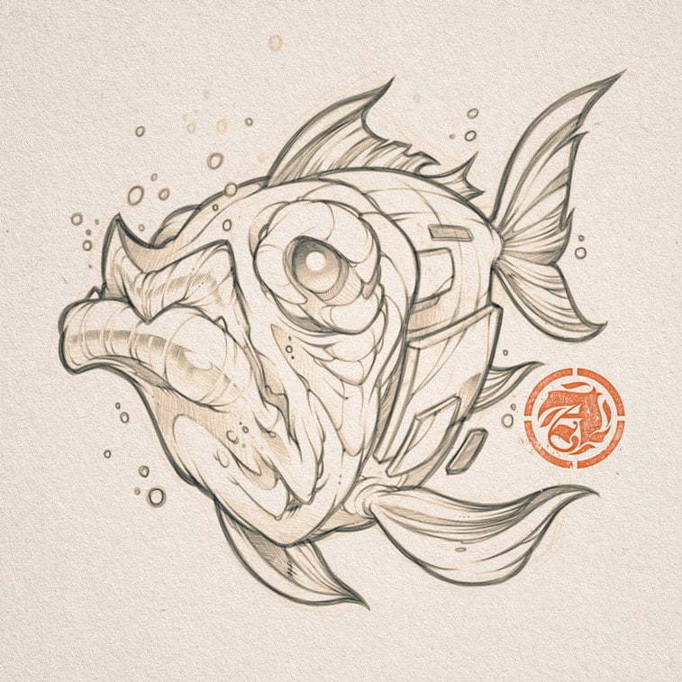
PS: You said your art is inspired by graffiti. Have you ever done any?
CP: I have done a couple of permission walls but nothing to brag about at all. My can control still needs some serious work. I’ve just always been drawn to the raw style and collaborative nature of the movement. Guys just getting together and mixing unique styles and throwing out all the rules and just creating whatever they feel.
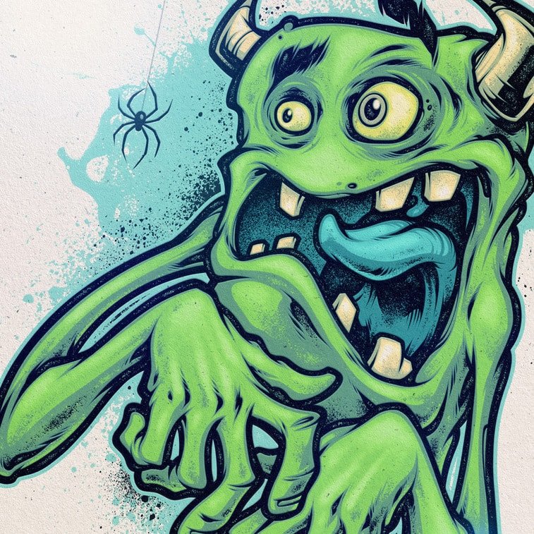
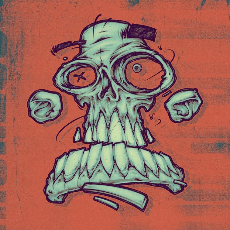
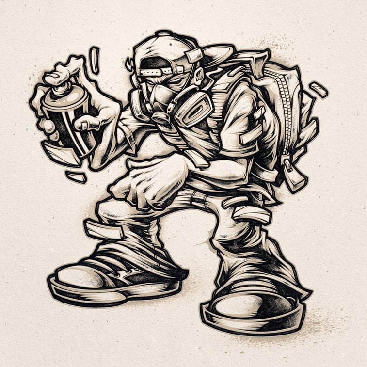
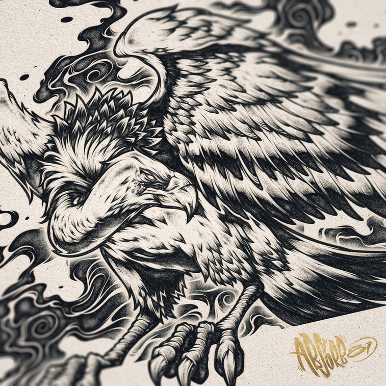
PS: Many of your works are pencil and ink drawings. Any particular reason why these two practices you hold, especially dear?
CP: Sketching and refined pencils will always be my favorite stage in the process. I’ve always loved the free and expressive lines in a concept sketch. Sometimes adding final coloring to a design can hurt it, I feel.
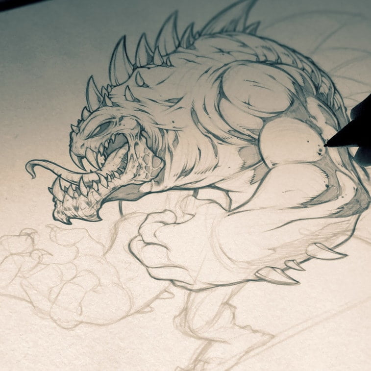
PS: Do you use graphic tablets for illustrations? If so, which one?
CP: I’ve been using a Wacom Intuos 4 and a Cintiq 24HD for a few years now, and I’d be lying if I say it didn’t make my life easier and quicker. That being said, nothing beats the feel of pencil on paper.
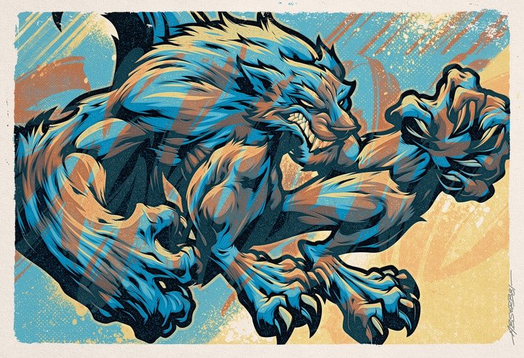
PS: Besides Photoshop and Illustrator, what other programs do you use when creating an illustration?
CP: Illustrator is my goto for any vector work. Photoshop is my goto for coloring and adding effects, and my favorite program for sketching and inking in raster right now is Clip Studio Paint. The brush engine is so good, and you can’t beat the price.
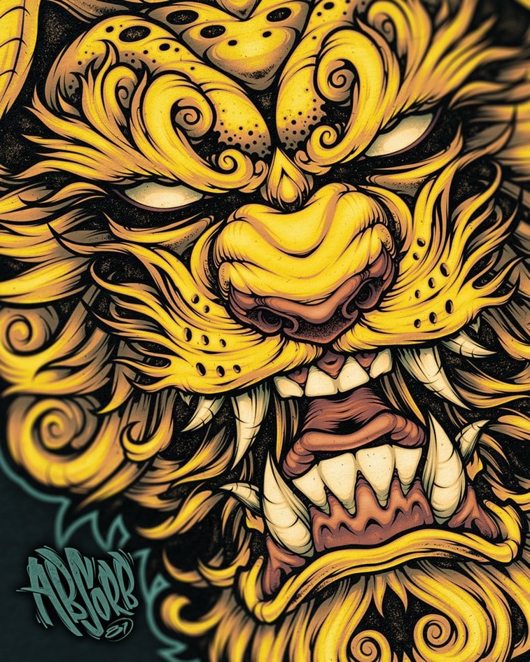
PS: How would you describe your style?
CP: I always say a mix of commercial design, street art, and skate deck graphics.
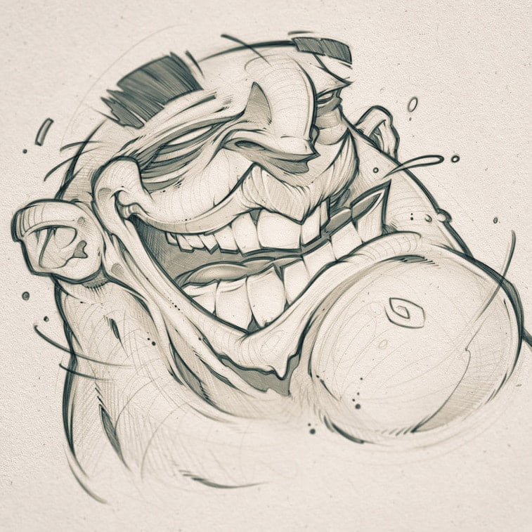
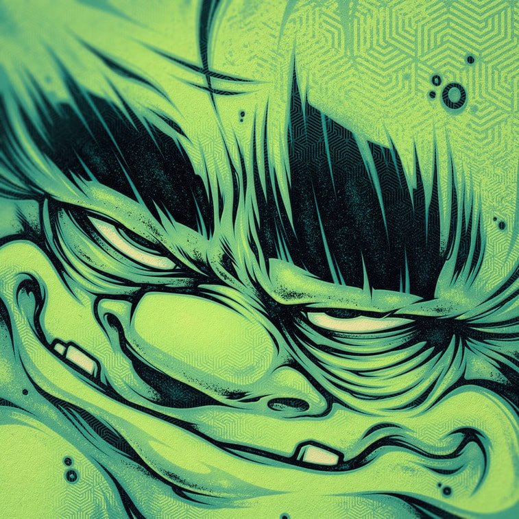
PS: Human faces are rather caricatured, why such practice?
CP: I find that twisting reality is more interesting and enjoyable than just redrawing what I see every day.
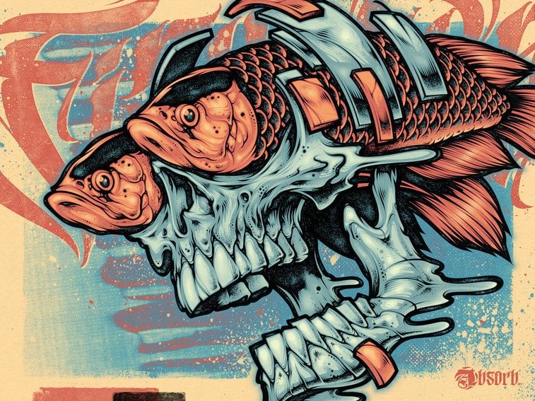
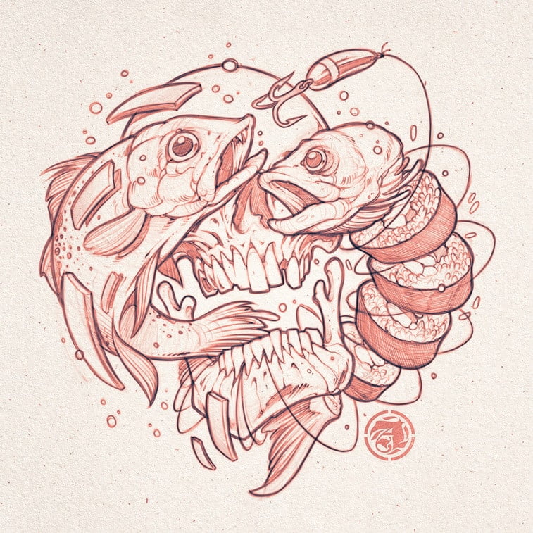
PS: You often combine fish and skulls. Any particular meaning behind that?
CP: I’ve been working off this idea that we talk about doing things more than doing things sometimes. It’s so easy to come up with a plan, and it’s a whole other thing to actually execute it. We watch and admire the doers and sometimes wish we were in their shoes. So the fish represent the ideas we have and the process of sitting on a concept or idea or “soaking,” and the fish skull represents sitting on an idea for a long time or possibly too long. It’s definitely still a work in progress.
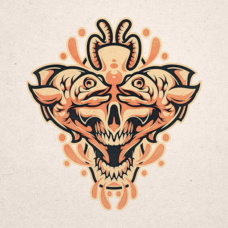
PS: Animals, especially with horns, are very present in your art. Can you tell us why?
CP: No real reason. I just like drawing horns, ha.
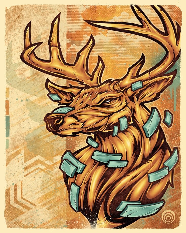
PS: What stories and messages do your works carry?
CP: I try and create something new that might make someone look at things with a fresh perspective. I draw what I’m feeling, and that’s it really. I don’t consider my art to have any deep, complex meaning.
PS: Have you ever been involved in designing a video game, or an animated movie?
CP: I have not, but that would be cool.
PS: Are you satisfied with the circumstances (creativeness, autonomy) of your work?
CP: I’ve never really satisfied, which I guess is a good thing, but I’m excited to see where it goes next. The moment drawing or creating something loses that sense of exploration, it might not be fun anymore.
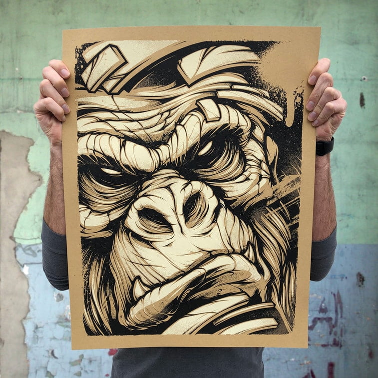
PS: How do you observe the development of your style, and where is it heading now?
CP: Trying to find that balance between consistency and exploring new things can be a hard balance. I’m hoping to fine-tune my style and approach in the next few years.
Thank you Craig, we enjoyed chatting with you!
