When it comes to web design for government agencies, some web designers pull back right away while others accept the challenge in the blink of an eye. Both camps have their reasons for saying either “yay” or “nay” but one thing cannot be denied: creating a government agency website has its perks and guidelines and designers must be up-to-date with every standard and regulation in order to do a good job.
Not to say it’s more demanding than a commercial website, but it certainly does have a lot more “must” features to live up to expectations. Also, most of the time, web designers are required to know a bit more about the related policies and laws which in some cases lay down the foundation of the entire website.
So, let’s dive into the best guidelines for a government agency website design.
Languages
Based on the country, government websites can (or more precisely must) be bilingual or even more. Building fluid and intuitive bilingual government sites are required in countries like Canada, where they must adapt to the demands and evolution of multi-tiered menus both in English and French.
When you’re required to build a website that features more than one language, it’s always pivotal to ensure that the site operates smoothly with both languages and that the content on the site is easy to understand and is written in the spirit of the given languages.
Accessible Website Navigation
A great navigational system should be an important building block for any website but when it comes to government agency websites this feature becomes even more important with more stringent guidelines and rules.
For starters, if you are working on a redesign for the current website, take your time, study it. Look at the analytics data, figure out how users are currently navigating the site. Try your best to identify weak points, and tweak both the navigation and page architecture to create better, more user-friendly solutions right from the mapping and wireframing stages.
Responsive Design
This feature is also an absolute must for any government website. What this means is web designers must open a flexible interface that shows and operates ideally on all devices and screen sizes. Even if you are designing a rather specific site that is only used by a handful of government workers, you should always focus on creating a site that is easily accessible from all devices.
Keep in mind that most current government websites aren’t responsive to all devices and browsers but more and more users try to access them from the mobile which makes responsiveness more and more important. Given the latest search trends, you probably know that they won’t stick around for too long if the site loads only halfway or if they need to zoom in like if the website was made for ants.
So, if you don’t want a significant drop in visitor numbers due to difficulty of use, it’s necessary to develop a website that is mobile-friendly in every aspect.
Subtle Colors and Inclusive Imagery
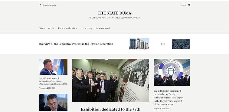
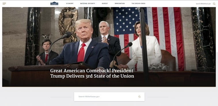
While government websites aren’t really known for their flashy and cutting edge design, this doesn’t mean that they can’t be beautiful. Before starting your work, take your time and study the current “heavy hitters”. Examine websites like the White House, the State Duma, and others. You’ll notice that subtlety is a prevailing feature everywhere.

Try and approach the user interface of the site with subtle colors and with design elements that aren’t obtrusive. This combination might not let you pull off every design trick in the book, but it will certainly give you the creative blueprints to create something prettier than the vast majority of mundane and tired of government agency websites.
One other thing you should strive to achieve through these design guidelines is visual coherence. Make sure that the design and style are prominent on every page. Don’t fall into the pitfall of redesigning only the main page or a set of pages that visitors often visit. This – while might make sense from a time-saving standpoint, makes users skeptical and less likely to use the valuable info that is otherwise on the website.

Make sure to create a modern design overall but also be a minimalist when it comes to fancy features. Chances are, not every user’s device can handle auto play videos and elaborate JavaScript. Keep the most important sections up-to-date, like payment portals and application forms.
Next up on your list should be carefully assessing a compilation of stock photos that adequately represent the demographics of the given state you are creating the website for. Create a fine balance between all ethnicities, cultures, and ages.
This process might be lengthier than you’d first imagine so give yourself additional time to source the images. This feature is crucial since a government agency website has to communicate with every user and earn their trust in the process.
Accessibility
This is an increasing trend which is in part, legal (it protects the rights of people with disabilities) and in part, moral. A government website should be available for every citizen.
Access should be ensured for people with disabilities including, cognitive, auditory, motor, seizure/neurological and visual impairments. The content should be robust, understandable, operable and perceivable.
A great example of a widely accessible government agency website is the website of Serbia’s Ministry of Finance, which incorporates text-to-speech software that enables sound text reading. Thus, the Serbian Ministry’s website is entirely adapted for visually impaired and blind persons.

That being said, take your time to come up with a design that meets these requirements and conduct the necessary accessibility testing before the website becomes live.
Policies and Regulations
This is the part where it can get interesting and tricky. While there is more or less a coherent set of policies which generally regulate web design, website standards and the world wide web in general, different countries can have a different set of bylaws, laws, policies and other documents that can affect your design process directly.
For example, the USA has an extensive list of different policies for all websites and digital services, like the Connected Government Act, Digital Government Strategy or The OMB Circular A-130 Managing Information as a Strategic Resource.
- Copyright – There are also different aspects which have certain policies attached to them. Knowing your way around different Copyright issues can generally save you a lot of time and unnecessary trouble. Plus, this is something you should generally know about.
- Do your research especially if the agency uses private sector info or other materials posted on government public websites.
- Domains – Be careful of domain use since government agency websites are quite restricted in this sense and different countries have different policies regarding domain use and domain names.
- Use required info and link – To evade any complications, it’s always best to know the content and links you are required to feature on the website.
- No Advertising – National public government websites are prohibited to run advertising campaigns and can’t be used for direct or indirect lobbying. Make sure that you keep this in mind while you’re doing your work.
- Managing Records – Know what kind of inventories you should create and keep up with how laws and policies change so you can help the agency archive or delete files and documents that have become outdated or even obsolete.
Summing It Up
By reading this article, you can better understand why some developers stay away from government websites. The development process can be lengthy and sometimes, extensive research must be conducted in order to just get started.
On the other hand, it more or less should be a one-glove-fits-all website with straightforward and simple menus and subpages. No thrills and fancy gadgets, only subtle colors and sophisticated lines.
The key to creating a good website for a government agency lies in the simplicity of the external and the complexity of the internal. The ideal government website should be easy to understand and navigate, yet it should comply with all necessary policies and must include all the necessary features which make it what it is – a government website.


