We bet you’ve never met anyone who said they don’t like to travel. That’s why today, tourism holds one of the most prominent places among the world industries. The near $10 trillion global revenue made by tourism and traveling, in 2019 alone, goes to show just how important traveling is in our lives. As the interest further increases, traveling receives more attention, demands, and fans, but competition as well. An amazing website dedicated to traveling is unique, picturesque, and attention-grabbing – and we’re here to show you how to make one.
Even amid the global lockdown, we’re currently in, traveling demonstrates how an invaluable role it has in contemporary society. The toll was and is yet going to be, taken by many – from travel agencies to tour guides, international hotels to seaside renting houses and apartments, adventure vloggers to travel bloggers.
Although for now, we are unable to travel, it doesn’t stop us from drooling over stunning beach photos, day-dreaming about our next trip thanks to vivid travel blog posts, or even planning our vacation with a little help from renowned adventurers and travel vloggers. And once all this is over, traveling will flourish to unimaginable heights.
Therefore, your travel business has to be ready for the hurl of travelers hungry for new experiences and exotic destinations. In order not to miss your opportunity, read through our tips and tricks for a professional travel website that converts visitors into clients, and provides your business with a competitive edge.
Exquisite Homepage and Landing Pages – Musts for Travel Websites
The first impression is everything, so you’ve got to look the part. There are basically three essentials people interested in traveling will look for on your website – reliable information, stunning visuals, and a trustworthy partner.
Thus, your website has to convey professionalism from the very start, and no better place for that than on the homepage and individual landing pages. These are two types of pages your visitors will first encounter when coming in contact with your brand, and they will make or break visitors’ potential conversion into a client.

Homepage should present who you are and what you do, without misleading or baiting, even unintentionally, your readers into content or offers you don’t have. It has to present everything you are, yet concisely, precisely, and alluringly. Beautiful imagery, sleek design, and to-the-point information help visitors build trust in your brand.
On the other hand, landing pages are designed specifically for a certain service, offer, or type of content. Therefore, travel agencies should focus their landing pages on different destinations and accommodations they offer. As for tour guides – landing pages about the tours, together with some interesting facts will do the trick. Travel bloggers, vloggers, or adventurers – stories and galleries from the places you’ve visited.
Fullscreen & High-Quality Travel Media
A picture is worth a thousand words. Your copy might be on the level of Frost or Keats when it comes to nature descriptions, but a beautiful photograph will always do the trick better.
However, it’s 2020, and images alone are slowly fading into oblivion. On the other side, there are 360° images, videos, virtual tours, VR, etc. If you’re managing a hotel, motel, guest house, bed and breakfast, or any other accommodation service, showcase a gallery of the rooms your guests will stay in. For travel blogger – a video presenting the destination, or a vlog where you share your experiences is a great idea.
Visual content is so crucial because it provides value to your visitors. It’s a tell-tale that what you offer is valid, they can rely on you and you’ve got nothing to hide. All of this will convince them that you’re the choice they ought to make for their next vacation.
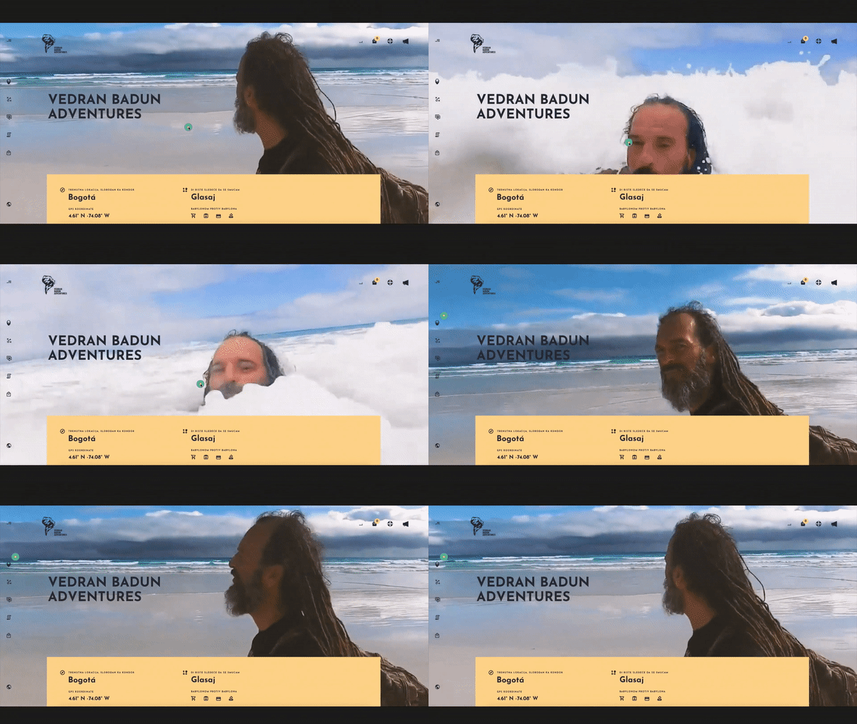
Large and quality media goes without saying. However, there are issues. The first is optimization and website speed which can suffer immensely if images aren’t incorporated in the right manner. The other is their layout – a non-user-friendly one will confuse and dishearten your visitors from further exploring your website. Therefore, it’s probably for the best to consult a professional in the field, who’ll know how to give you the best of both worlds.
Subdued Colors and Fonts
If you’re an already established business, it’s recommended you go with the brand colors. On the other hand, if you’re just setting out into the travel business adventure, think hard about the message you want to convey.
Your brand colors, logo, fonts, and all other branding aspects have to comply with who you are. So, if you’re a seaside resort – blues for the sea and beiges for the beach. Conversely, nature parks, hiking adventurers, or a nature reserve should aim for the greens. It’s important to get inside the head of your potential clients and successfully replicate the mental image they have of their ideal holiday. If your website presents what your visitors imagined, their loyalty is a done deal.
However, colors tend to carry away. Our advice is to keep it simple with two to three colors that are warm and complement each other, and the overall website feel. You should always work with an experienced designer who will create a color palette that draws attention towards your website but doesn’t draw it away from your content and offer. Teaming up with a professional in the field is the way to ensure an appearance unique to your brand, and a favorable user-experience as well.
Visuals are important in traveling business, but the colors and fonts you use on the website should be subdued. It’s a fine line between appealing and distracting, so unless you’re a professional, you’re most likely bound to go overboard. Colors are welcome, but keep them moderate.
Not Minimalism, But Subtlety
Whether you’re thinking about creating or redesigning your travel website, the chances are you’ve done your research online. Among the top trends in web design, today is definitely minimalism. However, will it be your friend in your tourism business as well?
Probably not, and if you wonder why, let’s ponder the idea. First of all, minimalism entails several web design aspects, such as user-friendly interface, hidden navigation, plenty of empty space, experimentation with fonts, no unnecessary detail, etc. While some, like making the website user-friendly and keeping the interface uncluttered, are good ideas to stick to, some practices of minimalism may not be in favor of your tourism website.
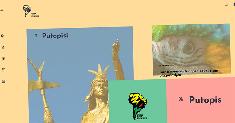
Subtle, unique, and aesthetically pleasing site, on the other hand, does the trick. But how does that look like? Well, grids, collages, and content blocks are definitely favorites for traveling websites.
Different elements for different purposes
Content blocks help a better organization of your, well, content. So, if you own a tourist residence, content blocks can serve to divide images, prices, information, visitor experiences, etc. It will make a clean and clear view of what you offer in a streamlined order.
The grid system is great for blog sections, separating destinations, and others. Collages help your media stay organized in a more fun and lively manner.
Another popular web design trend is text with a transparent background. This is a great space-saver as you don’t have to crop images nor create colored areas for texts. Rather, you incorporate both image and text in the same place. However, text discernibility and readability against the colors of the background image can be a hassle, so it’s a thing to keep in mind.
Websites with dynamic elements tend to perform far better than the plain, old, static ones. Animations and effects attract and engage site visitors, so it’s always a recommendation to incorporate some movement into your website. Yet, it’s a job experienced professionals have to do for you, as mistakes are so easily made. You don’t want everything flying across the screen, nor your website taking ages to load due to these heavy-weight graphics. It’s a bad, bad UX.
Don’t Be Thrifty On Features
Again, we’re walking on eggshells here. The point is to find the right balance between what’s necessary and what’s just piling up. When it comes to the travel industry, it depends on what your main focus of business is.
Travel bloggers and vlogger adventurers will do with the basic sections – a search option, tagging, content sections, contact information. On the other hand, travel agencies, hotels, or tour guides have to step up their features. Besides the already known booking feature, another option that’s increasing in popularity is a calculator. The calculator helps interested parties do the math right on your website of how much will their trip cost.
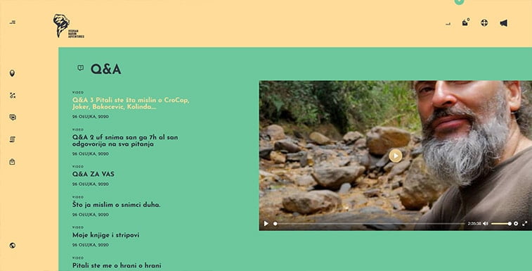
Besides, in-depth filtering options are a great way towards your visitors’ hearts. If you rent accommodation, create filtering based on prices, distance from the city center, beach, or another landmark. If you’re a tour guide, filter your tours based on the visiting points, length, time, etc.
When thinking of filters, try to recall all the questions you were asked throughout your career. Perhaps something that looks pretty obvious or irrelevant to you is actually quite important to your clients.
Be Super-Informative
The age of the Internet has spoiled us into wanting all information here and now. And the traveling industry is no different. Whether you’re a travel vlogger or a tour agency, people come to you for the same thing – and that is information.
If you don’t provide all the info your visitors may want and need, they’ll go off to a different website. And once they’re gone, they aren’t coming back. Therefore, it’s uber important to list all the relevant and useful info, but also less-known or interesting facts about a particular destination.
So, what should you include? Well, make sure you’ve covered the basics. For a travel agency – detailed information about the costs, insurance, seating arrangement, travel time, state border requirements, a brief plan of the trip, additional info in case of travelers’ inability to travel, trip cancellations, etc.
If you’re in the accommodation business, showcase the rooms you rent, their prices, images and description of rooms, inventory, etc. Provide a brief summary of the surrounding area, with special focus on the nearby lines of public transportation, stores, proximity to important city landmarks, and time required to get to them. Give your visitors a visual clue as to where you are and create a map of the area, or – even better, implement Google Maps into your website.
Streamline Your Visitors’ Journey
A common mistake of many travel websites is not providing an all-around offer. By not being all-encompassing, you let your potential clients wander off from your website. So, it’s your task to present them with a solution for every aspect of their trip. However, if your only focus is providing transportation or renting rooms, or organizing tours and excursions, you may now wonder how you could possibly offer all that.
Easy – through linking to other sites that provide services you don’t. If you’re a hotel, you can partner with a transportation agency and link to their website or vice versa. In case you’re not into partnering, you can always include a link to some of the popular booking sites, where your potential clients can find what you don’t offer.
Linking is a great strategy because you don’t only get a backlink from a reliable and popular website, but your visitors get to see that you are a reliable agency as well. Besides, linking helps create a streamlined path for your customers to quickly and easily organize their desired trip.
Partnerships are popular forms of cooperation between businesses and influencers. That’s why, if you’re a traveler, adventurer, or a blogger, plan your website to suit your future partnerships. Unlike businesses, travel influencers are more often sought for when looking for objective and honest reviews and travel stories.
Thus, travel bloggers should be abundant in the information they offer. List your transportation, accommodation, guides to cultural and natural attractions, packing tips, food and language advice, etc. Besides a traditional blog post, you should create separate content blocks for bulleted lists, where you can highlight the most important information.
Of course, contact information, contact forms, Q&As, FAQs, and cookie and privacy policies have to be clearly presented and stated for all your visitors.
Powerful and Reliable Website
Last but not least – the website itself. Everything we discussed above goes down the drain if your website is slow, not optimized, not user-friendly, or unorganized. Therefore, professionally executed website development, a design created by someone experienced in the travel industry, and SEO specifically done for the type of services you offer and keywords your clients search for, are the key to success.
First and foremost is choosing the platform for your website. CMSs, such as WordPress, are a great option as they offer plenty of options and features, yet are easy to use and maintain. If your website will be frequently updated with new pages and media, a WordPress website is definitely the route to take.
On the other hand, frameworks such as Laravel offer stability, endurance, and vastness of possibilities. There’s a variety of different frameworks and software out there, but in order to choose the best one for your travel business, it’s best to meet with the development team and outline them your vision.
Design that puts faith
Research showed that in 94% of the cases, people distrust a website because of its design. We don’t have to say anything more about just how important website design is, and what a major role it has in converting visitors into clients. You’ll find plenty of pre-made themes and templates for travel websites all over the Internet. But these quick and easy solutions come with a price. These templates are usually rigged, without any consideration of UX, SEO, cross-device optimization, and uniqueness of design and features. In addition, they lack support, reliability, and customizability.
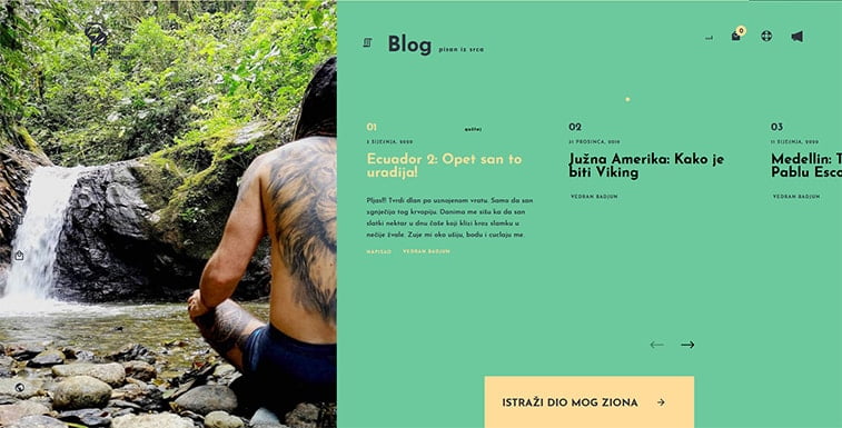
So, instead of going with the templates, opt for a custom design for your website. Custom enables you to implement options you want, create a recognizable brand image across your site, and provide your visitors and clients with a smooth and satisfactory experience. If your website is lagging, doesn’t load, or is difficult to use, the visitors will abandon it and go search somewhere else.
Make your website visible
SEO and marketing efforts are vital as well. Search engine optimization is a process that begins together with website development, and lasts, well, as long as you want your website to perform great. Different digital marketing strategies can also do a tremendous job for your travel brand, so it’s a good idea to consult a marketing expert who can help you find the best one for your goals.
The Takeaway
Creating a website dedicated to traveling is a massive work. Regardless of what your exact niche is, tourism already offers great competition, but an abundance of opportunities as well. If you’re a travel business that provides certain services, make sure you give enough information, images, and booking options. On the other hand, adventurers and bloggers should highlight their experiences and impressions, as people rely on them as independent parties to provide them with the most honest reviews.
It’s always the best to consult and partner up with an experienced agency in the field because doing things solo or dividing tasks between people who aren’t a team and aren’t used to working together can cause huge problems, delays, and misunderstandings. With a great idea, a well-developed plan, and a trustworthy team, your traveling business is bound to go sky high.
