No matter if your business is small or an enterprise, it should be your priority to use your online presence as a marketing tool to attract your potential customers and to generate leads. There are a lot of ways to go about this and you can leverage everything the inbound marketing process uses (internal blogs, email marketing, social media), but in the end, you’ll still need an eye-catching and highly functional website because it’s essential in the lead generation process.
The process of generating new leads is basically attracting new potential customers to your website to make them see what you have to offer, may those be services, the business produces, or physical products. Having a functional and highly responsive website with a beautiful design which can definitely help you in this process, however, there are a few extra steps you could make to boost your site’s lead generating potential and grow your business as a result.
Designing a lead-generating website isn’t an overly uniform process. Different businesses in different niches will have to deploy different or slightly tweaked tactics to get the same or similar results, however, there are a few general guidelines that all websites can follow.
In this article we’ll go through some of the best practices businesses can use to bump up their lead generation numbers. Some of them will probably be pretty self-explanatory, while others might even surprise you. All in all, every single step here aids in your efforts, so read the article carefully and analyze your website to see where you can tweak it.
Stay away from templates on your site
Don’t get us wrong, there’s nothing bad about using templates if you have a WordPress site. They are handy tools, especially at the start of a project as they are nice jumping points to get a head start. However, your site will have the “cookie-cutter” look, which tends to make your business look unprofessional and, even “boring” for customers.
So, instead of using a template, go for a custom-built WordPress theme that can adapt to your business easily. With that, you’ll get a professional look and feel, and you can further customize it to match the look and feel of your brand.
Keep your design consistent on your site
We’ve already touched the importance of having an eye-catchy website design to improve its conversion rate. In order to maximize conversions, you’ll also want to make sure that your site’s design is consistent throughout. You should avoid having a unique design for individual pages.
While it may seem like fun, in practice, a non-cohesive look can run the risk of confusing your visitors and can take out your brand’s feel and personality of the equitation, not to mention the sense of professionalism. So, instead of individualized pages, make sure that all of them form a cohesive unit, with your logo on every page. This will help a lot with your branding efforts and can solidify your professional status in the eyes of your potential customers.
Don’t skip on your contact info
In order to generate leads, and ultimately, turn them into customers, you need to make your contact info visible to your visitors. It might seem a bit redundant to display your contacts on several pages, especially when your intention is to boost your conversion rates and online sales. However, Blue Corona’s web design statistics from 2018 say that as high as 64 percent of site visitors wanted to see the firm’s contact info on their website’s homepage.
This is especially crucial is you are running a small business so make sure to display your contacts on multiple pages. If nothing else, it can bring them a sense of comfort to know they can reach out to you if they face any problems with your products or services (hopefully not).
To add your contact info without being too obtrusive about it is either by adding it to the footer on every page or by placing it on a small bar above your main navigation. This way, your number will always be visible but not distracting users when they are looking at your web pages.
Put forms on your pages with high traffic
There are and always will be people who will prefer talking to you, either by calling you or in person. However, lately, an increasing number of customers prefer to initiate business relationships online. To take advantage of this phenomenon, create forms, and add them to some of your pages. It’s a great way to gain leads and contacts. The less you ask, the more likely will your visitors reach out, and leave their email addresses and names in the process. On the other hand, make sure that the information you’re asking isn’t too little. This might lead to more leads but way fewer quality leads that actually won’t do much to your conversion rates and sales numbers.
So, make sure to find the “sweet spot” when creating your forms and add them to your pages with the highest traffic. You can also check out some of their web form examples to get an even better idea about how these forms should look like.
Go heavy on images and video content
Again, we’re not saying that you should overcrowd your website with photos and videos to overwhelm your visitors. However, videos and photos are great visual assets that easily attract people and are more engaging to them than plain text and website backgrounds.
Video has been a rising trend for years now and marketing professionals predict that it will gain more ground in the forthcoming years. In such an increasingly visual world, you can’t have a boring, text-heavy website. That being said, make sure to include videos and images wherever possible, but make sure they don’t disrupt your website design’s natural flow.
When adding these videos and photos, don’t forget about adding alt text to all visual elements and descriptions. This will further help with your web app’s SEO and make your website more accessible to those who have disabilities.
Gain social proof with testimonials and case studies
We’re living in a world where traditional marketing strategies don’t cut it anymore. You need more to convince your potential customer if you want them to make a purchase. Nowadays, thanks to YouTube and Google, people want to read reviews and to hear testimonials before buying anything new. They want to make sure that the product is worth their money.

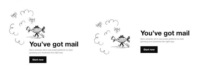
Image source: wordstream.com
To leverage this trend and to attract leads, make sure to place a couple of testimonials and case studies on your website to have that “social proof”. This way, your potential customers can get a better sense of your products and services and can also read/hear/watch positive reviews and testimonies from your previous satisfied customers. Don’t stick to plain text only. Including photos of your previous clients and videos of them reviewing your products or talking about your services can help earn your leads’ trust when they can see an actual face behind those testimonials.
Add buttons and CTAs
Call-to-actions are crucial parts of website conversions and digital marketing in general. These phrases and clickable buttons encourage the site visitor to perform a certain action, like subscribing to your newsletter, contacting you for specific purposes, or ultimately, purchasing your products.
Needless to say, they are extremely important for your marketing and lead generation efforts, so you should add them on every page either in the form of separate buttons or text links. You can also use a unified CTA on every page, to encourage the visitor to take one single action. This can be a really good way to make a bold statement about your brand and encourage sales at the same time, but it might not work for every company and product.
Make smart use of whitespace
With all these lead-generating elements, people often end up integrating all of them and in the end, they are left with a crowded and cluttered website. That’s why it’s also important to make good use of whitespace (negative space), which is the background around your content on the website. Whitespace might just be one of the most important design elements when it comes to generating leads since it ensures that your visitors aren’t overwhelmed by way too many elements on your pages.

Image source: medium.muz.li
According to Sweor, around 38 percent of your visitors will stop engaging with your site if they find the layout or the content unattractive. That’s why it’s important to have a clean and simple website with a nice balance of text, visuals, and whitespace. This can be difficult to achieve on your own, however, professional web designers have mastered this subtle art form and they can help you out if you are experiencing difficulties.
Take a better look at your sales copy
Your design elements might be fine-tuned for generating leads, however, if your sales copy isn’t doing a good job attracting your customers, all your other efforts might prove to end up being futile.
Your sales copy should be inviting, should reinforce trust in your visitors, and encourage them to build a stronger bond with your products, services, or solutions.
If you don’t really fancy using pre-manufactured writing forms, using power words is the way to go. These powerful action words like “feel”, “get”, and “have” are compelling, mainly because of their active tone. By using an action-oriented sales copy, you place your customer in a situation where they already have the product with all its benefits and glory. If you use something like “imagine having”, you are using less powerful words and running the risk of losing an otherwise potential customer.
Clarify your goals first, then test, test, and finally, test
There’s been a lot of talk here about different web design practices to boost lead generation and you can rest assured – they work.
However, before implementing any of these practices, you should define your meaning of an ideal “lead”. If you can pinpoint it exactly, then testing your implementations and monitoring your results will become easier. Also, it will help you give guidance in determining what further actions you should take to turn your leads into customers.
Is your goal to have people fill out your forms or to sign up for your newsletter? If you define your ideal lead, then it will be much easier to adjust your conversion strategies accordingly.
Lastly, there’s one other thing too, which is testing. These tips generally work for every business however, you’ll need to test them out and may even need to tweak them a bit to adjust them to your target audience’s liking. Every business and every situation is unique and if you want to see quality leads, you’ll have to put in the necessary work.
Truth be told, you can literally assess every single aspect of your website (including even your products and their prices) and modify them to better suit your marketing and sales efforts.
The best way to test out crucial design tweaks and any other changes is by using landing or lead generation pages before applying them on your entire website. With these pages, you can test every little tweak and apply the most profitable ones to your website. Also, make sure you use the right analytics and testing software for this to clearly see what’s working and what’s not. This will make a world of a difference.
Conclusion
These 10 steps will surely help you with your efforts and help you generate quality leads. Don’t forget, you should define your goals first, and must be willing to do the necessary testing before applying any drastic design changes. The key things here are patience and the willingness to research your target audience’s online habits. Only then you can create a lead generation strategy that will drive you the results you are after.


