Are you worried about your website’s low conversion rate? Believe it or not, but the industry data show that the average website conversion rate is around 2%, equaling at 2 customers per 100 visitors. For the majority of sites on the realm of the Internet, the reality is far grimmer – with a conversion rate between 0.1% and 0.2% these websites see 1000 visitors yet get a single customer. Because this is not something you wish for your website, we give you our ultimate guide to a conversion rate optimization strategy that actually works.
What is a Website Conversion Rate Optimization?
Conversion is the buzz word of online marketing and the grail to which business owners and advertising experts alike strive. In the simplest terms, the conversion is any completed action that you wanted your website visitors to take. Generally, the conversion is equaled to purchase, of either a product or a service.
Besides, website conversion can be a filled out form, a newsletter subscription, social media share or follow, a reservation or a phone call, a website registration, a download, or any other method of user engagement with your website. What you count as conversion will largely depend on your business models and goals.
The conversion rate is the percentage of those website visitors who turned into loyal clients. You derive it by dividing the number of completed actions on your website with the total number of website visitors and multiplying it by 100.
Your website’s conversion rate is, ultimately, one of the most relevant metrics you’ll come across in your digital marketing efforts. High website traffic on its own means nothing if those visitors wander off without becoming your loyal clients. Having an unprofitable and useless website is definitely not on your checklist, which is why you should turn to finding the right strategy that will help increase conversions on your website.
However, as we’ve mentioned before, different businesses require diverse approaches to conversion rate optimization (CRO). As such, not all marketing strategies and optimization efforts will always fit the bill of your business which is why you should resort to a marketing expert to help you in finding the perfect CRO model for you.
Website Conversion Rate Optimization vs Other Methods
CRO isn’t the only method of increasing your website conversion rate. However, it’s definitely the best initial step towards boosting your website performance.
Instead of optimizing, you could begin advertising via Google, Facebook, or some other popular website. Also, you could offer more discounts, create more campaigns, up your SEO targeting, and much more. Although all these strategies can provide a massive help for your business revenue, they won’t be of any good if the user experience on your website doesn’t entice visitors into converting.
But why conversion rate optimization is that great, you may wonder. Well, it’s because it makes use of everything that’s already there, but just isn’t structured and organized in a proper way.
A case study on the website redesign of the Canadian branch of Walmart suggested that their conversion rate increased by a fifth after making their website responsive on mobile devices. Simple as that. Creating a seamless and intelligent user experience is your first step towards generating more website conversions. Only then can digital marketing and advertising campaigns be beneficial and actually further push your conversion rate.
How to do Website Conversion Rate Optimization
There are 5 great methods of optimizing for an increased website conversion rate. Though they all provide positive results, not all will fit your business goals, which is why we suggest you discuss different options with an expert in the field.
Here are our proven techniques of how to successfully do conversion rate optimization.
A/B testing
This is a super effective and straightforward strategy for determining what does the trick for your visitors. Whether it’s the appearance of your landing page or the looks of a Google ad, A/B testing will prove fruitful in discovering the elements that strike the chord with your target audience.
During A/B testing you basically test different variations of your, for example, landing page. Change the background image, color palette, call-to-action, button color and placement, font family and size, copy, overall page layout, etc. The possibilities are truly endless.
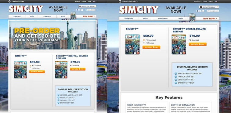
Image source: mobilemarketingmagazine.com
However, beware that you have to make only a single variation between different versions of your landing page. Otherwise, you simply won’t know what prompted the better response from visitors – was it the intensified call-to-action, more quality image, or the improved button location.
In-text call-to-actions
How often do banner ads on websites draw your attention? Apparently, it’s not much different with others as well. There’s a new phenomenon in the online marketing world called banned blindness. Banner blindness is basically a form of selective attention, where website visitors (un)consciously ignore banners and the containing information so that their user experience remains undisturbed.
Banner blindness might explain why this type of advertising is not that feasible. In addition, it can be an incentive to revamp your marketing methods.
Instead of banners, try placing call-to-actions within the text of a blog post. These CTAs are usually in the form of hypertext, added to a heading or the article text itself. Though make sure your anchor-text CTA actually makes sense and flows naturally both within the text and the content of the target page you’re referring to. Linking unrelated content is a bad user-experience, not to mention it can bring you a Google penalty.
Create a sense of urgency
Urgency prompts us to take action. Just think of those many times you bought a piece of clothes just because it was on sale. If there are only a few tickets left, several rooms available, or that special discount lasts only these couple of hours – chances are you’re going to click that button, even though you may not even need the product you just bought.
When faced with too much choice people tend to get paralysis by analysis, i.e. they block from the excessive examination of the variety of choices and ultimately end up choosing nothing.
This is where the sense of urgency comes into play. Just look at how great Booking.com does it – from highlighting the business of the desired area, through offering coupons that are valid only today, all the way to informing you about the number of people interested in the same accommodation as you and the number of rooms left.
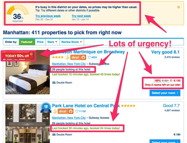
Image source: neilpatel.com
However, don’t fake it. Sooner or later, your visitors will get to the bottom of it, and once they do – their confidence and loyalty are lost for good. Therefore, ensure your urgency is authentic. If there’s no urgency –don’t fabricate it.
Resolve any visitors’ doubts
Imagine this scenario: the offer is a bargain, it’s all you ever wanted, and you’re on the verge of making that conversion, however, hesitation kicks in.
Can I return those pants if they don’t fit? Will I get a refund if I cancel my booking? Is there a money-return policy if I don’t find this software useful? These and potentially hundreds of other questions can dissuade your website visitors from converting. However, this is where your conversion rate optimization strategy kicks in.
Be abundant in information regarding anything that can be of interest to your visitors. Eliminate any uncertainty by adding FAQ and Q&A pages. Provide substantial info on what exactly your offer or product entails. Add your contact so that interested parties can easily reach you and inquire about your services.
Speak the customer’s language
Everyone loves to sound knowledgeable, especially when trying to explain the features and benefits of the products they’re selling. However, if your visitors don’t understand what you offer, how will they ever become your buyers?
Thus, keep your copy simple, without unnecessary terminology that might confuse the potential customers. Instead of an extravagant copy, go for an understandable one. Highlight the benefits your customer will gain and aim for enticing their emotions.
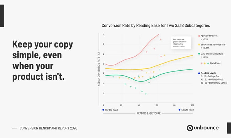
Image source: www.producthunt.com
A great way to do that is through a customer value proposition. A powerfully written CVP pushes your potential customer further down the conversion funnel. Craft your CVP meaningful by differentiating your business from the competition and highlighting the whys of opting for your services.
How Do I benefit From Conversion Rate Optimization?
CRO is a simple and efficient method of making the most of what your website has to offer. Even with the best marketing campaign out there, you won’t see the desired increase in conversion rates if your website doesn’t fulfill the visitors’ expectations.
What conversion rate optimization does is it improves the already existing aspects of your business. Thus, other marketing campaigns, such as Google or Facebook ads, will not be rescuers of your failing online business, but rather a cherry on top of your already fruitful cake.
As such, CRO should always be your first step in the process towards increasing your website’s success. There are plenty of different methods, so when setting out to optimize for conversions, it’s for the best to discuss your wants and options with experienced SEO and marketing experts. Their guidance can help you choose the right way of optimizing your website for success.
