As an owner of a business with an online presence, you are certainly aware of the influence website design has on your market success. However, you also know that web design is not a one-time-only thing, rather it’s an ongoing process. As times change, different digital eras usher in giving space to new web design trends, making features that sold yesterday obsolete today.
With that in mind, site owners and online businesses should keep up with the trends, carefully following the latest developments in the domain of web design and development. Only in this way can they ensure to offer clients and visitors a website that is up-to-date with the latest user behavior trends and expectations.
That’s why compiled a list of the latest top 10 critical facts and stats you should know about web design.
Most Essential Web Design Statistics – Know What Matters
Putting it simply – your website is the way people see you online. It is the purest representation of your company, your brand, your values, and your business message.
In other words, you must put in the effort and time to create and maintain a website that will offer value to your customers, keep your regular clients engaged, and give your potential buyers more than one reason to stay on your website.
In order to create such a website, you need to know the latest trends and stats that matter to businesses the most. By putting these stats to work on your web app, you can rest assured that you’ll conduct business with a website that’s optimized for all the latest trends.
1. According to Design Resources, a staggering 94% of first impressions are related to a website’s design
You know what they say, you can make a good first impression only once. In most cases, you can pull that off with a great website design that can have a long-lasting effect on how your visitors see your business and products.
On a similar note, data gathered by Blue Corona suggests that people will decide within 10 seconds whether they trust your company or not, judged solely on your site’s looks. Also, the same study from Blue Corona stated that users who can only spend a limited amount of time online would always choose to spend that time on a great-looking website rather than on a simple one.
Lastly, around 38% of visitors will stop going to your site if they find your design unattractive (SAG ipl).
What does this mean?
It should be pretty clear that first impressions are crucial when it comes to the first few interactions between your website and your potential customer. So, making a good first impression in 2020 means having a beautiful and elegant design that catches the eye of your visitors.
How to use this to your advantage?
The best way to drive the odds into your favor is to partner up with professionals who know exactly what kind of design will work best for your needs, sends the right message, represents your brand, and looks visually appealing guaranteeing that you make an excellent first impression.
2. Most website credibility comes from the design (75%)
Just as already mentioned above, it takes only 10 seconds for your visitors to decide whether they trust you or not, based solely on your site’s design. Design helps your visitors decide whether you’re a legit business or another con-artist looking for a scam-opportunity.
To ensure that you look professional and trustworthy, a great and reliable design is a must.
Design is especially important in this aspect. According to Blue Corona, nearly half of users prioritize design when it comes to forming an opinion regarding the credibility of a business, and according to SWEOR, it takes them 0,05 seconds to form an opinion about your website after loading. That’s pretty fast, and sometimes, too fast to give businesses the space they need to make a great first impression.
What does this mean?
Again, this means that to create a successful website, you must aim for high-quality, functional, and elegant design.
How to use this to your advantage?
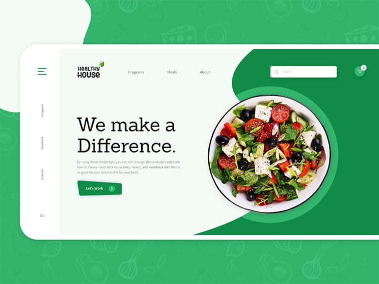
Sit down with your web design agency and take a look at some of the best examples they have to offer and show them a few websites that you like. Give every option a thorough look and start coming up with different ideas together to create an eye-catching site.
3. Over 70% of users have stated abandoning their shopping carts due to poor user experience
Aquent’s research suggests that the global rate for abandoning online shopping carts is 75.52% and that in the vast majority of cases, it’s because of poor user experience. Also, a SWEOR report has shown that 88% of users will never visit a particular site ever again if they had a bad experience with it.
Here’s one more if you need some more convincing about the importance of UX: 89% of consumers will go to your competitors if your site has poor UX. This means that, even though design overpowers usability when it comes to first impressions, in the long run, you need a functional site to keep your customers happy and coming back. That being said, here’s a more positive stat: according to Youpicom, UX can have an ROI of 100%, meaning, it’s totally worth the effort.
What does this mean?
This means that beauty and function should go hand in hand in 2020. To catch your visitors’ eye, you need a website that looks great but to keep those visitors coming back, you need a website that’s functional and easy to use.
How to use this to your advantage?
Consult with your agency and take a good look at your options that will improve the user experience elements of your eCommerce website. See how you can create a more organized navigation system, how you can cut down on loading time, optimize the layout, and so on.
You’ll see that there are a lot of elements you can tweak and make sure to inspect every one of them.
4. According to Toptal around 90% of people who use smartphones say they’d keep on shopping on particular websites when they’re satisfied with its user experience
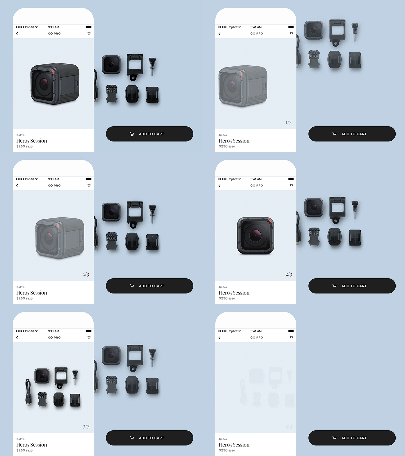
Also, 74% of users are likely to visit mobile-friendly websites more than once. This shouldn’t come as a surprise since mobile internet browsing has been on the rise for a while now, so having a responsive website that looks great across all devices has been a must for some time.
What does this mean?
There’s no shortcut, if you want a site that’s successful and brings you money, you must invest in creating a mobile-friendly web app. That can help you with your Google rankings and a great deal with visibility too.
How to use this to your advantage?
Focus on creating a responsive design since it ensures that your site adapts to any device your visitors use. Optimizing your website to mobile can also help you a great deal so consult with your web design agency so they can point out the best practices you should apply to your site.
5. Around 73% of businesses invest in their web design to make their brand more recognizable
With so many companies investing in design to outdo each other, you can definitely say that the competition is fierce online and if you want to beat them to the punchline, chances are, you too need to focus more on design.
What does this mean?
This stat simply means that in order to give your visitors a truly unique and remarkable experience, you need to have a custom website. We’re not saying that you can’t use pre-made templates, however, with them, chances are, you’ll end up looking like the rest and you’re possibly running the risk of losing precious leads to your competitors.
How to use this to your advantage?
In short, to stand out and make a difference, you need to invest in your website’s design. Custom options can be highly beneficial for your online presence and a good web design agency can help you out with branding as well.
For starters, you can agree to introduce small perks like clickable logos that lead to your homepage. According to Web Alive, nearly 36% of customers click on them to access your home page.
6. A whopping 55% percent of visitors spend less than a quarter of a minute on a page
That’s only 15 seconds… According to Time, to catch your visitor’s eye, you need to create a great design that sticks with them.
This stat seems to reinforce the one we mentioned earlier about people rather staying on a beautifully designed site than an older one if given only 15 minutes to consume content.
So, even though your content is top-notch, chances are, your potential clients won’t notice it unless your design didn’t make a mark with them in the first place.
What does this mean?
Even though the content is still king when it comes to online merchandising, people still need to be visually stimulated to engage with said content. Valuable information means little if your website is not delivering from the visual aspect.
How to use this to your advantage?
We don’t want to get repetitive here, but you see where we’re going with this. To keep your audience engaged, focus on a design that’s elegant, user-friendly, and complements your content. Using elements such as infographics, photos, and videos can make your site more appealing, can help with making a better first impression and can improve the overall content quality on your website.
7. Around 30% of users will switch devices and 38% will stop visiting the website if they are engaged but the page isn’t fully responsive
These stats from Blue Corona show it clear that in some cases, the website can get away with not being totally responsive (hence switching devices) but in most cases, people will simply leave.
Now, they can leave because the content is either too long or because it won’t load properly on the devices they’re using. In both cases, you need to be alert and take action and solve the problem.
What does this mean?
What this means is that your website needs to be fully responsive on all devices, so you’re not running the risk of people leaving when they realize that it won’t load properly on the device they are using at that moment. On the other hand, people also leave because the content is too long. That being said, limit your blog posts to 7-12 minute reads tops. Blog posts in that range provide enough value and information to keep your visitor engaged and wanting more.
How to use this to your advantage?
Take your time to optimize your content and have your agency create a responsive website for you. Chances are, the web design team you’re working with may also offer content management and copywriting services, meaning that you might be able to kill two birds with one stone.
This is especially important since Blue Corona also states that 38% of users will stop visiting a site if they find the content unappealing.
8. Content: people spend 88% more time on video-rich pages
Nowadays, video plays a crucial role in content creation and the statistic above clearly indicates that. Videos can also help you with your site design if used properly and will give more options for your users to engage with.
What does this mean?
Don’t try to force walls of text on your consumers. Instead, focus on delivering content visually. It will help in keeping them on your site for longer.
How to use this to your advantage?
Create a video strategy with your digital marketing and web design managers and see which pages might be best suited for video content on your website.
Don’t overdo it, you don’t need video content on every single page. You don’t want to end up with a crowded website that resembles a circus. Instead, focus on a strategy that concentrates on putting video on all the right places on your website.
9. The power of personalized content: nearly 34% of costumers will make an unplanned purchase if they get content personalized for them
Just as we told you above, a great design is only half of the story. The content you push toward your visitors is the other. If you really want to make them stick around, the content on your site needs to be informative and hold value.
The design gives the first valuable impression, that’s true, but the content helps create the tone for the company. That being said, if you tailor your content to your audience’s liking and needs, chances are, they will purchase from you.
What does this mean?
This means that content is still king and can still heavily influence buyer-decision. Great content can help you generate more leads, conversions, and sales.
How to use this to your advantage?
Sit down with your digital marketing experts and ask them about the latest content trends for your particular industry. Research the most trending topics, formats, and keywords and try to formulate your content accordingly.
10. 83% of people won’t wait more than 3 seconds for a website to load
You’ve probably heard that loading speed is a crucial aspect of every website’s success and as it turns out, it’s even more important than most site owners would suspect. With such a high percentage of people expecting fast websites, having one that’s lagging can cost you customers and money, big time.
On average, people spend 37 seconds on a single article, which makes speed even more crucial. What we are trying to say is, if they aren’t patient enough to read your articles, they definitely won’t wait for your site to load.
Slow sites are a huge monetary problem for businesses since they can lead to a staggering $2.6 billion in revenue loss each year. People are simply used to get the info they need quickly, without delay. That being said, slow sites can potentially deter them from putting items in their shopping carts.
What does this mean?
This is pretty much self-explanatory. Slow sites mean less sales-potential and losses in revenue. People want fast-loading sites and you need to take every step you can to ensure that your site isn’t taking ages to display the info customers are looking for.
How to use this to your advantage?
When discussing design options with your web design team, make sure to touch the topic of site performance as well.
Designers (by default) will be looking for options and features that will keep your site both elegant and fast, but just to make sure both of you are on the same page, ask them what they’ve had in mind and how’s that going to affect the content you already have on your pages. If improving speed means removing a few videos or images from your site, discuss it beforehand.
Examine These Stats and Take Action
With all these stats and insight, you probably know by now the weak points of your website and what to do to fix them.
You may even have most of these things sorted out and need just a few tweaks here and there. Whatever the case may be, make sure to consult with your web development team and digital marketing experts because in most cases, they can give you even more insight and will probably offer a hands-on approach for fixing your specific site-related issues.
Now, get started with optimizing your site and enjoy its fruits!
