In the world of design, comfort is a luxury designers rarely have. The nature of their game demands them to constantly be alert, to constantly evolve their chops and craft. New clients often mean new solutions and a set of new challenges. In such a dynamic scene, it's safe to say that sometimes, the only things that let designers get back in their comfort zones are their trusty design tools.
And it would make perfect sense. Graphic design is a fine mixture of creating art and crafting commercially applicable visual content that sends a message, tells a story. A profession like this demands that they feel comfortable with their tools and know every pro and con of each tool.
Fortunately, in the digital realm, there’s an abundance of tools for designers to use, they are constantly evolving, updating, adding new features, simply becoming better. And ultimately, there comes a time when designers must leave their only comfort zones and venture into a new path. Less dramatically put, there comes a time when they opt for a new design tool to keep up with the demands they’re getting.
That being said, in this mini-series article, we’re going to dive head-first into the world of Figma, one of the most prominent editing tools for designers out there, aiming to give Figma-beginners the anchor they’re looking for to get started.
Enter Figma
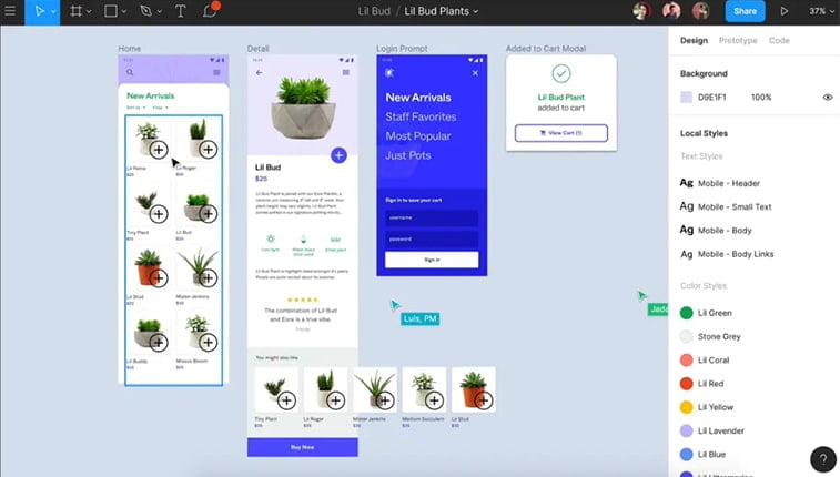
This design tool is used for vector graphics editing and prototyping. While it has macOS and Windows-based offline features, the tool is mostly online. It also has companion applications (called Figma Mirror) for iOS and Android respectively, for viewing Figma prototypes on mobile.
The main feature set of the tool focuses on user experience and user interface design concepts with emphasizing real-time collaboration.
The first iteration of the tool seen its debut on December 3. 2015 as an invite-only preview program and the first public release came one year later, on September 27, 2016.
Three years later, on October 22, 2019, Figma started the Figma Community, where designers could publish their work for others to see and edit. Today, the tool and the company are valued at over $2 billion.
Getting Started – Keeping it Simple
Before we get started, you should know that the aim of this article is to simplify the entire design process and cater mostly to beginners whose current designing background is fairly small, and need an
As such, don’t forget that you shouldn’t just read the info you find here, but make sure you make good use of it as well once you get started with the tool (On the other hand, our upcoming articles on the subject will also cater to those who are planning on moving to Figma).
Also, make sure that you’re familiar with the basic design-concepts like the importance of consistency, white space, or the importance of visual design in the overall UI design arena and philosophy.
A Short Introduction – Figma Basics
As stated before, Figma is a vector-based design tool allowing designers to hammer out projects in real-time. Its pricing is subscription-based with a free plan with limited features, meaning, you’ll eventually need to upgrade if you are looking for the full experience.
Since its debut, this handy tool managed to gain massive popularity and became a go-to and one-stop option for designers across the globe.
Apart from the possibility of real-time collaboration and Google Docs-like commenting, the tool offers other integrated solutions like the obvious graphic design, templates, prototyping, UI and UX design, and wireframing.
Among other handy features, the software runs smoothly both as a desktop-based application and through your browser.
As a bonus, those who prefer Linux can also reap the benefits of Figma on Unix-based systems.
Key Features
What makes Figma stand out among its many established competitors? Let’s find out.
Frames & Layout Grids
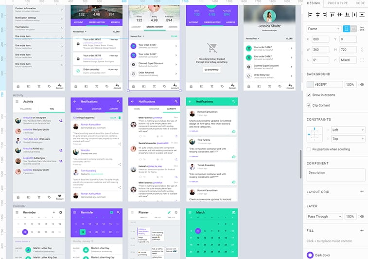
Choosing the preferred frame size should be step one in every project. It determines how the User Interface element will scale in the entire design. You can either access Frames from the top panel or simply by hitting “F” on your keyboard as a shortcut.
You can also simply just drag and start designing right off the bat but with this, you miss out on such finesses like pixel snapping and pixel grid. Oh, and now that we are at the topic of grids, give layout grids a try as they can make your life easier.
One other thing we should mention is the usage of layout grids in Frames, which can also help you speed up the entire design process.
Another great feature in Frames is its masking tool that will hide elements that stick out of the frame itself. This can especially come in handy for beginners.
The layout grid also serves as a handy, yet fairly simple-to-use tool in Figma. It allows designers to control negative spaces and layering elements over the same space, as well as coming up with a unique layout code on the web.
Color Libraries
It’s safe to say that Figma generally tends to simplify the entire color usage process of its users. Once you create and use a particular color setting in a design project, the tool automatically ads it to your library which you can access in the “Document Color” option in the menu where all of your color profiles are saved and ready to be reused again.
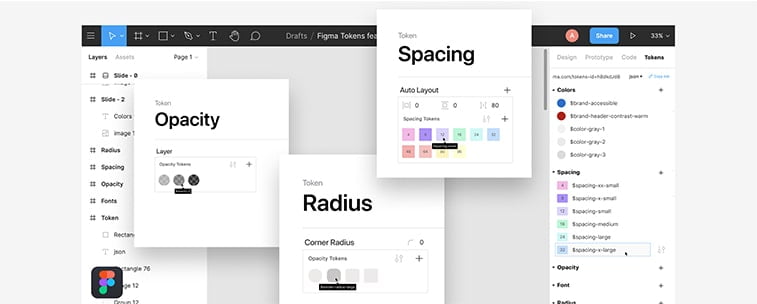
This can come in handy not just to speed up the process by not having to save every color manually and individually, it can help you out a great deal when you are working on a project with similar color shades and schemes. It’s great for achieving consistency with little effort.
Constraints
While we’ve already touched Figma’s mobile-view features (Figma Mirror) it’s also worth mentioning that the Constraints feature also lets you toggle between web and mobile view. This can help you achieve better responsiveness on the fly letting you tweak your project for each respective view for the best outcome for both cases.
Real-Time Collaboration
This might be one of the best features of the Figma tool, allowing for real-time online collaboration on projects with fellow designers.
You can simply just import your file into the board in Figma and get started. While it can get hectic, it can also serve as a great base for hammering out rock-solid projects with colleagues with ease, when you can’t be physically together (just think about the ongoing Coronavirus pandemic, for example).
Notifications & Comments
Figma is totally integrated with Slack making commenting and notifying others on the same project as you as fast and streamlined as possible. It’s a simple and straightforward process – you send your project over to your client or colleague, then they leave comments if they are needed, where they are needed. Later, you can access and cater to them easily without any fuss or confusion.
Prototyping
It’s safe to say that this Figma feature may have changed the way designers present to clients forever.
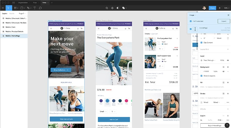
It’s not just about starting and hammering out a project in the same tool but made ongoing presentations a breeze by just sending clients a link where they can interact with the design and giving you their input directly while they get a better idea of the experience and the feel of the upcoming or finished project.
Basic Pros And Cons
Before we get into the deep-end, let us focus on some of the advantages and possible drawbacks out of the box for those who prefer a quick rundown and verdict regarding the basic features.
Pros
- Saves up space – since it’s mostly designed with online work in mind, you don’t need to worry about storage space on your desktop. Figma stores all your work on the cloud, meaning you can access them anywhere and anytime as long as you are connected to the internet. This also means that you don’t need to delete or copy older projects to other hard drives. You can access older files with ease and can make tweaks in minutes if you need to.
- Streamlined and quick workflow – With the numerous templates Figma offers out of the box (such as diagrams, story maps, flowcharts, templates, and pre-made wireframes), speeding up the entire work process isn’t a problem. You just have to choose one of the pre-made templates and you can start designing it to your current needs.
- Real-time goodness – Without any doubt, this has to be one of the best features of Figma, especially for those who are used to working with tools that don’t offer this option. With Figma, you don’t need to mess with sending every single small tweak to your clients or colleagues. You can seamlessly work on the very same project at the same time and making tweaks along the way. Just like with Google Docs, you can leave comments and let your coworkers know if they need to change something or they are simply doing a great job. You can all edit at the same time or you can also disable multi-editing. Also, you can have your copywriter create content on the project while you are working on it, thanks to the copywriting features. Lastly, the real-time feature from browsers is compatible with Mac, Linux, and Windows so if you and your colleagues prefer different operational systems, you can still work together.
Cons
- Real-time can be a hassle – As you may know, the only problem with these is that you almost always have to be online to work like this. When connectivity is an issue, this can be a huge problem. On the other hand, if you aren’t working on a project at the same time, editing can get out of hand and the project can turn chaotic pretty fast.
- File-sharing mishaps – It’s always vital to know who was the last to edit and what the last changes were. Yes, there is a version control function within the tool, however, it will mostly change the entire version while you only wanted to revert a few small elements.
- The cloud and connectivity – When your projects are stored on the cloud and you don’t have an internet connection… Well, you know the drill…
The Takeaway
As you can see, Figma boasts quite a few nice features, even when we are just scratching the surface of its capabilities.
Undoubtedly, one of the most promising features of this tool is the opportunity to work together on a project in real-time. One the other hand, prototyping can also help designers a great deal speeding up a project’s workflow, enabling quicker edits and overall, a more streamlined approach toward meeting client requirements and needs.
This was part one of our mini-series on Figma for beginners. In our next article, we will cover the most important teamwork aspects of the tool and the above-mentioned prototyping features and its uses in a B2B setting.
