Last time, we've discussed the migration process to Figma within an agency and the possible benefits such a move may have for a team.
In the last part of our mini-series, we will revert back to the basics by bringing you the best courses to learn the ins and outs of the tool. On the other hand, we will also cover some of the main differences and similarities to Sketch since most designers tend to come from that particular background.
Making the transition from Sketch
As already mentioned in the first article, Figma is a web-based tool for a design that allows for you and your team to work on a project together in real-time. It’s mostly an online web browser tool, but you can use it online as well, only with limited features.
The online aspect – there are quite a few designers who wonder whether going all-in online is a good thing. A predominantly online tool has its own set of drawbacks but also some serious benefits that can make your professional life a lot easier.
- Automatically shared files in the cloud.
- No downlands, installs, and continuous updates.
- One unified URL for the project – no need for continuous uploads, syncs, PNG arrangements, and so on.
Plus, Figma is a well-performing tool, so it won’t freeze on you even when you have to work on a larger file.
The ecosystem
Sketch is notorious for having an extensive plugin ecosystem that makes the tool a mainstay for most designers.
While Figma clearly lacks the sheer number of plugins when compared to Sketch, there are other areas where designers will gain from making the switch. Some even dare to say that Figma is basically Sketch, Abstract, Craft, InVision, Freehand, Liveshare, Dropbox, and Zeplin all in a single package.
- For starters, it has the same drawing tools that you’ve come to know with Sketch.
- The prototyping features resemble those of InVision and Craft
- The built-in commenting features work the same way you would comment in InVision and Google Docs (you can add comments anywhere on the project), tag colleagues, mark comments, and even integrate it with other tools like Slack.
- Developer Handoffs work pretty much like they do with Zeplin. You can give devs styles, dimensions and you can download images and icons from the project URL. The only difference is that there’s no need to sync artboards after every update.
- Version history makes it easy to revert the project into a previous state or to fork from it.
- Collaboration – a lot has already been told about this already. It works similarly to Freehand.
- When you want to see what others are seeing on their screens, just click on their avatar. and follow their cursor – the same way you did it using InVision Lifeshare.
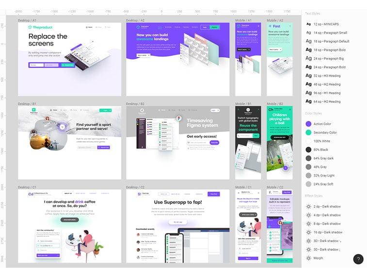
- Components on Figma work similarly to Sketch’s Symbols but gives you more bang for the buck.
- Constraints work like Resizing in Sketch.
- Team Libraries let you update and upload new component collections across projects.

Image source: medium.com
Is There More?
The things we’ve mentioned above are more or less the basic things that might make Figma a worthwhile option for you.
Figma’s real power however is in overall workflow improvement. As such, here are a few ways that can make a fundamental impact on how you and your team hammer out projects.
Iterations are faster thanks to the collab-features
With Figma, reviews, updates, and giving feedback is way faster than it is with the tools you may have used previously. Some changes that took days to make and to approve can now be done in a single day or in minutes. You simply don’t waste any time syncing, messaging people, generating links, and so on.
For instance, with InVision, after syncing your screens for a review, if you need any tweaks, you need to change your design file and re-sync to screens again.
Syncing multi-screen prototypes used to be a hassle with Craft because you’d have to spend a lot of time arranging the correct order of screens in InVision later on.
Oh, and you know very well about those software updates that make all your third-party plugins to crash? Precious time wasted.
A seamless and inclusive process
The real-time collaboration makes it easier for designers to work in parallel and to explore every possible option or design route on the fly. This also means that developers can point out certain technical concerns just in time and also, clients, stakeholders, and managers can also see how the project unfolds and voice their opinion, given that they have the link.
There’s no need for a large number of files anymore since everything can be stored in one single project.
Faster route from design to code
Figma can also give designers the option to structure their projects in a way that can reflect how those designs should or will be coded.
How come? Instead of artboards, Figma uses frames. You can nest a frame inside a bigger one and when you place a small frame over a bigger one, the two get grouped, with the small frame becoming the child frame and the big one the parent frame. The small (child) frames are constrained and positioned relative to the parent frame.
You can use these frames to draw the lines of the different content areas on the screen and then nest your components inside those divided sections.
Such a framing system can be helpful for your colleagues in development because a Figma frame acts somewhat like a container in HTML. When inspecting the designs, they can see the UI elements in the containers meaning that they will have an easier job in mapping out the entire layout and will have a better idea of how the design blueprint looks like.
More consistency across projects, more flexibility, and overall ease of use
While we’ve discussed that there are a few drawbacks to Figma (like the lack of animation features, limited offline work capacity, and the possible hassles of reverting to older project versions), all in all, it tends to help you get the job done faster and also helps you get consistent with your projects.
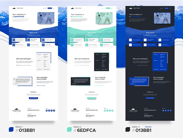
For instance, Figma’s Components are similar to Sketch’s Symbols, with the difference that Components are generally more flexible. This enables you to do more with less.
With Figma, there’s no need to detach layer components from a master and create different UI element versions when you want to change, for example, text size, background color, or border weight like you’d have to do with Symbol Overrides. A similar approach goes for nested components as well.
The naming structure is also more straightforward with Components. When you rename the master component later in the process, it will update every instance, not like Sketch. Creating a category is also easier. You just have to group them in a given frame and name the frame with the category’s name. As such, you can easily reorganize everything just by dragging your components to the right place. Also, finding your components becomes a lot easier because you can see them as a thumbnail list.

Image source: pinimg.com
Learning From The Best Sources
If you’ve been in the world of web development or/and digital marketing for a while, you’re probably aware of the benefits of online courses and tutorials.
They offer you a more comfortable alternative for learning that you can adjust to your own schedule. Some might criticize them for being a rather passive learning experience, however, they can provide you with all the knowledge and tools you need to significantly shorten the learning curve required to use a new piece of software, especially when you need it in a work setting.
Courses & Tutorials
So, without further ado, here are some of the best online courses and tutorials that will help you master Figma and get you back on working with projects in no time.
As you will see, some of these courses will focus on the bare-bone basics of the tool while others will give more insight into how the create designs for specific purposes.
Learn Figma – UI/UX Design Essential Training Course
This course dwells into the details of user interface design with Figma’s tool palette. During the course, you will learn the basics about the software, learn how constraints work and that make your design responsive, along with components to create our own library of design elements. The course also offers valuable insight into the ins and outs of the real-time collaboration feature helping you maximize the gains from working together with your colleagues on the same project.
Toward the end, you will also get the chance to learn about prototyping.
All in all, a valuable course that will help you get started with Figma.
Figma App Design Course For Beginners
This course is also designed to cater to those who want to learn everything about the design tool from the basics all to way to becoming familiar with all the features of Figma. Covering all the fundamentals will help you develop the necessary skills to design beautiful websites, apps, and blogs.
The course will cover the basics of:
- Design principles with Figma
- UX/UI app design
- CSS
- Interaction Design Contra Interactive Design
- Best practices for effective designs
As far as Figma and its capabilities are concerned, you’ll learn about
- The tools UI/UX design elements
- Vector Shapes in Figma
- Slice vs Frame tool
- Figma browser vs Figma desktop
- Constraints and Components
- Figma design principles in UI/UX design
- Time-saving technique
Figma Training Course
This is also a course for beginners focusing mainly on the fundamentals and the basic techniques. It emphasizes mastering the essentials of Figma and giving designers the opportunity to gain experience, learn the basics of UI/UX design, prototyping, and other Figma features like constraints and components. It also includes a part detailing the ins and outs of developer hand-off creation, and several “how-to” mini-courses to gain experience and master the tool.
Figma For UI Design
This course focuses on the essentials of UI design for Figma. It also details different working techniques when it comes to prototyping and developer handoff creation.
The course will let you learn about
- Basic tools and interface
- Best Figma collaboration practices
- How to export graphics
- Figma Components
- Vector Optimization
Figma for UX Design
This course has everything you need to get acquainted with the basics of UX design in Figma. It focuses on the basics of project creation, how to import from Sketch, gives you a detailed description of working with shapes and frames, adding text and formatting it, and so much more.
The course begins with the basics of the tool and how to get started. As you get deeper into the course, you’ll basically learn every essential step that’s necessary for developing competent UX design skills. From the basics to prototyping, this course can be a great source for anyone who wishes to master Figma and the features it has.
Learn Figma: User Interface Design Essentials – UI/UX Design
This course can also be a great starting point for those who know little about the trades of both UI and UX design, apart from also being a beginner with Figma.
Obviously, the course focuses on mastering the Figma app, but it also shifts attention to other important principles such as UI elements and typography.
On the other hand, the course contains a project of designing a finance app from the ground up. It will cover all the techniques, tricks, and tips you need to know to make it fully functional.
This course is a great source for anyone who wants to learn the basics of UI and UX design through the prism of Figma.
Finishing Thoughts
To wrap up all three articles, let’s just keep it short and concise. Clearly, Figma is a step forward in a myriad of ways by offering an almost all-in-one designer package that allows an entire team to work on a project simultaneously and seamlessly. Its advanced features enable teams to use a single platform for the majority of their work significantly improving time-efficiency and overall productivity.
Clearly, Figma was created with teamwork in mind and this is its strongest point. The tool performs best in an organizational environment, with hard-working teams who need a unified system where they can efficiently work together without having to import, export, and sync files unnecessarily. The monthly pricing payment method also reflects that organizational character, meaning that agencies may find the expenses of using Figma more bearable than freelancing individuals who just want to keep up with the trends. We’re not trying to discourage them from using Figma, however, they will need to include those monthly costs in their budget as well.


