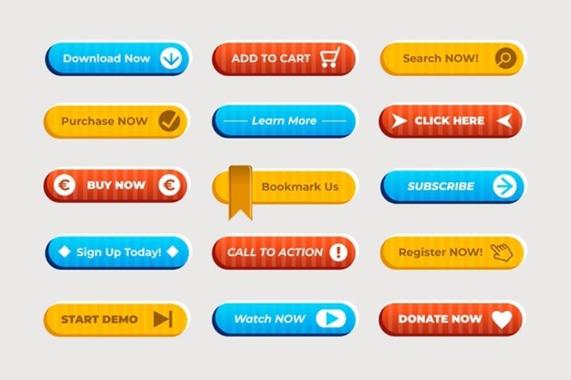
You don't have to be an eCommerce guru to know that CTAs or call-to-action buttons are the bread and butter of most websites and online companies. They're the main mechanisms behind every banner add, knowledge base article, or blog post. Or at least, most of these posts or articles will finish off with instructions about where to click next. Heck, they're pretty much the soul of every landing page.
Simply put, in the digital world, CTAs have a really prestigious place in the marketing hierarchy since they are those instruments that help bring the user one step closer: toward a conversion.
As such, effective CTA buttons should be crafted the clearest way possible and that usually will not come without its own learning curve.
Each and every website, blog post, the ad is different. This means that trial, error, countless tests, and years of experience are pretty much the only things that can groom you into a professional who will be able to come up with CTAs that people will actually click on. But that doesn’t have to be necessarily true in every case.
You’ve probably noticed already that coming up with the best calls to action can be extremely hard, and often, you end up with an ad or piece of content that doesn’t convert at all.
Here to help, this article focuses on some of the best practices when it comes to CTAs. These guidelines should help you with boosting the number of clicks you get and will help you avoid the most common pitfalls.
So, without further ado, here are our top five tips for writing bullet-proof CTAs that will surely click with your audience (pun intended).
Avoid Saying “Click Here”
This might sound a bit counterproductive, but hear us out. Even though this is the most concise and clear it can get, expert experience shows that this approach usually falls short. Mostly because you’re actually instructing people to click. Instead, try telling them why they should click.
So, instead of a direct approach like “click here”, go with a less boring and more benefit-driven action that will shed more light on what the user will do/why they should perform the action. “Learn more” is a great example of that.

Avoid Going Overboard But Make the Action Enticing
Another common problem you can see on multiple websites, ads, blog posts, and landing pages. You’ve seen those CTAs with too many actions? You know, those long and unwieldy calls to actions that manage to confuse users.
And it kind of makes sense. You don’t want to ask your visitors to perform 2 or 3 different things within a CTA because they simply won’t know which action to take. Worse, they might not even know where they should click.
That being said, your best bet is to give only a single directive in your call to action. This way, you avoid confusion and up your chances of actually getting a click.
If you need to provide more info in the meantime, you can simply do it in the text.
Keeping it simple and clear is one thing, but you will want to avoid becoming boring. If your CTA isn’t appealing, people simply won’t click on it.
So, to come up with the best call to action for the actual ad/post/page, a good tactic might want to be putting yourself in the shoes of your audience for a bit. If you were to be just an innocent visitor, would you click on your CTA based on your content, or would you just leave the page? If you don’t find your CTA enticing enough, you can be assured that neither your visitors.
If that’s the case, you might want to rethink your approach regarding the entire piece of content.
Use Action Words and Make Your Point Clear
The truth is, convincing your users to take action is pretty much an art form and will depend on a myriad of things, from web design through content quality to the actual product or service. This is quite a lot, however, a goo action-oriented call to action can give that extra push to your visitors to have them click. That being said, make sure to start your CTAs with an action word (a verb) that shows the users the benefit of clicking and helps you sell.
Also, make sure to take a more thorough look at your CTA copy or content. It needs to align perfectly with the actions you want your users to perform. We’ve already mentioned it but it should be abundantly clear to your users what will happen after they click.
This is utterly important as you will be setting different expectations based on your call to action. Just take a look at “download report” and “schedule a call”. Both can be great but they are for two totally different purposes. And as such, the more the experience of your users will align with their expectations, the more satisfied they will be.
Speak The Same Language As Your Audience And Choose The Right Placement
The tone you use to communicate with on the website should match your brand’s identity and it should also match the tone of the actual call to action. So, first thing’s first, make sure that your content/copy reflects your brand’s tone.
Second, take a look at your brand reviews, sales conversations and study the language of your audience members a bit. Look at recurring phrases and words and work them into your copies and CTAs to make them sound more natural to your audience and thus, yield better results.
Second, you should also be mindful of on-screen CTA placement. Call to action generally needs to be in a visible place where they can grab the attention of your audience. If they can’t notice it, your CTA can be the best in the world, it will most probably go unnoticed.

That being said, if you’re about to publish a large 10-minute read, and planning on jamming on CTA at the very bottom, you might need to rethink your approach. It’s true that some of your most devoted followers will most probably click on your CTA even then, however, this way, you’re risking losing other potentially interested users who just gave up before they’ve reached the bottom of your article.
In cases like these, you might want to have two calls to action. One could be near the top of the page while the other can be near the bottom.
Don’t Try Too Hard To Sell But Be Relentless
You’ve probably experienced how awkward it is when someone tries so hard to sell you something. It’s uncomfortable and can even leave a negative impression. Furthermore, it speaks of desperation and might even leave you cutting ties to that seller/brand in the future.
You don’t want that to happen to your brand, do you?
So, to avoid this, you need to believe in your product and service. Put in the effort into your landing pages and ads. Fill them with useful data, testimonials, and other good stuff that highlight the best qualities of your service/product. Let the product sell itself and don’t try to leave everything to your CTAs.
Even though you need to focus on your products, you should also make an effort to test your CTAs regularly. Knowing which combinations worked the best can go a long way in improving your future campaigns and can help you navigate the world of digital marketing a lot better.
That being said, you should also know that even these best practices above are just mere guidelines. What worked for some might not work for others. Everyone’s audience is a bit different and you need to find the preferences of your users and try to build on them.
The Takeaway
Remember, focus on user gain. Don’t underestimate the power of words and how they can change the outcome of your online endeavors. Take into account the nature of your campaign to create a sense of exclusivity and urgency if necessary but always keep in mind that the CTA you will end up using needs to align with the type of material you’re creating and what you are looking for to achieve with it.
To get the best results, always make sure that you measure the success of your call to action, this way, you will know how to approach every new sales challenge and will give you a better idea of what works the best for your brand.


