Let's be honest for a second and admit it: we all want our daily fixes of caffeine first thing in the morning. And as we don't give that much thought to it in the morning when we finally make it to the kitchen, we kind of have the same strategy when wandering through the supermarket aisles. We don't really make much of it, we either just grab the brand we're already familiar with or grab the one with the most intriguing package design.
And it makes perfect sense. We can’t really smell nor taste the coffee itself, so we use our eyes to select the most attractive product.
This is where unique branding and packaging comes into play. Package design plays an utterly important role in growing the customer base as it’s the first stop of the customer journey. This might come off as a long shot, but the truth is, a nice and attractive design won’t only influence the initial purchase but can help in building consistent brand loyalty as well.
For many of us, grabbing a cup of hot coffee is the ONLY way to start off the day right. To make the experience even more profound and memorable, every coffee brand needs to work on its packaging design. In this article, we explore different ideas so they can help you come up with your own branding and design ideas and start growing that customer base the right way.
Explore your options
Who said that coffee needs to come in a bag, a jar, or a bottle? Whether you’re selling roasted coffee beans or granulated coffee, you don’t need to stick to any kind of restrictions packaging-wise.
That being said, you can go with oval packages that look more like a box of Pringles, or something more brick-like, like a package of tea. The point here is to become creative and to wow your potential customers instantly with your design.
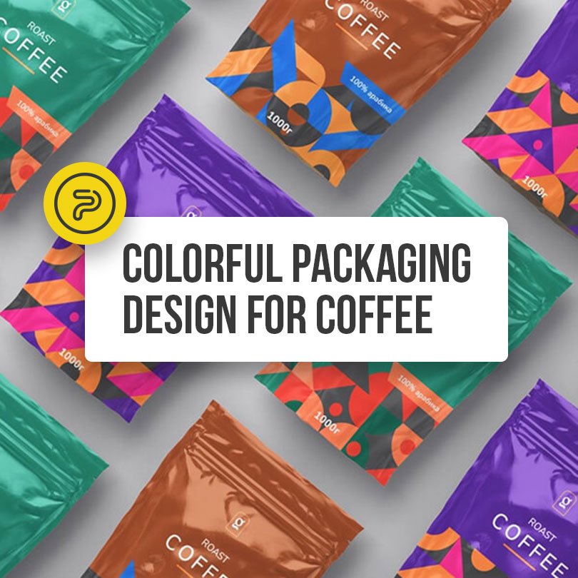
When it comes to the color schemes, you can choose to stick to the tried-and-tested earthy colors, or you can take one step further and use bold colors with a minimalistic design to make a bold statement right off the bat.
Show that you mean business
What else do you need to get your message through than powerful colors and a neat logo design on your packaging? This way, people will know that you’re serious about your brand as think of coffee as more of an experience than your run-of-the-mill drink.
Look for contrasting colors: a black background with your logo shown in large white fonts. Sophisticated typography and a minimalistic approach will help you convey the message. This is a serious beverage for serious people.
Have a sense of humor
You don’t always have to take your brand seriously. Ever heard of Chocolocuras? Their designs play with the words “bronzed coffee” in a clever and funny way, attracting both eyes and funny bones instantly.
Just like this company, if you come up with a whole line of different packaging, your customers can collect them, which will only encourage them to buy more of your products. Now, that’s good marketing right there!
Be scenic and inspirational
As we talked about this before, for some coffee drinkers the beverage is more than just “that black drink that gets them going in the morning”. For some, it’s an experience, a ritual of some sort. Oftentimes, these people like to savor every little gulp of coffee. For them, you can opt to give a product that gives them more even more things to appreciate than just taste.
Embrace the drink’s rich history and heritage and come up with a packaging design that encapsulates certain motifs and scenery that are connected to the drink. You can always look for inspiration in Peruvian or Brazilian landscapes. Especially in the latter case since Brazil is among the largest coffee producers in the world.
Embrace retro aesthetics
Who says you can’t go all-in when it comes to selling coffee? As it’s mostly used as “fuel” to give you the necessary energy and focus to survive the (work)day, why not go with the consumerist marketing approach of the 50s, with retro aesthetics and bold, strong typography making a lasting impression.
Going with a retro design vibe sometimes means sacrificing minimalism but if you pull it off the right way, you can create an enticing package design without looking too “overcrowded”.
It’s in Your hands
All in all, there are countless great ideas (as you can see from these visual examples) and some of them follow different guidelines that we’ve provided here for you. When it comes to design, every brand is a bit different. Your main focus will probably be to find a look and a feel that blends together perfectly with your brand’s message. If you manage to do that, the coffee will pretty much sell itself.


