As a site owner and/or marketer, one of your main goals is to increase the reach of your website and to reach as many people as possible. In order to achieve that, you’ve probably done everything by the book: creating the necessary marketing strategies, developed and nurtured a brand that your audience can associate with, and created a website with all the pivotal bells and whistles.
However, what if, in the process, you unwillingly closed the door to a group of your visitors? Specifically, what if you’ve neglected the needs of your audience with disabilities?
People with disabilities make up roughly 15% of the population across the globe and in the US alone around 61 million people fall into this category or 26%.
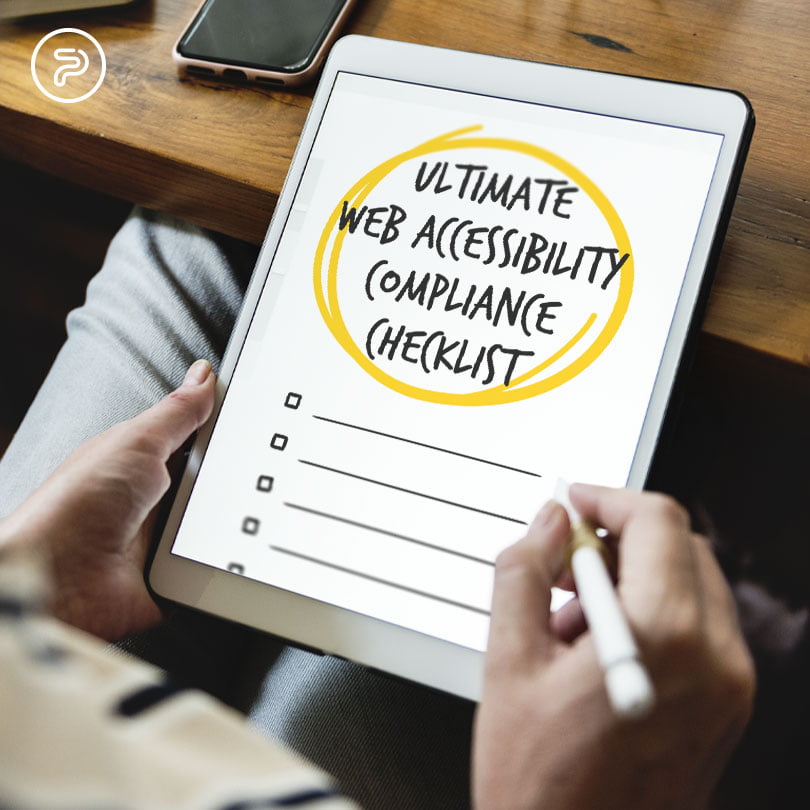
To cater to their needs, you need to adhere to the latest web accessibility guidelines, i.e. removing all the access barriers from your website(s) that make it difficult for your disabled audience to use and/or enjoy your content.
Before we start, you need to understand that disabled internet users are diverse with different impairments that need to be catered to with different approaches.
The five most common categories are:
- Auditory impairments: Hearing loss and deafness
- Visual Impairments: Low vision, color blindness, blindness
- Speech Impairments
- Motor Impairments: paralysis, lack of fine motor control, limited sensation
- Cognitive Impairments: Dyslexia, epilepsy, autism, ADHD, learning disability.
In order to make sure all their needs are met, it’s always a good idea to check the Web Content Accessibility Guidelines and look around for other trending solutions that help people with disabilities use the internet with ease.
WCAG or Web Content Disability Guidelines
These guidelines are a set of international requirements and recommendations published by the Web Accessibility Initiative (WAI), providing detailed instructions and specifications helping site owners understand the needs of disabled users who browse the web. By adhering to the recommendations of the WCAG, web owners allow disabled people to use and enjoy their website and content.
The document was first published in 1995 and since then, it has seen a few updates over the years, with the latest version of the guideline list coming out in 2018.
The WCAG, or the guidelines are based on four different principles:
- Operable: The users can use (operate) the website with the controls they normally use.
- Perceivable: The users can use their senses (hearing, sight, sometimes even touch) to “consume” the content.
- Robust: The websites are accessible from all browsers and platforms.
- Understandable: The sites and the user interfaces are understandable and not confusing to users.
Following Web Content Accessibility Guidelines
Alternatives for non-text content
According to the guidelines, all non-text content needs to have a description to help convey its meaning to users who can’t see it. CAPTCHAS, ASCII, art, images, and emoticons all fall in this category.
In most cases, website users solve this issue with the usage of image alt text or alternative text. Basically, alt texts are short descriptions that developers add to the HTML code to indicate what the image represents. In most cases, content management systems already have mechanisms in place enabling site owners to add these alt texts after uploading the image.
When writing the alt texts, the best route to take is the path of simplicity. No need to use words such as “graphic of” or “image of ”because the screen reader software (which blind people use to browse the internet) usually notifies them if it detects an image. Using simple, descriptive keywords also work, but stuffing the alt text full of keywords might not improve SEO that much and might just only weaken user experience.
When navigating through the cases of alt text, there are a few things to keep in mind. For example, in the case of decorative images, you should have a null alt attribute (alt=””).
When you’re dealing with linked images, things are a bit different. Here, you also need alt text that details the URL destination, not an image description.
Viewing Media Content
Media content (primarily audio and video) is mostly pre-recorded on websites so for the sake of accessibility, it always makes sense to supply them with alternative formats as well.
Audio Material
When it comes to audio content, most site owners tackle the topic of accessibility by providing a transcript as an alternative format. These formats should have a full record of speech that describes everything relevant in the recording.
Video Material
One of the most effective things you can do with video content is to add captions that are synchronized with the audio. They can be closed or open, meaning you can either be able to toggle them on and off or they might be burned into the video.
Most commonly closed captions come in .SRT format, which is basically a text file that contains the dialog for the video and the appropriate timings. This file format can be turned on and off.
Also, avoid auto-captioning as it can potentially misrepresent the dialogue or at least, some parts of it.
Furthermore, adding transcripts to videos can make sense too, not just from the standpoint of accessibility, but SEO as well, as both transcripts and captions can be indexed by Google.
Viewability from Different Platforms
What this means is that you should create content that you can present in different ways afterward without losing any info or structure.
To tackle this challenge, you can often solve most cases by using the right HTML code. Apart from that, using a WYSIWYG editor can also help a lot.
Below are a few examples of using code to improve accessibility.
Emphasis
A simple way to make text stand out is to bold or italic the words or paragraphs that you want to place emphasis on. In most cases, bold is the better option.
Lists
Using numbered or bulleted lists for item groups can help users, in general, to make better sense of the content on your website. From the standpoint of accessibility, screen reader software can tell users just how many items are there, and which of them is being read out (otherwise, screen readers might miss out on the info).
Numbered and bulleted lists are also a great SEO addition, as they might help your content to become a featured Google snippet.
Headings
Headings make for easier page scanning. For people who use screen readers, headings can be a huge help for improved navigation, because the readers can jump directly to the heading and bypass parts of the page that aren’t relevant for the user.
When using headings, it’s important to use them properly (like using heading 1 for page titles and heading 2 for subheadings, etc) because enlarged texts and bolded subheadings might not get recognized by screen readers.
Creating Content That’s Easy to See and Hear
As the name suggests, this guideline is all about making the content that you have on your website easier to “take in”.
Color Usage
Relying on color alone to convey a message or any piece of info might not be the best idea, as color-blind users might not be able to notice the distinction.
For instance, having two buttons to enable or disable a feature without actually having any type of text on the buttons that convey what they do is a bad idea as these people won’t be able to tell the difference between the two functions at first.
Underlining your links in the content can also be a huge help for color blind people who might miss a link that only features differently colored text.
Contrast Challenges
When you stare at your screen in the sunlight and struggle to make sense of the words and the content in general, chances are, you’re facing a contrast problem. Poor contrast can be a deterrent for any user, however, it will most certainly affect the experience of users with low vision conditions.
Being mindful of the color combinations for foreground and background can go a long way. More precisely, good color combos can increase readability for your entire audience.
For example, the guidelines recommend a 4.5:1 contrast ratio for regular text and 3:1 for large text for WCAG AA compliance, meaning, if you want to get the highest rating (AAA) you will have to adhere to even stricter criteria.
Audio Control
Do you have background audio playing on your website? If yes, then make sure that your visitors can have full control over the audio, as in, being able to adjust the volume or stop it altogether. Music or speech that can’t be controlled will interfere with screen readers and will weaken user experience.
Keyboards and Accessibility
What this means is, all the functionality on your website should be accessible through a keyboard as not all users are able to use a mouse. Those with fine motor problems (like people with Parkinson’s disease) will most likely try to access your website without a mouse and for them, making everything accessible with a keyboard can make a huge difference.
To get a better idea of what kind of work has to be done here, just try to use your keyboard to navigate the world wide web for at least a day. No mouses, touchpads, just keys. Look for links and push enter to see whether it will open the destination or not. The same goes for buttons and other actions, such as form submitting and so on.
Timing Adjustments
When completing particular actions on your website, your users should have the option of adjusting time limits. For instance, the elderly or motor-impaired users might take longer to complete a certain action like filling out their form.
One of the best examples of this is making a booking. If there’s a time limit, you users should be allowed to extend it to avoid the page timing out.
Also, alert messages that interrupt browsing should have turn-off features.
Avoiding Flashing and Blinking Content
People who suffer from seizure disorders are sensitive to flashing and blinking content and as such, the guidelines advise avoiding using these features more than 3 times per second to avoid seizures. Also, some people might be sensitive to the parallax scrolling’s motion effect, so limiting its usage might also make sense.
Accommodating Different Input Options
Apart from the traditional keyboard and mouse, enable operating functionality through such devices as touch and speech input devices. More on the developer side of things, going over these with your web dev partners makes a lot of sense.
Designing Predictable Features on Your Website
It’s nothing out of the ordinary that your users expect that the websites they visit behave in ways that they can predict.
For example, if you switch the navigation order on each of your pages, most users would get confused and the majority of them might even abandon your website. Those with cognitive disabilities, blindness or low vision would get confused even more and might even never return to your pages ever again.
That’s why it’s important to keep your design features consistent and predictable, following an easy-to-understand pattern.
Make Sure that Text Content is Grammatically Correct
The text content on your website should be written in a style that’s easy to read and to understand by your audience.
Also, look for grammatical errors and make sure that your text is free of any cognitive errors that may confuse some users.
Keep it simple and straightforward.
Don’t Skip on Good Code
Simply put, make sure that you’re using platforms and developing websites in a way that maximizes compatibility with also the current and future user agents, not to mention most (if possible all) assistive technologies.
Needless to say, this guideline focuses on the technical parameters on web pages, and touch bases on the following points:
- Is the code on your pages valid and correct? Most browsers are smart enough to compensate for certain errors, but most screen readers might not be able to recognize the right controls without the proper code.
- Are all the custom controls built in a way that they can be used correctly? Here’s an example: an accordion might not make a good screen reader user if it’s poorly coded.
- Do your users get regular state messages to tell them the consequences or results of their actions? If your user adds something to their shopping cart, they should be notified.
Providing Tools for Better Navigation
In other words, make it easier for your users to navigate your web pages with the following guidelines:
Defining the Page Titles
All of your web page titles should be descriptive in the sense that they clearly indicate the content in the title tag. When you have well-written title tags, it’s clear both to your users and search engines what your pages are about. Not to mention, this way, they can rank higher and assist your users to find your page when several tabs are open at the same time.
You can simply check your title tag on your pages by hovering the mouse over them in the browser tab.
Descriptive Links
Those users who’ve been using screen readers for a while can have pages read out to them faster. Oftentimes, they will just browse a page by the headings or the link lists. As such, having links that say “learn more” and “click here” might not be sufficient enough as they will have no idea what to expect and where to go.
Section Headings
These headings do a great job breaking up the pages and increasing readability across the board. In all honesty, a wall of text isn’t just difficult to read but knocks down user-friendliness a few notches as well too.
As already stated before, try to focus on using simple language. There are a few apps out there that can help you simplify complex sentences and use simpler words if necessary.
Also, if you have to use unusual words and abbreviations, it’s best to define them to benefit your reader. Either include a simple definition within the text itself or you can simply link to the appropriate definition in a glossary.
Keyboard Focus
A focus ring or visible focus (or even focus indicator) is a visible indication on your buttons, form fields, and links. Users will see such an indication when they are using the tab key to find their way on your pages. Unfortunately, these focus indicators often get forgotten or overlooked in the design process but are pivotal for keyboard users for navigation. Without them, the users don’t know where they are on the page and might even waste time on clickin unnecessary links.
The indicators most commonly show as a highlight on the form fields, links, and buttons, or as an outline and they provide an obvious way for users to see where they are at that given moment on the page.
Wayfinding
If your website is larger than only a few pages, it helps your visitors immensely if they have different methods to reach their desired destination. For instance, people with cognitive and/or visual impairments will find it much more comfortable to use a search facility to get from point A to point B on your website than using the navigation menu.
As such, a well-configured site map can also be a great tool. The map lists all the pages on the site in grouped sections. This also speeds up the navigation process greatly.
Lastly, using breadcrumb navigation can also be a solution, which uses links to let the visitor know where they have been and how to get back.
Offer Assistance in Case of Mistakes
It goes without saying that all of us who have filled out forms on the internet made at least one mistake. If you choose to incorporate useful tips on how to fill out the forms and descriptive, helpful error messages to correct (and help prevent) mistakes.
Also, try to avoid using placeholder text instead of form labels. Placeholders disappear when you start typing. As such, people with memory issues may forget the info they were supposed to type in.
Also, avoid withholding key info until after the user has submitted their form. One such example is character usage when creating a password on a website. If you have complex rules for that, then people need to know them first. Otherwise, they can easily get frustrated at having to go back and fix the problem even though it wasn’t their fault in the first place.
Also, don’t forget to mark the required form fields. It’s frustrating for everybody to go back and submit a form again because it wasn’t obvious from the beginning which fields were required.
Lastly, giving unhelpful error messages that don’t really tell users how to correct their mistakes should also be avoided. For example, “password is invalid” isn’t a totally unhelpful message but it does not tell you how to correct it. Instead try something that helps correct the error even better, like toggling another message that explains capslock sensitivity.
Making Your Content Accessible
At first glance, following all these guidelines may feel a bit too much of a challenge. However, adhering to all of them is well worth the effort.
For starters, you will be able to reach and retain a larger audience because you’ve catered to everyone’s needs. Generally, your site will be more usable, people will have no hard time navigating it and understanding the content. Also, you will probably have better SEO plus using the correct code and multimedia text alternatives will delight both visitors and search engines.
Not to mention, you will protect yourself from any legal and liability risk that happens as a result of a site that’s inaccessible.
Lastly, the internet is for everyone: you’re simply doing the right thing by making it easier for everyone to access it.


