Creating a logo is a thrilling process for both designers and companies, in which creativity merges with knowledge. The logo is a small graphic, an engaging symbol whose purpose is to make a company, organization, or any other entity recognizable.
The function of the logo is communication with customers. It seeks to transmit as much information about the company’s identity as possible. The end goal is to stand out amongst competitors, build loyalty with the existing customers and appeal to potential ones.
Although quite simple at first glance, these are very powerful graphics.
The logo’s secret mightiness lies in the fact that every single aspect of its aesthetics, such as colors, shapes, and letters, is there for a good reason.
Top Logo Design Trends For 2022
It is most certainly very exciting to be a designer these days. Innovation happens daily, trends are numerous and possibilities are limitless. The palette of choices is impressive and leaves no one without inspiration.
At the same time, logo design is dynamic and has to adapt to trends and social changes in general. Good examples of this adaptability are recent rebranding cases we could see in 2021. Many companies such as Burger King, Pfizer, and even the CIA, recently modified or changed their logotypes. This had to be done because old logo solutions no longer suited the digital media environment. Simplifications had to be introduced in order to fit the current development of digital communication and web design. Fewer pixels mean quicker loading, while on the other hand, details are lost in small formats.
Therefore, before we elaborate on top logo and graphic design trends predictions for 2022, we can point out that the current overarching trend of
- simplicity,
- limited color spectrum (growing preference for black, white, gray, and blue colors)
- flatness, and
- adaptability
will most probably persist in the following year as well.
Less Is More: Minimalism
The fundamental rule of minimalism is: be simple, but striking. This means that in the future, logos will have to say even more using fewer elements. In a noisy digital media environment, people don’t have time to deal with ambiguities. Their attention is dispersed, and to gain some of it, a clear and impactful message has to be embedded in a clean and neat design.
If done properly, a minimalist logo can be extremely effective. However, there is a risk to avoid here. Minimalism isn’t about design deprivation, as this only makes a logotype look meager. It’s about removing any excess to reveal the very essentials.
There are many examples of minimalist logos, but probably the most unforgettable ones are Apple’s bitten fruit silhouette, Nike, Twitter and many more.
Asymmetrical/Chaotic
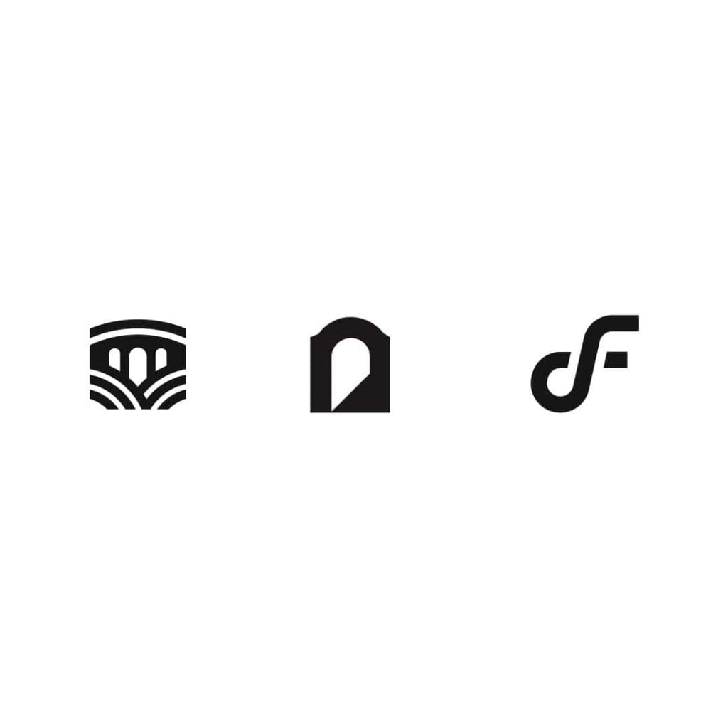
As minimalism has more or less dominated the art for several decades now, this trend rebels against minimalistic austerity.
Logos inspired by asymmetry will catch those eyes which seek a drop of playfulness in the world around them. This trend allows more freedom and allows the designer to experiment with elements and their combination.
And as it usually happens, the biggest risk lies in the greatest strength. A quirky logotype will probably impress the audience and draw attention. However, it is important to properly dose the eccentricity. Otherwise, people might become confused or even frustrated by the hazy design.
There is a very interesting story behind the Starbucks logo. The company changed the logo in 2011, and the result is the graceful sirene that many of us wake up with today. Bogdan Geana, a member of the design team responsible for the current Starbucks logo explained the secrets of this apparently symmetrical design:
“In the end, just for the face part of the drawing, there’s a slight asymmetry to it. It has a bit more shadow on the right side of the face. It felt a bit more human, and felt less like a perfectly cut mask.”
We will never know where Geana and his teammates found inspiration, and if it was in dark bags under our eyes when we are in urgent need of coffee on Monday mornings. Whichever the case, this example shows just how powerful asymmetry can be if properly dosed and applied.
Gradient
While previous trends focus on order and quantity of elements, gradient trend focuses on the colors. Logotypes with gradients have remarkably lively and bright colors. Therefore, they will most probably continue to be popular among the designers.
The gradient trend becomes especially relevant if we remember the global rebranding tendencies mentioned at the beginning of this post. Namely, making solid colors merge in gentle shades is a great opportunity for logo modifications. This is true whether the color play is a central modification, or it is simply a subtle, supporting one.
What should be avoided at all costs here is the risk of making dim, indistinct logotypes if too much color thickness is lost. Therefore, the conical gradient should be accompanied by 3D, shadow, and depth effects.
Perhaps the best example of a gradient logo is the one from Firefox. A burning fox curled up around the globe is their long-term logo, which was significantly stylized in 2019. From then on, the colors come with less saturation and much more gradients.
Flat or Semi-Flat
About a decade ago, a flat logotype design trend started gaining popularity. It quickly became almost a standard. However, the online communities were quite agitated by these types of logos. Even some memes came up, showing overall discontent with the lack of character in such logotype solutions.
But as we all know, old trends tend to come back, in a new look. The same happens with the flat trend in 2022.
The shadows added behind flat logos are now making a delicate but important difference. Look at Google’s Gmail logo: a simple red and white envelope seems to pop up from the surface just a little bit. Simplicity is kept, while monotony is avoided.
It’s a good example of flat logo improvement, which is especially relevant for new businesses. Accepting this variant of modern design sends a strong message. It is easy to animate, adjust to various platforms and provides a clear hierarchy of visuals, leaving space for some important details. Finally, it shows that the brand keeps up with the prevailing fashion and taste of modernity.
Eye-Tricking
Similar to the trend of asymmetry, the idea here is to spark people’s curiosity. In this case, however, the logo does that by tricking the viewer’s perception. The designer shows things that seem to defy the laws of nature and the rules of logic.
There are various methods to achieve that: portraying surreal imagery, adding hidden shapes, playing with depth, using distortion and negative space, and so on.
Depth games proved to be particularly entertaining and engaging, and will therefore be quite popular in the future. What’s important to emphasize here is that it shouldn’t go too far either. Making design too demanding can reduce interest.Toblerone is a good old example of this kind of logotype. Most of us can see a mountain above the red inscription of the brand’s name but – did you ever notice a bear as well? Managing to hide something in such a way can inspire interest, and make people remember the message. Toblerone wanted to tell us that their chocolate comes from the Swiss mountains, but also secretly reminds us that they originate from Bern – a city associated with bears.
Geometrics
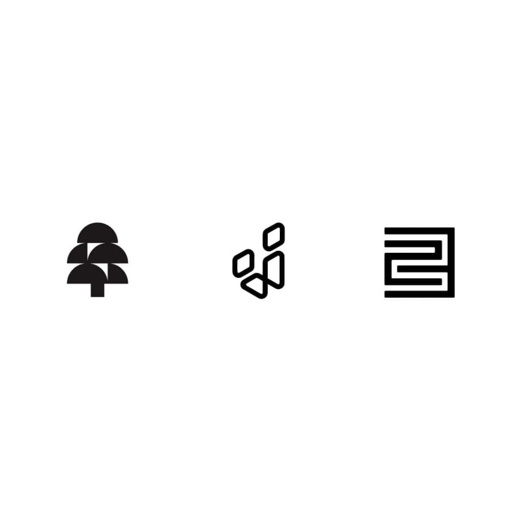
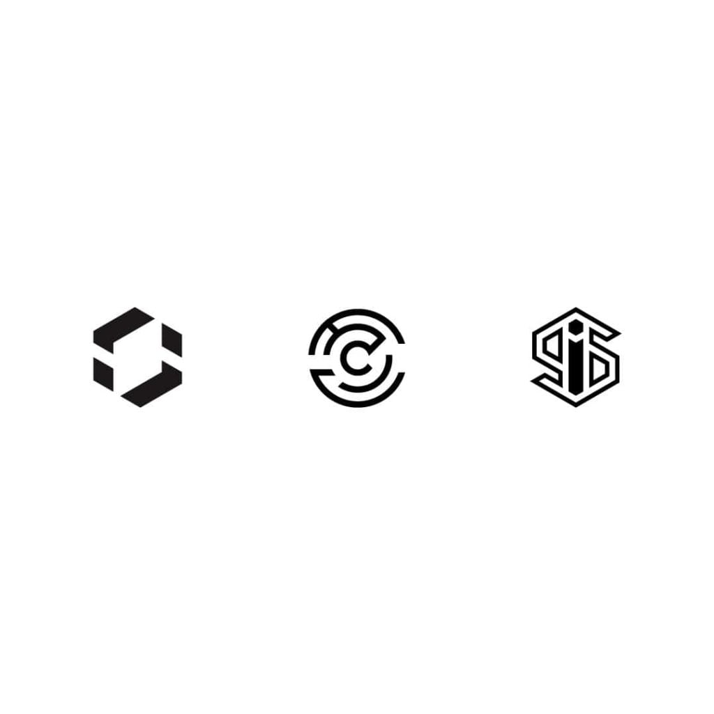
A geometric logotype refers to simple and symmetrical graphics, reducing all forms to basic shapes (squares, circles, triangles). Owners of some of the most popular geometrical logos are AirBnb and a lot of cryptocurrencies, such as Ethereum and Binance Coin.
There are several connotations related to this type of logo design. In general, they are well suitable for brands that aim for futuristic, serious, mathematical, and logical meanings and values. The greatest advantage of this design solution is elegance and seriousness.
Additionally, each of the basic shapes hides a meaning of its own.
An upward triangle signifies masculinity, while a downward one connotes feminity. A circular logo points to businesses dedicated to community values, and care. Finally, a squared design shows professionalism and endurance.
The biggest threat with this design is monotony. There is a limited number of basic shapes, while there are so many brands. Therefore, it could be a good idea to experiment with less popular basic shapes such as ovals, hexagons, or diamonds. For example, Mitsubishi has a well-known logo with three lozenges joining at one spot, which refers to the 19th-century family crest of the company’s founder Iwasaki Yatarō.
Manually Written and Drawn
As we are immersed in the digital world, a whiff of the analog past can sometimes feel good.
A vintage design implies nostalgia for the “old days” when things were much more simple and honest, yet elegant and safe. If this resembles the message a brand wants to send, then a manually written logotype is a perfect choice. Companies such as Cadillac and Unilever know this very well.
A tricky thing about this kind of logo design is that usage of templates and stereotypical symbols are less acceptable. Originality is a must, as the audience presumes that the brand personality behind such a logotype is unique.
Ray-Ban is a quite famous hand-written logo. It imitates handwriting by the diagonal direction of the inscription, but also with the slight asymmetry between the capital letters, where R is a bit larger.
Animated, Mobile
This is quite a new trend, which came up as an alternative to simplifying logos. It usually doesn’t make logos different in any way, but it adds some kind of animated effect to the existing one.
Motion graphics are gaining momentum because of their ability to surprise the eye and draw attention. A study from 2011 shows that our brain is programmed to respond to an animate motion. In the past, it was a matter of evolutionary survival and staying safe.
Today, brands use animation to break the monotony and attract attention more efficiently. It is Netflix that probably has the most recognizable animated logo at the moment.
What’s important about this kind of logotype is that it should be conceived very carefully. The art here is to adjust the speed properly, making it neither too fast nor too slow. Also, since animations aren’t compatible with every platform, an animated logo is perhaps not the best choice for the primary logo. It does, however, make a great option for the secondary logo version that can be used for website presentations or at the beginnings of Instagram videos, for example.
Detailed and Naturalistic
This trend will continue to exist despite all odds, regardless of the overall minimalistic dominance. There will always be people, designers, and companies willing to see vivid images and animations, rather than plain symbols. Shades, details, colors, texture – everything is allowed. Everything except negative spaces!However interesting, it’s tricky to make a good naturalistic logo these days. This is because too many details are hard to notice on small screens and transmit without trouble across so many different platforms. It is possible, though, but recommendable only to the bravest.
It’s not easy to find famous examples of highly-detailed logos – because there aren’t many. Dogecoin logo uses a picture of a famous meme dog inside a circle, resembling the shape of a coin. It usually has the letter D written over the picture.
Final Thoughts
In the future, the further development of social media and technology will keep changing how brands communicate with the audience. The logotype design, as well as the entire process of building brands, website design, social media marketing principles, content marketing – everything will have to become more impactful, flexible, and assertive.
Many famous brands begin to realize this and start changing their logotypes to comply with the new ways we communicate. As for the new brands, it is always a good idea to learn from the best.
