If you’ve spent any time in web design and development, then you pretty much know how important it is to create a website for your visitors that looks great, has stellar content, and is easy to navigate.
Easier said than done, right?
While the definition of good design will differentiate among designers and users, navigation is straightforward. You either find your way easily on the web platform or get lost somewhere. Or, you spend minutes trying to find a page or info.
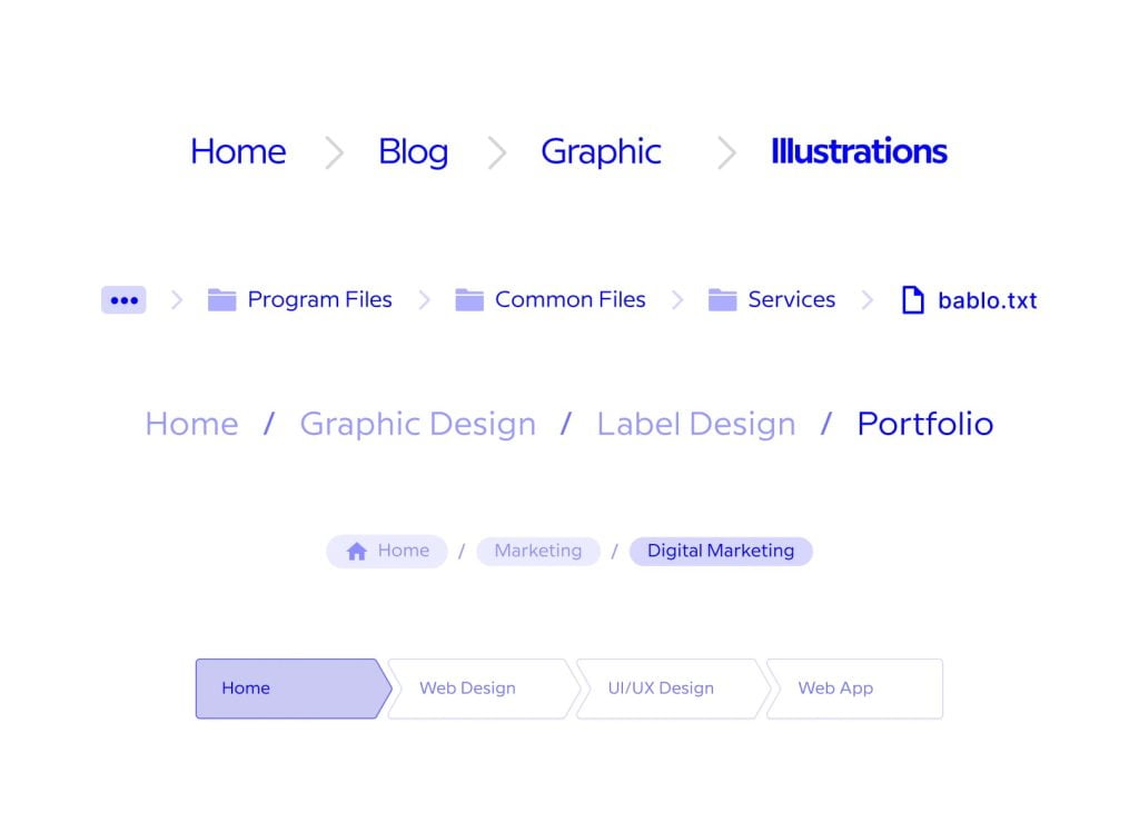
To tackle these issues, quite a few designers opt to use breadcrumb trails as they enable their users to track their path on a website. This helps them make better sense of where they are currently on the website, improving the UX in the process.
That being said, in this blog post, we will talk about breadcrumb navigation, different breadcrumb types, the advantages of this navigation system, best uses, and best practices for breadcrumb navigation.
So, without further ado, let’s dive into it!
Breadcrumb Trails in Web Design – Why?
As you’ve probably guessed from the intro, breadcrumbs are a category of secondary navigation methods aiding site visitors in, well, navigation.
They identify visitor locations within the site hierarchy. This is a handy UX feature that helps with improving user navigation across the website, helping them find the sites they are looking for faster.
They basically show the site’s page hierarchy and enable the user to go to higher-level pages with ease. It’s a really great feature when in eCommerce website development, where you can simply browse different product types with a few clicks without having to go back and forth on the site, trying to find the goods you want to add to your cart.
Trail Types
In essence, there are three different breadcrumb trail types that function differently.
Here they are:
Location Breadcrumbs
These include the user’s location in the site hierarchy. These location-based systems are great for sites that sport multi-level navigation as they help the user get to higher-level pages from their current location easier. It’s a good choice when a site has a lot of deeper-level pages, like product pages, making it an ideal solution for eCommerce platforms.
Path Breadcrumbs
These systems display all the pages users have visited in an orderly fashion, starting with the first page and ending with the current one they are viewing. This type enables to user to get back to previous pages faster than by clicking the “back” button.
Attribute Breadcrumbs
These systems display the attributes of the pages the users are viewing. Attribute systems are also often used by eCommerce platforms, especially when visitors can use product attributes to filter their search.

Breadcrumb Trail Benefits
Webmasters will usually use breadcrumb trails to improve UX, and as such, it can come with a heap of benefits if done right. To give you a better idea, here are only some of the benefits that might come from implementing this navigation system.
To Improve Site Findability
Let’s face it, users don’t really want to spend a lot of time looking for anything. They want to find the needed info as fast as possible. When findability on a website is solid, the user experience becomes a lot better. This is especially true in the case of eCommerce sites. When customers have a hard time finding what they want, they will most probably end up visiting another site and buying the goods there. If they only need a few clicks to find what they’re looking for, your conversion rates improve.
To Reduce Bounce Rates
This is pretty similar to the case above. When your visitors land on your website, they want to find the product they’re interested in as fast as possible. And, what happens when they can’t find the goods? Well, they either try to find the product by using your navigation system and product category pages or leave your website and look for another one.
Sadly, the latter scenario happens more often than the first one.
However, with implementing breadcrumb navigation, visitors will be encouraged to visit the category page, look at the preferred product, and view similar products. This alone can dramatically reduce bounce rates on the website and potentially help improve conversion rates.
And every site owner knows that low bounce rates and high conversion rates are two of the key performance metrics they want to see on their analytics pages.
To Reduce User Frustration
At one point or another, all of us have been there. Trying to find a page, a product, with no luck. No matter how often we visit the website at hand, due to lousy navigation, the pages remain elusive.
It’s frustrating. It really is. As a matter of fact, around 94% of users say that good navigation is their top UX feature? On the other hand, poor navigation is one of the main sources of frustration.
On that end, breadcrumbs can help your visitors know where they are on your site, evading frustration.
Reduce User Action Numbers
As we’ve already discussed, the breadcrumb system allows visitors to reach high-level pages faster. When looking at an eCommerce website, this can be a huge advantage, especially when users are comparing products, prices, etc. When they want to return to the category page to view more, they don’t have to hit “back” over and over again. Instead, they can get back almost instantly by using the breadcrumbs.
When to Use Breadcrumbs?
It goes without saying, that those sites with an intricate and complex hierarchy can highly benefit from using breadcrumb navigation. For eCommerce sites with several product pages and filters, these systems can help a great deal with creating a better UX.
On the same note, these systems might not be utterly necessary with sites with a flat hierarchy. As each page is only a few clicks away from the other, users will intuitively figure out where they are and where they want to go.
Lastly, it might also not be the best move in the case of websites where the pages belong to several categories. Simply put, including all the categories in the breadcrumb trail can be confusing both for the site owner and the visitor, defeating their purpose altogether.
Figuring out whether you should use one shouldn’t be a hassle. Reaching out to your web design agency is a good way to start.
Breadcrumbs in Web Design: Best Practices
Before entrusting a web design and development agency with creating a breadcrumb trail for your site, there are a couple of things you should keep in mind.
For starters, you need a reliable team who know:
● The proper way to use separators between links. You can use a few different methods for separating links in the breadcrumb trail. Make sure to partner with a team of experts who know how to choose the best separation method based on the visual appeal of your website and the breadcrumb type they’re using.
● They know how big the trail should be: Your breadcrumb trail is still secondary navigation, and it shouldn’t be more prominent than your primary system. Good webmasters know this.
● Best placement: Designers know where should the breadcrumb trail be on your site.
● Applying the best hyperlinking practices: Should you link the last item in the trail? A good expert knows.
● Visibility: The trail needs to be visible enough to stand out but not too big to overshadow the main navigation system. Hire a designer who works according to the latest design principles to get the best out of breadcrumbs.
These are only just a few key points you should consider. There’s more, and your agency will probably know every detail.
Measuring Effectiveness
The best way to see whether the breadcrumbs are paying off is by tracking user interactions.
There are a handful of great analysis tools that can help you track user behavior, with heat mapping services and Google Tag Manager that monitors clicking activity.
These tools can help you figure out just how effective your breadcrumbs are. If there’s no user activity with the trail system, it might mean that your agency should redesign it to make it more visible or to use another solution.
Work closely with your design agency to track any changes, to test solutions and tools to find the best method your visitors will love and use.
Getting the Most Out of Your Secondary Navigation
Using a handy breadcrumb system can be a great way to improve user experience on your website and to help boost conversion rates. They have a myriad of advantages. Still, you should know that they don’t work for every website.
If you are thinking about implementing them, discuss the idea with your design agency first. They will be able to help you either with finding the best breadcrumb trail system for your site or coming up with another solution that will yield even better results.


