We’ve entered 2022, and if you’re following the latest graphic design trends, you know that artists and designers are already challenging all the rules.
Experts agree that this year will be a remarkable and exciting one since artists are looking for ways to break all the rules and deem everything possible. Nostalgia, movement, matching “unmixable” elements, the leading graphic design trends of 2022, revolve around open-mindedness and freedom of expression.
This isn’t just something that professionals do. Hobby designers from around the globe are also pushing the boundaries set by previous trends and exploring different styles and approaches that were unheard of last year or even a month ago.
And we, as dedicated web designers, love to research the latest ideas and works that can inspire us as well.
So, will 2022 be a chaotic year in graphic design? Or will the open floodgates set up new standards in the world of design, enforcing agencies and freelance designers alike to take up the latest crazes? Let’s find out the graphic design trends that will mark 2022 that will allow you to optimize your workflow yet create remarkable designs.
1. Mashing Up the Worlds of 2D and 3D
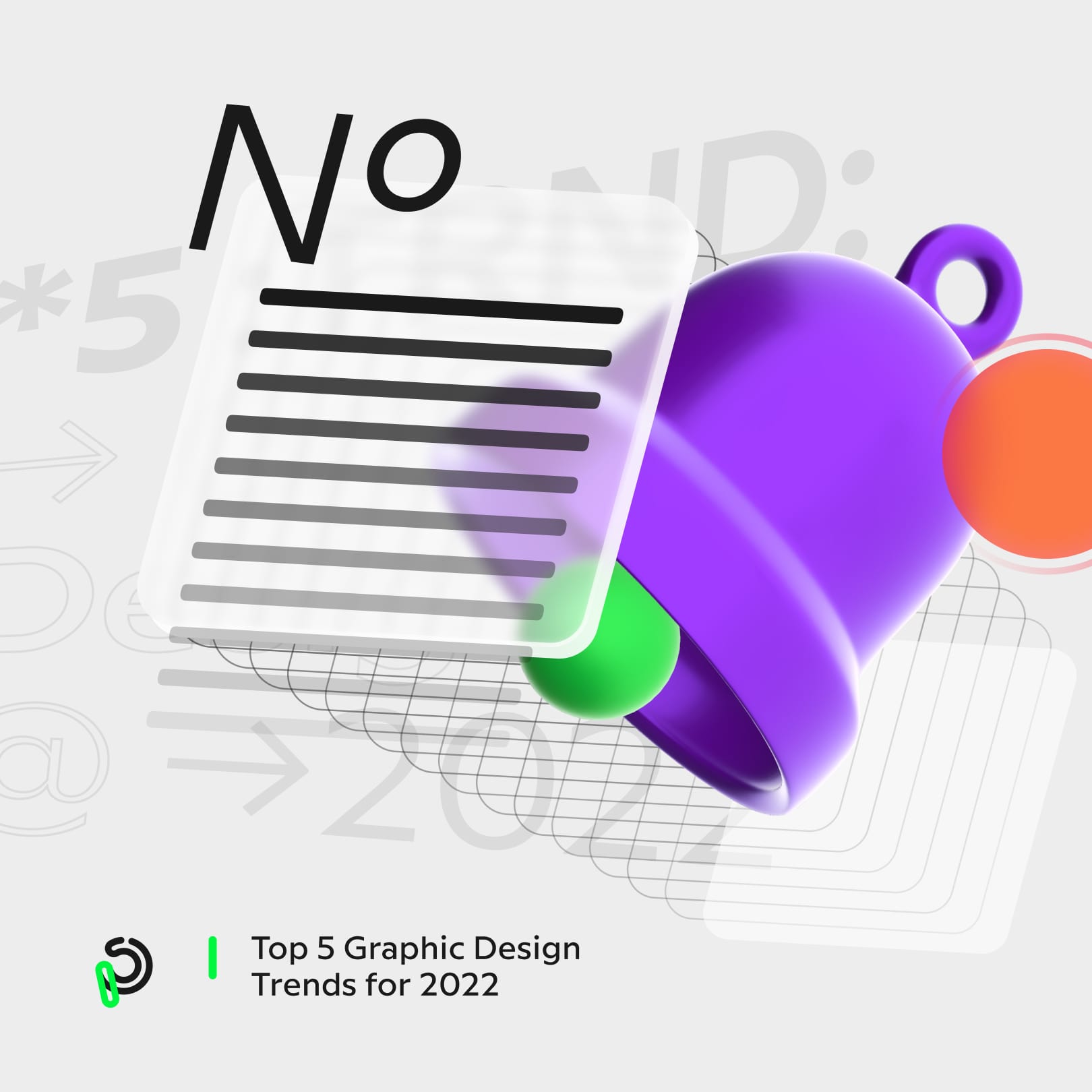
3D trends have been on the rise for some time now. Truth be told, 3D design trends are still evolving, establishing themselves more and more as time goes on. The approach offers an abundance of different possibilities for designers. 3D has room for literally everything, from ultra-realistic 3D visuals blurring the line between real-life and digital to imaginative combinations with various 2D elements.
When it comes to combining 2D and 3D elements, experts say that 2022 will be a pretty exciting year as designers and artists are striving to pack the best of these two worlds into one package.
What’s great about these design ideas is that they are very easy to adapt to almost every illustration and/or animation form. From typography to web design, they can serve as bases for engaging and intricate designs.
Experts say that they will be especially popular in the world of app design.

2. Fonts With a Distinct Twist
In all honesty, when it comes to typography trends, there wasn’t much you could do in recent years. Well, there was, but even then, you had to obey pretty obvious and rigorously set rules.
However, 2022 aims to break every standard and establish a new order in the world of typography too.
This year introduces the Riso print philosophy to typography. Things can be imperfect and still be beautiful. But, how would this translate into this design area? What exactly is this twist?
Simply put, typography can still remain cocooned in its rigorous rules, but small imperfections will make the entire design stand out.
This can be anything that manages to break the order. Anything from a single letter that’s either bigger, smaller, upside down, missing, or written with a different font. A couple of letters can follow a different pattern in order to reveal a different or deeper message. It’s an outstanding way to give graphic design even more depth and gives even brands a chance to bring more to our attention.
The design approach has an even more pronounced effect when showcased with kinetic typography. As the message gets revealed through motion, the “hidden” messages can be even more powerful, still, static designs can also be pretty awesome when done right.
3. Crystals and Glass
If you remember, last year was all about gold. 2021 was all about mimicking the looks and the luxurious feel of actual gold and enhancing design elements with it in every way possible.
Well, if last year was gold, this year is all about glass and crystals. Coupled with the realistic capabilities of 3D technology, this trend manages to push the boundaries of design and puts graphic design in a whole other league.
Generally, the design ideas revolve around transparent matters that use holographic 3D tech, rost grass backgrounds, etc.
The glass trend Introduces an entirely new definition to the words “chic” and “elegant” with a subtle and refined touch that blends incredibly well in this 3D setting.
It’s needless to say that we will probably see these approaches to be pretty popular among established luxury brands in the near future (if they haven’t taken advantage of it already).
4. Candy and Its Inspiring Colors
The truth is, as we are constantly getting bombarded with different types of digital content from all angles of the world wide web, it gets increasingly difficult for designers and content creators to come up with ideas that will make a lasting impression.
As the competition is stiffer than ever, the visual appeal of an app’s, site’s, or page’s design becomes even more crucial as it plays a key role in keeping site visitors engaged.
What makes a design stand out? Eye-catching vibrant colors definitely. Remember the neon craze of yesteryear? 2022 keeps the ball rolling with vibrant candy-colored ideas, enabling designers and artists to elaborate on the neon idea with less protruding colors and more space for creativity.
Sure, pastel is still an outstanding and time-tested option, but if you want to make a bold statement without the over-the-top visual impact of neon colors, candy schemes are a great choice.
What’s the best part is that candy colors can be used in almost all areas of graphic design, from web design, through animation, illustration design, to typography. It’s a great way to draw attention as candy colors tend to be friendly and a bit psychedelic and mesmerizing. All in a good way.
5. Enter Riso Print
We’ve already touched bases on the re-emergence of the Riso print style. It’s only natural. As trends go bolder and bolder, they often go back in time to find something that’s tried and tested and look for ways to incorporate it.

Risograph art is making a true comeback, and the artistic influence it made translates perfectly into modern trends, both digitally and physically.
This decades-old approach was originally created for administrative purposes, but it soon became a handy design tool for artists and designers for creating outstanding works of art, ads, printable posters, and other eye-catching works.
The vivid colors of the Riso print and the slight imperfections like color inconsistency, ink bleed, alignment imperfections, and rough textures make the entire concept unique and imperfectly beautiful.
Pushing All Boundaries in 2022
As you can see, this year will be a unique one in many aspects. Some of the trends we listed here feed off of principles that were established a few years ago, while others stretch decades back.
On the other hand, you can see that this year, designers and artists are all about bending the rules and establishing new standards in the world of design. Even more rigorous areas of design (like typography) are being challenged, making us think about what we can and can’t do in graphic design.


