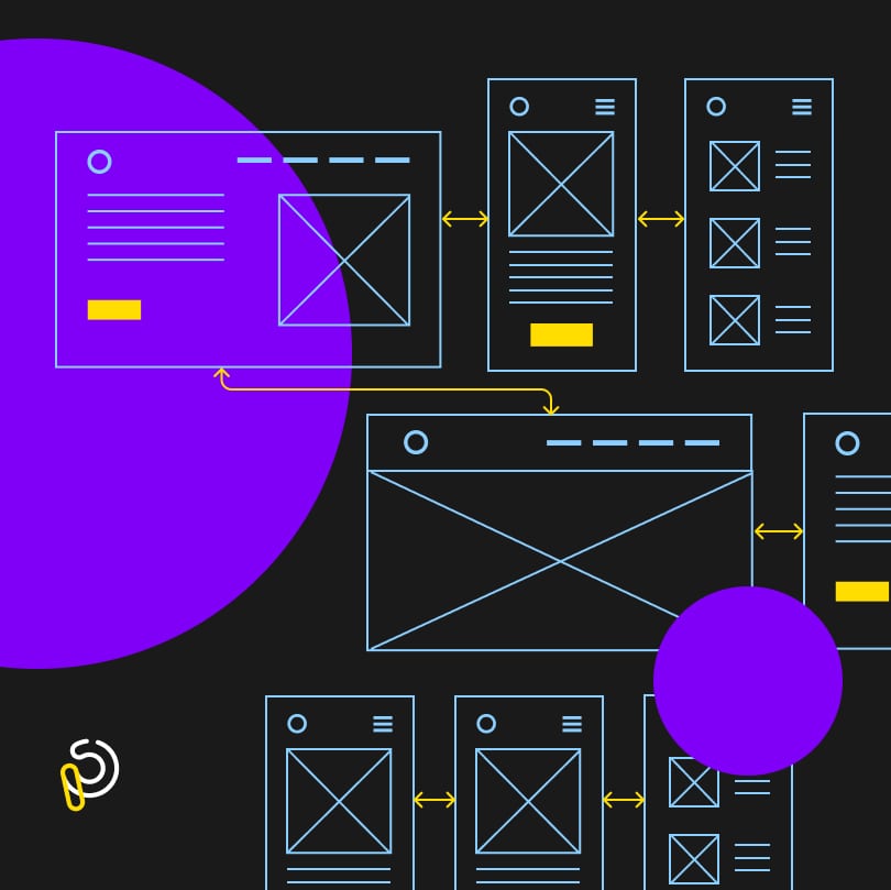
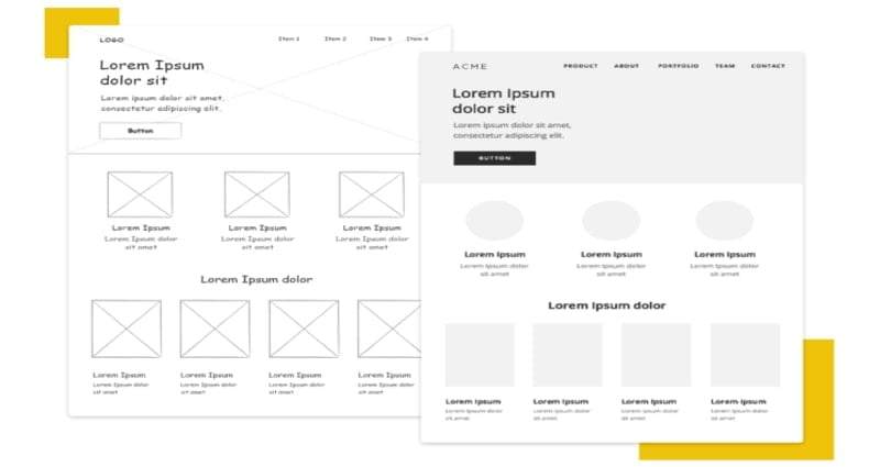
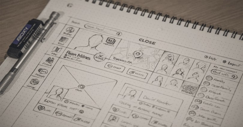
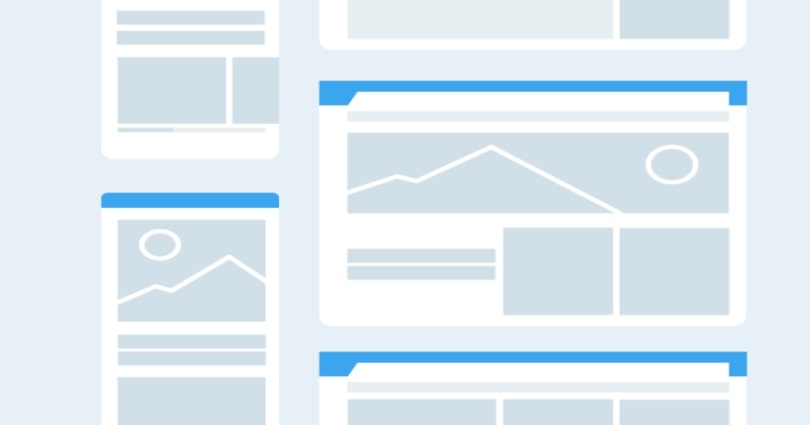
A wireframe is created by UX designers to show the basic functionality of websites, mobile apps, or any screen-based product that involves a user interface. It is a visual guide that plays an important part in the early stages of the design process because it tells other stakeholders about the layout, functionality, and interaction design. Regarding the project’s complexity, a wireframe can be sketched on paper or whiteboard or with a wireframing tool.
In this post, we will share with you what makes a good wireframe, what is the most important part of wireframing, how to make a good wireframe and also the best tools to wireframe. Now let’s dive in.
What Makes a Good UX Wireframe?
Why are some wireframes effective and others not? How to make sure your wireframes really work well? Here are the answers.
Fairly appealing visual design
As designers often use the same tools to create both wireframes and interfaces, it is always tempting for them to fall into interface design at the wireframing stage. Do bear in mind that an effective wireframe is about content placement and user flows, not about visual design. Just keep the wireframe simple because a very beautiful wireframe limits the UI designers’ creativity.
Default style
From the clients’ view, an effective wireframe may look a bit basic or empty because it keeps visual design as invisible as possible. It may be presented in a default style with black text, grey backgrounds, and a few highlighted buttons and links. Only in this way, other stakeholders will not be distracted from the visual design and concentrate on the basic functionality of a digital product.
Clear user flow
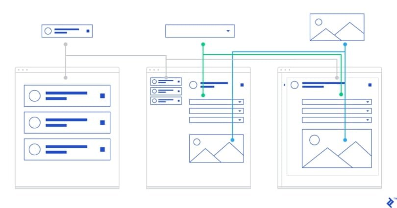
If you want to get your wireframe tested, you should focus on how a user moves through your product from screen to screen at the wireframing stage. You can use a wireframing tool like Mockplus to create interactive prototypes, thus clearly showing test participants the flow through your app/website with clickable elements.
Realistic content
Having realistic content in a wireframe will make it feel more complete, and make testing less confusing. Do always use real content if you can, but if it’s not possible, you can add in simple content you’ve written, or copy-paste some relevant content from PRD documents or partially written drafts. Do not use too many images in your wireframe, which will change the weight of different elements in the design and bias user tests.
12 Best Tips for Building Effective UX Wireframes
Here are the best 15 tips to help you create great, efficient wireframes.
Start with user research
Who is the target audience of your project? What are their real needs? How can you help them solve their problems? Gathering this information can help you better your users so that you can better prepare yourself and your team to visualize your product and services in advance. This rule comes first because it helps you build a clear user persona.
Sketch your wireframe
During the ideation phase, designers need to generate as many ideas as possible and iterate toward the best possible solution. Sketching your wireframe with pen and paper can be very easy for you to express your ideas. It gives you a better idea of your overall plan and also makes your clients and team members understand the basic concept of the user experience so that they can provide you with the necessary content.
Know your wireframe types
There are two main types of wireframes: low-fidelity wireframes and high-fidelity wireframes. A low-fidelity one omits any detail that could potentially be a distraction and its primary purpose is to get you started. While a high-fidelity one boasts pixel-specific layouts and it can be saved for the latter stages of the product’s design cycle. Making your wireframing goal clear will let you know what type of wireframe you are going to create.
Meet your clients’ expectations
Before you start wireframing, you need to talk with the clients about how you will present your wireframe and know their expectations. If your work does not meet their expectations, they won’t hear you no matter how amazing and clean the design is. Therefore, you should be more proactive and communicate clearly and often from the beginning to avoid failed expectations.
Skip the color
The primary goal of a wireframe is to lay out content, page, and view elements, and to describe the app’s functionality. Using any elements of design, such as color, can be distracting. If you want to use color in your wireframes, use it sparingly and consistently. Otherwise, your team members or clients will be distracted from the conversation on the experience to the visual design.
Maintain consistency
Your wireframes are meant to create a conversation about the overall user experience. Before you start wireframing, you need to make it clear what you will include, and what you won’t. Your typography spacing and buttons should all be consistent across every version and wireframe you create, which allows other team members or stakeholders to focus on the layout of your wireframe, rather than its idiosyncrasies.
Do not work alone
Sharing your ideas with others will double their potential for greatness. Just get past your ego and reach out for some feedback, which is one of the best ways to produce a better end result. If you present your wireframe layouts to your team or clients, you can get their feedback at an early stage and they may also make you notice the absence of some simple things. Therefore, wireframing is a collaborative process and should not be done alone.
Annotate your wireframe when needed
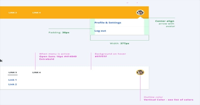
Wireframes are blueprints that guide designers and developers to build the app or website. If you want to make your wireframe easy to read and remove misunderstandings between you and other stakeholders, just add annotations when needed and where appropriate. This is a valuable way to bridge the gap between designers, developers and other stakeholders.
Create reusable styles and symbols
There are many wireframing tools available for you to choose from. Most of them have the capability to create and reuse styles and symbols. Creating reusable styles and symbols will save your effort and help you speed up your design process. It can also help to keep your wireframes consistent.
Iterate your wireframe
For this part, you need to add the missing details or steps that you overlooked in the initial generation phase to iterate your wireframe. You can involve other team members who know the problem and use cases as design collaborators to give you some feedback. Try to have a few different variations for each screen but do not strive for the final design here. Also leave out finer details like fonts, colors, and interaction details that will be distracting for others.
Test your wireframe
As a usability testing technique, wireframe testing allows you to get insight into the most effective layout and outline of a page, and how to best present information to users. By wireframe testing, you can let your team continue iterating and provides valuable insight to your client or stakeholders. It is an indispensable part at the early stages of the design process.
Apply what you have learned
Congratulations! Your wireframe is done. After the whole wireframing process, you have learned more about the user, the client, your stakeholders, and your team’s feedback. Just apply what you have learned to build a fantastic end product that meets the needs of your organization, or your client. You can also take similar approaches to other projects or tasks in the future, helping to build a collaborative environment that’s focused on success.
5 Best UX Wireframing Tools for Designers
Here are the top 5 wireframing tools to help you craft your perfect idea.
Mockplus
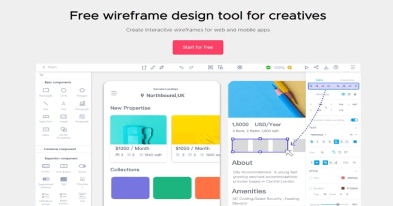
Mockplus is an easy-to-use wireframing tool that allows you to create interactive wireframe designs that look like fully functional prototypes. It provides more than 3,000 built-in icons, components, and templates, allowing you to use the simple drag-and-drop interface to quickly create wireframes. Speaking of user testing, Mockplus offers eight ways to preview and test your interactive wireframes. You can also directly get feedback from your team or other stakeholders on your design pages. It is a great choice that covers the whole design process from ideation to hand- off to developers.
Justinmind
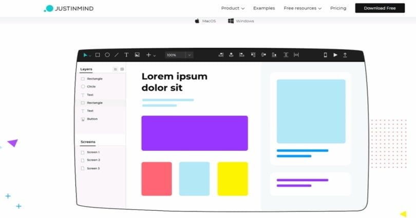
Justinmind is another flexible tool that allows you to create everything from rough wireframes to working prototypes. It offers custom styling, so you can add rounded corners, cropped images or color gradients, or import graphics by dragging them into the browser. As for user testing, you can preview and test your wireframes and validate the complete experience in any browser, or as if viewed on a real device. However, this tool is somewhat less complicated and much more suitable for non-techies.
Framer
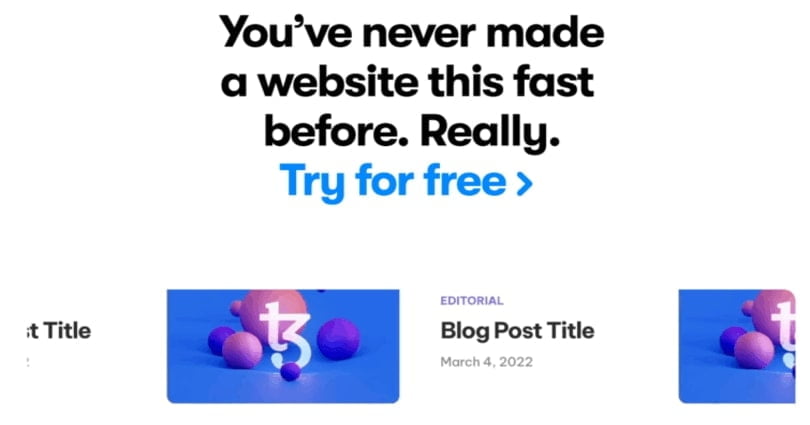
Framer is a web-based tool that allows you to create a website on a freeform canvas. With Framer, you do not need to start your wireframing design from scratch. It provides tons of ready-made starter kits and UI components to accelerate the wireframing process. You can also customize the included elements to control and see how they animate across screen transitions. With the ability to add up to two editions and create three projects, Framer is one of the best free wireframe tools on the market.
Axure RP
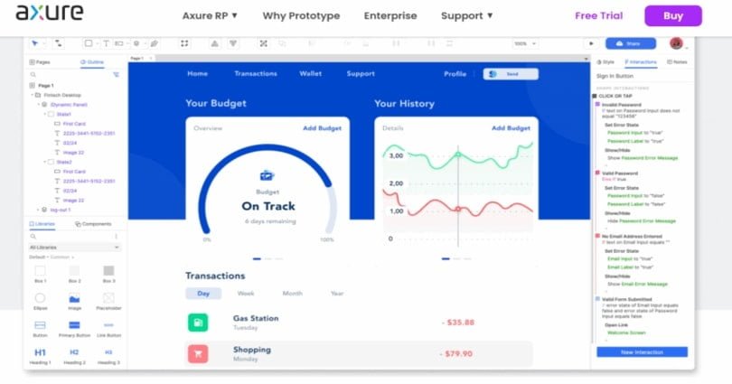
Axure RP is a dedicated wireframe tool that allows UX/UI designers to create their mockups and handoff directly to development teams. Designers can create interactive HTML mockups for both websites and apps and view your design on your phone. This wireframing tool provides symbol override features, a developer inspect mode, animation effects, cloud storage and sharing, CSS exporting and documentation. It is a great choice for experienced UX professionals because it needs a learning curve.
cc
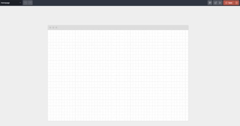
Wireframe.cc is a no-frills, browser-based wireframing tool for designers on the go. You do not need to download any software, and its drag-and-drop interface is very intuitive for designers. With its free version, you can create a simple wireframe in minutes and customize its grid layout, typography, canvas size, and more. If you want to create clickable wireframes, or to export to PNG and PDF formats, you’ll need to have a premium account that runs from $16 to $99 a month depending on your needs. In a word, it is a great option for those looking to create simple, low-fidelity wireframes quickly.
Conclusion
When it comes to wireframe, the key is to keep it simple. The primary goal of wireframing is to identify the navigation, page elements, and flow of information that a visitor or user will see on their given screen. Following the above guidelines and tips can help you create effective wireframes that allow you to easily experiment with new ideas. What’s more, do take your time to figure out the best wireframing tool that fits your needs, which helps to speed up your whole design process.
