Is there any advertising form that guarantees more brand visibility than billboards? – Probably not.
Everyone can notice billboards due to their size and effectiveness – drivers, pedestrians, and those looking through nearby windows. Seventy-one percent of people consciously look at billboard messages while driving, and 26 percent of consumers visit a store after seeing an out-of-home (OOH) ad. Moreover, 37 percent of pedestrians look at billboards every time they pass.
Eye-catching and Memorable
These gigantic ads catch people’s attention, invite them to look, and often become a part of their conversations afterward. Even though they have been around since the early-1880s, they are still just as captivating and practical.
It is hard to miss them, and they often make a more lasting impact than small posters, flyers, and online marketing. But various factors affect whether these large ads will captivate people’s minds.
Billboard design is the most significant factor, as it helps spread the message and make it visually appealing. As supermarket chains often rely on them for advertising, it’s crucial to consider that element.
Before moving to billboard design tips, let’s learn more about this marketing form.
What are Billboards?
Billboards represent large outdoor digital and print advertising structures promoting a brand, product, service, or campaign. These giant marketing poster boards typically appear in high-traffic spots near shopping centers or highways.
They can simultaneously pique many people’s interests, including pedestrians and drivers. Advertising agencies use different materials for these bulletins, such as metal, wood, or paper.
But it’s crucial to make them from durable components, as they should stand tall and strong regardless of weather conditions. These outdoor ad visuals can be static, with a vinyl print over an aluminum or wood base.
But they can also be more creative and contemporary when advertising agencies use giant computer screens that display images and messages. Times Square in New York City is a stellar example of a combination of multiple digital and print billboards.
However, these bulletins can also be painted and 3D. The former requires professionals and artists to paint them on-site or in studios (e.g., outdoor advertising on the Sunset Strip, Los Angeles).
The latter represents modern bulletin structures with pop-up elements and graphic and dramatic visuals that capture people’s attention. Every type has advantages and unique design possibilities that make it easier to pass the message and raise brand awareness.
American Jared Bell created the first billboard in 1835. He used it for circus advertisement, as he was an event promoter working with the Ringling Brothers Circus.
Nonetheless, many archeologists claim Ancient Egyptians developed the first billboards, using hieroglyphs to portray the power and dominance of their rulers. The standardized structure we know today started in the 20th century, with Coca-Cola and Palmolive leading the popularization of these outdoor marketing tools.
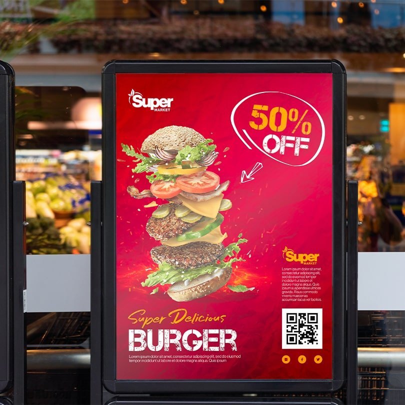
Top 5 Benefits of Using Billboards in Advertising
Here’s why supermarket chains should leverage these advertising structures.
Nothing Gets People’s Attention as Huge Outdoor Posters
People might miss small, subtle ads on shop windows and flyers on coffee tables, but they’ll rarely pass by prominent outdoor advertising without noticing it. The size of billboards helps their visibility, allowing them to reach a diverse, big audience.
Since companies typically place them in spots where many drivers and pedestrians pass, they are a stellar way to increase brand exposure. However, bulletins with uncluttered and memorable messages do better, as they spark people’s interest and trigger their curiosity.
Opportunity to Spawn Sales Boost Immediately
When passing by the billboards, people are already on the move, making it easier for them to visit the supermarket from advertisements right away. If the poster was intriguing and persuasive enough, it could stimulate a spontaneous purchase.
Thus, most of these structures are on highways with accessible and quick turn-offs. Thanks to that, they can convince people going shopping to visit a particular supermarket and buy their products there.
A Geographically Targeted Marketing
Supermarket chains don’t have to always focus on reaching their target audience. It is often better to center their efforts around attracting those nearby and influencing their purchasing decisions instantaneously.
Even though they don’t know who will see their outdoor ads, supermarket knows where they are when they see them. Moreover, if they operate in areas with limited service, they’ll position themselves as the best and closest option for the customers.
Cost-Effective Solution
Some might think these structures are overly expensive due to their size, but they’re the most cost-effective advertising solution. Even if supermarkets opt for more costly designs, they can bring more than enough customers to cover the costs.
However, various factors impact the price. But circulation, demographics, and impressions are the three main factors that indicate how many people will see the bulletin and their characteristics (e.g., income level, age, gender).
They’re Always On
Billboards are an advertising tool that never sleeps, and it works 24/7. For instance, supermarket chains often opt for radio or tv commercials, but that only gives them exposure a few times a day.
On the other hand, these bulletins are always there, using repetition to drill in the message. When people pass them by daily, that content stays in their minds longer, as they’ll see it in person and typically more often.
The Importance of Billboard Design
It is not only about where you place your advertising bulletin or how big it is. Billboard design matters as much as the message you share and the material you use.
Thus, supermarket chains often disregard the importance of visuals and focus on letting people know about their discounts, location, and novelties. But a creative, high-quality billboard design can increase engagement, lead to more impressions, and convert leads.
Moreover, stellar visuals also increase your business credibility and help you stay ahead of your competitors. After all, customers often judge products and brands depending on the colors they use in their marketing materials.
Bulletin aesthetics can improve storytelling and make your messages more compelling. Because of that, you should learn about billboard design best practices.
Top 5 Billboard Design Tips for Supermarket Chains
Share a Clear Message
Although these ad structures are typically massive, many people pass them by in their cars, not giving them much time to read the text. You only have seconds to spark their attention and send your message.
That’s why it should be clear, concise, and easy to understand. Supermarket chains usually want to inform customers about the latest discounts, benefits, and products.
That requires engaging but straightforward messages and a compelling CTA. However, it should also be meaningful and align with your brand’s storytelling.
Play and Experiment with Perspectives
You can opt for more creative, unusual, and distinctive visuals despite being a supermarket chain. Playing with perspectives and angles is among billboard design best practices.
For instance, you can experiment with optical illusions and contrasting colors and go beyond the structure dimensions. But ensure it looks natural to your brand and in line with your ad’s message.
Address Your Customer’s Needs
Put yourself in your customer’s perspective and acknowledge their needs. Make their interests your priority and consider how your products and actions benefit them and make their lives easier.
Use your billboard design to highlight the practical ways you help your customers and address their expectations, problems, and hopes. Consider using bright colors and visuals that resonate with their living standards and possibilities when conveying your messages.
Play with Cutouts
Consider using 3D cutouts to portray product shapes and make your visuals eye-catching. For instance, you can make it look like items hang off the structure or expand beyond it.
Combine it with compatible colors to accentuate specific phrases or products. Thus, you can play with sizing and make some elements smaller than others to ensure your visuals stand out.
Use Interactive Billboards to Increase Engagement
Outdoor advertising has various forms and appears in different locations. Billboards don’t necessarily need to be on the highways.
Instead, you can place them on bus stops, airports, subways, and streetlamps. But you can also make them interactive and allow customers to engage with the bulleting, making their experience more memorable.
To Wrap Up
These billboard design tips can help you make your advertising visuals more captivating and unique. But if you feel more comfortable having professionals do this, you might consider collaborating with a billboard design agency.
The goal is to appeal to the needs and expectations of your customers and create memorable, easy-to-understand, and compelling messages.
