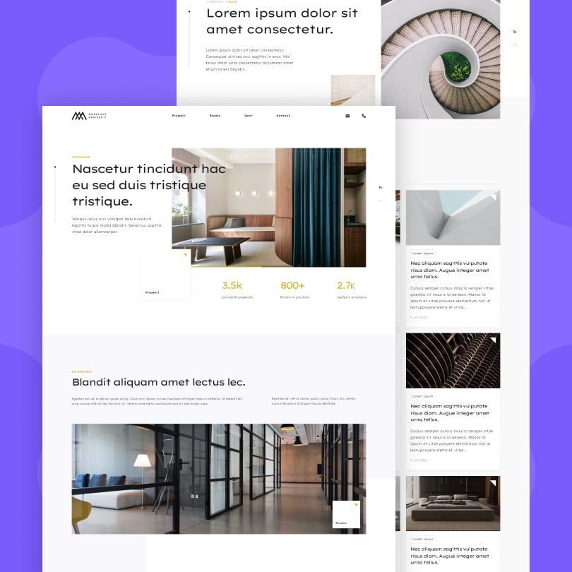
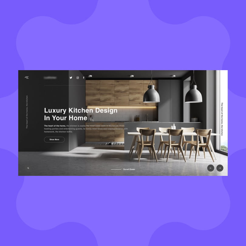
People may think - jokingly, that designing a website that talks about design is a straightforward job. Well, that's not entirely true, and some will state that the opposite is actually the case.While Interior design websites have evolved positively over the years, most site owners, with a plank slate of a platform often find it overwhelming to nail down the perfect look, feel, and engagement touchpoints for potential clients to reach out to them.
Still, experienced web design agencies will tell their interior designer clients that there are only a few things to focus on right off the bat: Big and beautiful imagery, smooth inquiry processes, and fast-loading pages.
While that’s all true, a professional web design agency will also tell their interior designer clients that they will also need to incorporate touchpoints where their visitors can potentially interact with the site, receive education, and even make purchases.
Are you taking advantage of your interior design site’s full potential? Hopefully, this article will tackle all the obstacles you may be facing.
Effective Approaches and Key Strategies to Create Websites for Interior Design
Make Your Visitors’ Jaw Drop From The Very Beginning
Remember what we mentioned about the images above? Yup, you’ve read it right. All the best interior design websites feature massive, high-definition, and, above all, beautiful images that, apart from catching your visitors’ eyes, also make a bold statement about your brand and the superior quality of your website.
Interior design sites (just like interior design itself) are visual-heavy, and as such, you should definitely prioritize the question of imagery on your website.
The homepage should be a testament to your brand’s expertise, and it should exude beauty and confidence from the very moment the screen loads.
On the other hand, websites for interior design should also double as an online portfolio of your work. Even if you will have a downloadable portfolio, ensure that every page on your site is actively showcasing your best works. And this won’t work without the element of beauty.
As such, all great interior design websites should prioritize crisp, well-lit, and well-styled images. Don’t forget your images aren’t just representations of what you’ve done in the past. They also act as an active sales tool and can predict the course of your future projects.
On that end, make sure that while your site is visually compelling, there’s no disbalance or disharmony between text content and imagery. The photos are the bread and butter of your interior website design, but that’s no use if visitors can’t read about you because the text is dark or gets lost in the photo.
Try to strike a perfect balance between the two, but don’t allow yourself to dull down your image so that you can insert text across them. Speak with your design company to ensure that both the photos and the text are readable on your pages and ensure that both messages get through to the visitor.
Your Brand’s Presence Should be Felt EVERYWHERE
The images, content, portfolio, service materials, and even products should all carry your brand’s visual identity and clearly communicate your vision as an entrepreneur. All great interior design sites feature consistency when it comes to visual branding, from the images to the fonts, color schemes, and motifs.
As such, you also need to look for opportunities to make your branding consistent and instantly recognizable throughout your website. On that end, you can go even a few steps further: make your branding recognizable on your invoices, email signatures, automated emails, and even offline print materials.
Lastly, to make an even more massive impact with your interior design website, incorporate your branding into other digital platforms where you’re present: YouTube, Facebook, and especially Instagram, where you can play with images and make your vision felt and heard.
Give A Chance for Your Audience To Engage
The best interior design websites all make good use of emails and mailing lists. Emails and newsletters are all essential in keeping past, current, and potential clients engaged with you and your content.
On the other hand, email gives interior design sites the opportunity to close deals, as those interested will probably reach out via electronic mail.
Still, you should remember that sometimes, it takes potential clients days, weeks, or even months to reach out. That said, it’s highly recommended that you enable them to subscribe to your newsletter to “keep them on hold.” On that end, ensure that your newsletter materials are composed of high-quality content and images that reflect the spirit and visual identity of your brand.
On the other hand, you can also opt for additional lead generation tools on your interior design website, like lead magnets. They are great for grabbing email addresses from visitors and also excellent for keeping them engaged with your brand.
Lastly, you can make good use of different interior design website gadgets. For example, style quizzes and “interior design builders” can give a more personalized experience. Apart from that, these gadgets will make your visitors stay longer on your site, which will help you to decrease bounce rates and increase visitor time spent on the platform, which will only help with your rankings and overall SEO goals.
Remember, all of this can be highly experimental. Some audiences will appreciate the interactive content, while others will look for value in good newsletter materials. Test out different things, get hold of the metrics, and stick to what works.

Humanize Your Brand
While people visit interior design sites to get inspired and to look for a service, in the end, people will hire people.
The trust and like factors are real, even in the digital age, so if you want to build rapport and establish a meaningful connection with potential clients even before they send you a message or pick up the phone.
So, how to humanize your brand? Take a look at some of the best interior design websites and their approaches. You will see headshots and different images of other team members.
Your copy and overall content should also have more personality. On that end, video content can be immensely valuable to create a deeper connection with you right off the bat before even actually talking with you.
If the video seems intimidating at first, try going small at first. For instance, you can send your video materials to onboarding clients, people on your newsletter list, and people who showed interest in your services and contacted you via email.
At the end of the day, introducing a human factor and personality into your brand and website will create a more profound connection with your clients right from the start.
Tell Your Visitors What To Do
Stellar interior website design has clear navigation and will have an overall design composition where the visitor always knows what type of action you’re expecting them to perform.
Clear call-to-actions may seem blunt and salesy, but if done the right way, they are honest and polite.
When a lead is ready to reach out, don’t make it hard for them to do so. Always have a main CTA button at the ready on every page of the website. Or, have one link ready on each site for your contact page.
When they land on the contact page, don’t be vague and boring with contact form fields like “message” and “subject.” Instead, try to incorporate a few important but easy-to-answer questions. Lastly, keep the budget-related questions off your forms. People might get intimidated and take their business elsewhere.
Tell Visitors Who YOU Are
If you specialize in a particular style, cater to a specific target audience, or work in a specific area of design, room, or home type – make it clear from the very beginning, and it often needs to be demonstrated as well.
The best way to talk about these points of differentiation in your interior website design is primarily your copy.
However, the imagery you choose to showcase on your site can also create a powerful message. They can demonstrate your area of expertise, and if you select some of your best testimonials to highlight them, you won’t only showcase your specialty. Still, you will also tell real-life, engaging stories in the process. Also, you will want to be clear about what your interior design services include and what they don’t. Clarify your services and your way of doing business.
While we assume that visitors will look for the information themselves, this is rarely the case. That said, optimize your H1 tags with keywords that cover your services so that Google can rank your site accordingly and show it to searchers when it’s relevant.
On the other hand, you can always put disclaimers on your pages for things that are out of your scope of work.
Testimonials and Online Cred – Your Clients Should Speak for You
Nothing can do a better job of increasing your reputation and digital credibility than when your clients say good things about your services and their experience with you.
Testimonials and reviews do a mighty fine job when it comes to helping potential clients choose their next purchase or service provider.
Stellar interior website designs all make good use of testimonials and reviews as they answer crucial questions:
- What will it be like working with them?
- Will I be happy with the job they’ve done?
- Are they the right fit for my needs?
Online reviews can actually help potential clients reach out to you and not to your competition. And if you really are fantastic at your job, your visitors need to know it.
Lastly, keep the testimonials throughout your site instead of keeping them on one page. Look at your metrics and place them on the pages with the most traffic. Keep the reviews short so visitors can read them while skimming the site.

Structure Your Pages
Let’s be honest – modern internet readers have become rather lazy and impatient. We won’t even start reading a wall of text, we want answers, and we want them now.
To cater to the modern reader’s needs, you want to make your website skimmable with structured headings, subheadings, shorter paragraphs, and bullet points.
It will also make your website more “airy” and leave more space for web designers to do their magic.
Your Traffic, Your Choice
The best interior websites aren’t just gorgeous. They are also visible to search engines. Optimizing for SEO is something you must consider if you want to drive traffic in the long term. Generally, it gives the best and most sustainable gains out of every strategy that affects your traffic.
Still, you can combine SEO with local networking, email marketing, paid advertising, and offline ads to bring the most potential out of your efforts.
And no matter which strategies you opt for, it’s essential to track everything to see which approaches bring the most people to your site and help with conducting business.
Beauty IS in The Eye of The Beholder
Designing and interior design websites aren’t just about beautiful photos. It has to engage with the client, be easy to navigate, and above all, visible on the internet.
Every interior design company is unique, with unique needs and target clients. Still, the essential rules of web design and sensible digital marketing should be followed by all of them if they want to drive more traffic, create a pleasant user experience, and ultimately close more deals.
In short – a great interior design website is the perfect blend of function and beauty.


