E-commerce had a relatively steady trajectory throughout the 2010s. The competition was considerable but not stark, giving every determined entrepreneur a chance to differentiate their online business.
But the abrupt arrival of the COVID-19 crisis changed everything, including eCommerce. Thousands of companies had to close their on-site offices temporarily or permanently, forcing them to find alternative solutions.
For many, the online world was the best way to go. – No wonder that, according to the United States Census Bureau, e-commerce sales increased by $244.2 billion or 43 percent in 2020.
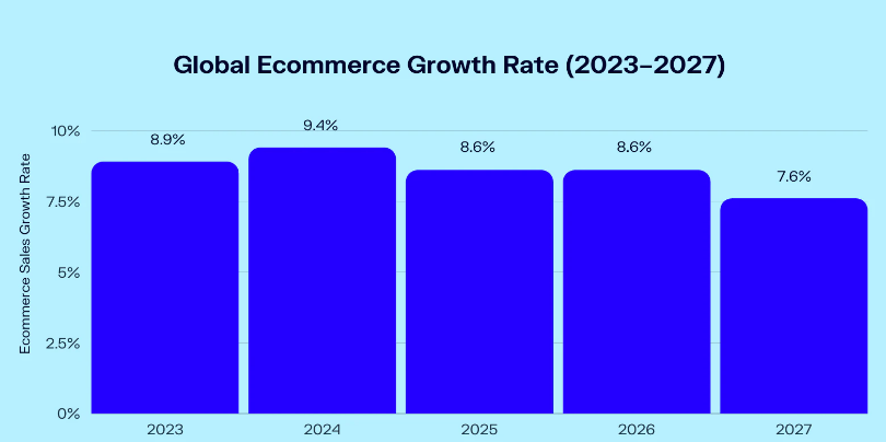
Growth will only accelerate in 2023. Oberlo found that global eCommerce sales will reach 6.3 trillion this year, but online retail growth will hit 8.2 percent by 2026.
Even though this is good news for those with eCommerce businesses or planning to sail into this landscape, that also implies that differentiating your brand will be more demanding. The tight competition also means there’s little to no place for mistakes.
You must plan every step ahead and think of details when creating your eCommerce product page design. That shouldn’t be a problem if you stick to certain rules and standards.
Here’s what you should know about how to create effective eCommerce product pages.
Why is an On-Point eCommerce Product Page Important?
As the name already implies, these pages communicate vital details and information about a specific item with relevant videos, photos, and descriptive text. They provide an easy and simple way for customers to buy these items online instantly and receive them at their home addresses.
Some businesses also include reviews on these pages, allowing people to make easier decisions. They may also have a list of related and suggested items and wishlist features where customers can save their favorites.
The design and structure of your eCommerce product pages can help you sell more but also deter people from purchasing. You must ensure the cohesion of all elements and not neglect any aspect.
These web pages must be functional and have excellent content and layout, as well as UI (user interface), IxD (interaction design), and UX (user experience). Otherwise, you risk creating poor interaction costs, which means forcing customers to exert an increased physical and mental effort to buy an item.
People should never have to invest too much effort and time to navigate a website, as that impacts sales performance, customer satisfaction, and conversion rates. Ultimately, that affects your company’s bottom line.
Although you may think it’s enough to get hundreds of prospects to open your homepage, that is only one stop in their customer journey.
Hence, your objective shouldn’t be to increase traffic solely. Instead, aim to create compelling product pages to boost your conversion rates and loyalty.
The Difference Between eCommerce Product Page and eCommerce Landing Page Design
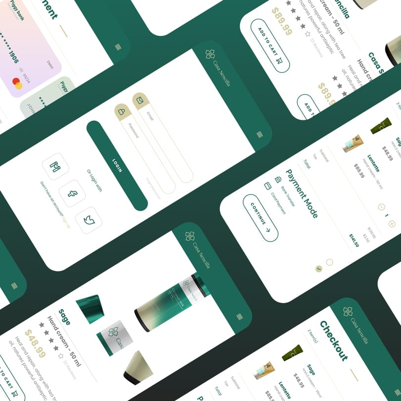
These two may sound like interchangeable terms, but they’re not, and it’s crucial to know the difference. The landing page highlights a brand’s marketing campaign and aims to drive traffic and convert leads.
Therefore, it focuses on a single, specific message and eliminates unnecessary distractions a product page may contain. On the other hand, a product page includes data about the service or item, meaning that it aims to inform people and nudge them to proceed with their purchase by highlighting the UVP.
As a result, it appeals to the masses and provides the necessary details about the items to let buyers know what to choose. However, both are equally significant and require an easy-to-navigate design and structure.
Here’s how to use them.
When to Use a Product Page, and When to Use a Landing Page?
The former contains info about your services, items, and brand and includes enough details to encourage customers to finalize their purchase. The latter helps generate leads related to a unique marketing campaign, and they entice visitors to explore further.
Hence, you should use landing pages to attract potential leads, entice them to engage with your brand, and become your customers. Use product pages to inform people how to navigate your website, learn about your services and items, and make well-informed buying decisions.
These two should work together instead of against each other. Both designs should be top-notch, effective, and relevant.
But this time, we’ll explore what you can’t forget when creating product pages.
8 Essential Elements for Captivating and Effective eCommerce Product Pages
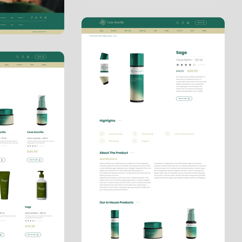
Responsiveness
A responsive website design across different channels is a must in every business. However, nowadays, most people browse on their mobile phones, making it crucial to develop a layout that adapts to the size and screen type.
Prospects and buyers should not need to zoom in to see the items; everything should align smoothly and quickly open. Moreover, the channels should be linked correctly, allowing people to switch directly from browsing the website on the PC to opening it on mobile phones.
Intuitive Navigation
A website must be easy to navigate, or your customers will leave. Remove all distractions and unnecessary elements that deter people from seeing your items and services and browsing swiftly.
Here’s how you can make it easier for visitors to navigate your site:
- Fast-loading speed.
- Interlinked related items and services and relevant pages.
- Ensure that the content aligns with the message you aim to convey.
- Use concise and clear listings for items and services.
- A search function that leads to relevant results.
- A mobile-friendly website.
There should not be a single moment your customers start thinking your site is confusing or makes no sense. Simplify their buyer’s journey by using good prompts and links to take them from one stop to another.
Product Segmentation
Many eCommerce businesses have multiple item types, making it essential to create distinctive listing areas and separate them in a meaningful way. The content you add should also be specific to each category.
The easiest way to arrange it accurately is to think of your business as a shopping mall. Different items will appeal to different customers.
Hence, you must organize them accurately and coherently. Otherwise, they might think you wasted their time or leave due to not finding information about the things they’ve been searching for.
Once they finalize their purchase, you can suggest similar items they might like based on their past buying patterns. However, these recommendations shouldn’t be overwhelming or aggressive.
Descriptive and Concise Descriptions
Compelling item descriptions are a subtle combination of art and science. – You must provide information and details about what they’re interested in and considering buying.
But avoid a forceful salesy approach and opt for a more lively and descriptive narrative. Include the key features and benefits and use concise and easy-to-understand language, as well as bullet points.
These descriptions should be captivating and informative descriptions of your brand. However, remember that you should also SEO-optimize your texts, making them more likely to appear in the SERPS.
High-Quality Images and Videos
Relevant and quality images and videos are a must in the eCommerce business, as people rightfully expect to see from different angles what they’re buying. But you should also include variety to help them understand how something would look on them or whether an item has multiple uses.
For instance, you can use several models to demonstrate how your clothing items look on different body types. Plus, you can use videos to show how it looks in action.
Seamless Checkout
Regardless of your brand’s quality, customers will leave the shopping cart if the checkout process is overly lengthy, complex, or demands unnecessary information. If you require sensitive data that most websites don’t, that will raise suspicions and push buyers not to feel safe finishing the purchase process.
Minimize the number of necessary steps and only ask for relevant info. Streamline this step as much as possible to avoid losing clients.
Different Payment Options
Be transparent about the shipping costs and delivery times and highlight them before the checkout. This phase should require no more than two pages to complete the final step, and you should offer different payment methods, such as PayPal and digital wallets.
Clear and Captivating CTAs
Remove bland and redundant photos and content from your home page, and use that extra space to surprise your customers with hot items, discounts, and special offers. These should take them directly to the item description, while clear and concise CTAs should guide them through all steps of the purchasing process.
People should never doubt what to do or where to click next, as straightforward prompts should instruct them intuitively.
Final Thoughts
Effective eCommerce product pages are no less important in getting your customers to purchase than landing pages. That’s why you must be thoughtful about each element, how you position them, and how you’ll craft item descriptions.
When confused about how to do it, many business owners turn to an professional eCommerce web design solutions, as they have the necessary skills and expertise to ensure the best results. But the goal is always to follow your brand’s story, be informative, and consider how and what your customers want to see when navigating your site.
