A Big Mac will trigger most people's senses due to containing a significant amount of fat and sugar, but fresh vegetables without pesticides will help promote wellness and longevity. Luckily, health awareness has increased during the pandemic.
Natural products and food have become the go-to choice for everyone willing to reinforce the resilience of their immunity system and nurture a healthier lifestyle. According to the National Library of Medicine (NIH), many people are making that choice.
The consumption and popularity of sustainable and healthy items and meals have increased during the COVID-19 crisis due to concerns regarding one’s environment, health, and sustainability more critical. Thanks to that, the demand in this sector has nearly skyrocketed.
Moreover, organic products are sailing into the mainstream tide, as Millennials and Gen Z already favored them before the pandemic. Still, even Baby Boomers are changing their habits and food preferences.
While that’s beneficial for the planet and humanity, it’s also an opportunity for businesses and manufacturers. However, as more people adopt a healthier lifestyle, it will be more critical for producers to differentiate their offerings.
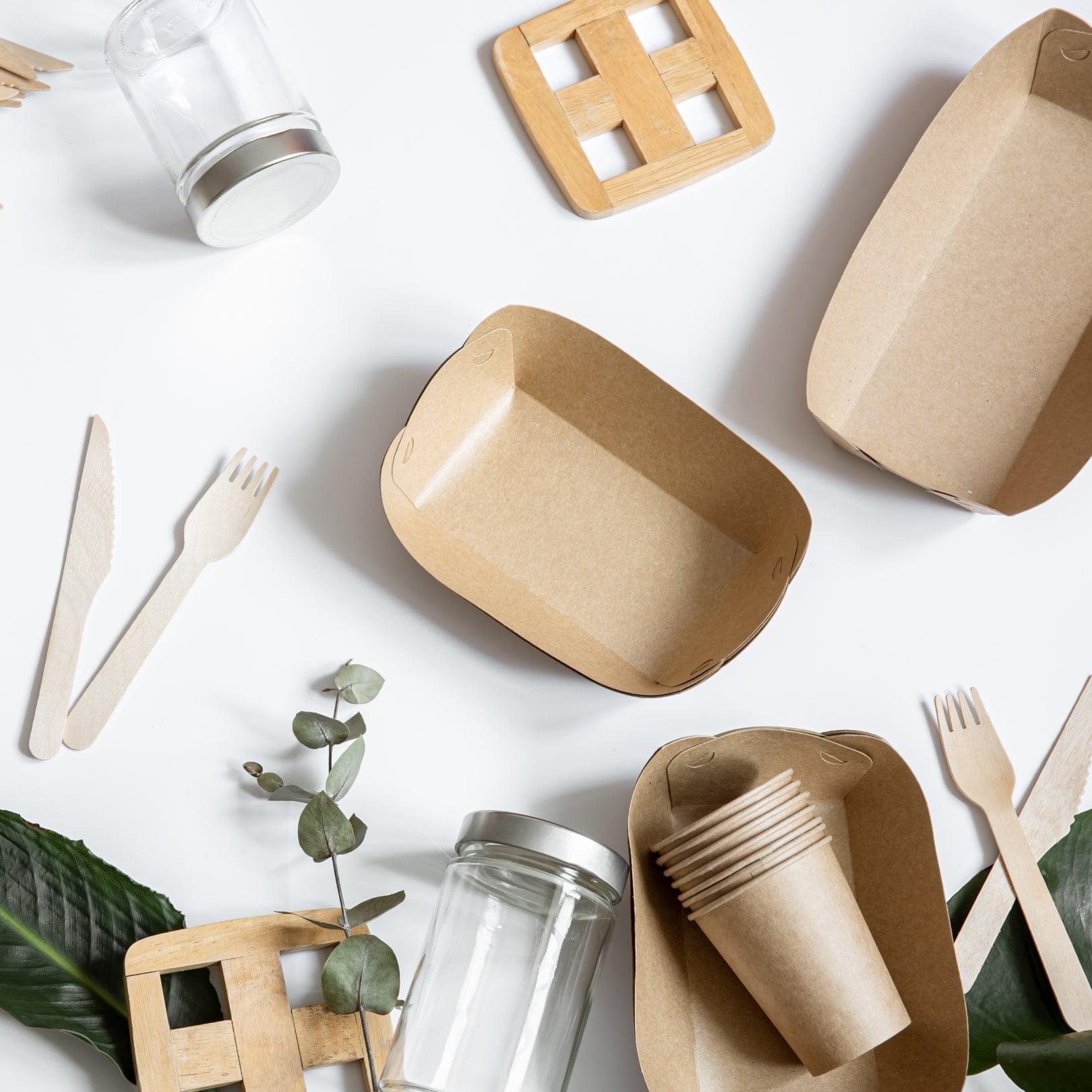
One of the best ways to achieve that is to leverage the combination of practicality, aesthetics, and functionality. That’s where organic product packaging design enters the picture.
What are Organic Products?
These products are made from raw and natural materials produced by organic agriculture. They include various items, including personal care, clothing, and food.
Socially and environmentally responsible handling and approach are vital to creating sustainable items and foods rich in quality and resistant to diseases. Every operation involved in the production of these goods must align with a country’s unique, strict consumer safety regulations, protect natural resources, use solely approved substances, and conserve biodiversity.
Because of that, manufacturers and producers foster ethical systems that don’t use pesticides and dangerous chemical fertilizers. However, it took a long time for these items to gain enough reverence since they’re more expensive due to the high production standards they must reach.
For instance, natural food sales amounted to only $13.26 billion in 2005 but reached $57.5 billion in 2021. It helped that Millennials were pushing brands to be more environmentally and socially responsible throughout the 2010s, and Gen Z adopted the same awareness and preferences.
Thanks to that, even some fast food restaurant chains, such as McDonald’s, announced they would produce only 100 percent recyclable and renewable packaging by 2025. Since consumers increasingly opt for eco-friendly wrapping materials, businesses want to show that they can deliver what their buyers want.
As a result, almost everyone uses green color to highlight the quality and vitality of their items. Why is that so, and why should designers consider expanding their palettes?

Why do Most Designers Use Green Color for Organic Packaging Design?
It is no secret that designers and manufacturers use colors to convey unique messages and values and appeal to people’s emotions. That’s why they’re careful about how they present and develop packaging.
As a principal selling tool, wrapping materials and packs must align with a brand’s values, product’s purpose, and industry standards. Since up to 90 percent of consumers subconsciously base their judgment of an item depending on color, designers choose shades that communicate certain qualities and ideas.
For instance, red stimulates excitement and passion and boosts appetite, making it ideal for the food industry. However, it typically increases the perception of sweetness, which is why it’s not the most common choice for organic food packaging design.
On the flip side, the human brain processes yellow color faster than others and releases serotonin, making it no surprise that restaurants such as Burger King, KFC, and McDonald’s use it. Naturally, orange hues are just as appetizing but are also associated with affordability.
These are clear examples of how color impacts consumer behavior and why most industries hesitate to experiment. Instead, most stick to tested formulas and hold on to palettes that are known to work well.
No wonder the green color became the staple for eco-conscious, vegan, and environmentally responsible businesses. Deviating from that choice often seems like a risk most aren’t willing to take.
Authentic Values or Trend-Hopping?
Greenish and emerald hues are the easiest for human vision and indicate growth, nature, freshness, safety, and resilience. Thus, they evoke a sense of inner peace and calmness, typically among the messages producers of natural goods want to transmit.
Moreover, green is connected with new beginnings, vitality, and prosperity. Unsurprisingly, that has become the standard color for all brands determined to show their committedness to going green and all-natural.
In times when climate change and the urge for sustainable living are hot topics, and many businesses want to harvest the benefits of hopping on the organic bandwagon, green color is among the best strategies to show the public they, too, are eco-friendly. It’s possible to go as far as to say that it has turned emerald hues into another commodity, not a depiction of genuine efforts and values.
As a result, even those using this green for their organic food packaging design to portray their alignment with nature may not come across as authentic. After all, what you create and how it serves people and the Earth is always the best indicator of your success.
That means you should allow yourself the risk of experimenting with colors. You can go beyond green and show your brand’s versatility by using different shades for organic package design.

4 Tips on Creating Quality and Authentic Organic Packaging Design
Make Well-Informed Decisions
Understand your brand and how it meets consumers’ needs and objectives. Identify your fundamental values and benefits outside of producing all-natural and raw items, as many others already do it.
Use heuristic evaluations, advanced analytics, surveys, and usability tests to grasp better how people use your products and benefit from them. These insights could help you expand the perception of your offering, which could also affect the palette choice.
Highlight Your USP
The safest way to make your organic beauty product packaging or other eco items stand out is to be confident in their unique benefits and features. Research what your customers like the most and leverage these insights by ensuring your package tagline reflects the USP and the colors and materials align with your brand’s story.
Try Different Colors
Go beyond the green color, as you can highlight that your items are eco-friendly and sustainable using other shades just as well. Assess how different colors are perceived in your culture, tap into external influences (e.g., current trends), and analyze your competitors to shortlist potential alternatives and make a final decision.
Leverage Smart Packaging
Add a QR code on your product packages and direct customers to a landing page where they can leave a review, give feedback or join your loyalty program. You can also use it to share information about sustainability, supply chain, and ingredients or offer a Thank You discount.
To Wrap Up
For the longest time, green was the primary packaging color for most manufacturers and designers. But since the eco-friendly approach and environmental and social responsibility have become more revered in the past decade, more businesses are producing all-natural items, making it hard to stand out and be authentic.
Experimenting with different shades could help you differentiate your company and expand the perception of raw and ecological ingredients and materials. Nevertheless, choosing the right color is tough, and sometimes all it takes is finding professionals experienced in packaging for organic products.
Regardless of how you decide to identify the best palette, keep in mind your brand, USP, and consumers’ feedback and preferences.


