Ask any expert who's working in the hospitality industry, and they will tell you that the restaurant landscape is a dog-eat-dog world, where everyone's fiercely competitive, and the restaurants are often even physically within arm's reach of each other.
In such a tough setting, restaurants need to exploit every chance they can get to stick out in any way. This can include developing competitive and unique offerings, several ongoing and weekend specials, and more. The latter has become especially true in the digital era, as businesses now also have the opportunity to exploit their online presence, giving them even more space to leave a positive impression on their prospects.
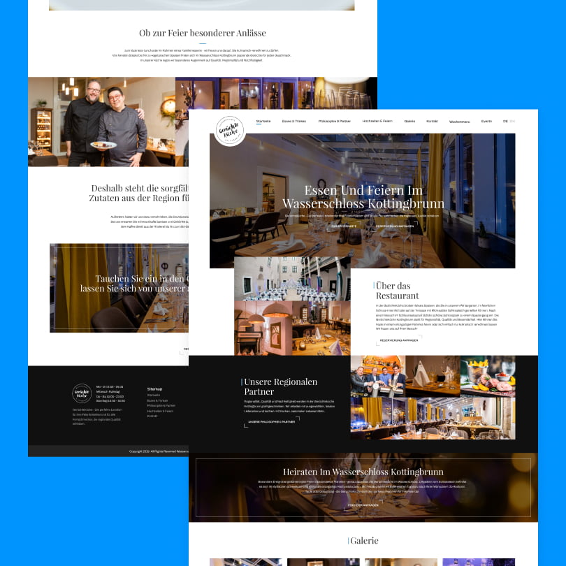
On that note, website design for restaurants can often go a long way in capturing not just the prospect’s attention but the essence of the establishment and the added value it can offer over the competition.
Needless to say, in this article, we’ll discuss all the best practices that can help restaurants get the most out of their web design and improve their offline presence through online supremacy.
Why Bother With a Restaurant Website?
Some food joint owners might say that great food needs no online marketing. And while it’s true that truly great restaurants will do fairly well by offering a great concept idea and really great food, in today’s rat race, not having a website may even make or break a business.
A website had proven pivotal just a few years ago: online orders and scheduling pick-ups during the epidemic had proven to be life savers for most establishments as they enabled them to stay afloat even when physical contact was limited.
On the other hand, a restaurant website serves as a virtual extension of the establishment’s actual location. With stellar restaurant website design, you can capture the essence of your establishment, drawing onlookers closer and closer, eventually upping the chances of turning them into customers.
Still, to achieve this goal, you must be careful and optimize every part of your site. Website design services for restaurants often means carefully arranging your widget placement, combining perfectly complementing color schemes, optimizing info hierarchy, and more. Each little aspect can dramatically affect your site’s overall performance, and this article will aim to guide restaurant owners to design their restaurant website to appeal to their target audience or everyone who’s down to eat some tasty food.
Boosting Your Online Presence With Restaurant Web Design Best Practices

Keep Things Simple
While some site owners may feel tempted to create a large website with complex design elements and several pages, it might do more harm to their online presence than good. Intricate designs may distract and overwhelm prospects, and they often fail to fulfill the essential purpose of the website: to serve tasty food.
That said, before you develop your design ideas, always address what your end users will need. No matter whether you’re looking at returning customers or new prospects, the following points must be mainstay features in your website design for your restaurant:
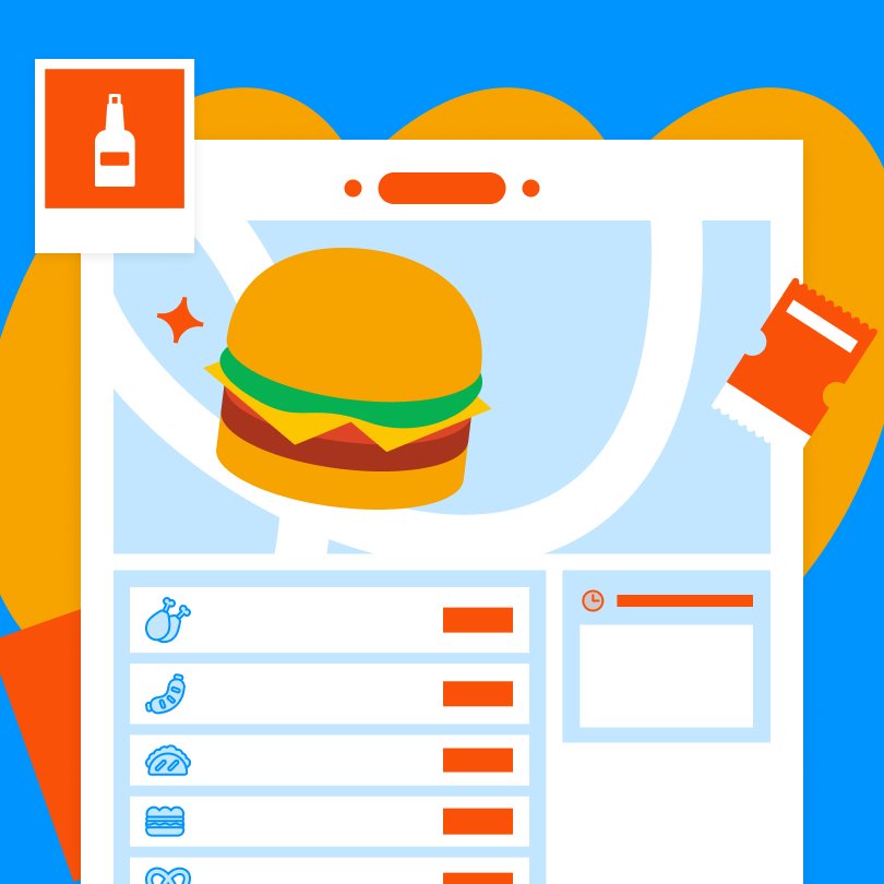
- Restaurant Menu: Almost everyone who lands on your site will want to check what you offer, your prices, portion sizes, and so on. Also, they will want to check out your ordering options as well, such as delivery, dine-in, or pick-up.
- Contact Information: No matter whether you just have a single phone number or an arsenal of social handles, your customers must know how they can visit or reach out to you.
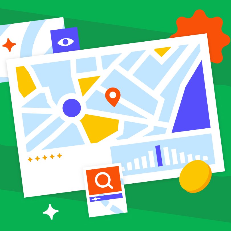
- Location: Again, this is vital for converting site visitors into paying customers. People will want to know whether your place is near their location. That said, you can always include a map and directions and highlight the nearest transport lines, so they don’t have to find that info out on their own.
- Working Hours: when a site visitor finally decides to become your client and visit your fine establishment with their family or friends, they will also want to know your working hours so they can know how and when to organize the occasion. Chances are, they will check your website again to see your working hours. And the truth is, if they can’t find it there, they might not pick up the phone or drop you an email to ask you about said working hours; instead, they will opt for another place to grab a bite. Because of this, it’s highly advised that you highlight your working hours on your site so that visitors can see them.
In a nutshell, you want to create a design for your website that helps clients find all the vital info about your establishment easily and quickly. For the most part, one-page templates can be an ideal solution for most smaller and medium-sized places that have only a single location.
Assess Your Colors Carefully
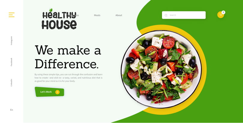
While you will probably go with already-established color schemes that define the look and feel of your physical location, your website design will also enable you to experiment with a few new color combinations.
Naturally, you don’t want to stray away from what has already proven to work, but you can explore complementary or contrasting colors, different shades of the same colors, or play around with color transparency.
Again, try not to go overboard, and try not to incorporate more than five colors. Better yet, stay with three: a color for your background with a primary and secondary color.
Highlight Your Branding Elements
Needless to say, developing, designing, and launching a website is a massive step for your business. That said, as the owner, you must provide your designer with your brand book so they can create the website design in accordance with your already existing branding elements.
The color schemes, logo, fonts, selling proposition, and overall brand persona should be the same on your website as it is at your physical location.
As a matter of fact, your branding should be consistent across all the online channels you use and your physical locations (if you have several). As such, integrating your branding elements and your website design is pivotal for success. This way, your customers will recognize your branding as a part of your establishment’s image, no matter whether they actually do see your restaurant at its physical location or just see your logo on social media.
Lastly, ensure that your site has the logo on the top left side, as this is the first spot that most visitors will see on any page.
Don’t Skip High-Quality Images
When your potential customers decide where they will want to eat or order from, they will often explore several different restaurant sites and often look at your reviews and how your food looks.
On the latter note, ensure that you convert your visitors into regular customers by populating your website with high-resolution and high-quality images of the food you prepare. Create a gallery of your most mouth-watering dishes and make it visible for your visitors to increase their appetite purposefully.
You can even go one step further and get photos of the interior and exterior of the restaurant. Include a few candid and lifestyle shots as well to create a welcoming and humane image of your place – it’s not just about the great food, but about the great experience.
Embrace The Power of Reviews
As we’ve mentioned above, people will often look at pictures of your food and will also read other customers’ reviews about your establishment.
That’s just how it is: potential clients want to hear about other people’s experiences with your place to decide whether it’s worth their money and time. As such, every excellent restaurant website design will include at least a few reviews to encourage prospects.
That said, there are two primary ways you can integrate reviews into your website design:
- You can allow customers to leave reviews directly on your site. This can be a bit more challenging for the development team, but it shouldn’t be overly complicated. As you may have figured out, the only downside to this is the fact that people will be able to leave negative reviews on your site, which will show., unless you moderate them. Still, you can take advantage of a negative review as long as the criticism is constructive and you address it, assuring them that you are or will be working on the issues they’ve mentioned.
- Linking to review platforms with authority: This is an easier way to build trust. Simply, just leave a link to the review platforms where your establishment has an account. On that end, you can also include a few images of positive reviews to build more trust on the go.
After all of this is done, you may also add the website link to review platforms to help improve your rankings in the SERPs.
Use Straightforward Menu Buttons
It’s pretty much self-explanatory that the restaurant menu should be the focal point of your website, as it has the power to improve your conversions.
To maximize its potential, consider the following:
- Place the menu button where visitors will most likely look for it: the top right corner.
- Use a contrasting color to your site’s background to make the menu button literally stick out. Better yet, you may also experiment with the neon variant of the color for your button border to enhance its visibility.
- Stay away from PDF menus, as it can negatively affect your Google rankings and may deter your potential customers. PDF menus typically load very slowly and should be downloaded before they can be viewed.
- Instead of PDFs, opt for online ordering menus that instantly load with the rest of the site when the visitor clicks the menu button. To optimize things even further, these options will typically also have an online ordering system that enables visitors to order food directly from the site.
Organize Your Info and Optimize Your Content
Every successful website design enables visitors to find the answers they seek. This can be easily realized if the info on your website follows an organized pattern that’s manageable to follow for the user.
We’ve already touched bases on things like menus, location, contact information, and working hours, but there might be other pieces of information that can be vital to the site’s success.
What are we talking about? Consider things like the following:
- Highlighting any ongoing promotions
- Adding a short and concise about us section with an origin story to build trust with visitors.
- Adding a review section
- Placing social media handles
- A space for announcements like staff hiring ads, ongoing or season-specific specials, and more.
Also, you should make an effort to optimize all your content with the right keywords that can help you become more visible to search engines. SEO or search engine optimization is a complex process that will often involve designers, developers, content writers, SEO experts, and other marketing experts to help your site rank higher on Google and Bing.
That said, here are only a few things you should consider:
- Adopt the mobile-first approach
- Use relevant keywords for your industry and brand.
- Optimize the content not just with keywords but with headings, subheadings, lists, and more to improve readability.
Embrace Your Social Links
Social media plays a vital role in helping restaurants build a loyal customer community, and it also helps in reaching new people. Ensure that you include all of your social handles on your website, and consider creating a strategic approach to social media.
Ensure that you’re consistently posting high-quality and engaging content on your social channels – this can help you convey the irresistible and inviting atmosphere at your restaurant, not to mention they will also be able to take a sneak peek at the delicious food you’re serving.

Focus on What You Do Best: The Food
Website design for restaurants is crucial for online success. Still, in the end, you should focus on creating tasty works of culinary art to capture hungry prospects’ attention.
That said, working with an experienced agency can help you lessen your design-related workload, enabling you to focus more on the business and culinary aspects of running a restaurant. Experienced designers will usually be able to get the right angle on any restaurant project and create a site where the branding, colors, content, and images are in perfect harmony.


