Innovative services and products are only one piece of the puzzle when establishing lasting connections with your users. It takes more than gorgeous visuals and stylish interfaces to ensure positive impressions.User experience (UX) is critical in shaping meaningful interactions and a memorable digital presence. An intuitive design goes beyond trendy aesthetics; it's among the fundamental ingredients of your web performance.
A good UX smoothly captivates your users, invites them to be a part of your story, and makes navigating the site engaging. That allows visitors to find everything easily, ensuring you meet their objectives, expectations, and needs.
Without those factors, a seamless, personalized, and user-friendly experience is challenging. And without that, you’ll likely encounter low engagement, conversions, and customer loyalty.
But sometimes, a site might look like it has it all, yet the results are not there. That’s why you need a website UX audit.
What is a Website UX Audit?
A UX audit is a quality assessment method that helps you identify whether users experience troubles interacting with your app or website. Thanks to approaching your digital product from a user’s perspective, it detects challenging areas requiring improvements.
It typically measures the following elements:
- Navigation and information architecture
- Accessibility
- Page loading speed
- Mobile responsiveness
- Content quality
- Forms and interactivity
- Consistency and branding
- User feedback and error handling
- Conversion paths
- User engagement
- Search functionality
- Security
However, you may want to create your website UX audit checklist and add additional elements, such as whether your site follows the trends blindly. The goal is to understand if people encounter design or functionality issues that prevent them from interacting with your digital product.
The Difference Between Usability and UX Testing
Although interconnected, usability and UX audits serve distinct purposes in evaluating digital experiences. Usability testing primarily assesses the efficiency and effectiveness of a website or application by analyzing how easily users can accomplish specific tasks.
Hence, usability delves into the navigational structure, clarity of information, and overall user-friendliness. In contrast, UX audits encompass a broader scope.
When running UX quality assurance, you evaluate the entire user journey, considering emotions, perceptions, and the holistic experience. UX testing goes beyond task completion, exploring the user’s feelings, satisfaction, and engagement throughout their interaction with the product.
Both are crucial and offer a comprehensive understanding of user interactions from different perspectives. Ultimately, these tests contribute to a more robust and user-centric design.
The Advantages of User Experience Audits
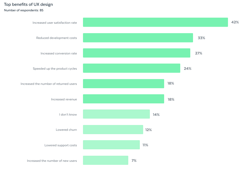
When diving deeper into the benefits of UX quality assurance, we must clarify how it impacts website performance.

Enhanced User Satisfaction
This method helps you pinpoint and address challenges users face navigating your website, ensuring they can easily navigate, find information, and complete tasks. That information allows you to create an environment where users are more likely to stay, engage, and return, fostering positive perceptions of your brand.
Increased Conversions
One of the objectives of UX audits is to evaluate the user journey toward important conversion points (e.g., sign-ups, purchases) and simplify processes. That way, you can remove barriers that may hinder visitors from completing desired actions, such as purchasing or subscribing. As a result, you enhance their experience and increase the likelihood they will convert, contributing to the site’s overall success and bottom line.
Better Accessibility
You must ensure compliance with accessibility standards so that your website is inclusive and usable for everyone, including individuals with disabilities. This commitment aligns your UX with ethical design principles and broadens your audience, making your content and services accessible to a more diverse user base.
Improved Brand Consistency
A consistent brand image across the website helps ensure that design elements, messaging, and overall aesthetics match your brand guidelines. Maintaining coherence is essential for building trust with users, reinforcing your brand identity, and creating a cohesive online experience that resonates with your target audience.
Data-Driven Decision-Making
The qualitative and quantitative data you amass during a UX audit empower you with valuable insights into user behavior and preferences. That helps make informed decisions based on authentic user feedback and analytics, allowing you to strategically prioritize improvements with the most significant impact on the overall user experience.
Sharper Competitive Edge
A user-friendly website will always set you apart from competitors by attracting and retaining users who appreciate a seamless, enjoyable online experience. As users increasingly prioritize positive interactions, a well-optimized website becomes a powerful differentiator, contributing to long-term success and positioning your brand among the industry leaders.
According to Forbes, every dollar you invest in UX brings 100 dollars in return, resulting in an ROI of 9,900 percent. Therefore, investing in audits helps you understand whether you point your efforts in the right direction and if the results match.
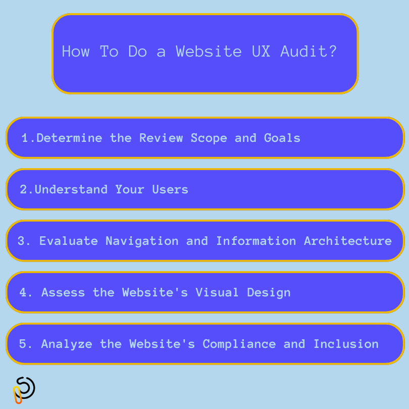
How To Do a Website UX Audit?
Some steps in UX audits are the same regardless of the website type you’re testing. Here’s what you should always include in your reviews:

Determine the Review Scope and Goals
Start by outlining what the review should cover and what it aims to accomplish. Be clear about what areas and elements you’re assessing and the metrics you’ll use to measure success.
Establish a concise roadmap to help you follow the process and spot all potential problems. Check in advance whether you want to solve existing issues, such as addressing low engagement.
Knowing your goals is crucial for understanding what parts of UX to focus on when auditing. Leverage the user data you collected over time, such as analytics and support tickets, to check whether there’s a recurring pattern.
You can also include different stakeholders to give their input. Developers, designers, data analysts, product managers, and customer support agents can all share their perspectives to ensure the audit is comprehensive and accurate.
The audit’s scope should depend on your objectives. For instance, suppose conducting a website UX review for a news and media platform to enhance user engagement. In this case, you might focus on a particular feature, such as the commenting system. However, you may also analyze every touchpoint of a user’s journey.
Understand Your Users
Website UX audits are more effective when you understand your target audience and their needs and pain points. Acquire those insights directly from your users through:
- User surveys: Gather quantitative data on user preferences and pain points. Craft targeted questions to understand user needs, satisfaction levels, and areas for improvement. Analyze survey responses to identify common themes and patterns that can guide UX enhancements.
- User interviews: Engage with users through one-on-one interviews to collect qualitative insights. Ask open-ended questions about their experiences, challenges, and expectations. User interviews provide in-depth understanding, allowing you to uncover nuanced perspectives and emotions that quantitative data may not capture.
- Usability testing: Observe users interacting with your website in a controlled environment. Focus on their navigation, task completion, and areas of struggle. Usability testing provides real-time insights into how users interact with your site, helping to pinpoint specific pain points and areas for improvement.
- Heatmaps and click tracking: Implement heatmap and click tracking tools to visualize user interactions on your website. Heatmaps highlight high and low user engagement areas, while click tracking reveals where users click and scroll. Analyzing this data helps prioritize design changes to optimize the user journey.
- User analytics: Leverage web analytics tools like Google Analytics to track user behavior, such as page views, bounce rates, and conversion rates. This method provides quantitative insights into how users navigate your site, helping to identify popular pages and potential bottlenecks.
- Session recordings: Record and watch users browse your website or app to identify specific pain points, common user paths, and areas where users might abandon their journey. Thanks to this, you’ll uncover usability issues and what requires further improvement.
- Social media listening: Monitor social media platforms for mentions and discussions about your app or website. That provides qualitative data on user sentiments, complaints, and suggestions. Engaging in these conversations helps you understand the broader user community’s needs and concerns, informing your UX strategy.
Evaluate Navigation and Information Architecture
Website information architecture involves organizing and structuring content to create a logical hierarchy. Meanwhile, navigation encompasses the user interface elements, such as menus and links, facilitating intuitive movement through the site, collectively shaping the user experience.
Understanding whether they’re effective, helps you learn if users know how to move around your app or website. Besides user surveys, usability testing, and interviews, you can use card sorting to assess the information architecture. Conversely, reviewing UX wireframes can offer early insights into how the proposed structure translates into a user-friendly design.
That helps understand whether users struggle with categorizing and organizing content. Moreover, you can analyze heatmaps, run tree testing, and ensure accessibility to evaluate user interactions and guide informed recommendations for enhancement.
Assess the Website’s Visual Design
Evaluate different visual elements, such as color palettes, images, and typography. Focus on whether they contribute to the app’s or website’s overall balance and functionality and if they align with your branding.
Every page should be visually appealing and meaningful to help visitors perceive the site as high quality. Here’s what to check:
- Hierarchy and readability: Evaluate the clarity of element arrangement and whether font choices enhance the overall user experience.
- Consistency: Analyze whether the icons, visuals, typography, contrast, and interactive elements are cohesive and match your brand.
- Aesthetic effectiveness: Check the overall visual impression of the website. Does everything, including whitespace, make sense, evoke the wanted emotional response, and send the right message?
- Brand identity: Assess whether every design element helps tell and present your brand’s story. Ensure your company’s identity glows through and speaks to your target audience.
Analyze the Website’s Compliance and Inclusion
Assess whether your website or app adheres to principles that ensure a diverse range of users, including those with disabilities, can navigate and interact with the site seamlessly. To accomplish that, analyze the following:
- Color contrast: Assess the color contrast between text and background to ensure readability for users with visual impairments. This factor is crucial for legibility and comprehension.
- Keyboard accessibility: Verify that users can navigate and activate all interactive elements, such as links and forms, using a keyboard, as many rely on keyboard navigation instead of a mouse. Another thing to check is whether your website is compatible with screen readers.
- Forms and inputs: Ensure that forms are well-labeled and provide clear instructions so that users can easily understand and complete them, especially those relying on assistive technologies.
- Multimedia text alternatives: Check whether all images and multimedia content have descriptive alternative text, as that helps make your product more accessible to individuals with visual impairments.
What Happens After a Website UX Audit?
If you accomplished the crucial part — performing every step on your website UX audit checklist, consider post-audit testing. That will pinpoint potential blind spots and ensure you choose the right solution.
But remember you should regularly conduct these reviews, as then you can continuously implement necessary changes. Share the audit’s findings with your team and relevant stakeholders to determine solutions for identified problems.
However, if you’re new or want to accelerate the process, team up with UI and UX Design services professionals. That could help you better understand your users and create an experience that sparks conversions.


