Prepare for gripping animations, playful layering, and retro visuals because web design trends for 2024 are all about dynamism. Bold colors and complex aesthetics have already been a tendency in the early 2020s.
Expect that to continue, as the vibrant design will help attract more visitors and provide a personalized experience. This article will share insights into web design trends that will stick and how to blend them with your brand identity.
But first, let’s explore the technical side of web design trends in 2024.
What About the Technical Trends in Web Design?
Web design trends often have a significant technical background that’s vital to understand. That provides information on what metrics to pay attention to and what will impact your website’s visibility in search results.
Let’s review the factors you should consider.
The Crossroads of AI and Design
Ever since it found its way into the spotlight, AI has been making a blast and disrupting industries, leaving web design as no exception. It has reached a point where it’s impossible to discuss trends and practices without mentioning generative AI tools for web design that enable automation and increased personalization.
When it comes to AI in web design and its pros in 2024, it will benefit from improved customer service through chatbots that assist users in brainstorming ideas, learning about the services and products, and finding inspiration. Moreover, eCommerce websites will find it easier to offer data-driven product suggestions based on previous purchases and behaviors.
But AI doesn’t only boost predictive analytics, personalize user experience, or improve accessibility. It can create imagery from scratch, aligning with your unique vision.
For instance, Midjourney can be a stellar tool for propelling your creativity and creating visuals you wouldn’t otherwise think of. However, use effective Midjourney prompts to make that happen.
Mobile Optimization Remains Unparalleled
Mobile-first website design isn’t going anywhere, as mobile devices generate around 50 percent of global website traffic. Naturally, not having a mobile-friendly site creates an inherent risk that you’ll lose potential customers.
Google might even punish your website if you don’t ensure it’s mobile-optimized, resulting in not appearing in the SERPs. Even if you adopt the latest web design trends, your organic traffic will suffer if your target audience can’t navigate your website on their mobiles.
Website Loading Time Speed
Page loading speed never goes out of style. It’s evergreen.
After all, according to HubSpot, an eCommerce website that loads within a second will convert 2.5 times more visitors than one requiring five seconds. Aim for load times between zero and four seconds for high conversion rates, and leverage A/B testing to assess your web vitals.
Accessibility is a Must
Around 1.3 billion people worldwide experience significant disability. Errors, such as missing alt text on home page images and low contrast text, exclude them from your audience.
That’s why accessibility is rightfully a never-ceasing trend, and AI will make it easier. Voice-driven suggestions and commands, automatic transcription, screen reader optimization, and semantic analysis for semantic markup are among the many AI tools in web design trends powering inclusion and easy navigation.
Aim to create a website accessible to as many users as possible and consider how to improve it continuously in the direction of inclusion. Now that we have discussed the technical factors to focus on, it’s time to tackle the backbone of this article.
Top 10 Web Design Trends in 2024
Are you wondering what are the latest web design trends and how you can leverage them to grow your business? We compiled a list of the styles and approaches most likely to stick.
Ready to learn what are the current trends in web design? Then grab yourself some popcorn and keep on reading!
1. Scroll-based Animations
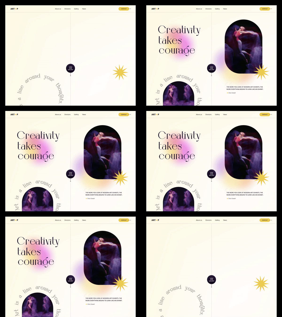
Scroll-based animations are an excellent technique to boost website user experience by introducing dynamic elements that match how users scroll and navigate the website. These animations include various effects, such as interactive storytelling, fading in and out, color shifts, or moving elements, which create an aesthetically pleasing experience and prompt further website exploration.
However, when implementing scrolling animations, you should ensure they’re subtle and don’t overshadow the content, as overly flashy effects can distract users and hinder accessibility. Focus on optimizing them for performance to prevent slowdowns or glitches, particularly on mobile devices with limited resources.
Moreover, consider the context and purpose of each animation, aligning them with the website’s overall aesthetic and usability goals. Finally, test animations across different devices and screen sizes to ensure consistent performance and usability.
2. Playful Layering
Integrate images atop other design elements to create a distinctive, personalized touch to your website and infuse it with a human-centric vibe. That helps add a sense of whimsy and personality, a stellar approach to give your website, regardless of how technically advanced, a handmade feel.
Thanks to the creative image layering, you can easily showcase vibrant colors, unique fonts, and captivating imagery that leaves a lasting impact on your visitors. However, pay attention to the following:
- Balance and Contrast: Layered images should match other design elements without overwhelming the visual composition. To accomplish that, use contrast strategically to draw attention to your website’s vital areas.
- Consistency: Focus on maintaining visual unity in image styles, colors, and themes across different layers to create a cohesive website identity.
- Accessibility: Remember to optimize images for accessibility by providing descriptive alt text and ensuring that layered elements don’t obstruct crucial content or navigation features.
- Performance Optimization: Be mindful of the file sizes of layered images to prevent slow loading times and optimize performance, especially on mobile devices with limited bandwidth.
3. Distinctive Grids
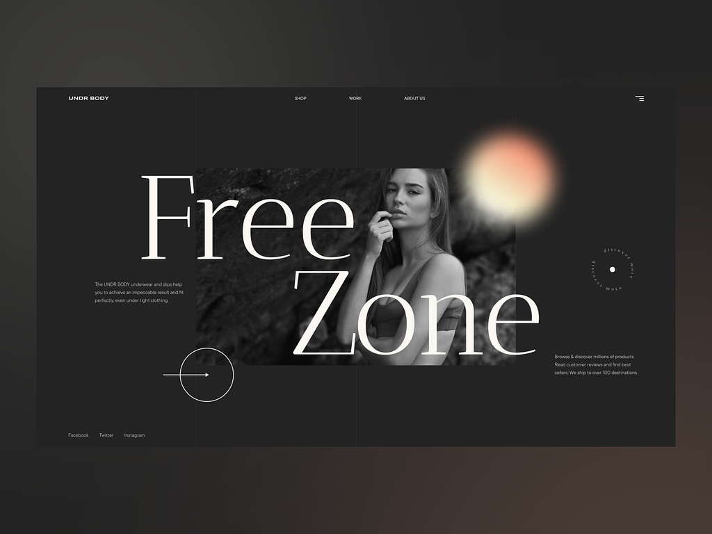
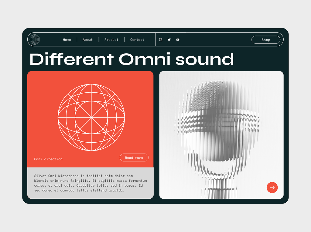
Nostalgia is still huge in 2024, explaining why the visible grid keeps finding its way to modern web design trends. It offers a unique and transparent aesthetic reminiscent of retro visuals. However, it also gives viewers immediate insight into the designer’s vision of the web page’s organization.
This approach facilitates easy navigation through clearly delineated sections and empowers designers to direct the user’s attention strategically. But when implementing visible grids, consider customizing the grid to complement the content and overall design aesthetic. For instance, you can experiment with variations in grid density, line weight, and spacing to achieve the desired visual impact.
You can also leverage the grid as a design element itself, using it to create interesting visual patterns or to emphasize key content areas.
4. Micro-Interactions
Micro-interactions refer to small, subtle animations or responses to user actions on a website. These interactions provide feedback to your users, boost usability, and create a more engaging and enjoyable user experience.
You can use them for various purposes, such as indicating a button click, confirming form submissions, displaying loading indicators, or providing visual feedback when hovering over elements. For example, when a user clicks on a button, a micro-interaction might include a brief animation to indicate they pressed the button.
Similarly, when filling out a form, micro-interactions can provide real-time responses to users, such as highlighting input fields with errors or displaying a checkmark when they complete a field.

5. Dynamic Text Effects
Animated typography elements leverage CSS and JavaScript animations to bring the text to life, adding visual interest and creating a richer user experience. This web design trend can include various effects such as text transitions, letter rotations, color changes, and text scaling, fostering engaging and interactive content that keeps your users’ attention on the edge.
You can use moving typography to convey messages dynamically and memorably, making it a popular choice for landing pages, headers, and other prominent website sections. But if you want to experiment with this trend, ensure that your dynamic texts perform in a way that doesn’t hinder smooth rendering across different devices and screen sizes.
6. Microsites
Mini sites are among the most popular web design trends for 2024 for many reasons, including being more affordable compared to larger, more complex websites. They’re small, focused websites typically consisting of a single page or a few interconnected pages.
These sites should deliver specific content or promote a single product, event, or campaign. The goal is to make them concise and visually appealing.
Microsites often feature simplified navigation, striking visuals, and engaging storytelling techniques that keep users interested and eager to interact with the site. You can leverage them for the following:
- Product launches
- Event promotions
- Contests or campaigns
- Temporary promotions
- Portfolio or work showcasing
- Specific brand initiatives.
Besides enabling you to highlight a specific product or activity, they have a simplified scope, fewer features and functionalities, faster development time, and limited maintenance.
7. Negative Space Prioritization
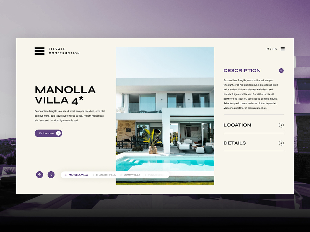
The whitespace no longer needs to be a dull, unused space surrounding your design elements. Even though minimalism is losing its leverage in the 2020s, this approach creates a sense of balance, clarity, and focus.
Moreover, this trend embraces the concept that the absence of content can be just as vital in shaping the overall visual experience. By strategically using negative space, you can improve readability, draw attention to essential elements, and craft a more elegant and sophisticated aesthetic.
For instance, you can use it to establish a visual hierarchy by separating content into distinct sections or layers, guiding users through the page, and directing their focus to the most significant information first. Or you can leverage it to highlight call-to-action buttons, product images, or headlines, making them stand out more prominently on the page.
8. Organic and Blob Shapes
For most of the decade, web design shapes in the 2010s revolved around the much-beloved Millennial hexagons and sharp lines and patterns. That was in a neat correlation with the dominant minimalist trend.
However, the younger generation, Gen Z, is choosing more playful and unorthodox structures, the wavey blobs. That’s having an impact on web design trends in 2024 as well.
If you’re targeting a younger audience, straight lines are out, and organic and fluid shapes are in. Think of blob shapes as background elements behind text or images or as decorative accents throughout the design.
These patterns can be colorful, abstract, and irregular in shape, creating a dynamic and engaging visual experience. Your website gets bonus points if you play with bright and contrasting colors, such as Cyber Lime, Digital Lavander, and retro classic palettes.
9. Maximalism and Nostalgia
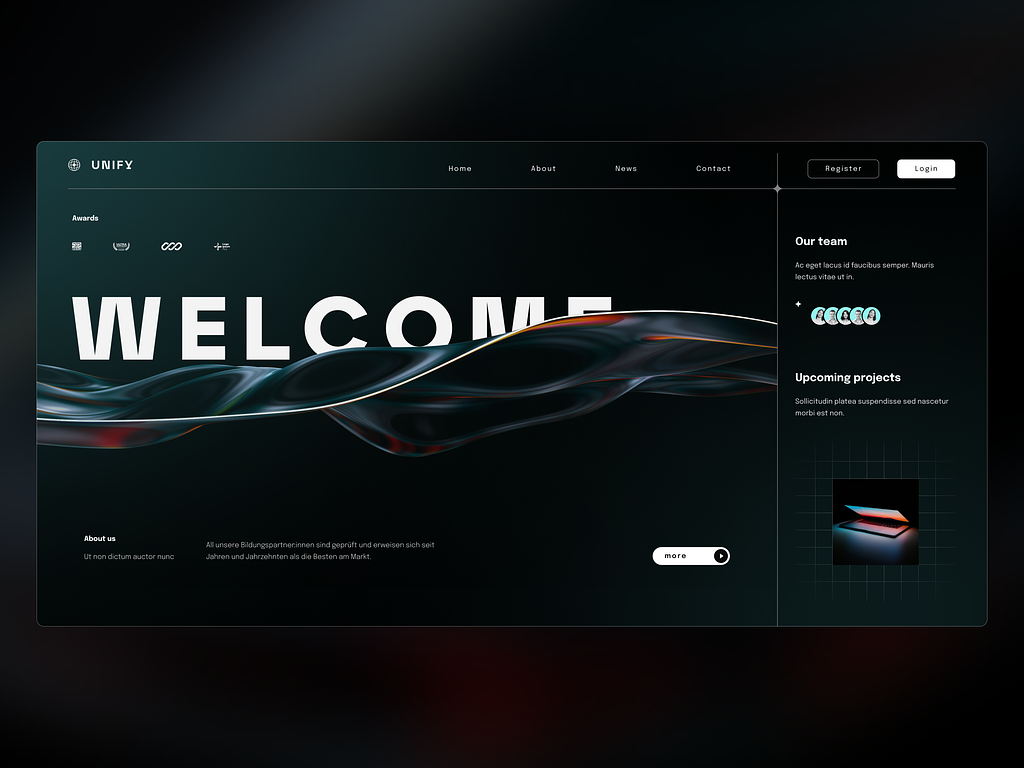
We already mentioned that the 2020s are big on nostalgia, and web design trends aren’t staying behind. Bold, vibrant, and eclectic approaches are coming to the forefront, embracing excess, diversity, and visual overload.
The goal is to break the rules, avoid playing it safe, and celebrate individuality. Unlike minimalism, which focuses on simplicity and restraint, the maximalist design explores an array of colors, patterns, textures, and design elements to create immersive experiences.
This trend prioritizes creativity and self-expression, encouraging you to push the boundaries of traditional design rules. Maximalist websites often include rich, layered layouts with multiple elements competing for attention, resulting in visually stimulating and memorable user experiences.
Add nostalgia-driven design elements to the mix, such as retro typography, vintage color palettes, and nostalgic visuals, to blend maximalism with depth, warmth, and familiarity to the overall design.
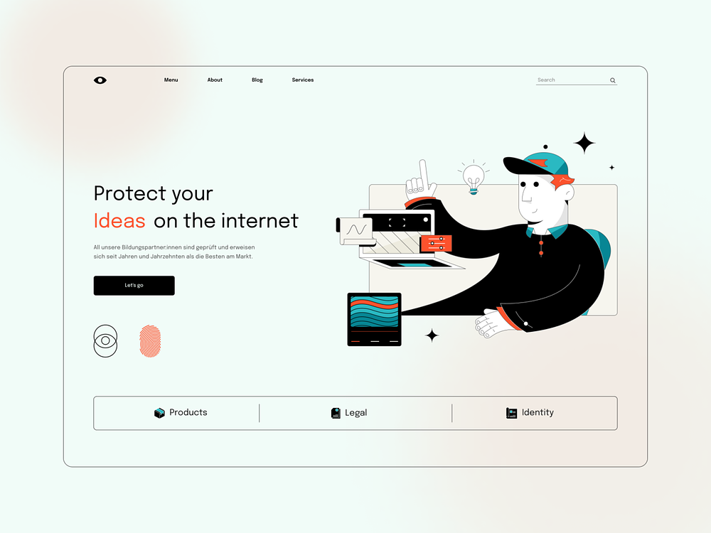
10. The Rabbit-Hole Scroll
This approach centers around crafting immersive and interactive scrolling experiences that draw users deeper into your website’s content or story. This trend takes inspiration from the concept of a rabbit hole—a metaphor for a journey of exploration and discovery.
Websites experimenting with this trend often feature long-scrolling pages with dynamic transitions, parallax effects, and sudden surprises that unfold as users scroll down the page. These scrolling experiences aim to hold a grip on users’ attention, encourage exploration, and create a sense of curiosity and engagement.
Adopt Web Design Trends That Flatter Your Brand Identity
Never follow styles and approaches only because they’re trending but don’t feel natural to your brand identity or company values. Instead, choose those that complement your existing website and align with your products and services.
If you need help deciding what approaches suit your brand and how to adopt them, consider professional web design services. That will streamline your efforts and give your website the sleek look it deserves.
