Portfolios give potential clients and employers a glimpse of your best work, baiting them to want to learn more about you. Whether you're new to the workforce or making a career switch, these compilations are just as vital as resumes.
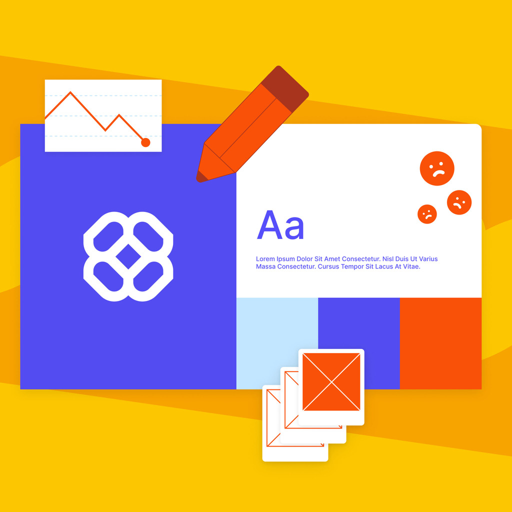
But since you’re competing with many talented UI/UX designers, your portfolio should be more than a visual presentation of your work. As a form of art, it should show your skills, experience, values, and how you approach and apply design techniques.
This guide explores everything you should know about the UI/UX designer portfolio, as well as the common pitfalls and how to avoid them.
What is a UI/UX Designer Portfolio?
A UI/UX designer portfolio serves as a digital showcase of a designer’s key projects and case studies, typically presented on a personal website or platforms like Behance. This provides recruiters with valuable insights into your skillset and potential.
Portfolios also elucidate your design process, showcasing the logic, thought process, and personality behind your work. Thanks to this, recruiters gain a better understanding of what to expect and can assess whether you are the right fit for the job role.
How to Create a Portfolio for a UI/UX Designer
If you want to create your UI/UX designer portfolio, you might feel uncertain about where to begin. Start by addressing the following questions:
- What is my unique design style and approach?
- Who is my target audience (clients, employers, specific industries)?
- Which phases of the UI/UX design process do I find most fulfilling?
- What sets me apart from other UI/UX designers?
- In which types of projects do I excel?
- Which projects provided the most valuable learning experiences?
- How can I effectively communicate the results of my designs?
Your answers to these questions will serve as a roadmap for creating your UI/UX designer portfolio. Here are the other guiding principles to follow.
1. Inform and Intrigue in Seven Seconds
People form their first impressions within seven seconds. That’s how long your portfolio has to showcase your knack for good UI/UX.
Think of it as your elevator pitch. Organize information neatly to make it easy for recruiters to parse and understand who you are and what your portfolio conveys.
2. Highlight Your Best Projects
Always include projects that would receive a high score, aiming for those above eight on a scale from one to ten. If you want to include work that falls below this range, address what is missing to improve its grade.
In some cases, you may need to put more effort into a project’s presentation. However, if the story behind the project is lengthy or dull, it may require extra work to make it engaging.
Limit your portfolio to no more than six projects; this is enough to catch recruiters’ attention and showcase your skills as a designer. Each project should work in your favor, as recruiters may only evaluate one.
Therefore, there should be no doubt about whether you are a UI/UX designer or an illustrator. Moreover, your portfolio should reflect the job role you are applying for.
3. Show How You Solve Problems
Some designers create the design first and then write a fictitious story to back up their project. Although this approach may work if you personally encountered that project, it’s better to include a real problem you solved. Striking mockups typically only show the end result.
Yet, recruiters want to see proof that you can assess and pinpoint an issue. This includes the entire research and ideation process, and how you reached a realistic solution that aligns with the needs and expectations of businesses and users.
You can do so by writing a precise narrative or including videos that showcase the project’s progression. Recruiters and potential clients will appreciate the effort you put into it, as well as being able to visualize how you approach UI/UX design.
4. Give Your Portfolio Some Personality
Each company has a unique culture that impacts its ideal candidate profile. After all, a designer’s skills aren’t the only factor shaping their performance and how they’ll adjust to the workplace.
Recruiters seek UI/UX designers with a compatible mentality, affinities, and objectives. They will assess whether you’re this person through interview questions, but your UI/UX designer portfolio can give an excellent headstart.
The goal isn’t to come across as different at all costs, as this can make you look ungenuine. Instead, approach your portfolio as a mirror of your online presence and brand.
Whatever direction you choose to showcase your brand, you should be comfortable with how it represents you personally and professionally. Be confident about the tone of voice, fonts, images, and colors and the message they convey.
5. Watch Out for Usability
As a creative professional, you may want to experiment with visual design and add an aesthetic statement to your portfolio. However, prioritize intuitive navigation, clear visual hierarchy, and accessible content. Your case studies should include an effective background story, and recruiters should be able to quickly find information. A user-friendly portfolio demonstrates your design skills in practice and makes it easy for others to evaluate your work.
What Should You Include in Your UI/UX Designer Portfolio?
Your portfolio should include more than just design projects. Here’s what else to include.

Contact Information
After recruiters, hiring managers, or potential clients decide your portfolio is worth their time, they’ll likely want to reach out. Streamline this process and make contacting you as smooth as possible.
You might include a “contact me” button in the main menu, provide a straightforward contact form, or simply display your email address on every page.
Personal Bio
Your bio should be easy to find and include your professional background, highlighting key skills and experience, along with a brief mention of your design philosophy or approach. The text should be concise but engaging, and the language should be clear and reflective of your style and expertise.
Relevant Links
While your UI/UX designer portfolio comes first, you may also want to add links directing recruiters to your resume, LinkedIn, or other relevant social handles. For example, consider adding links to your Dribbble or Instagram accounts to showcase additional work and sketches that, while not a top priority, complement your skills and expertise.
Common Mistakes to Avoid When Creating a UI/UX Designer Portfolio
You can only build the best portfolio for a UI/UX designer if you prevent the following don’ts.

Distracting or Unfinished Personal Branding
Your portfolio should convey to recruiters your genuine interest in the job role you’re applying for. This includes using high-resolution images, maintaining consistent visuals, and ensuring grammatically correct copy.
Avoid using color schemes that lack cohesion and branding elements that overshadow your work. Moreover, some designers overlook crucial branding sections, like an About Me page or a concise brand statement. Neglecting these sections can leave recruiters feeling disconnected and uninformed about the designer behind the portfolio.
Images of Low-Fidelity
These images lack the detail and clarity necessary to communicate the quality of your work. When recruiters and potential clients see portfolios with this mistake, they struggle to discern the finer details of the design projects, leading to a poor presentation.
Misaligned Problem Statement and Results
Any discrepancies between the problem statement you present in a case study and the final results can undermine your credibility. If your problem statement doesn’t accurately reflect the outcomes, you may confuse your audience and raise doubts about your ability to identify and address user needs.
Case Study Overload
It may be tricky to decide which ones to choose and narrow your selection to three to six case studies. However, adding any more will likely overwhelm viewers. Strike a balance and curate your portfolio to showcase a select few projects that best demonstrate your expertise and capabilities.
Outdated Styles
Your UI/UX design portfolio should be crisp, fresh, and relevant. Most recruiters and hiring managers are more likely to choose designers who are in touch with the latest UI/UX and web design trends.
Using outdated design styles may also convey a lack of adaptability and innovation. Your portfolio must demonstrate that you can create modern, user-centric designs that meet contemporary needs and preferences.
Lengthy UI/UX Case Study Text
Your target audience is typically busy and doesn’t have time for reading long and detailed narratives. They’ll rather skim through than assess every project thoroughly.
Keep your case study text concise and focused, putting key points at the forefront to maintain your audience’s interest and attention.
UI Collage
Including a UI collage might seem tempting, but relying solely on perspective mockups for visual appeal may not have the effect you imagine. Provide explanations for the screens, detailing their functions and how they address specific design challenges.
Depth Instead of Breadth
Your portfolio should showcase a variety of projects or experiences rather than focusing extensively on a single project or aspect. It’s better to demonstrate a wide range of skills and expertise across different projects within UI/UX design rather than probing deeply into just one aspect.
A Lack of Design
While you should discuss the UX aspects of a project, such as research findings and usability testing results, leaving out the design process can cause your portfolio to lack substance. Ensure your case studies adequately demonstrate the design decisions you made throughout the project, including wireframes, prototypes, and visual designs.
Misalignment with the Desired Role
If your portfolio doesn’t match the specific role or company you’re applying to, you’ll fail to impress potential employers. Clients, recruiters, and hiring managers seek candidates who can address their existing challenges and contribute to their teams.
If you lack work experience, consider identifying a problem within the company’s product flow and redesigning it independently. Employers appreciate those who take the initiative to tackle relevant issues through self-initiated projects.
How to Create a UI/UX Designer Portfolio Case Study?
Building your UI/UX designer portfolio case study requires a systematic approach to showcase your skills and design process. Here’s how to do it step-by-step.
1. Showcase the Final Design
Consider starting with the end product to pull recruiters in from the get-go. Show high-quality images or an interactive prototype to provide a clear overview of the finished design.
2. Set the Scene
Explain the problem you were solving and highlight the client’s needs and the target audience to offer context. Recruiters and potential clients should easily understand the project’s purpose and objectives.
3. Explain Your Process
Break down your workflow into key stages (e.g., research, wireframing, prototyping, and user testing). Describe the methods and tools you used at each stage and emphasize their role in shaping the final design.
4. Include Visual Elements
Use sketches, wireframes, and prototypes to represent your process visually.
5. Highlight Iterations
Show different versions of your work to demonstrate how feedback and testing led to refinement.
6. Detail the Solution
Make it clear how your design effectively addressed the initial problem and met the client’s goals.
7. Reflect on the Experience
Conclude with insights you gained from the project and note any challenges you overcame during the process. Moreover, you can discuss how this experience may benefit your future projects.
UI/UX Design Portfolio Examples
Creating a quality portfolio typically starts with finding inspiration from other UI/UX design portfolios. Let’s explore the best examples.
Sharon Kravanja
Kravanja’s UI/UX portfolio showcases her best projects and explains how she approached each problem. Her work includes redesigning Goodreads during Ironhack and creating a cleaner, more intuitive interface.
Stephanie Perez
This designer lists the projects they worked on, and the challenges they faced, as well as an About Me and Education section.
Nina Jovanovic
Logical order, variety of projects, and visual simplicity are the main characteristics of this concise portfolio. It includes all the projects the designer worked on between 2023/2024, as well as what their designs helped achieve.
Design, Context, and Quality Branding
While creating the best portfolio for a UI/UX designer isn’t the easiest task, remember to focus on showcasing the best projects. Prioritize showcasing your design thinking and add enough context but don’t overexplain.
Another thing to keep in mind is your personal branding.
Your portfolio should show the breadth of your expertise, but your personality should be present in consistent visual elements and typography.
Before starting, consider using free web design courses and tutorials to hone your craft. This may also help you learn about the latest industry trends and techniques. However, you may also consider teaming up with professionals who provide UI/UX design services; they can help you create your portfolio in no time.


