White and black may encourage you to appreciate simplicity and sophistication, but colors imbue life with intensity. A lack of different tinges and hues is a quick recipe for monotony and creativity scarcity.
Why would websites be any different? They must be vibrant and inviting enough to keep your visitors exploring.
This is why you must carefully choose the best website color schemes. The right palette allows you to evoke the desired emotions in your target audience and highlight your brand characteristics.
Yet, with so many options, you may struggle to decide which benefits your goals and values most. Our guide will help you determine an optimal site color scheme that complements your layout, navigation, copy, and brand.
Meanwhile, you’ll also learn why color psychology matters and the must-know tips and tricks for a visually flawless website.
Why is Website Color Scheme Important?
Website color schemes bring out your brand identity and influence the overall aesthetic and usability. As the anchor of web design, colors and chromaticity build the visual hierarchy and guide visitors’ attention to CTA buttons, navigation menus, and other relevant content.
According to PR Newswire, almost 40 percent of consumers consider colors the most important element on a website. Colors reflect a company’s brand, leaving the first impression and evoking specific feelings, experiences, and emotions.

Wisely experimenting with different hues can also help you attract a younger audience, as they favor maximalism. Unlike their Millennial predecessors, Gen Z loathes minimalist design, including cold and plain colors, and finds it dull.
When all these factors come together, they result in the following benefits of using a website color scheme effectively:
- Better UX: Choosing the best website color schemes makes your website a clear representation of your brand and boosts recognition, encouraging visitors to return. Moreover, the strategic order of colors and the use of accent hues, like those for CTA buttons, create aesthetic harmony and strengthen the memorability of key elements.
- More Conversions: The right colors can nudge your visitors to fill out a subscription or buy a product. However, an unpleasant color scheme may push them to abandon the cart or your website. Getting this done well increases your odds of encouraging people to perform a desired action, resulting in a conversion.
- Visitor Retention: The goal of every website owner is to keep their visitors scrolling and exploring for as long as possible. Effective colors can help you accomplish this. When paired with a well-designed user interface, strategic color choices help visitors locate navigation elements and establish a visual structure that directs attention to vital content. On the flip side, poorly selected color palettes, like black text on a dark background, can hamper usability.
So, how do you put these insights into practice?
Things You Should Know About the Color Theory
Before you can create visually appealing and effective designs, you must understand color theory in graphic design. The color theory centers around the interaction of different colors and hues, as well as how these interactions impact perception and emotion.
Once you master it, you’ll build skills that allow you to combine harmonious color schemes that speak to your audience. A solid grasp of color theory is vital when working with different color models like CMYK, RGB, and Pantone.
The CMYK model is most common in printing and combines yellow, cyan, black, and magenta to produce a full range of colors. You can only ensure printed materials match the intended design if you know how these colors blend.
On the other hand, designers use the RGB model for digital displays, meshing green, blue, and red light to develop a color spectrum. Meanwhile, Pantone is a standardized color-matching system that helps designers reproduce specific colors across various platforms and materials without mistakes.
Whether you choose complementary colors for balance or contrasting hues to highlight vital website elements, being well-versed in color theory is necessary for creating a visually appealing final product that effectively triggers the desired action and conveys the right message.
How to Make the Psychology of Colors Work for Your Website
Some colors have a singular power to draw in visitors to continue reading a blog post, while others make it hard to get to the end of the first paragraph. This explains why 66 percent of people accept or reject new products based on color.
Colors in branding psychology shape how visitors perceive your brand and interact with your site. For example, orange is the least popular color, while black can make people associate your website with high quality.
Many designers like to go all-white to make the layout and elements come across as more sophisticated, yet this is the most overlooked color. As the most popular color in the world, blue is a safe bet for having your brand perceived as reliable, confident, and stable.
The best website color schemes leverage the principles of the psychology of colors to make their website more impactful. Here’s what you should have in mind to ensure your site color palette works in your favor.
- Colorful and creative ads generate more clicks and views than black-and-white combinations.
- Yellow and brown are the second least popular colors.
- Young people prefer bright palettes.
- Blue is the most common favorite color among both men and women, followed by green and red.
- Purple is the most polarizing color. Both men and women seem to love it or hate it, making it a hit or miss.
- Women tend to favor softer color tints, like pink, while men are more drawn to vibrant shades, such as ruby red.
- Color vision varies between men and women due to differences in inherited X-chromosomes and color cones, which may explain why men often prefer colors with longer wavelengths, like darker blues and greens, or neutral shades like white, black, and gray.
Practical Tips for Choosing the Best Website Color Schemes
Let’s explore how to use the most harmonious color schemes for your site.
1. Get the Basics Right First
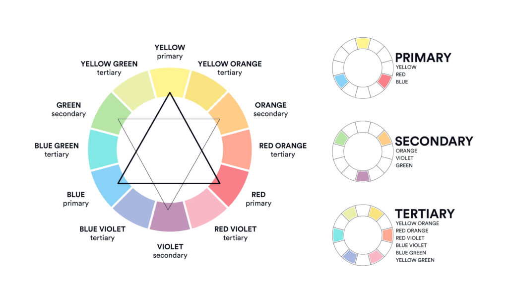
Learning the foundations of color theory also means mastering primary colors—red, yellow, and blue—that form the basis for creating all other colors. When you mix these, you get secondary colors like green, orange, and purple.
To refine your palette, consider tertiary colors, which you can make by blending a primary color with a neighboring secondary color, such as blue and violet, creating blue-violet. Moreover, you should know the difference between warm and cool colors.
The former include red, orange, and yellow, typically necessary to give your design a touch of energy and excitement. These are ideal for elements that should stand out or convey a sense of urgency. The latter encompasses blue, green, and purple, which create a calming and professional atmosphere. Cool colors work best for areas that require a soothing or more refined appearance.
But keep in mind that colors on your website are rarely pure, which can impact the overall feel of your design. They often appear as tints (colors lightened with white), shades (with black added), or tones (colors adjusted with gray). For instance, a softer tint might make a background feel light and airy, while a deep shade can add depth and sophistication.
2. Choose the Best Color Combination
Color isn’t a physical property; we experience it through the way our brains interpret light wavelengths rather than simply observing it. You may see a website’s background as blue because of how light from the screen interacts with your eyes and how your brain processes that information. Someone else may see it slightly differently, as color perception varies from person to person based on how their eyes and brain interpret light.
This means that stats on popular colors and different meanings are valuable but not as much as individual differences, what your brand represents, and who your target audience is.
Yellow and orange may not be popular colors, but if your visitors are mostly young, they’ll likely perceive these colors as optimistic and attractive. Choose your website color schemes based on your company’s identity, values, and visitors’ characteristics.
Moreover, when choosing the right website color combination, prioritize the mood or emotion you want to evoke by considering elements like chroma and value. These aspects communicate your brand’s message and resonate with your audience more effectively than simply targeting specific hues.
3. Don’t Use Too Many Colors
Less is more is the golden rule for a reason. You can experiment with different hues without cluttering your website.
It’s best to be consistent and stick with two to four colors throughout the website, social media, and email marketing. However, you can use variations of your main colors, including shades, tints, and tones, to achieve harmony and diversity in your design.
4. Don’t Overlook Accessibility
The contrast between text and background colors should hit the right spot to enable readability and usability for every visitor. Tools like the WebAIM Contrast Checker will help you verify whether your color combinations meet accessibility standards, such as a contrast ratio of at least 4.5:1 for body text.
For example, dark text on a light background generally offers good contrast, while light text on a dark background can also work well if the contrast is strong enough. Avoid relying merely on color to convey information. Instead, use text labels and patterns to make your content accessible to users with color blindness or other visual impairments.
5. Keep the Context in Mind
The purpose of your design should come first when choosing the best website color schemes. While calm, trustworthy colors like blue are ideal for a financial site’s overall design, logos benefit from distinctive colors that make them more striking and reinforce brand identity.
On the other hand, vibrant hues work well for creative portfolios, where the logo and site elements can share a cohesive, dynamic color scheme. Hence, you should tailor colors to both the functional and branding needs of different website components.
Let’s check how this works in practice with green color palettes.
Green Website Color Schemes
While there are endless palettes you can choose from, websites with green color schemes may become increasingly popular in 2025. After three turbulent post-pandemic years, many people seek relaxation and peace, nudging them to turn to nature.
No wonder different shades of green are poised to be in vogue. This color is associated with health and wellness and symbolizes growth and recovery.
Here are examples of the best green website color schemes to get your creative juices going.
Evernote
This note-taking and productivity app uses green as its primary color to represent motivation and clarity. Evernote balances green accents throughout the website with plenty of white space to create a clean and organized look that matches its focus on efficiency.
Meraki
In this case, green conveys innovation, growth, and a connection to nature, which is somewhat unconventional in the tech industry. However, this cloud-managed IT company subtly integrated green tones into the user interface for a fresh and modern aesthetic, making it different from competitors typically relying on more traditional tech colors like blue and gray.
Ecoist Car
As a company focused on providing environmentally friendly automotive solutions, Ecoist Car relies on green to highlight its commitment to sustainability and innovation. This color is prominent throughout the website, appearing in various elements such as the background image, headings, and buttons.
Conclusion
Appealing and meaningful color palettes are integral to your website’s success because, ideally, they complement and accentuate every other element. They’re the backbone of your visual brand identity and tie all your messaging into a cohesive aesthetic.
Albeit an exciting task, choosing the best website color schemes can also be tricky. Consider teaming up with professionals providing web design services to find the right color for your needs.